INTRODUCTION
THE TASK
To create a logo and the early stages of a brand, to be used in a Podcast format.
THE APPROACH
Through establishing the logo first, fonts and colours are derived and used through the design pieces. Shown on the thumbnails used for the podcasts (and later, to be used on advertisements).
THE SOLUTION
By utilizing the colours to their maximum potential, the brand is consistently speaking for itself, linking all of the content together.
LOGO - VARIATION USAGE
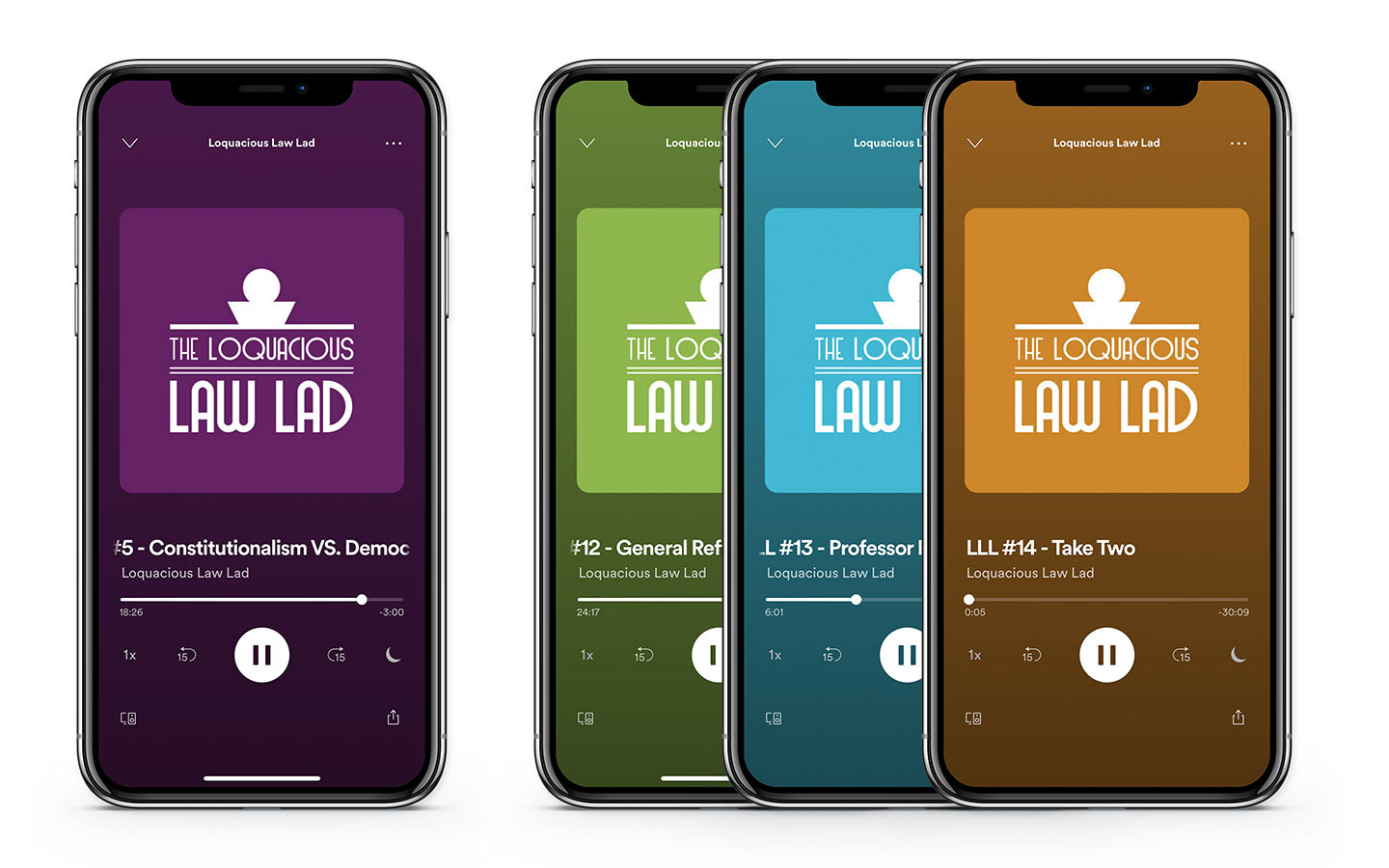
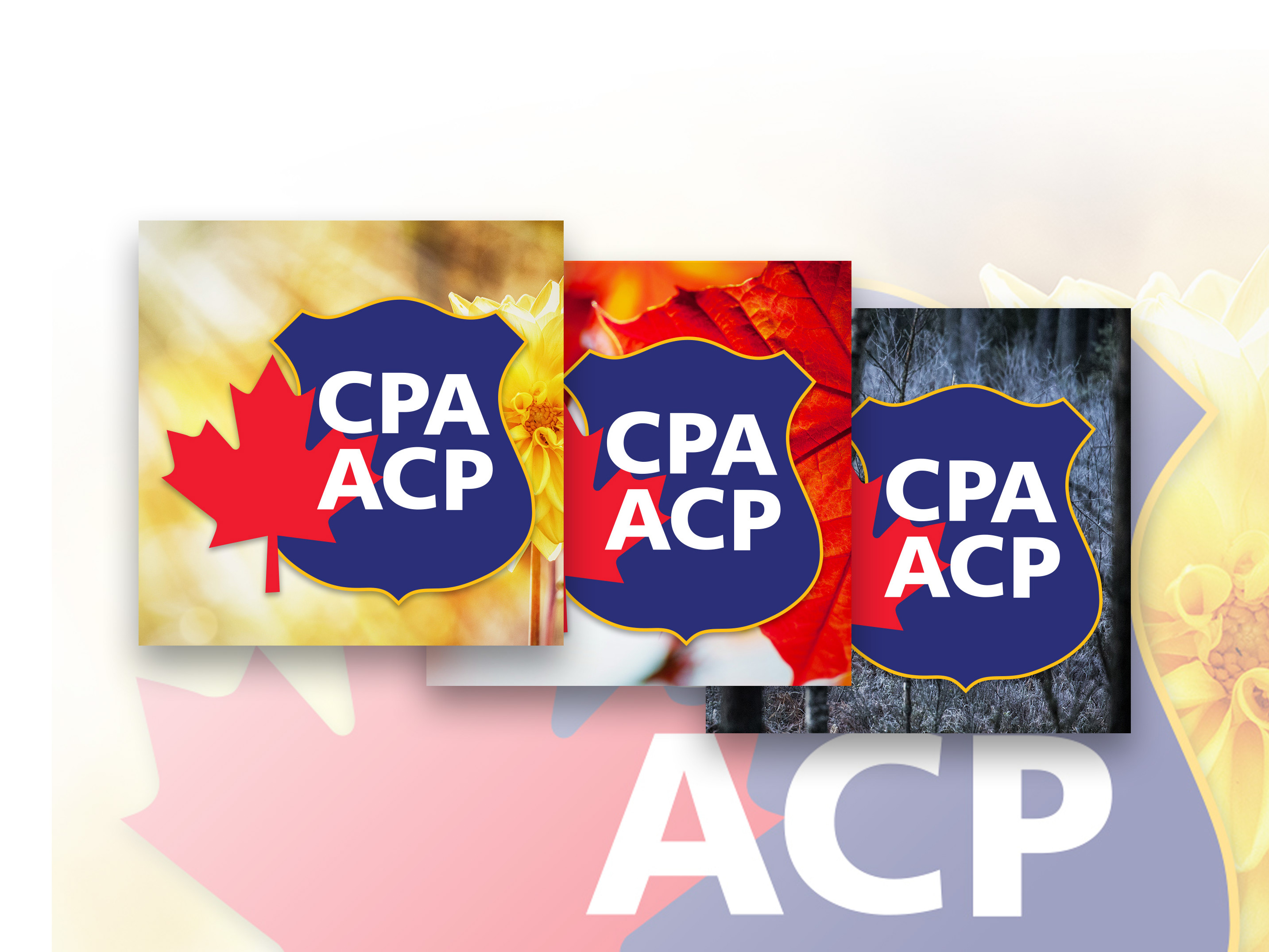
Logo Variations are used as Spotify Thumbnail (Art Cover) as well as for Social Profile Pictures.
SKETCHES
Examples below comprise of most of the sketches that were shown in the initial logo process, which helped with the selecting nine to proceed forward with. I always start off with a wide pool to pull ideas from.
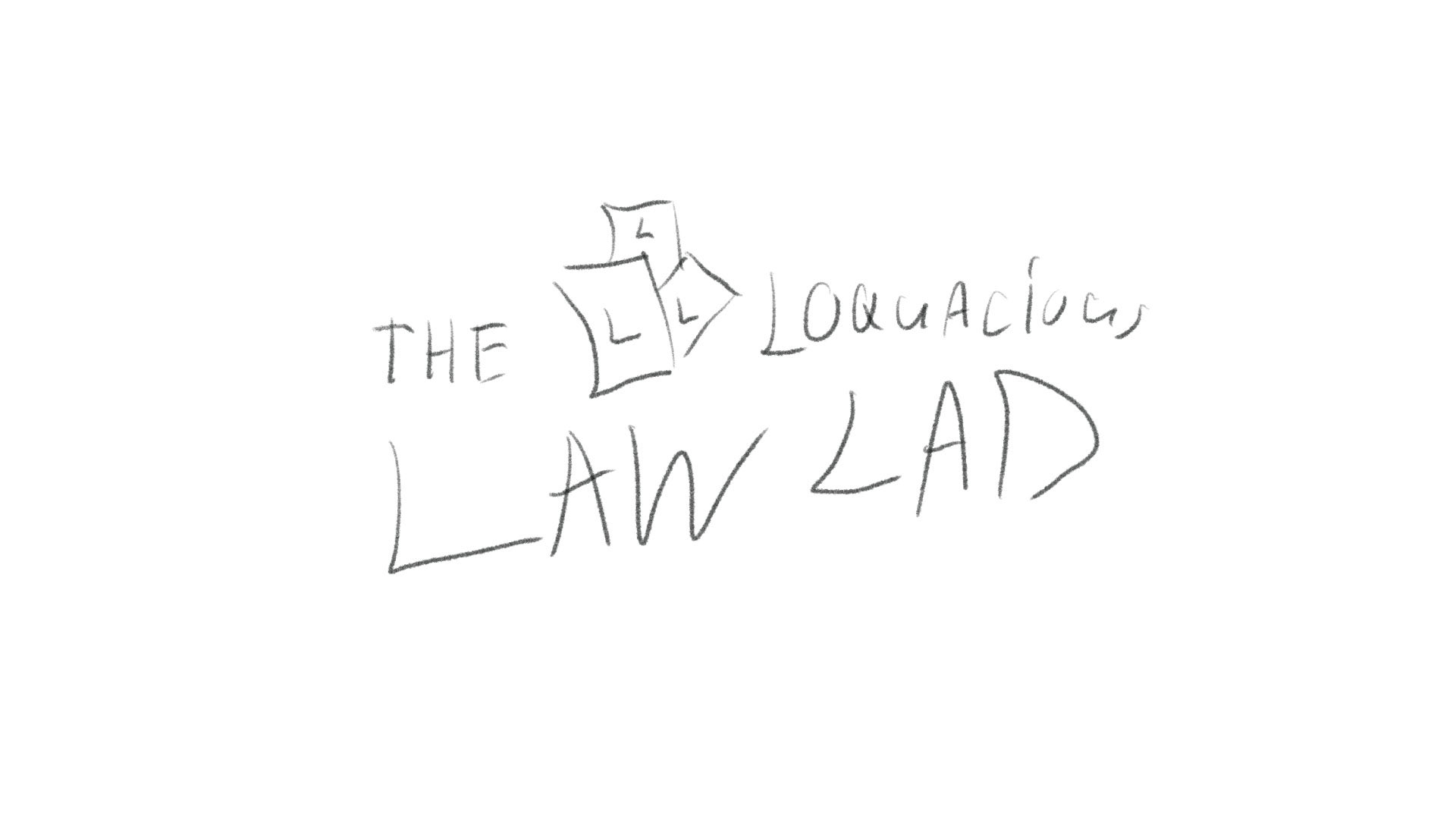
Sketch 1 of 20
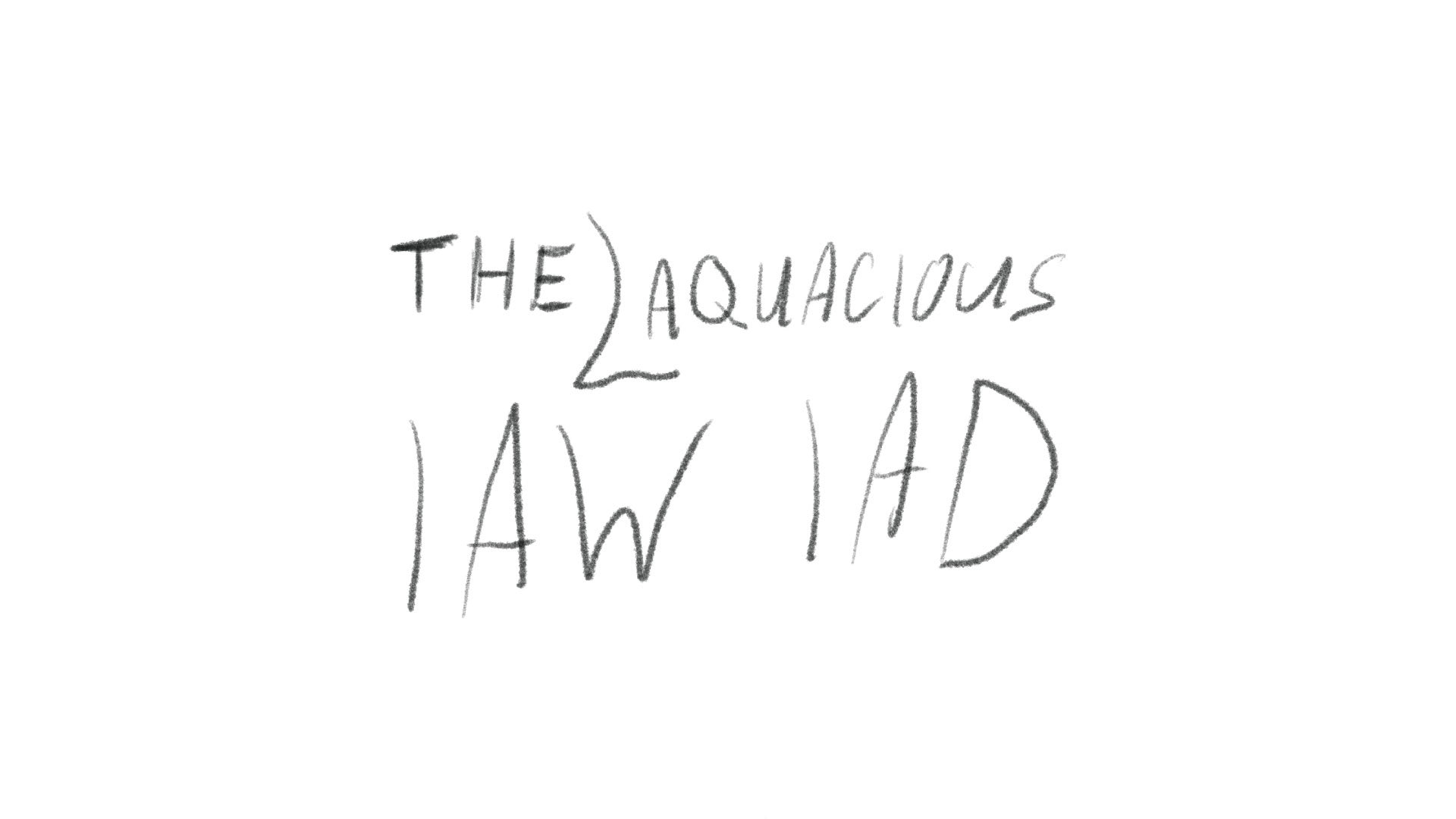
Sketch 2 of 20
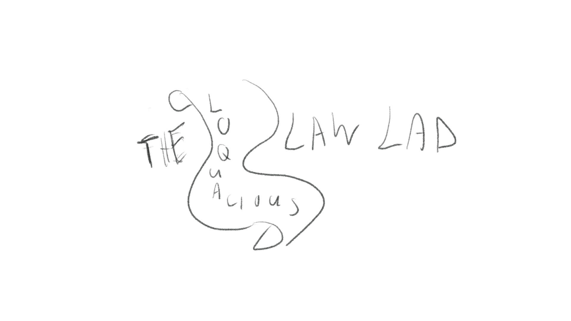
Sketch 3 of 20
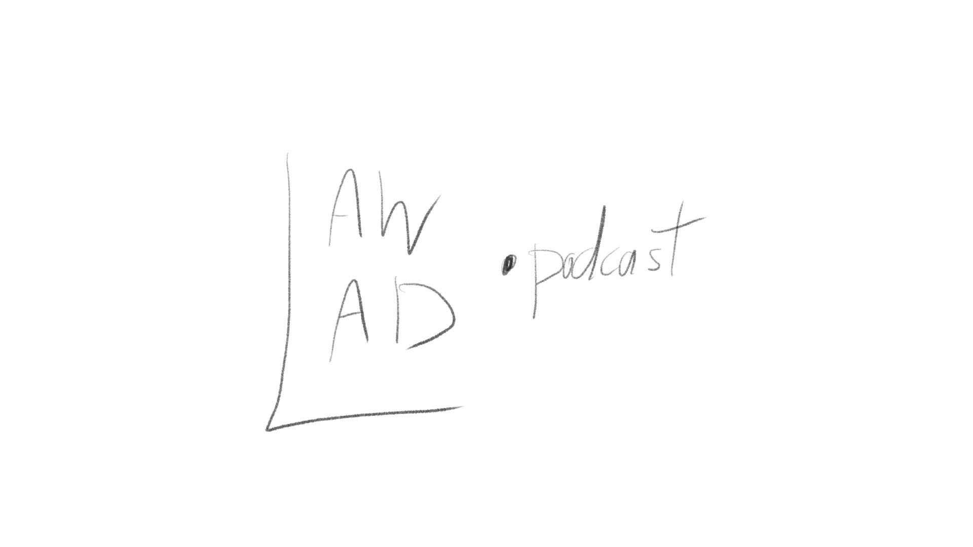
Sketch 4 of 20
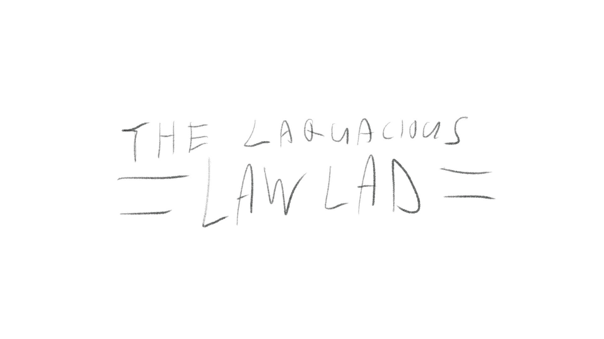
Sketch 5 of 20
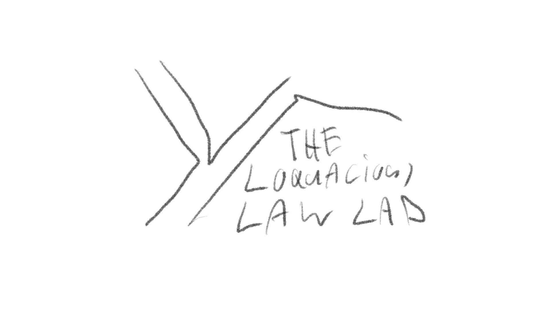
Sketch 6 of 20
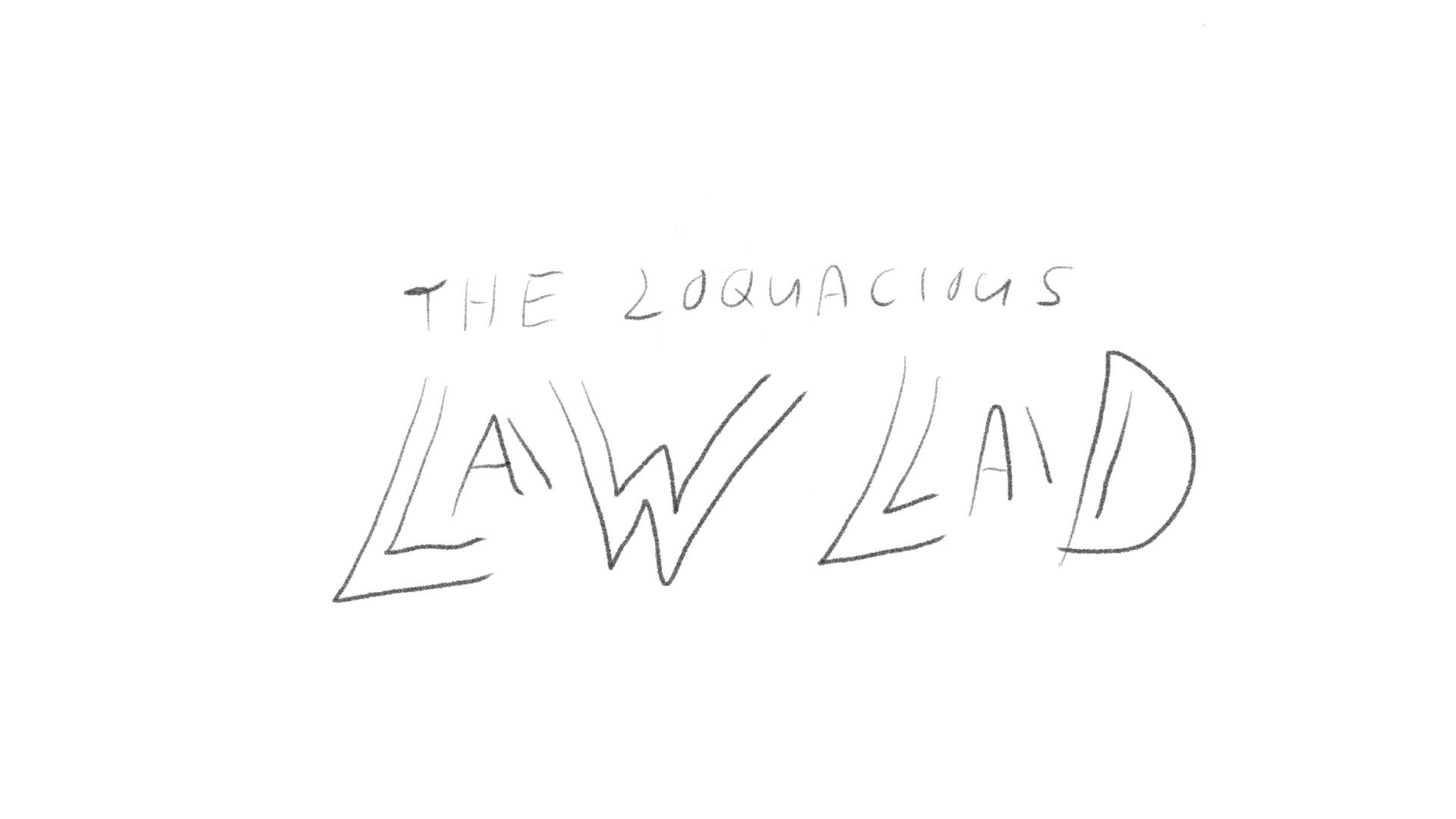
Sketch 7 of 20
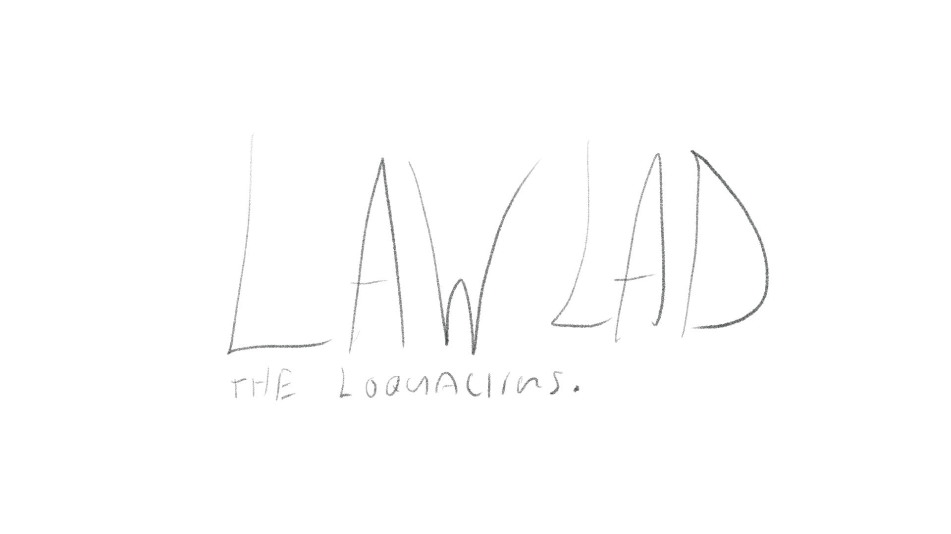
Sketch 8 of 20
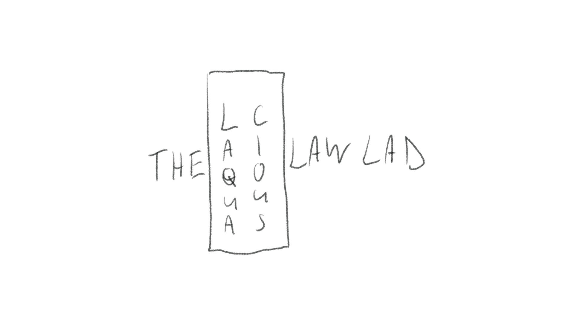
Sketch 9 of 20
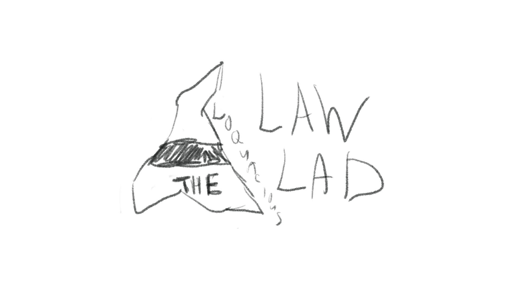
Sketch 10 of 20
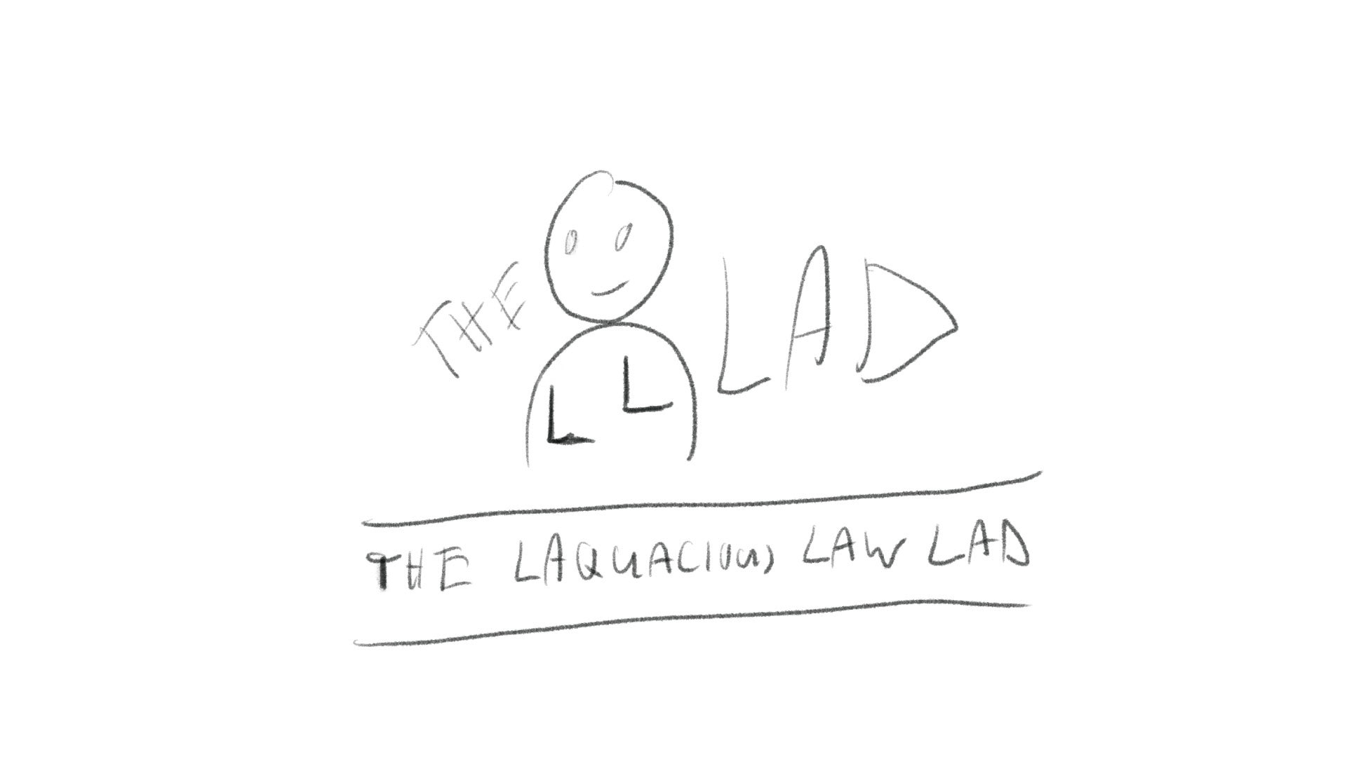
Sketch 11 of 20
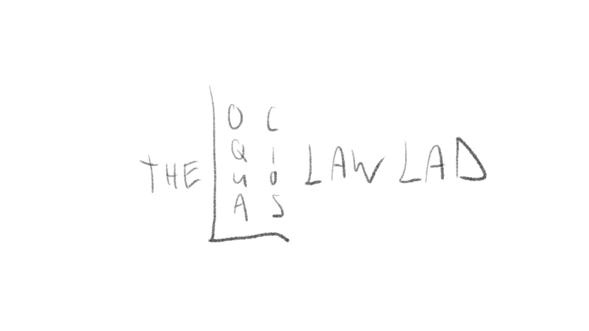
Sketch 12 of 20
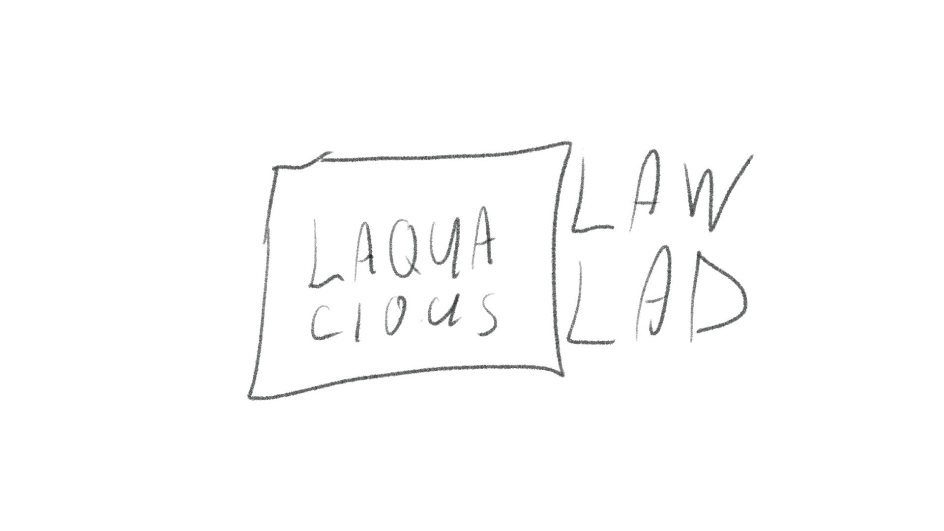
Sketch 13 of 20
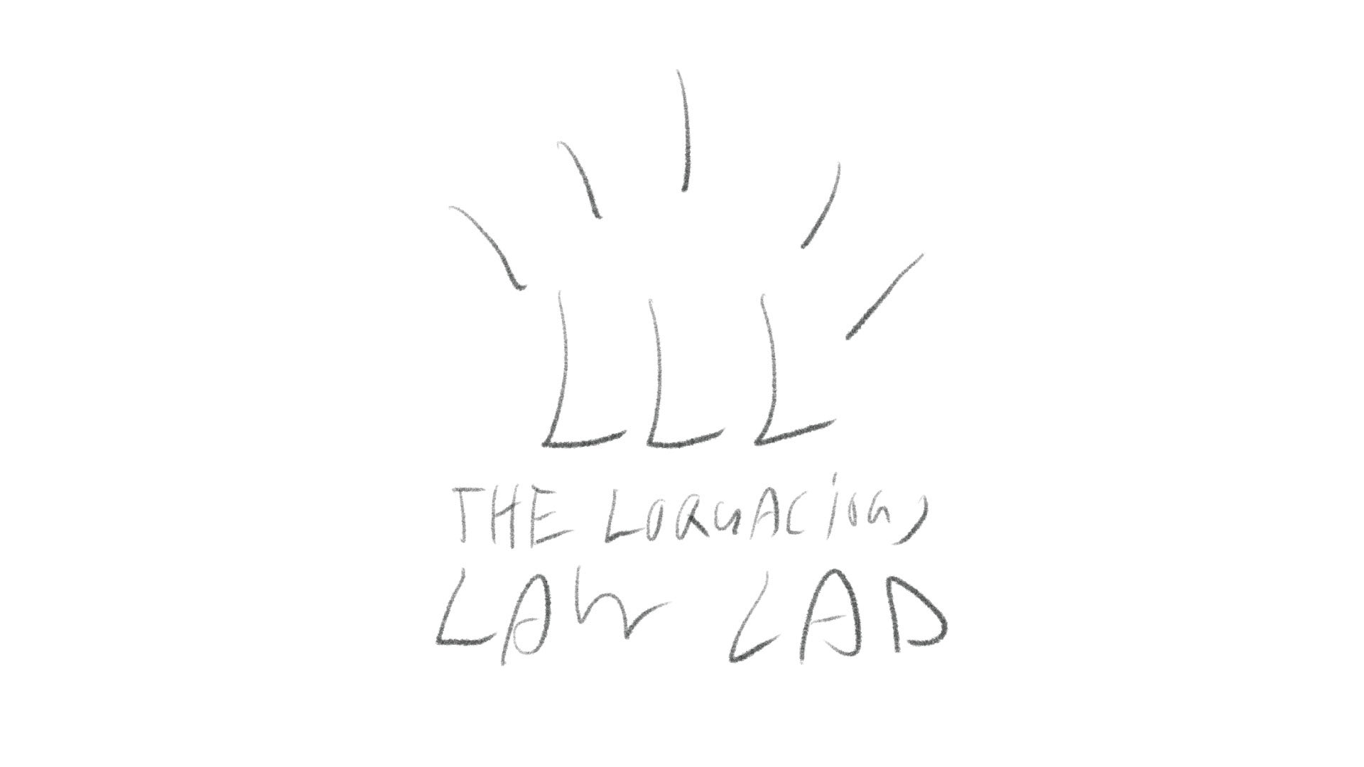
Sketch 14 of 20
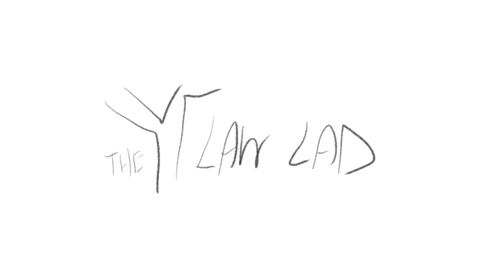
Sketch 15 of 20
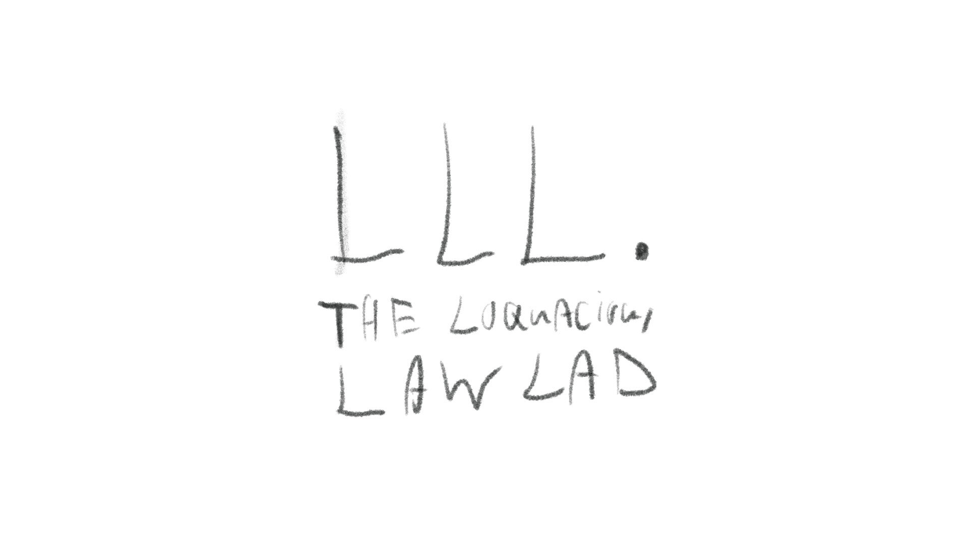
Sketch 16 of 20
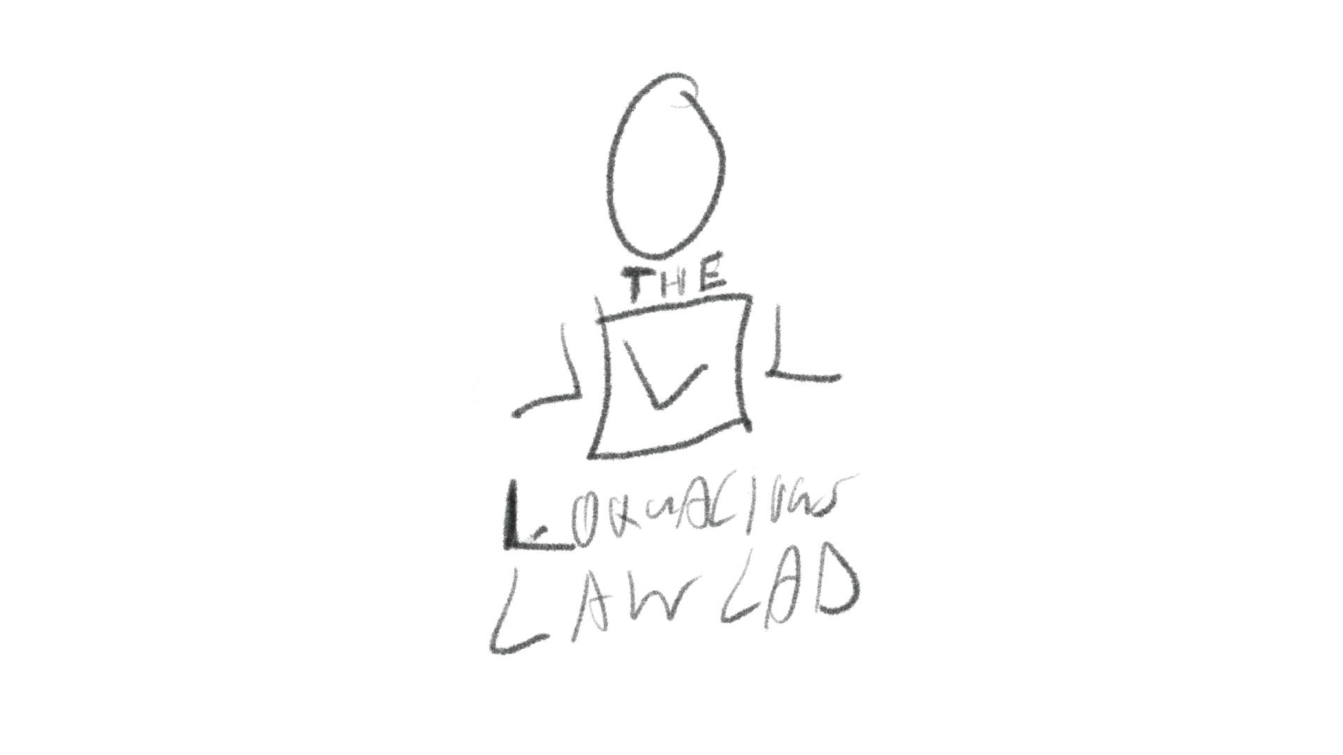
Sketch 17 of 20
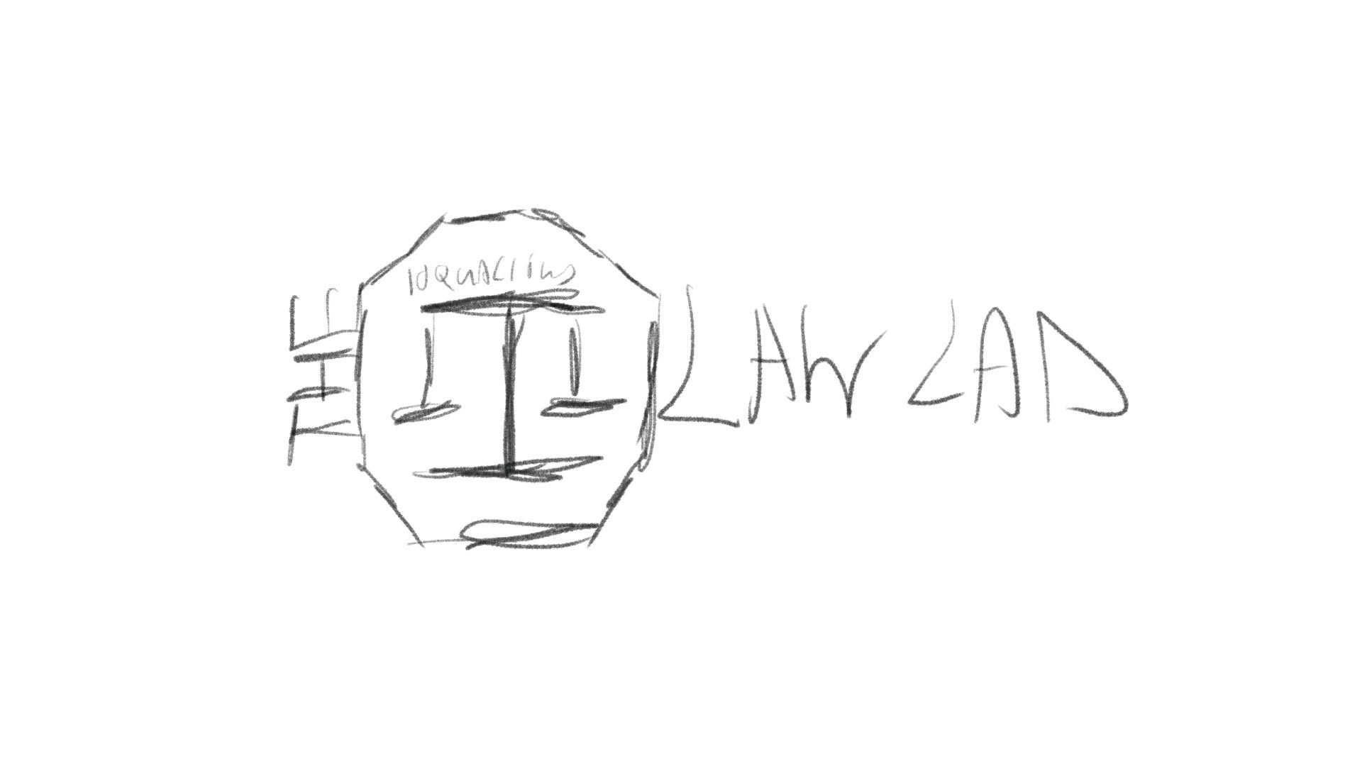
Sketch 18 of 20
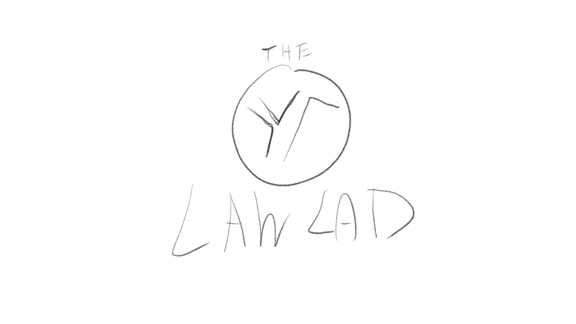
Sketch 19 of 20
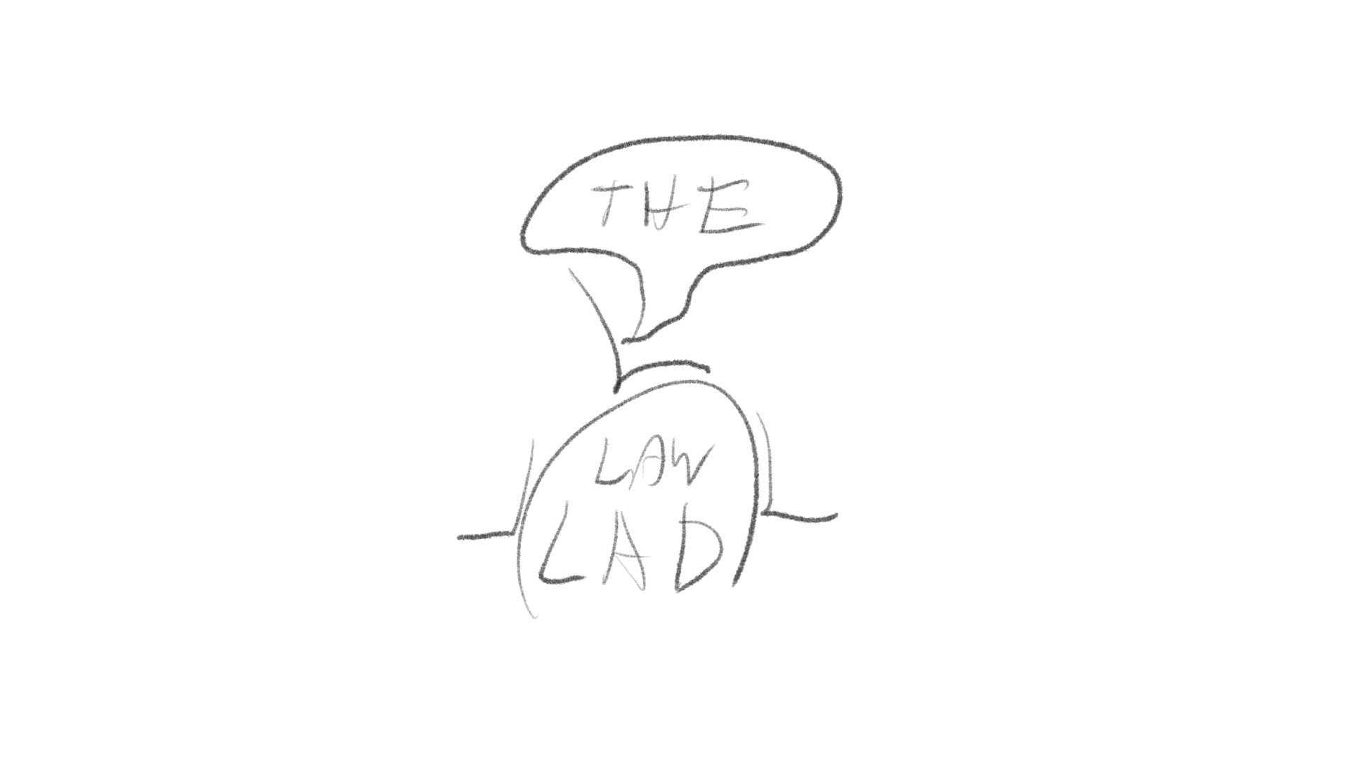
Sketch 20 of 20
ROUND 01
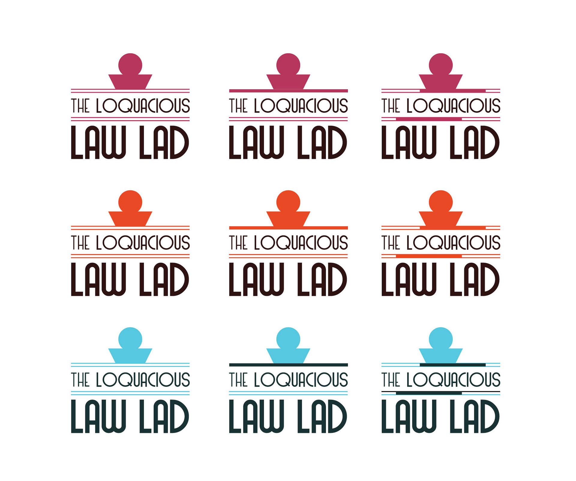
After showing the sketches to the client, nine were picked and then vectorized. Each having some polish and further improvements upon the initial sketched concepts.
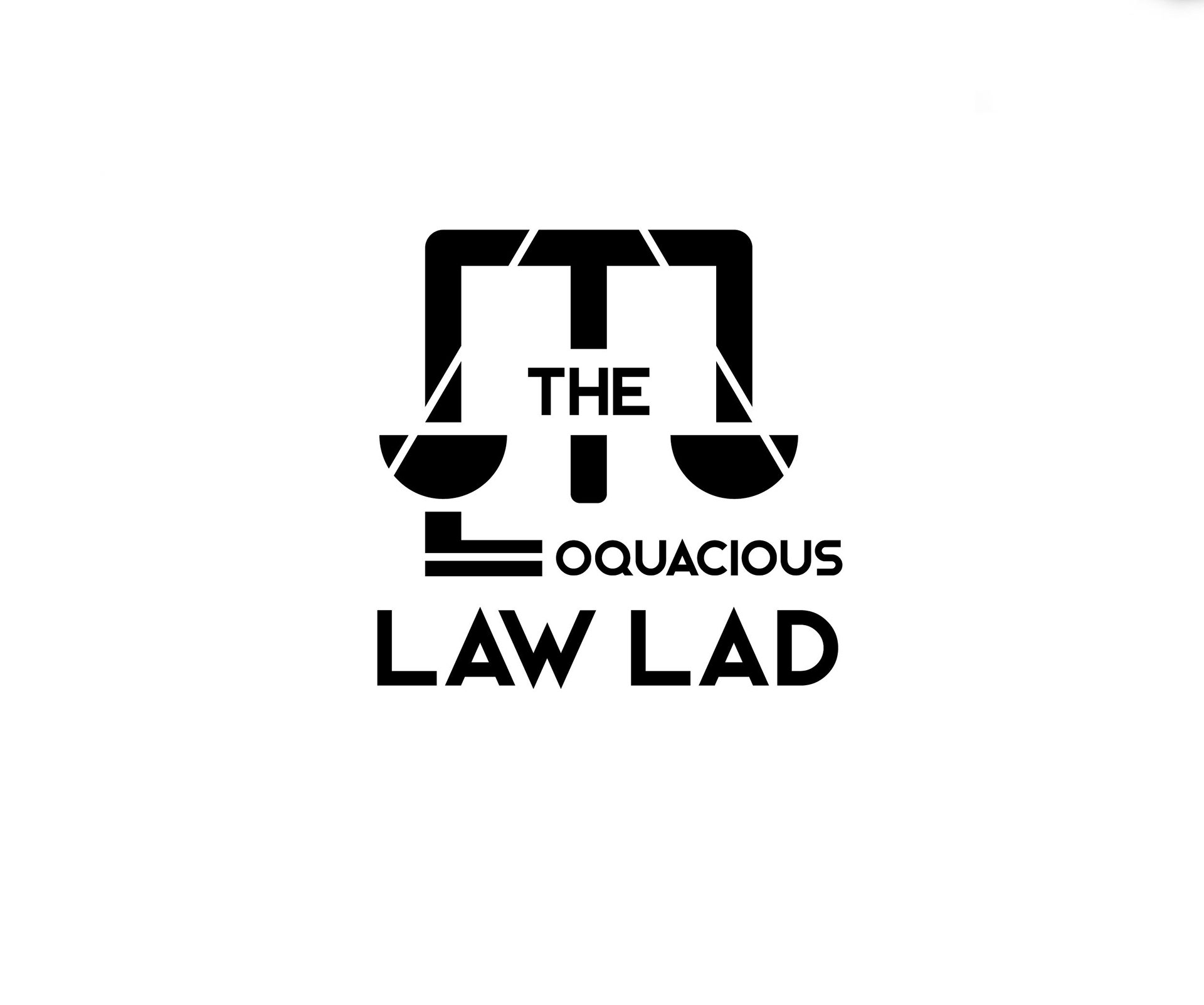
Logo 1
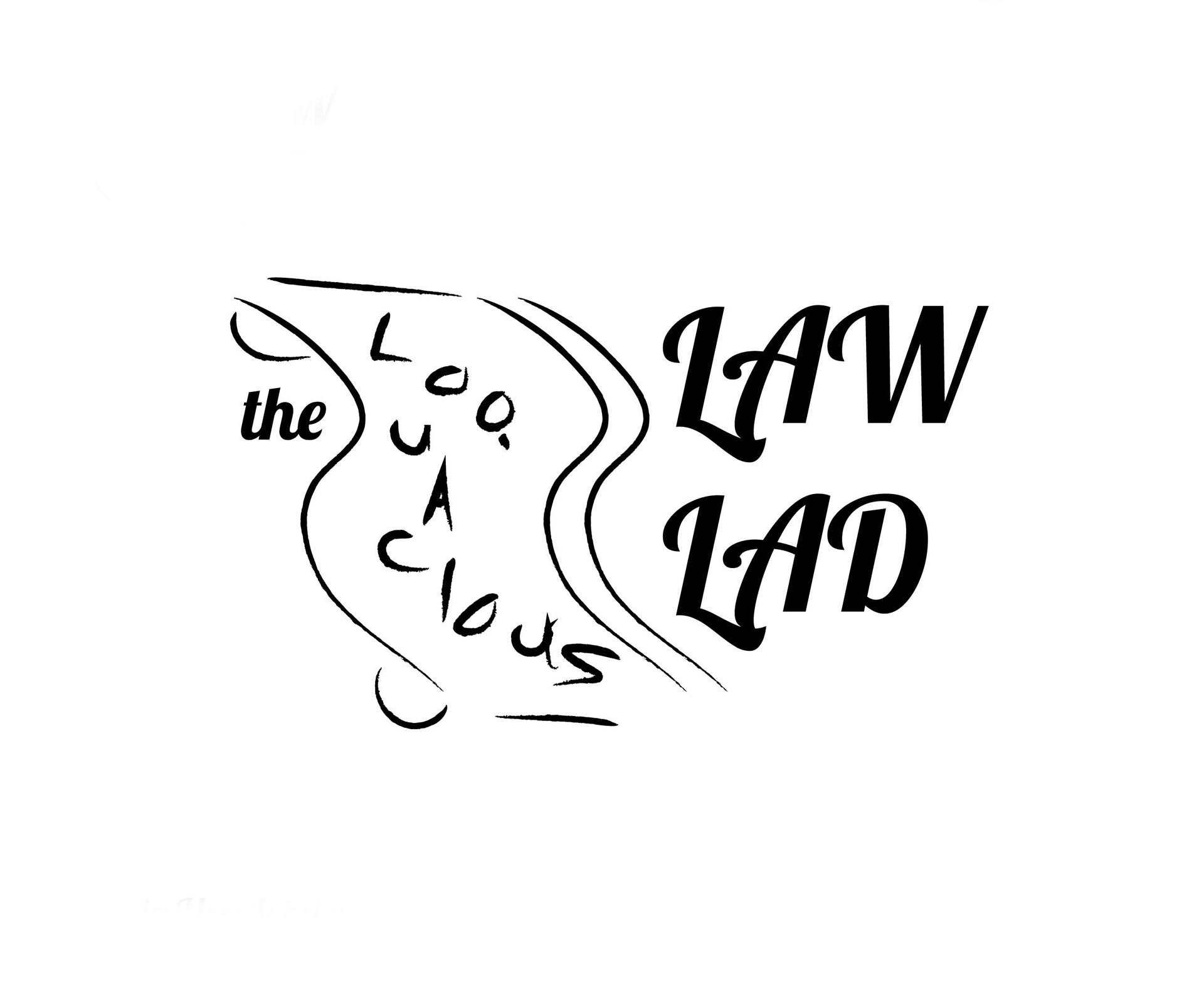
Logo 2

Logo 3
Logo 4
Logo 5

Logo 6

Logo 7

Logo 8

Logo 9
ROUND 02
Four were chosen from the nine, and colour variations were applied to them. The font process was also taking place at the same time (each logo option having a font associated with it) to showcase different mood and tones.
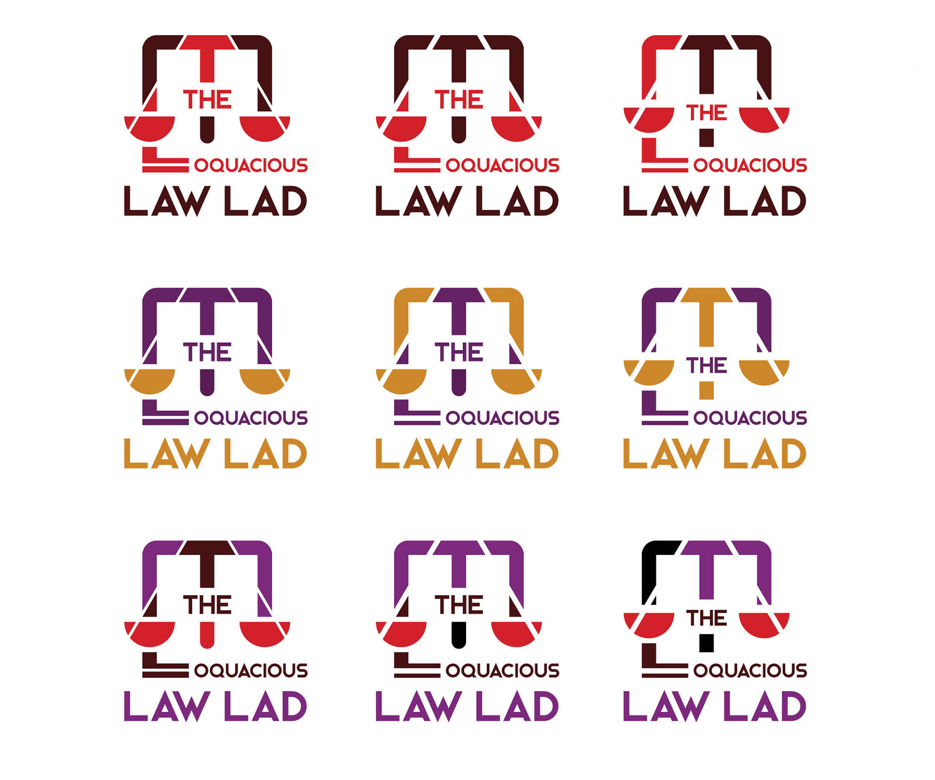
Round 2 - Option 1
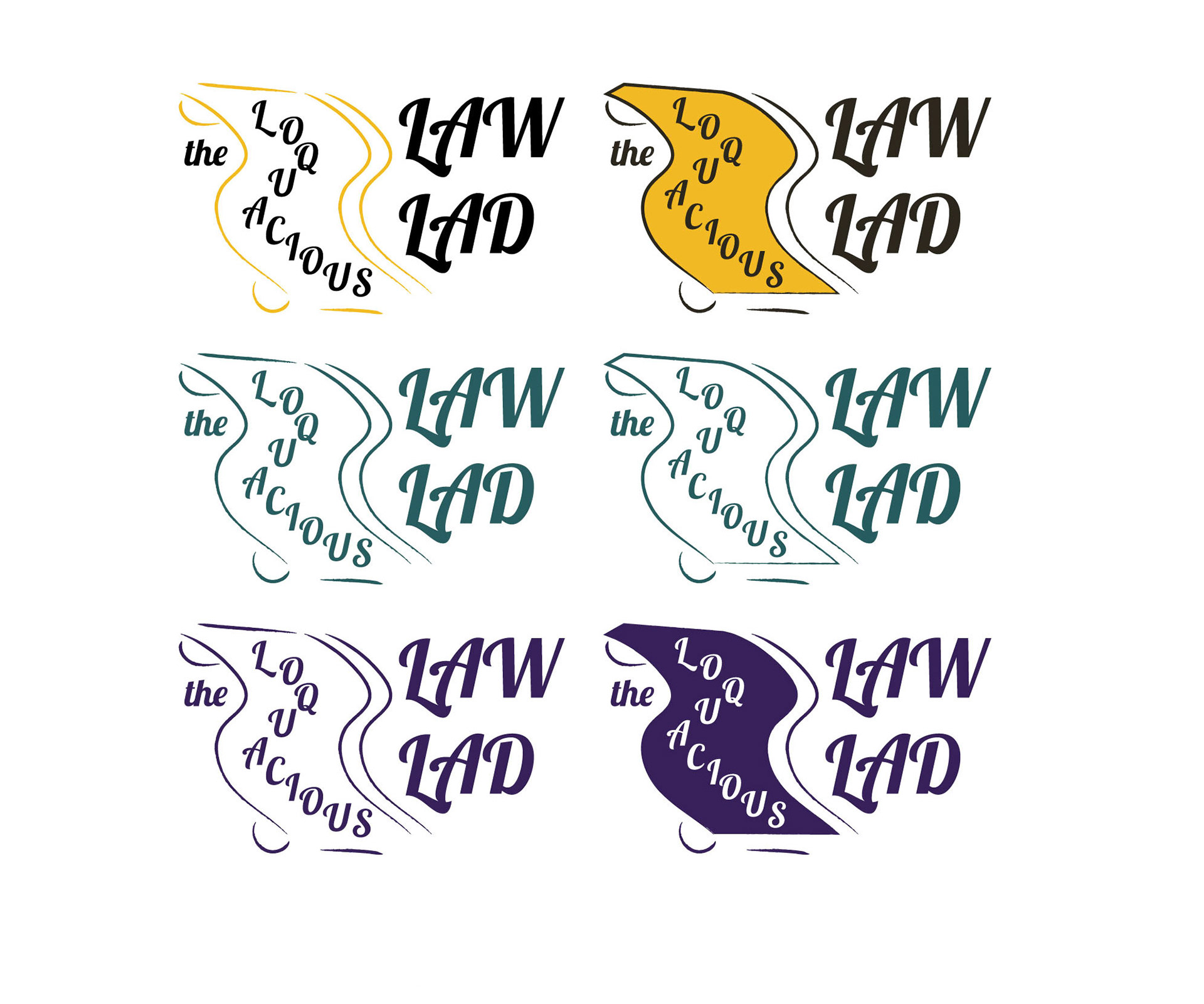
Round 2 - Option 2
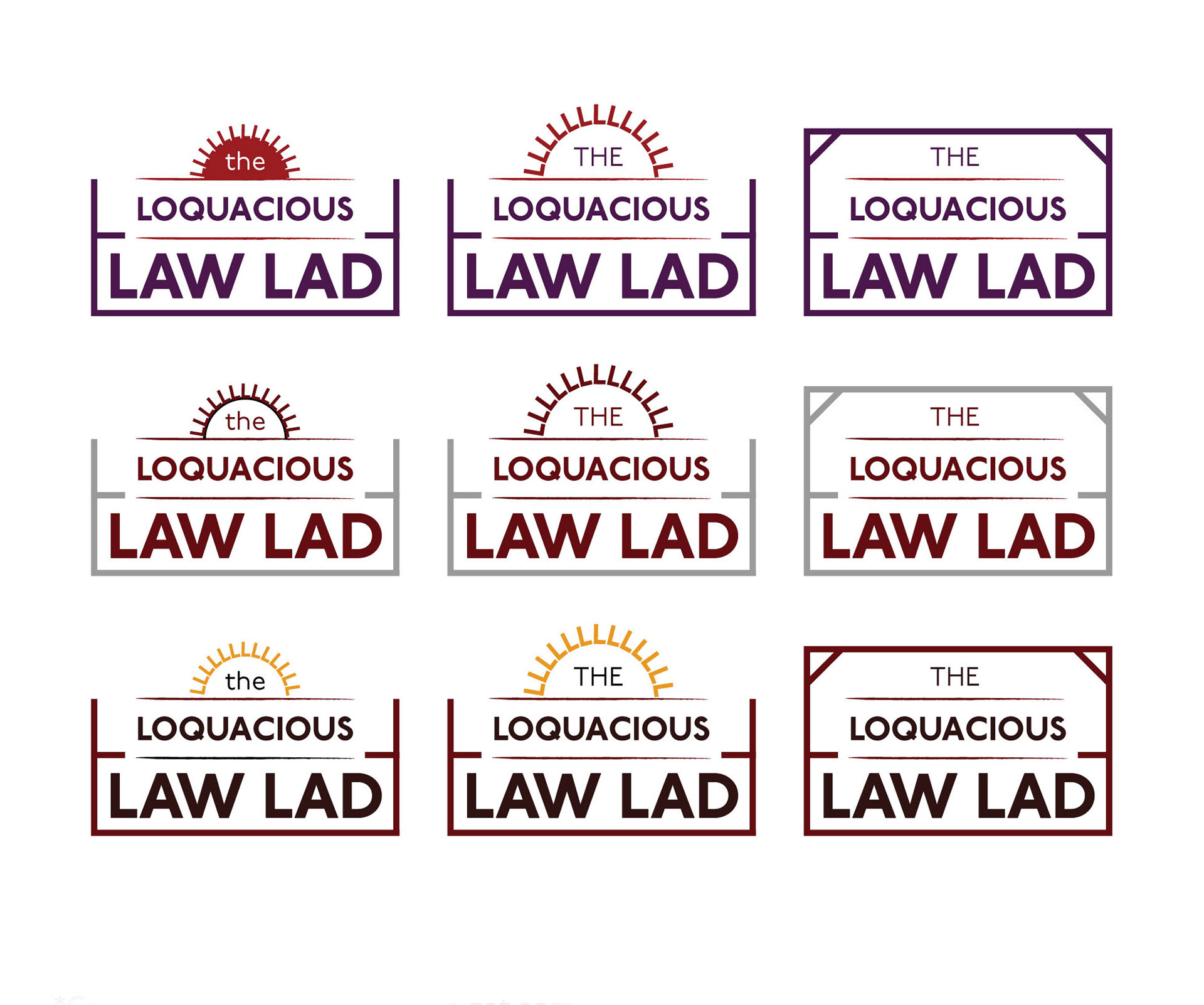
Round 2 - Option 3
Round 2 - Option 4
FINAL ROUND
With the selection process nearing the final stretch, two were brought into the final round. The main colour was picked, and the font was down to two choices. Ultimately the second of two concepts was chosen.
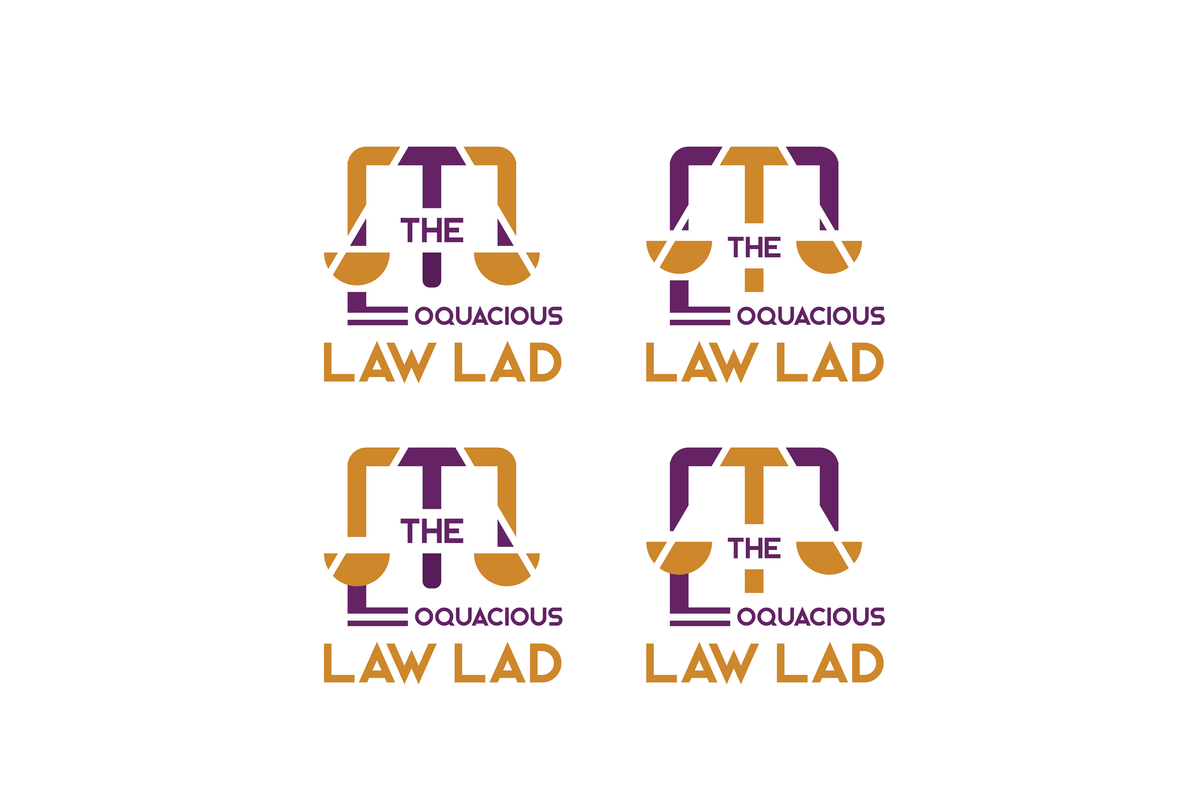
Final Round - Logo 1
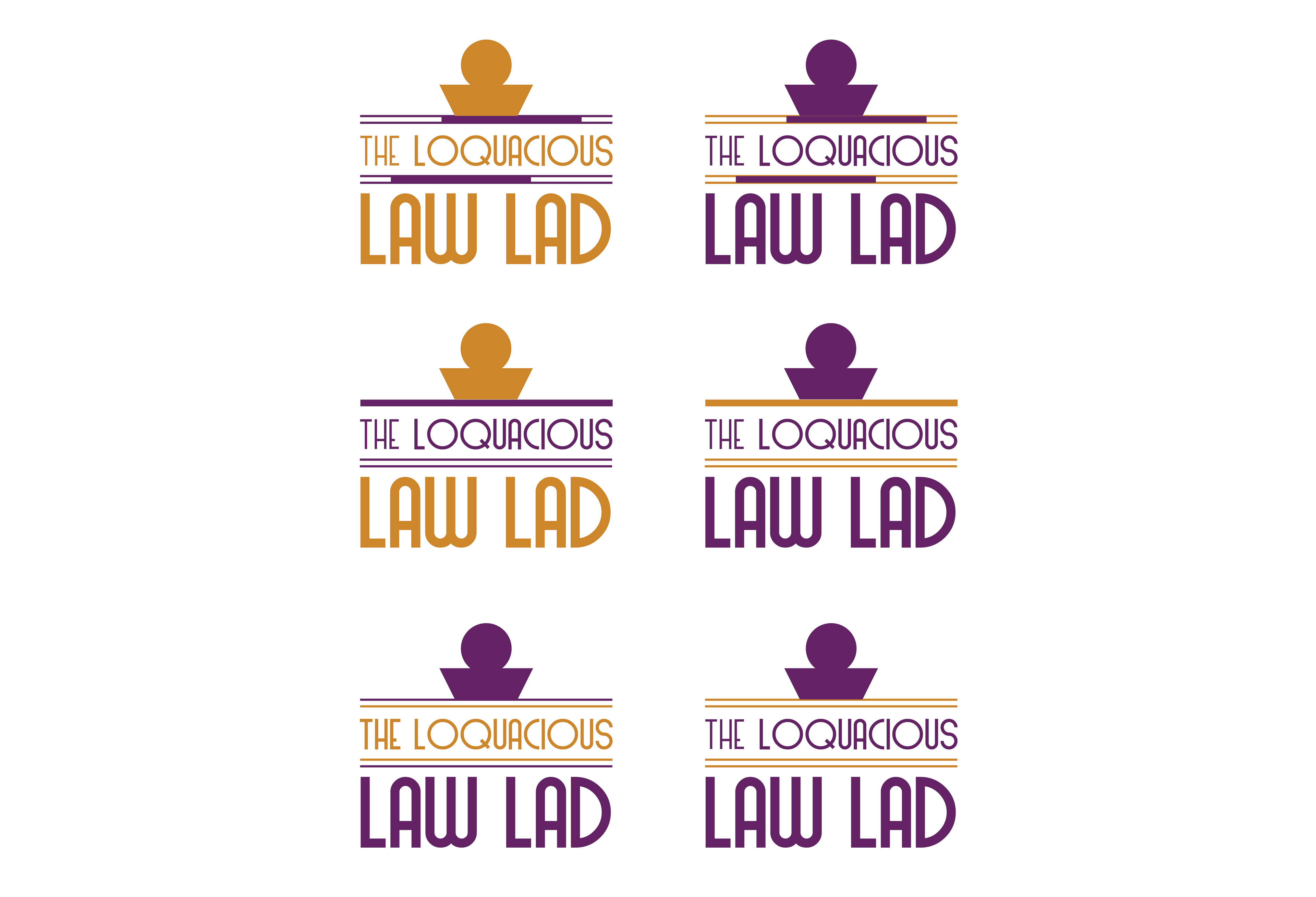
Final Round - Logo 2
SOCIAL
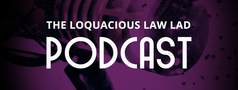
Facebook Banner
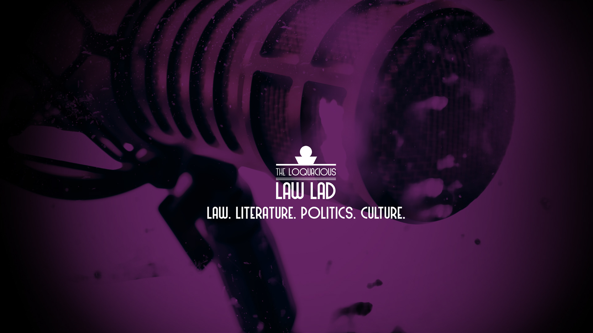
Youtube Banner (sized for various viewing platforms)
THUMBNAILS - DESIGN
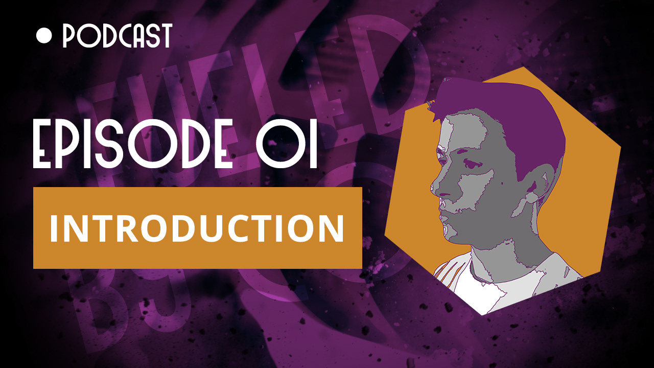
Youtube Thumbnail - 01
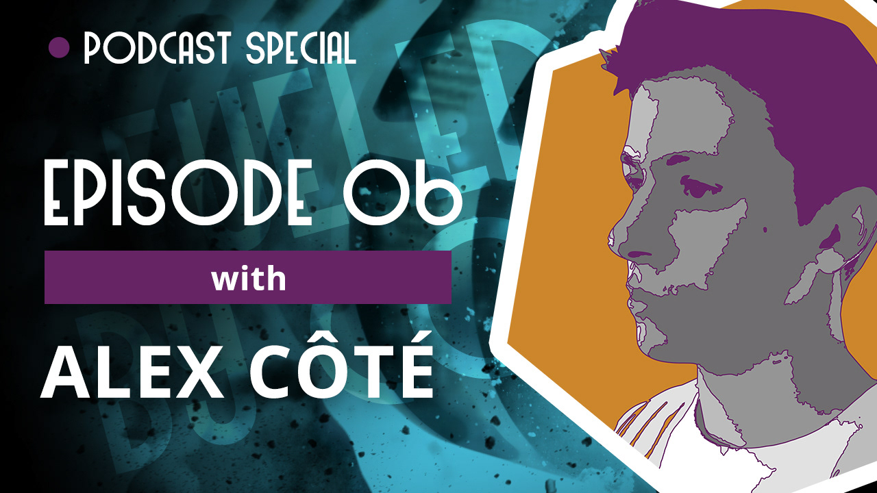
Youtube Thumbnail - 02
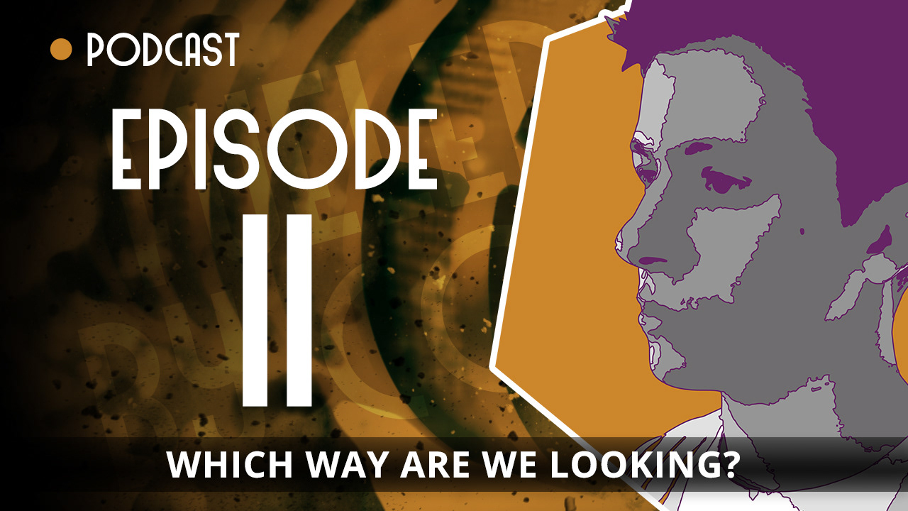
Youtube Thumbnail - 03
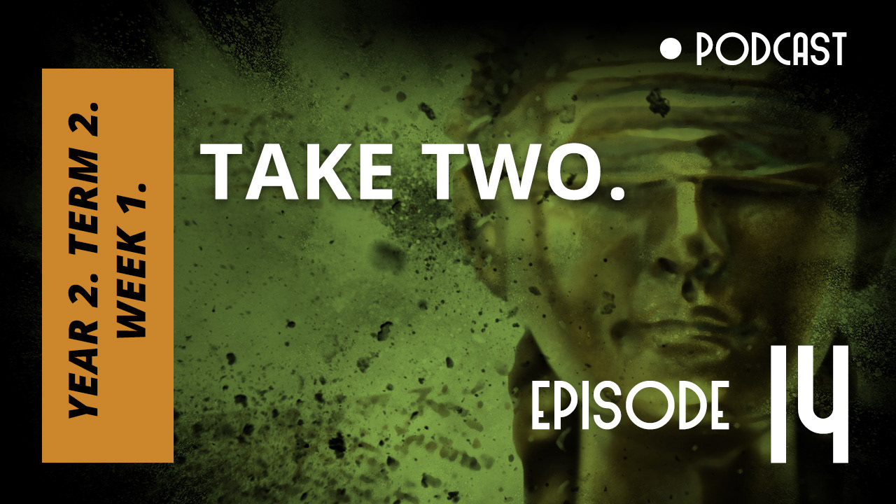
Youtube Thumbnail - 04
DESIGN - EXPLANATION
PURPLE
For podcasts that are done solo, these tend to be less than half an hour, and thus receive the purple colour.
BLUE
The most common of the designs, the blue thumbnail is used for videos that have a special guest. These can range from short to long (but less than the duration of a Gold thumbnail).
ORANGE (GOLD)
Podcasts that range near or beyond the hour marker. They're given the gold treatment to mark a special occasion in regards to its length. These podcasts are less common as a result of this.
GREEN
Course specific, green is allocated for any podcast that focuses on a topic rather than gives a general overview of life and ideas.
DESIGN IN USE
App Store, Youtube, Spotify.
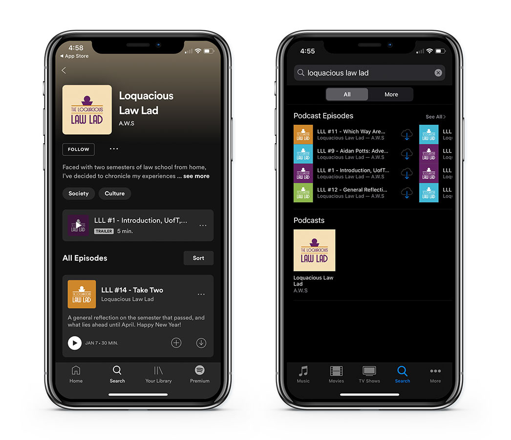
As they appear on the App Store
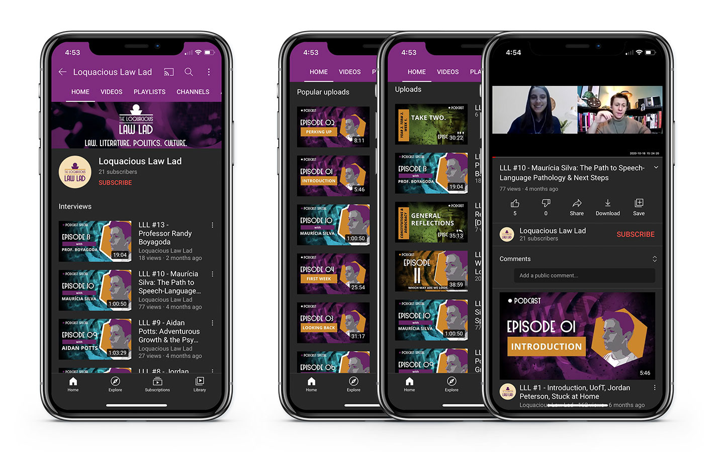
As they appear on Youtube
