
SKETCHES


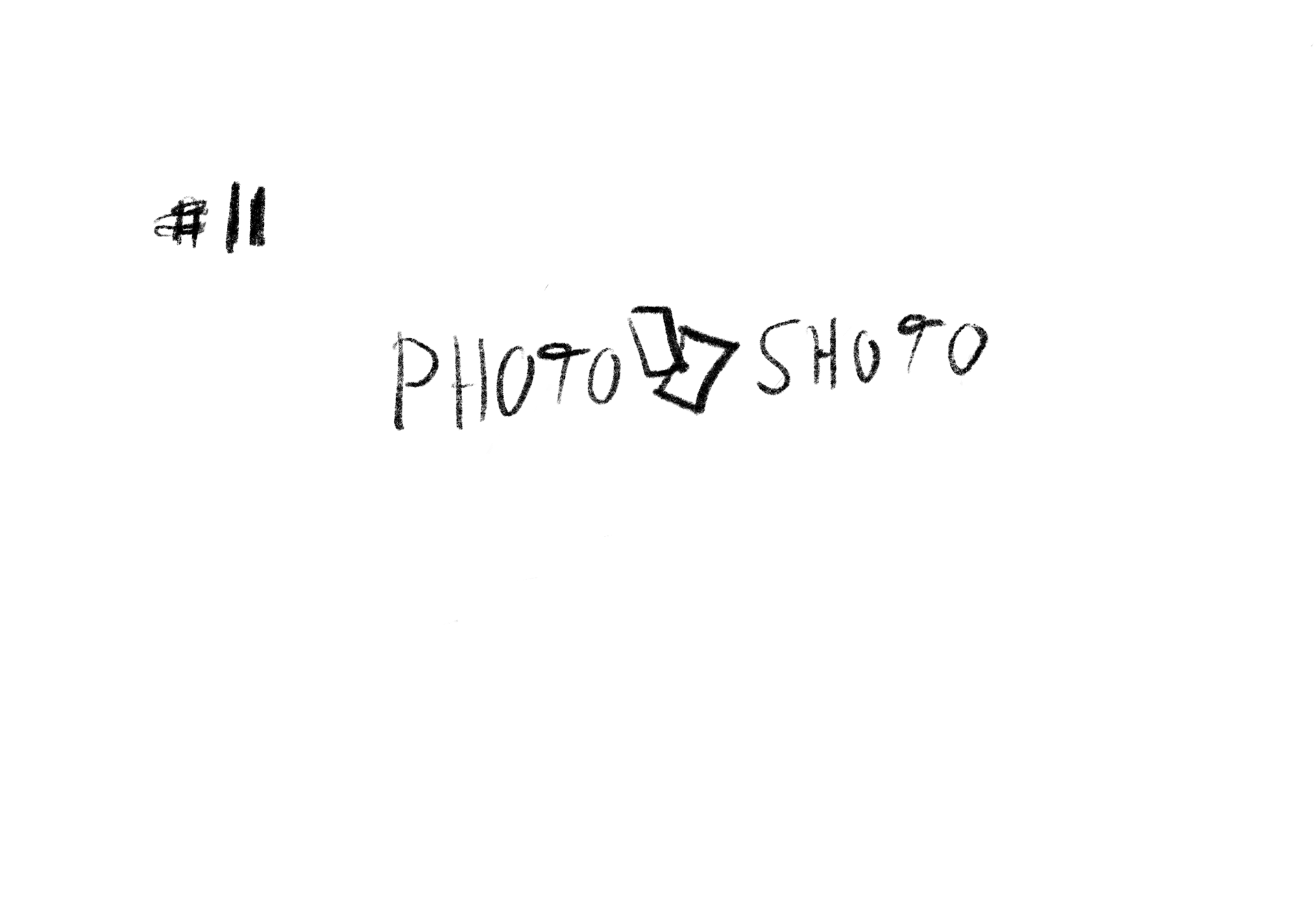

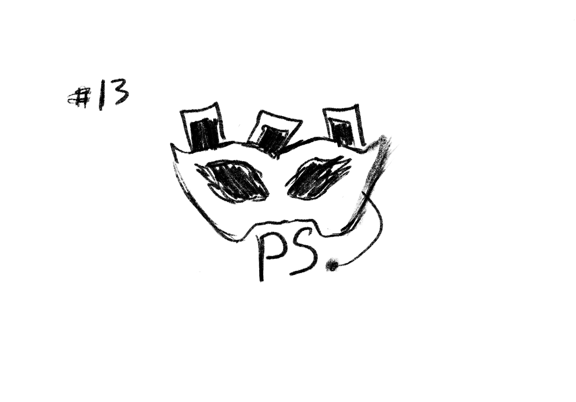


STAGE 1
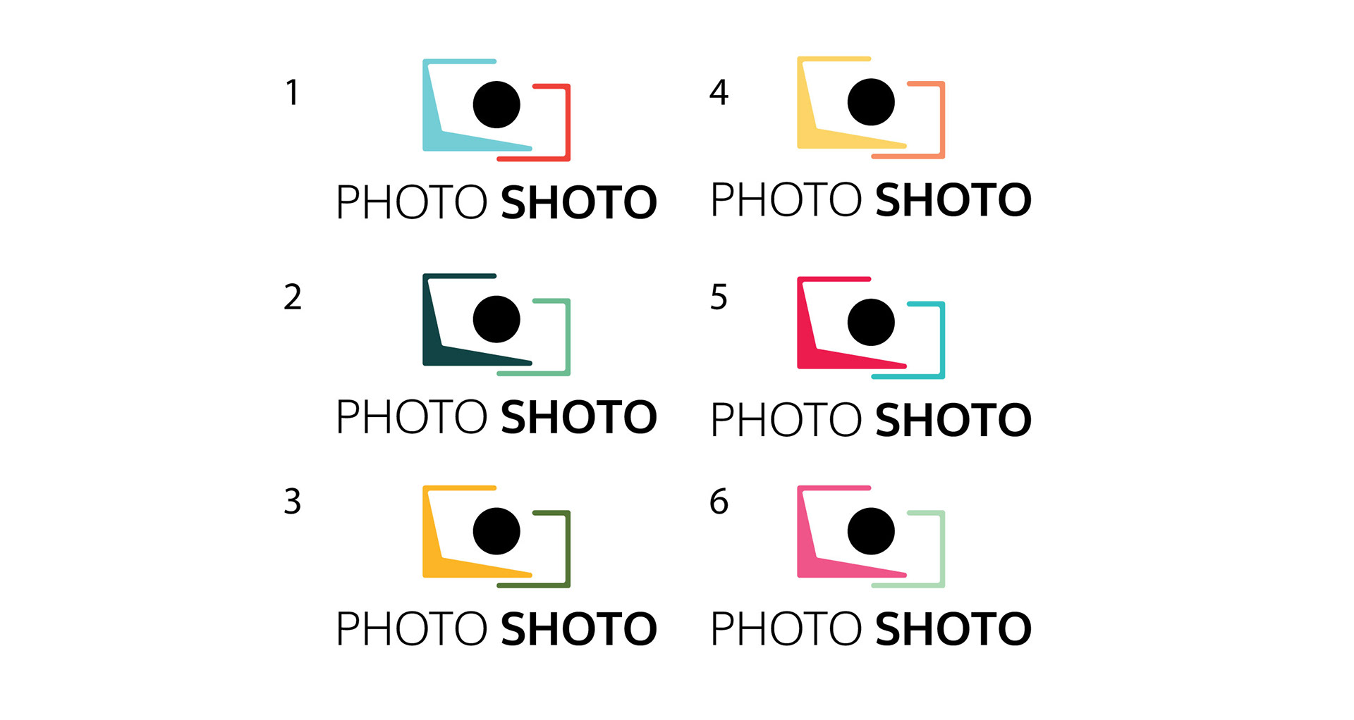

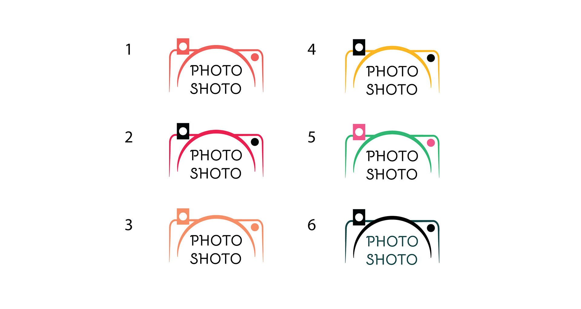
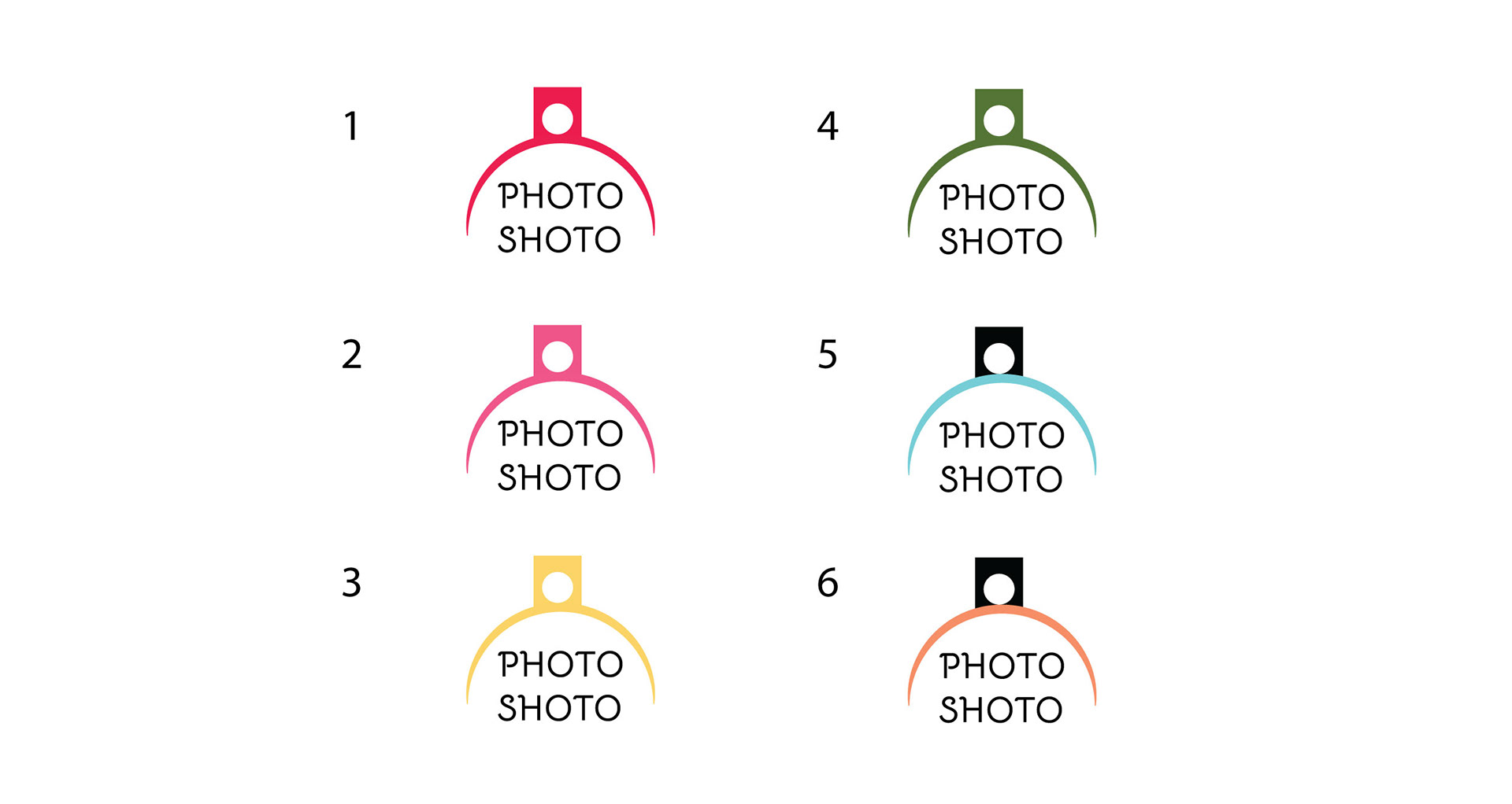
STAGE 2-
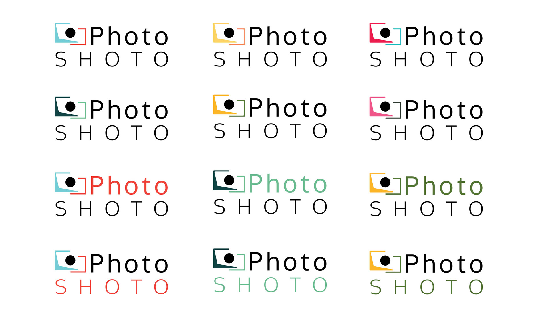
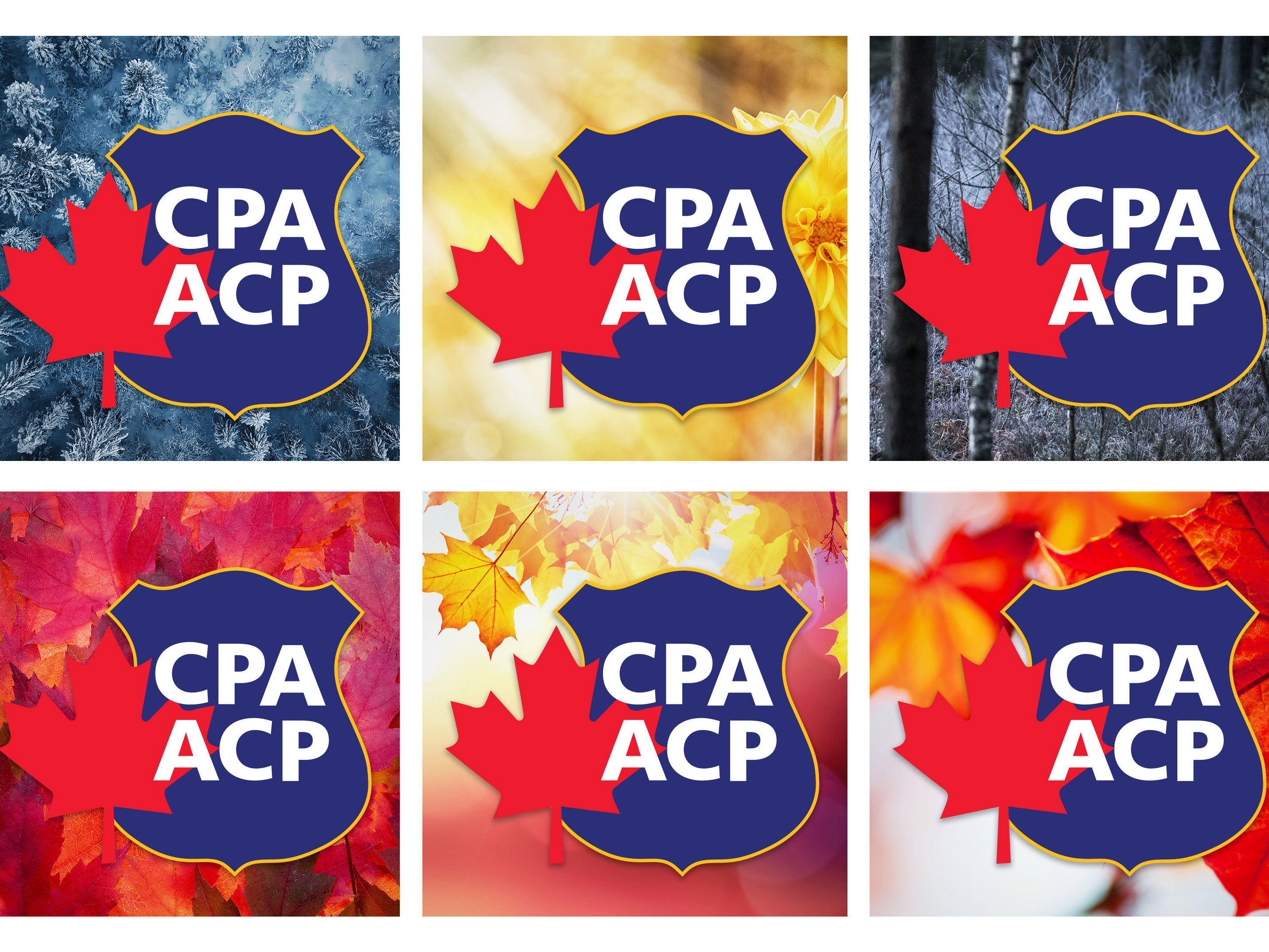
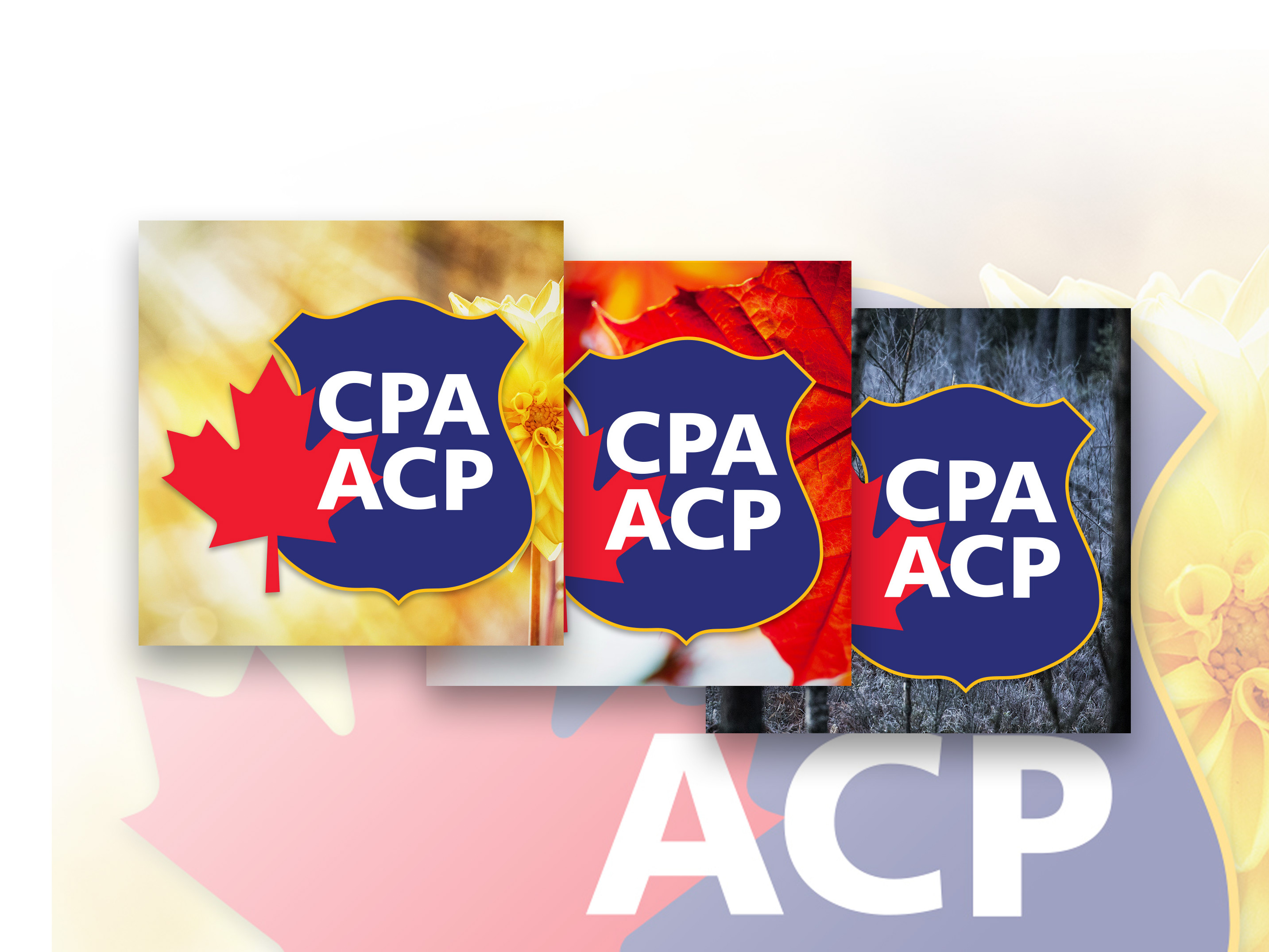
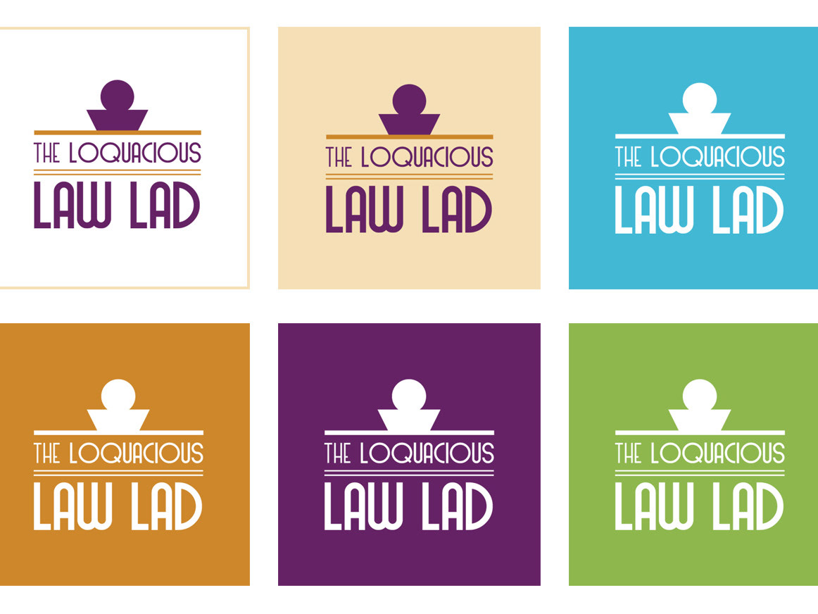
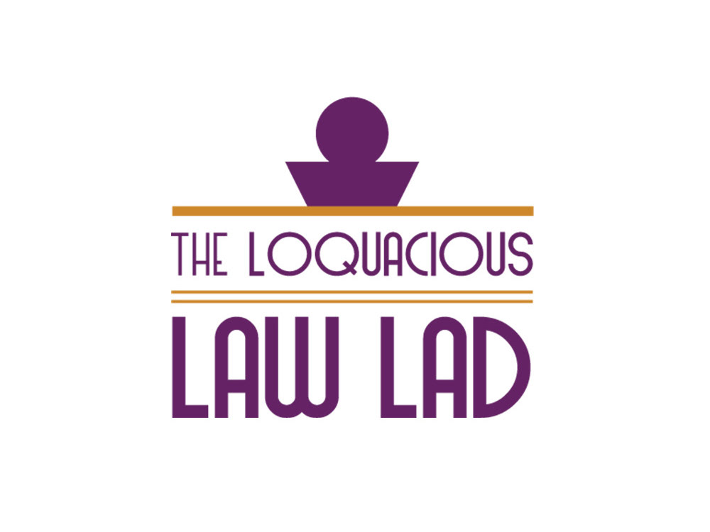
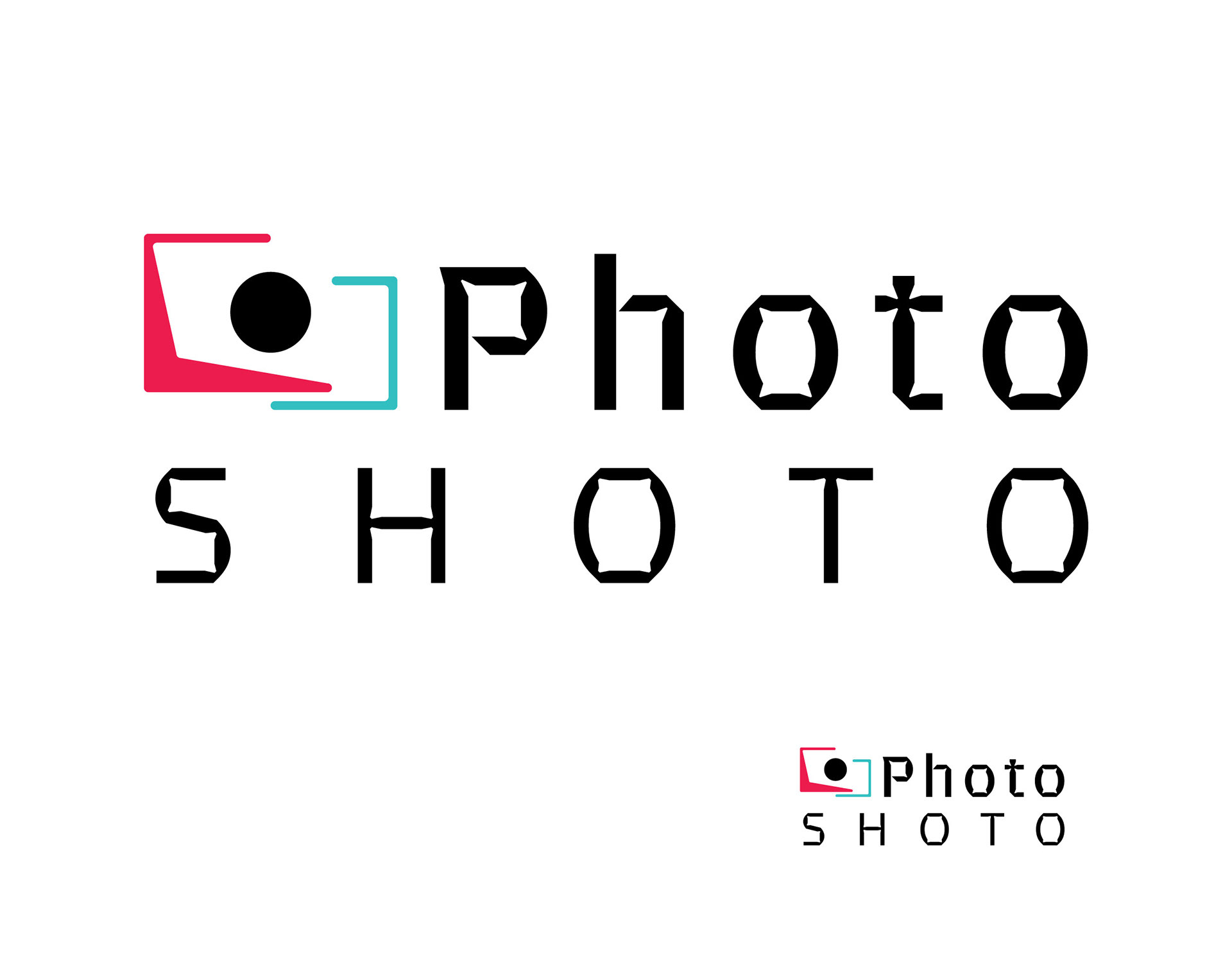
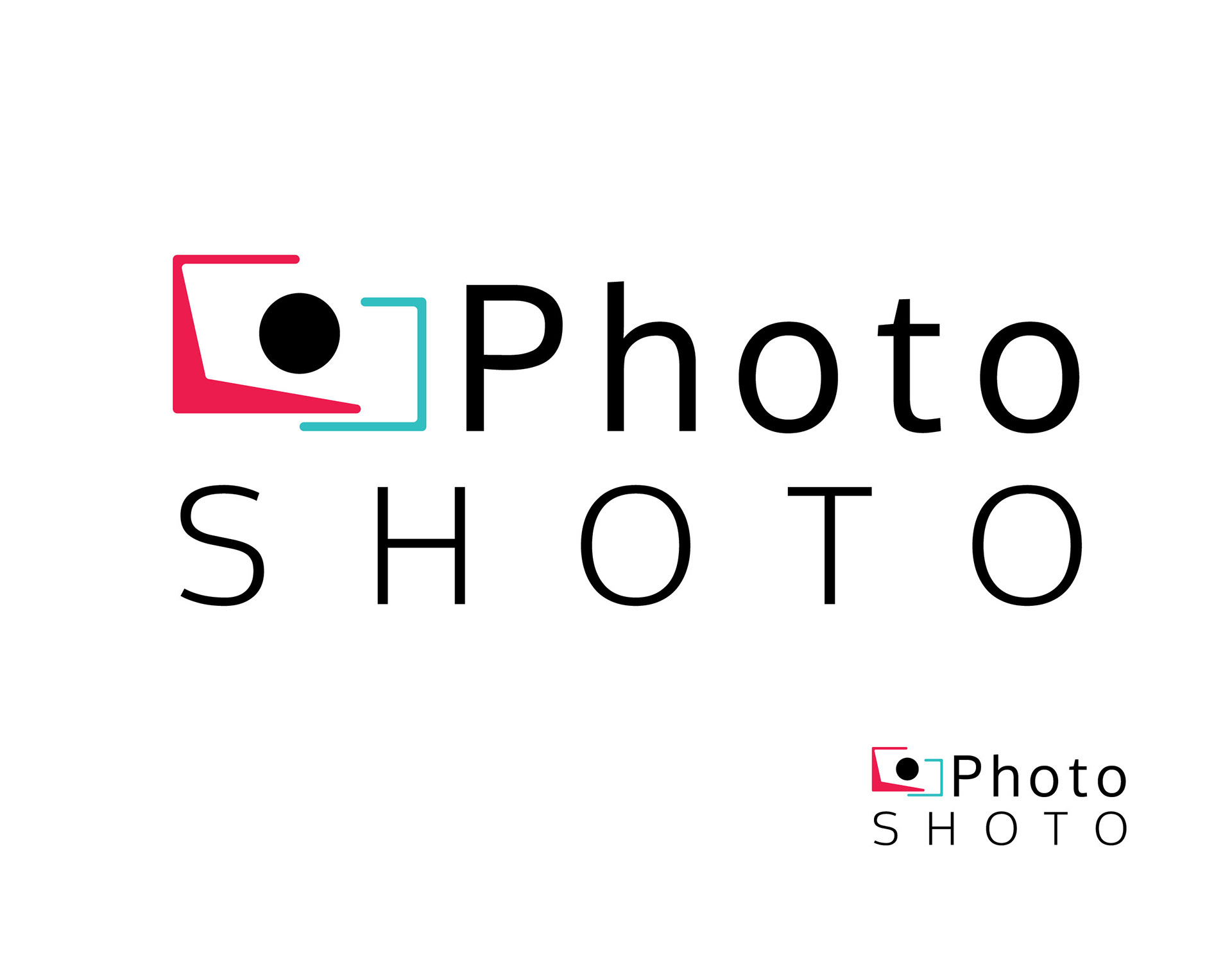
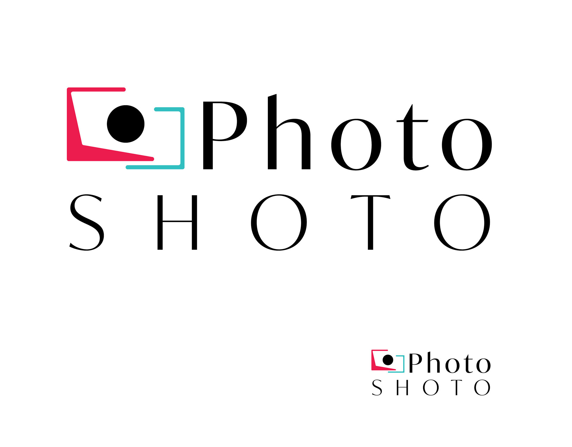
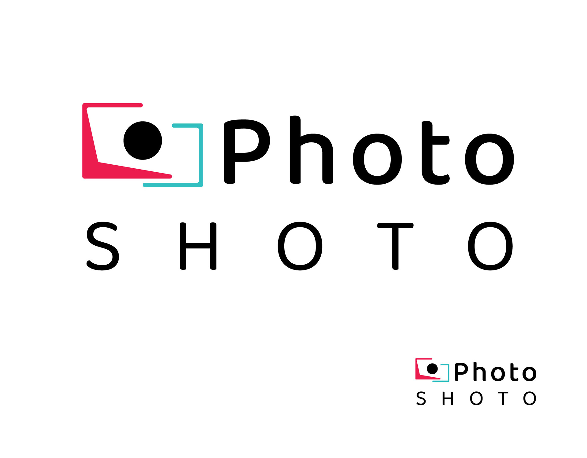
FINAL SELECTIONS
With a colour chosen, the options were narrowed down into the final stretch. Four of the same layout, each with an alternate font. This was done so that the design could be shown differently via the clients request. After presenting other font options, they became certain on their choice.
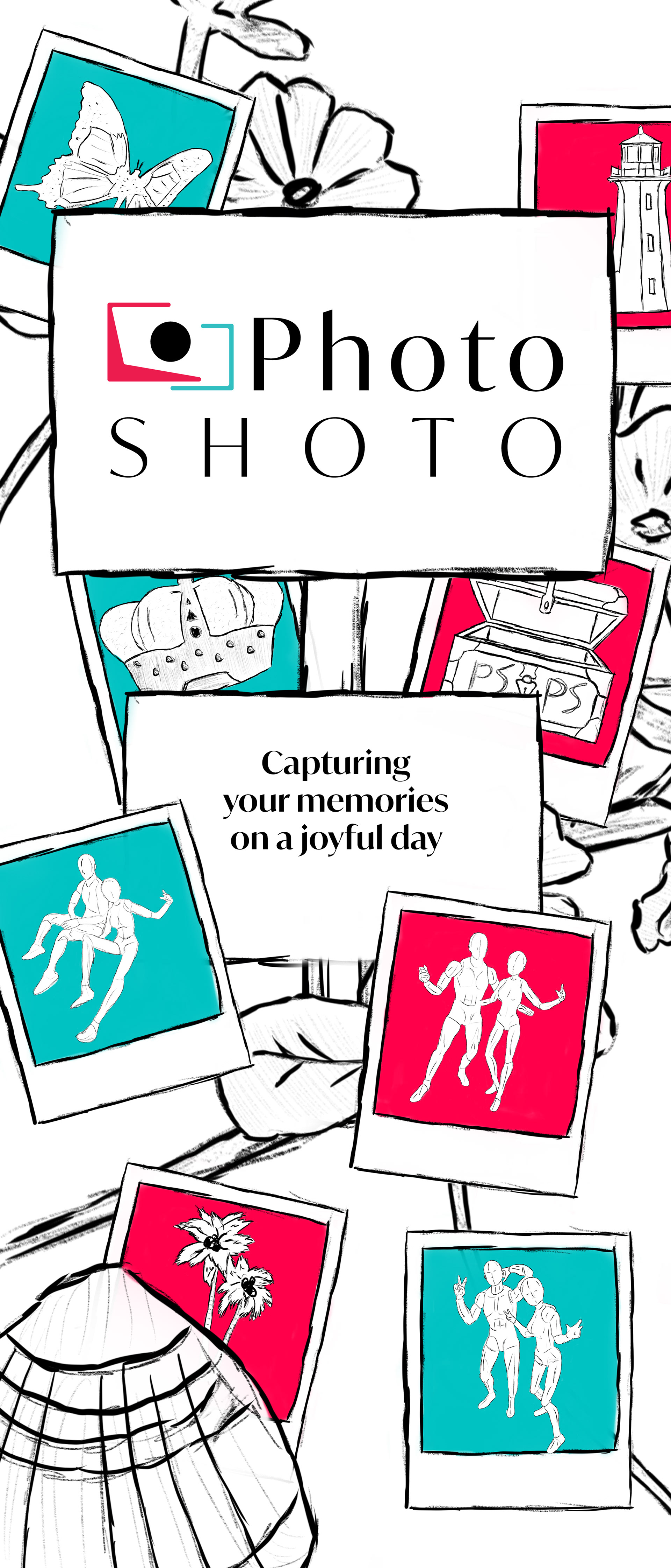
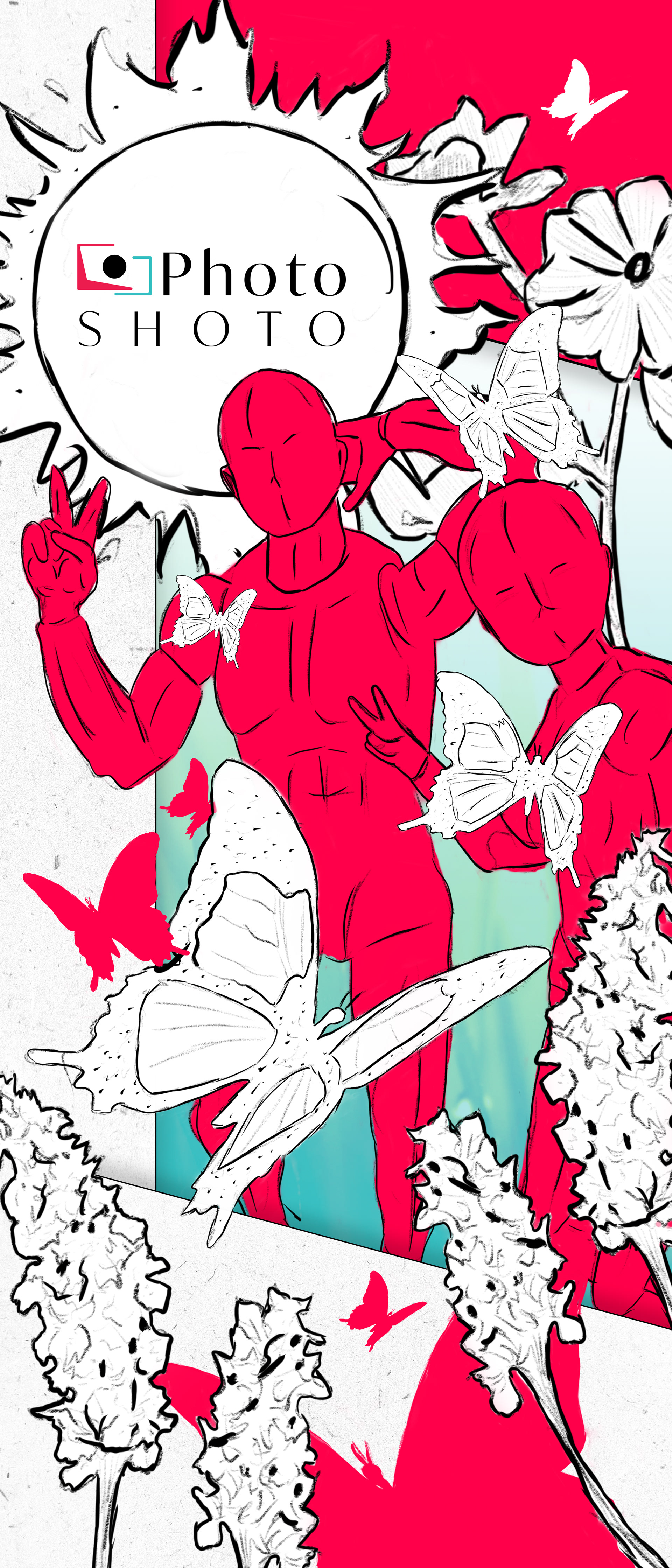
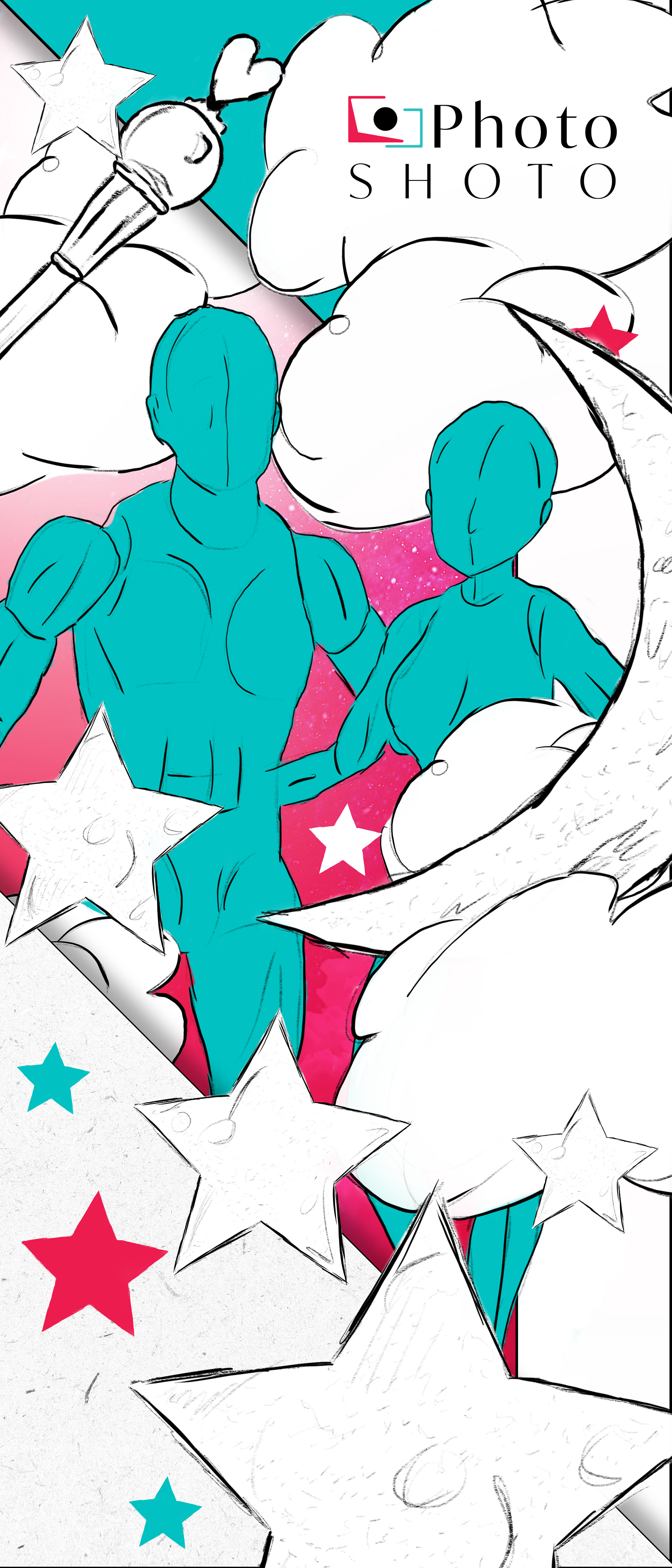
PULL UP BANNERS
An ongoing project. Below showcases the initial concept proposal, and the following stage where assets are created and the layout is refined. The final product will be similar (the theme being that of a sketch like style) however in the final product, as one might expect, a higher level of polish will be found.
The Idea:
Getting your picture taken at a wedding (photo booth style) can be quick, hectic and on the spot. Sketches are quick, often times hectic and depending on who's doing the drawing, thought up as the pen finds its way.
The Execution:
By using the two colours associated with the branding, the sketches (mostly all white) can dominate. The two themes shown are that of the sun and flowers, and the moon with its stars. The main banner is a combination of unused assets showcased within the polaroids.
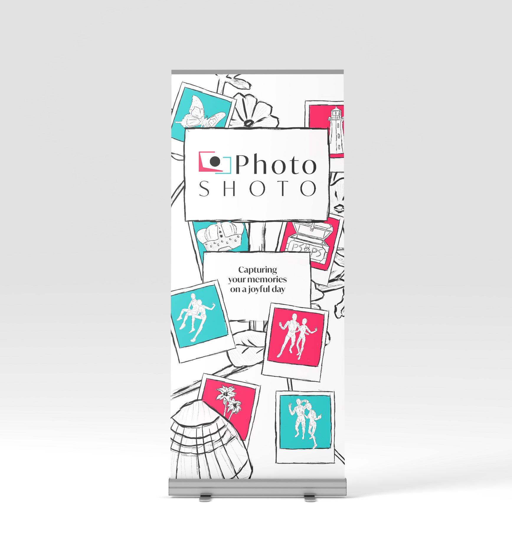
Main Banner (Current)
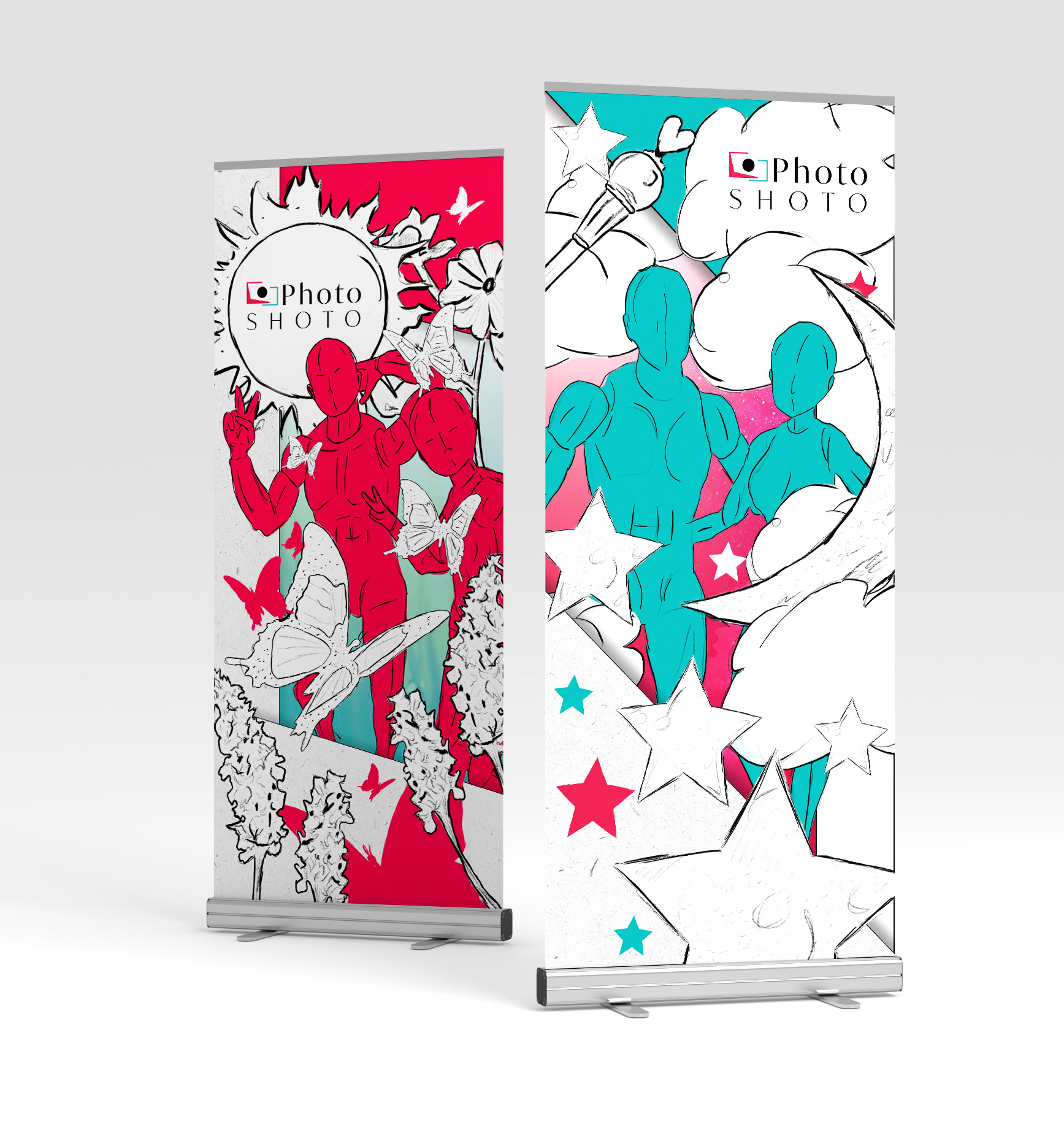
Side Banners (Current)
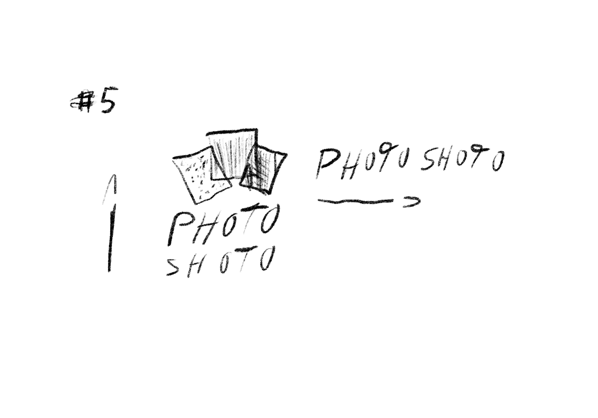
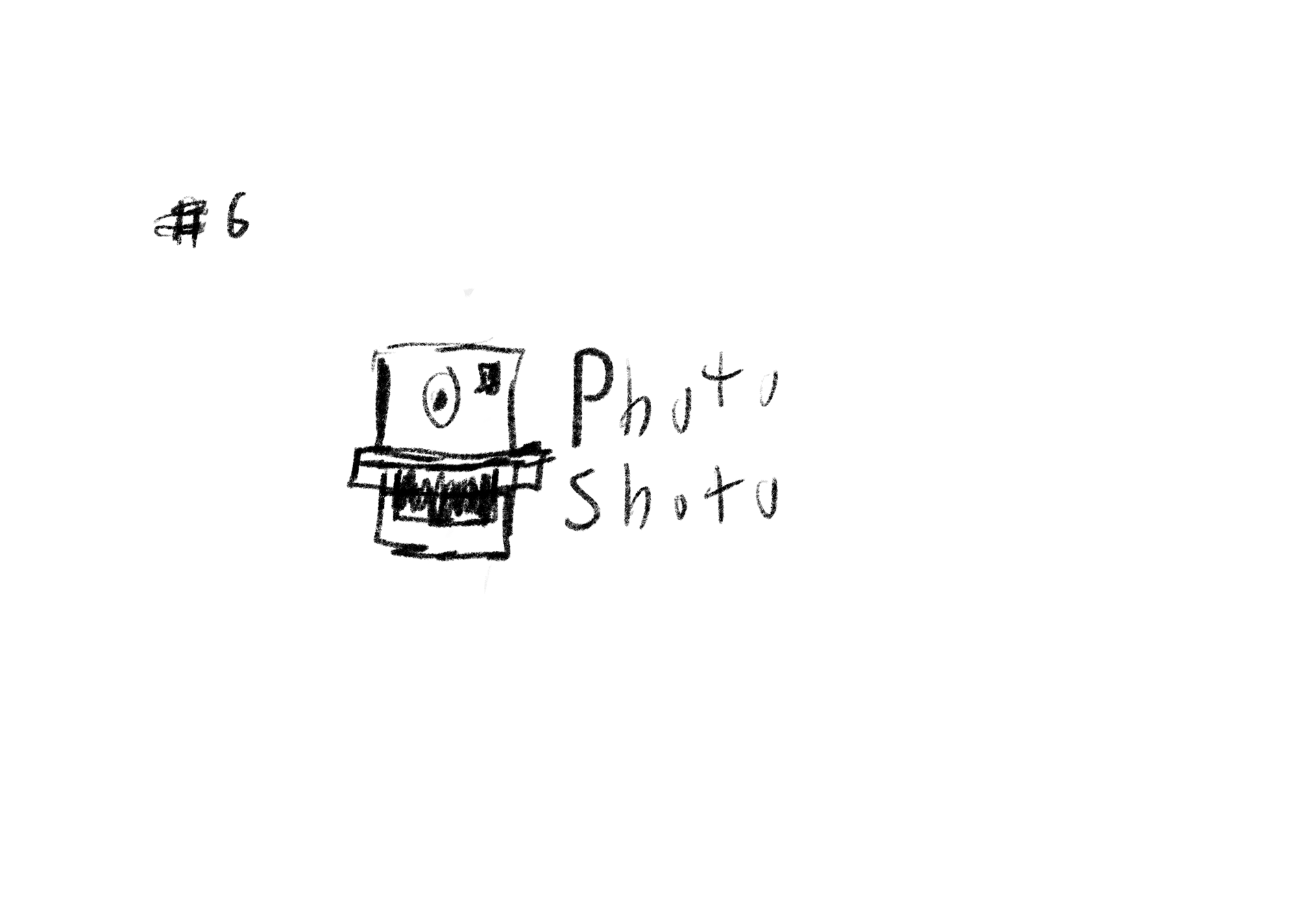
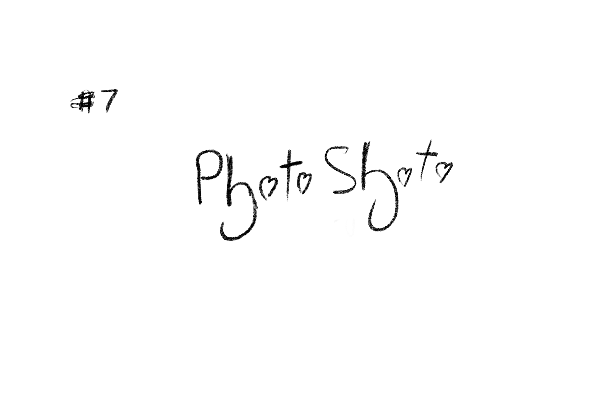
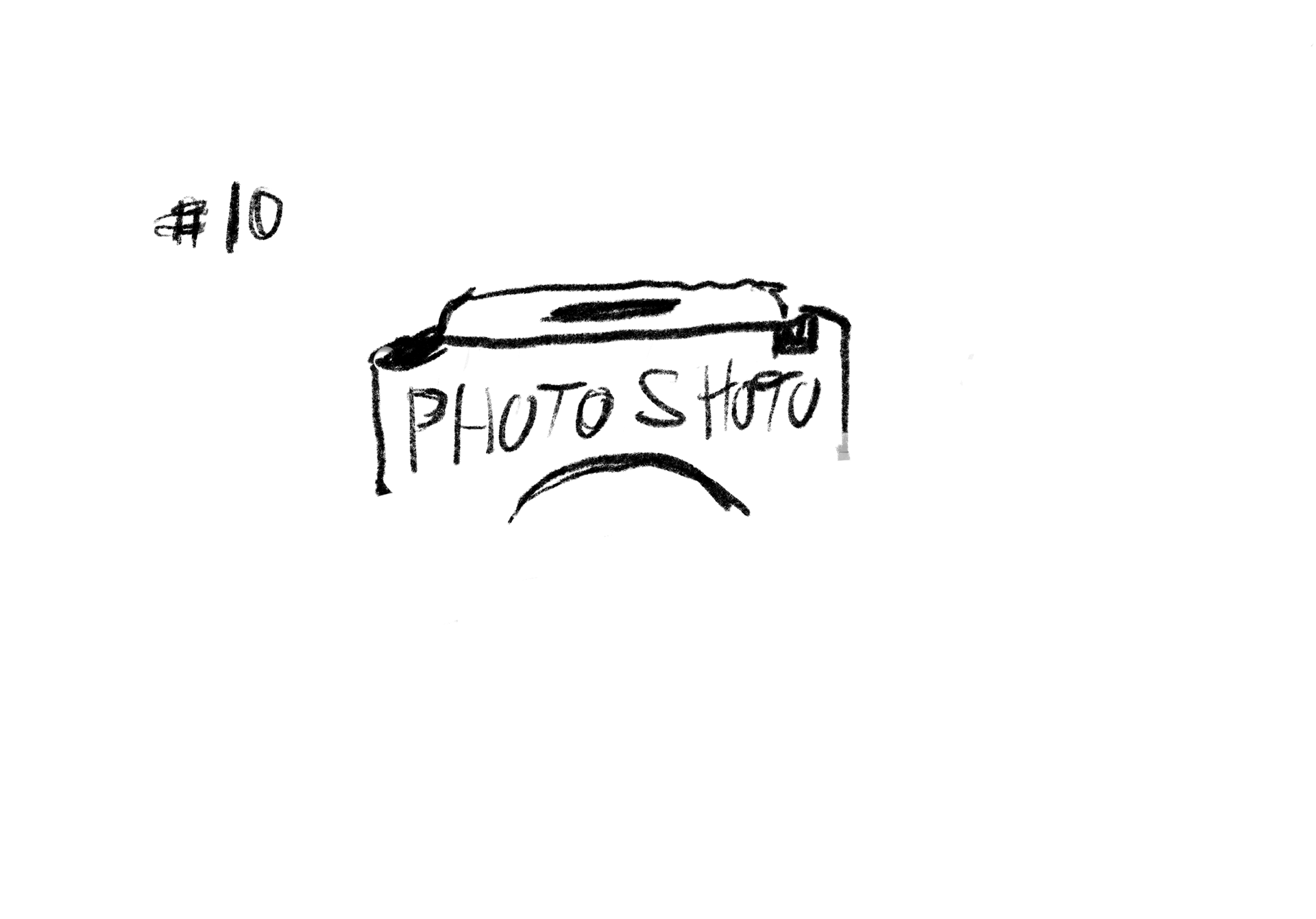
THE SKETCHES
While currently unrefined, the images themselves do the job in getting the concept across. With time, each line from a chosen asset will be cleaned up. Additional detail will be added (subtle shading techniques) and the white will still remain. Careful trial and error will be needed, to ensure that each asset ends up on the creative bearing the same weight. Currently, some assets tend to dominate via the line weight. This will be fixed in the final renditions.
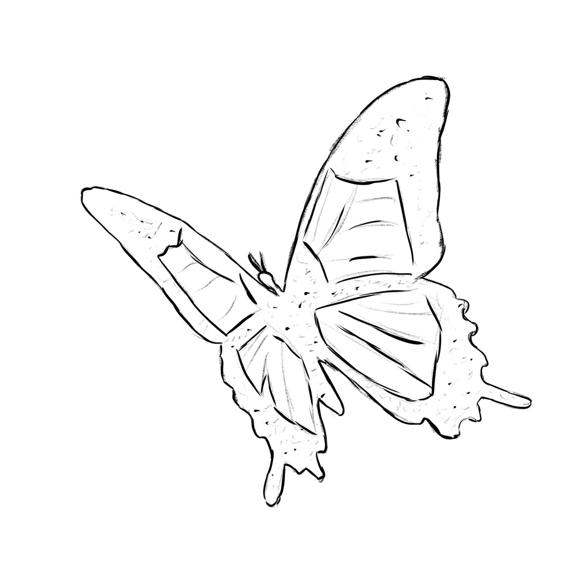
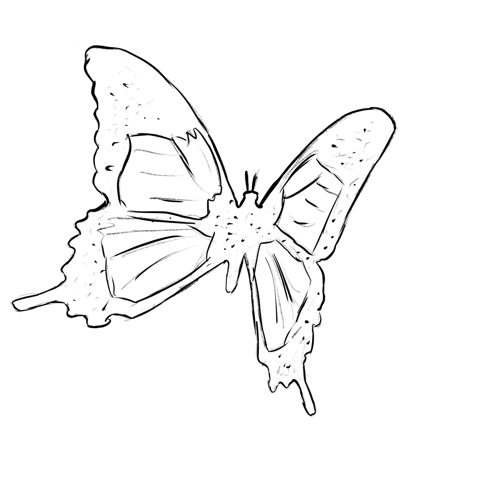
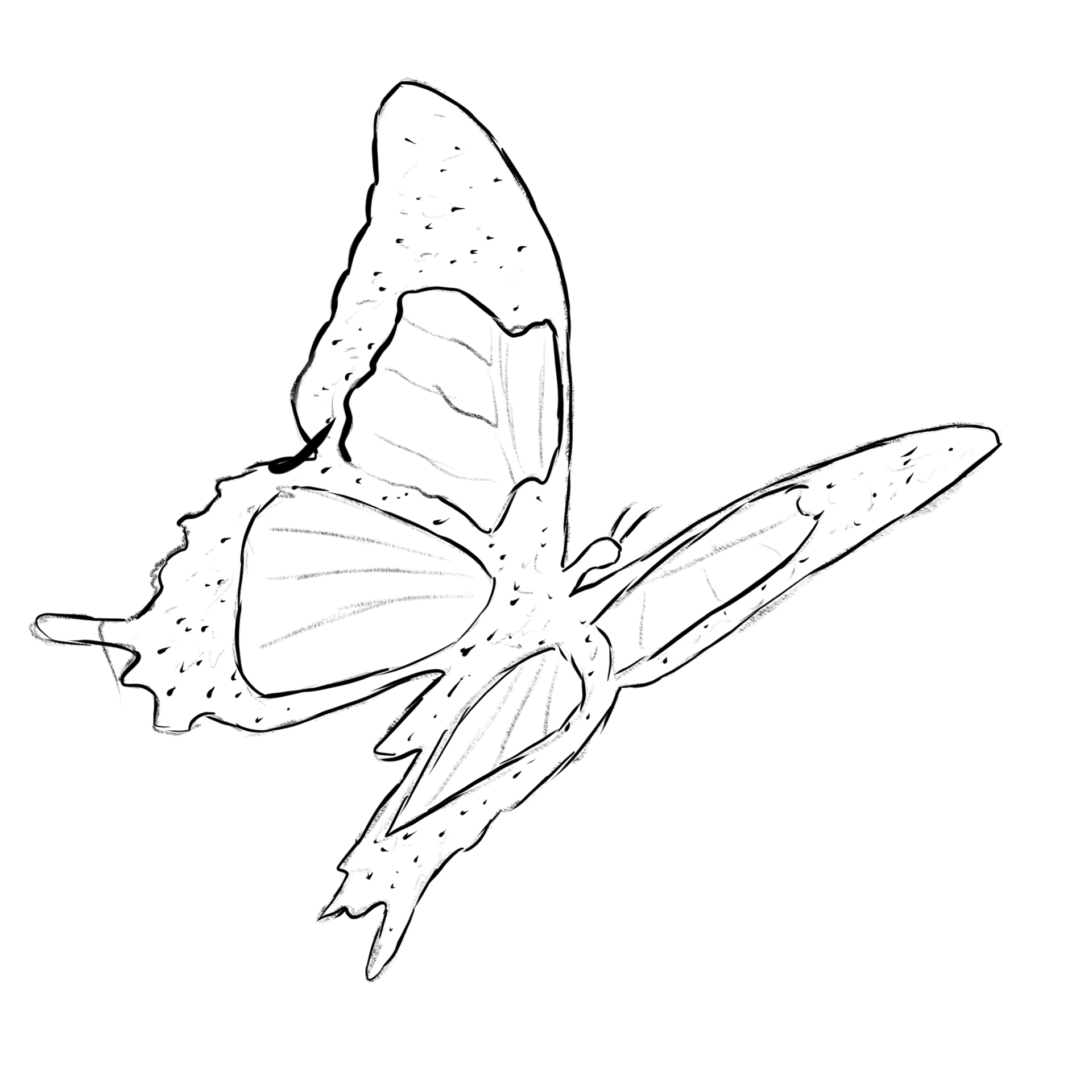
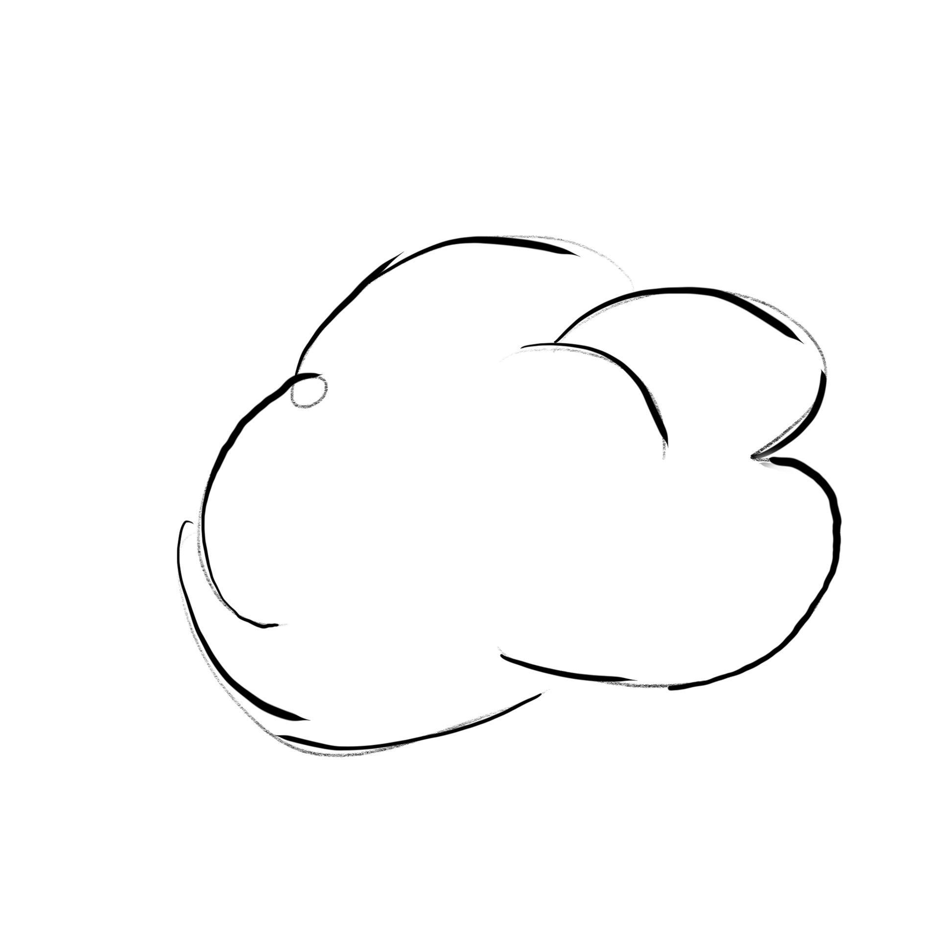

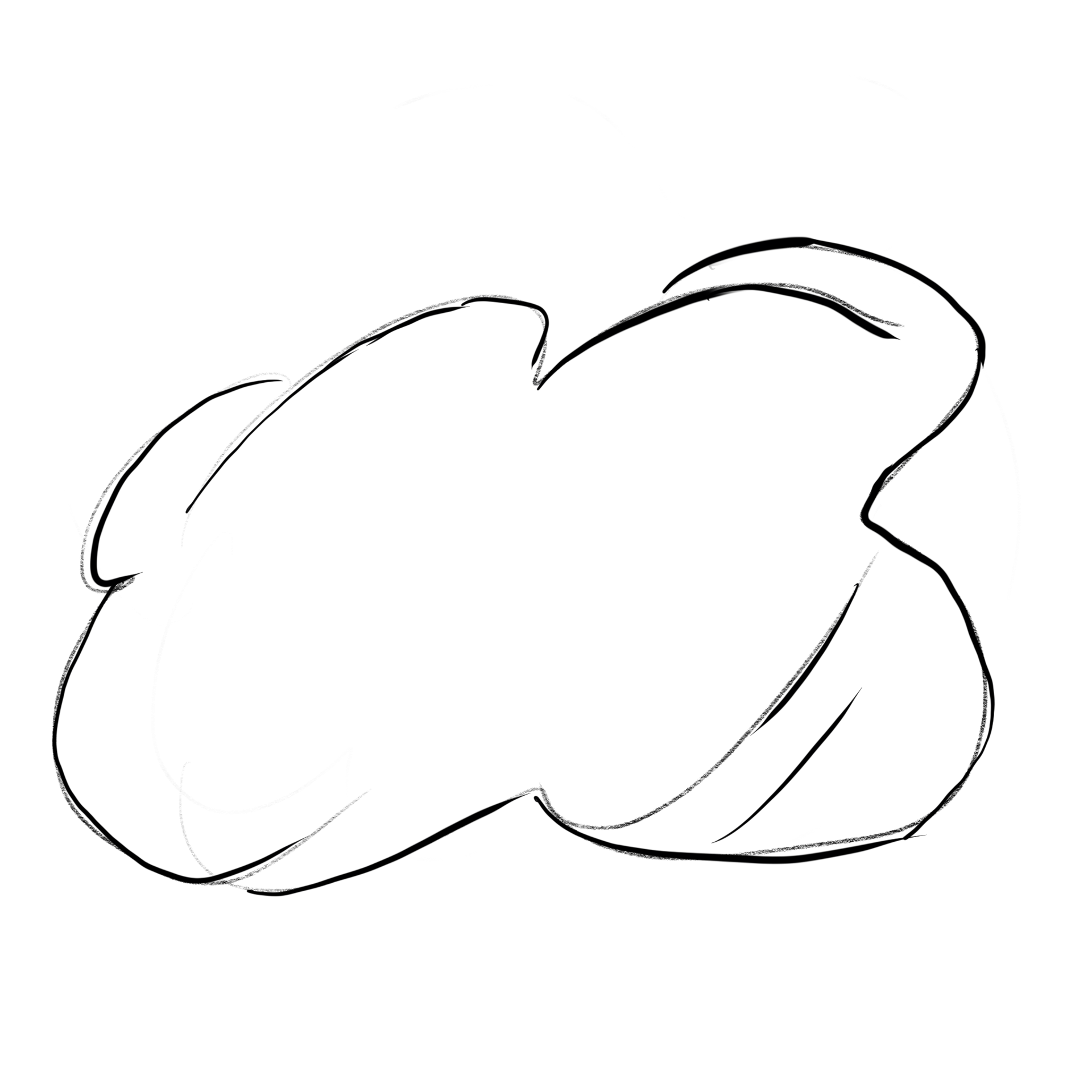
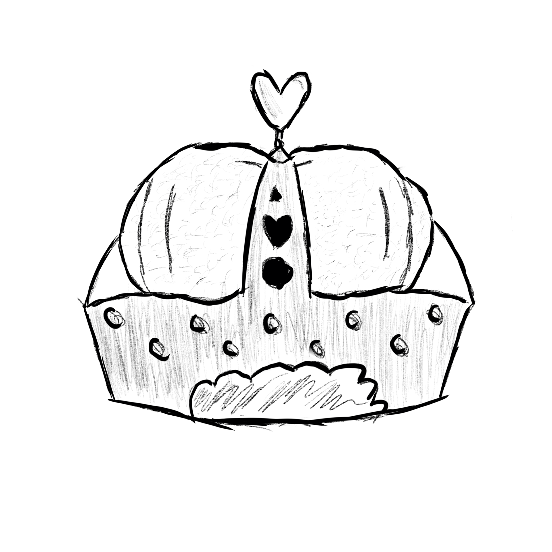
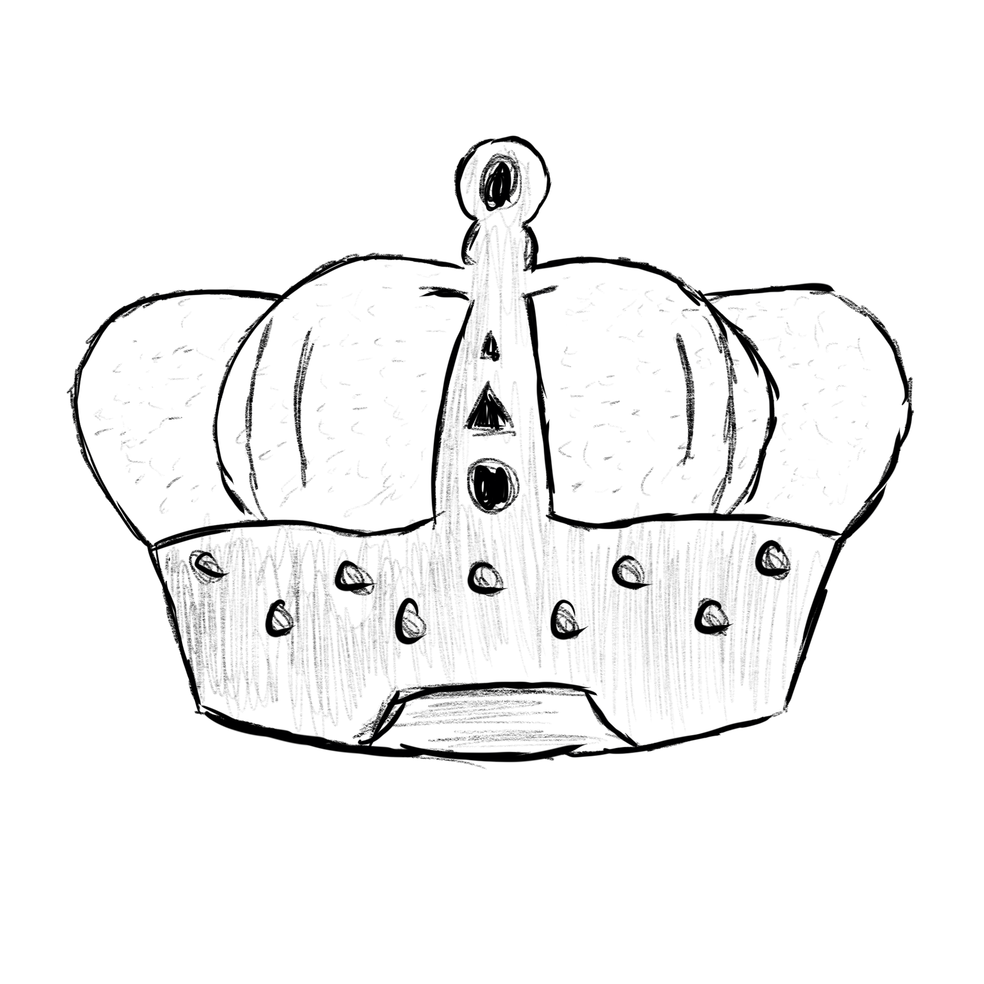
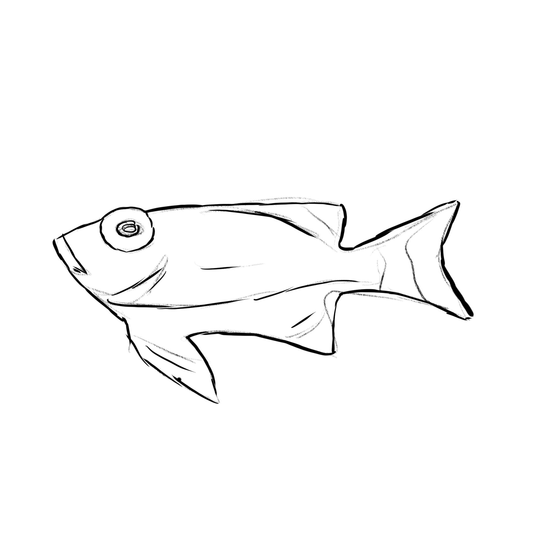
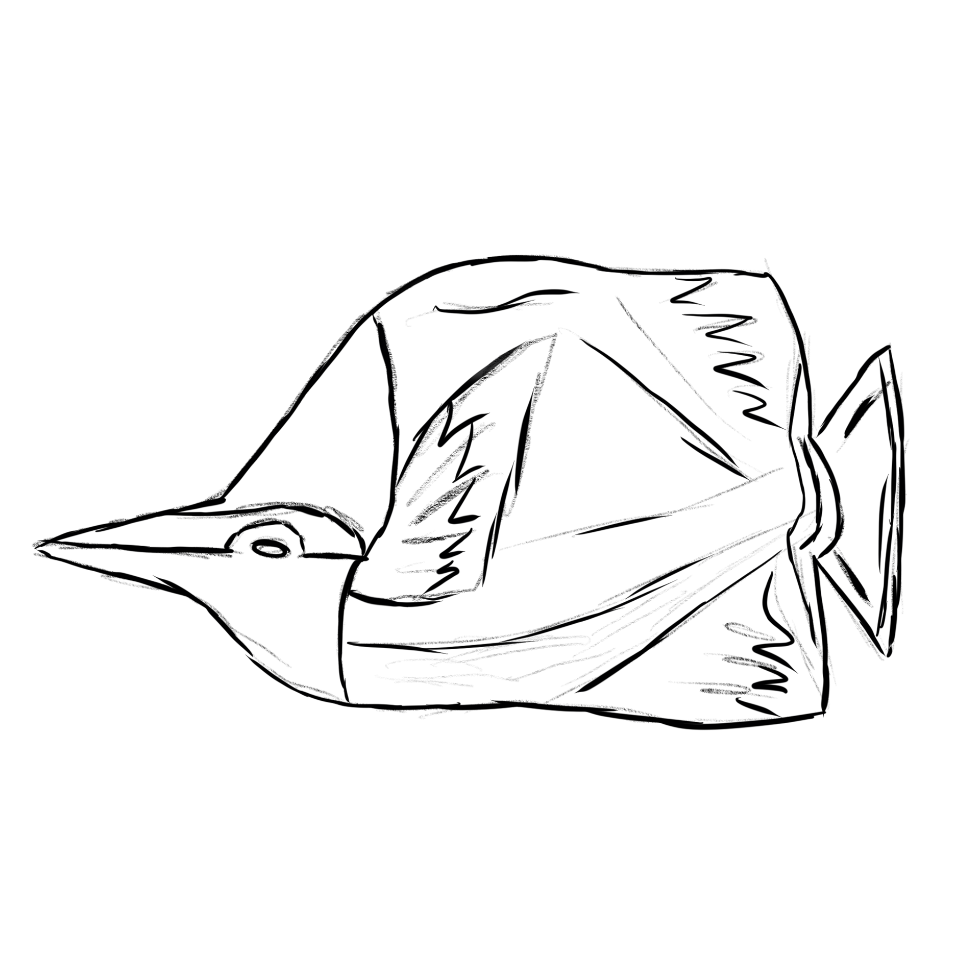
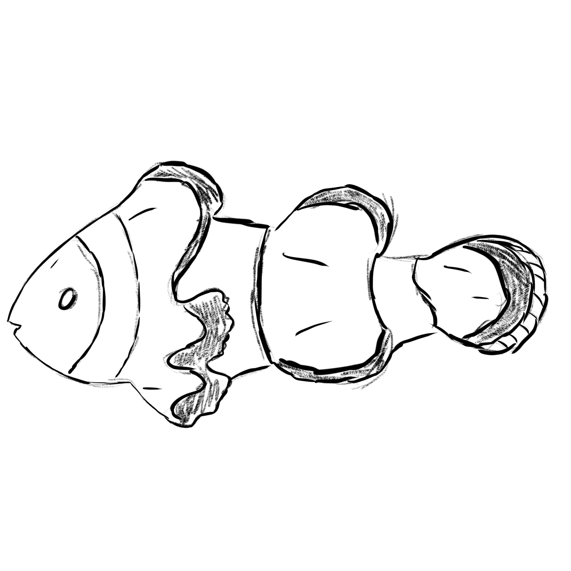
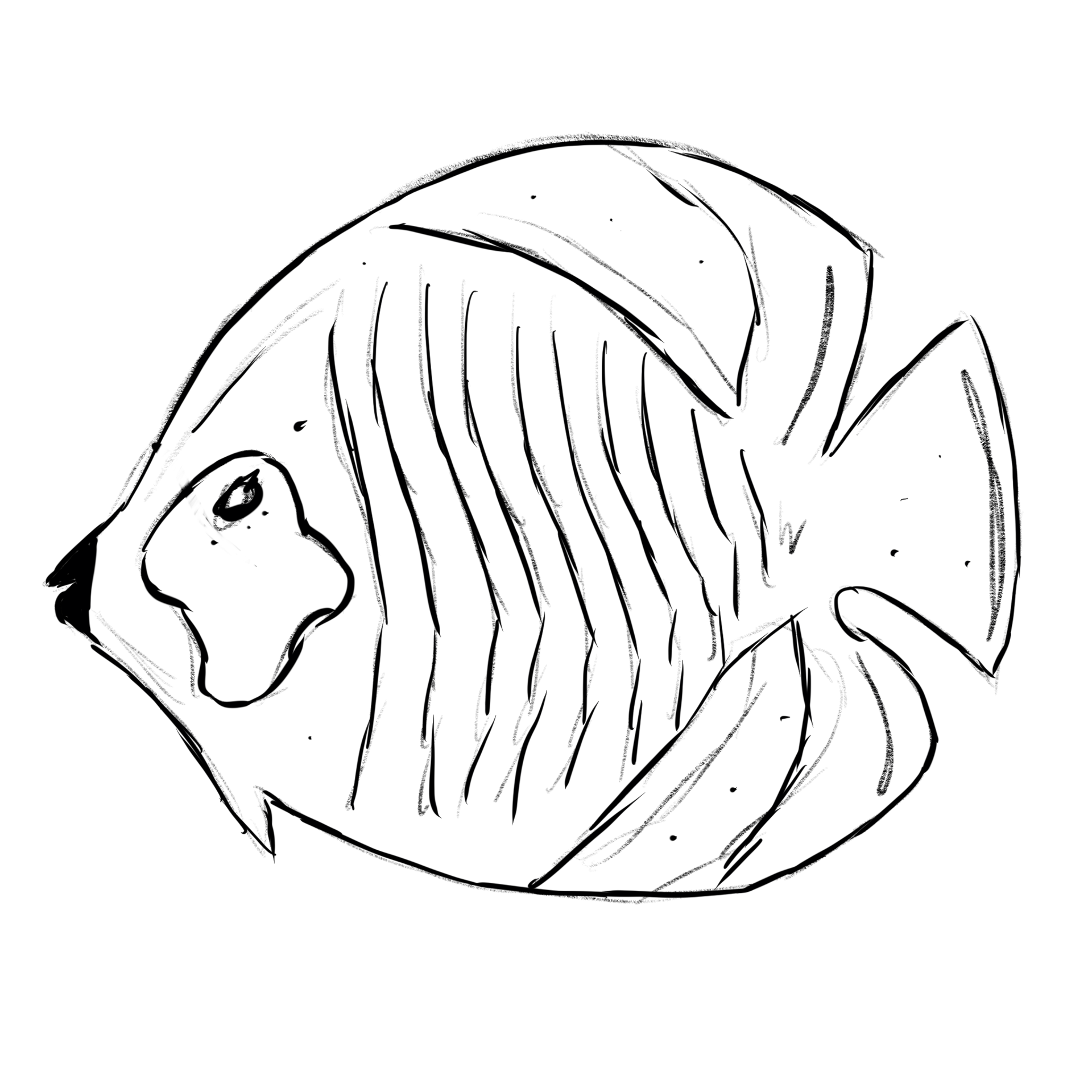
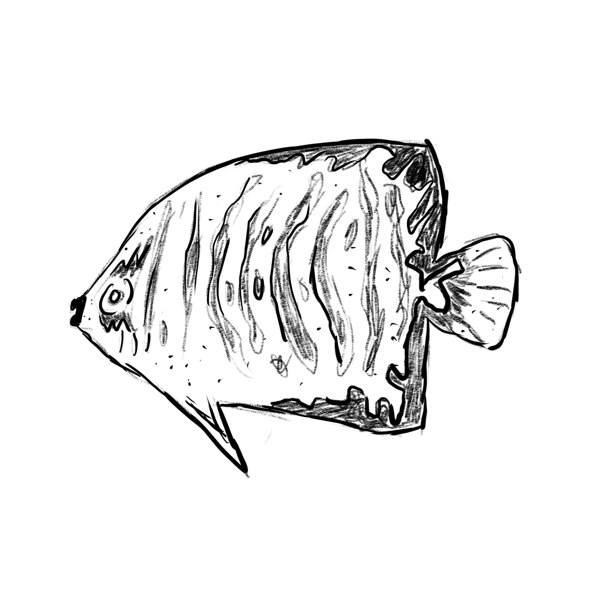
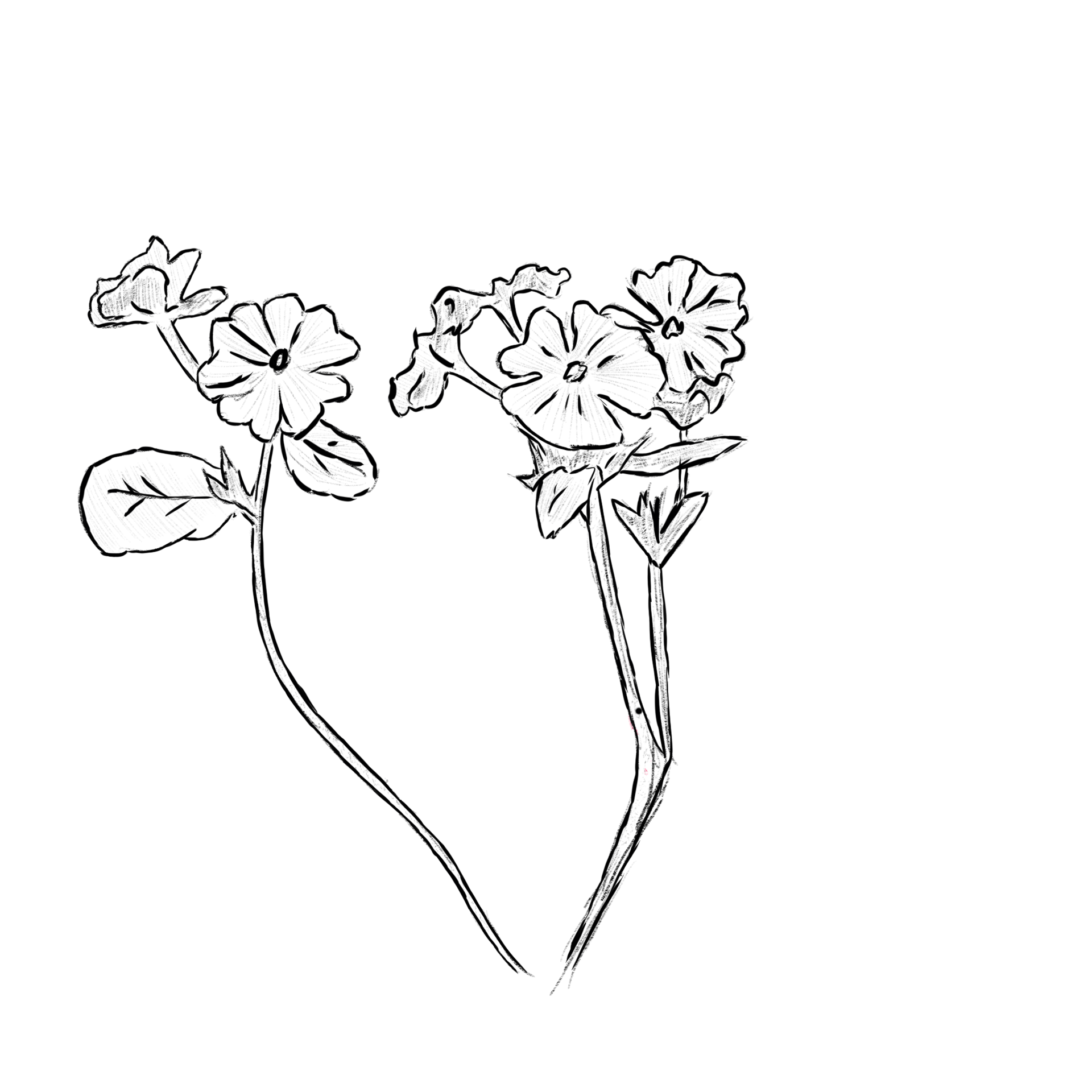
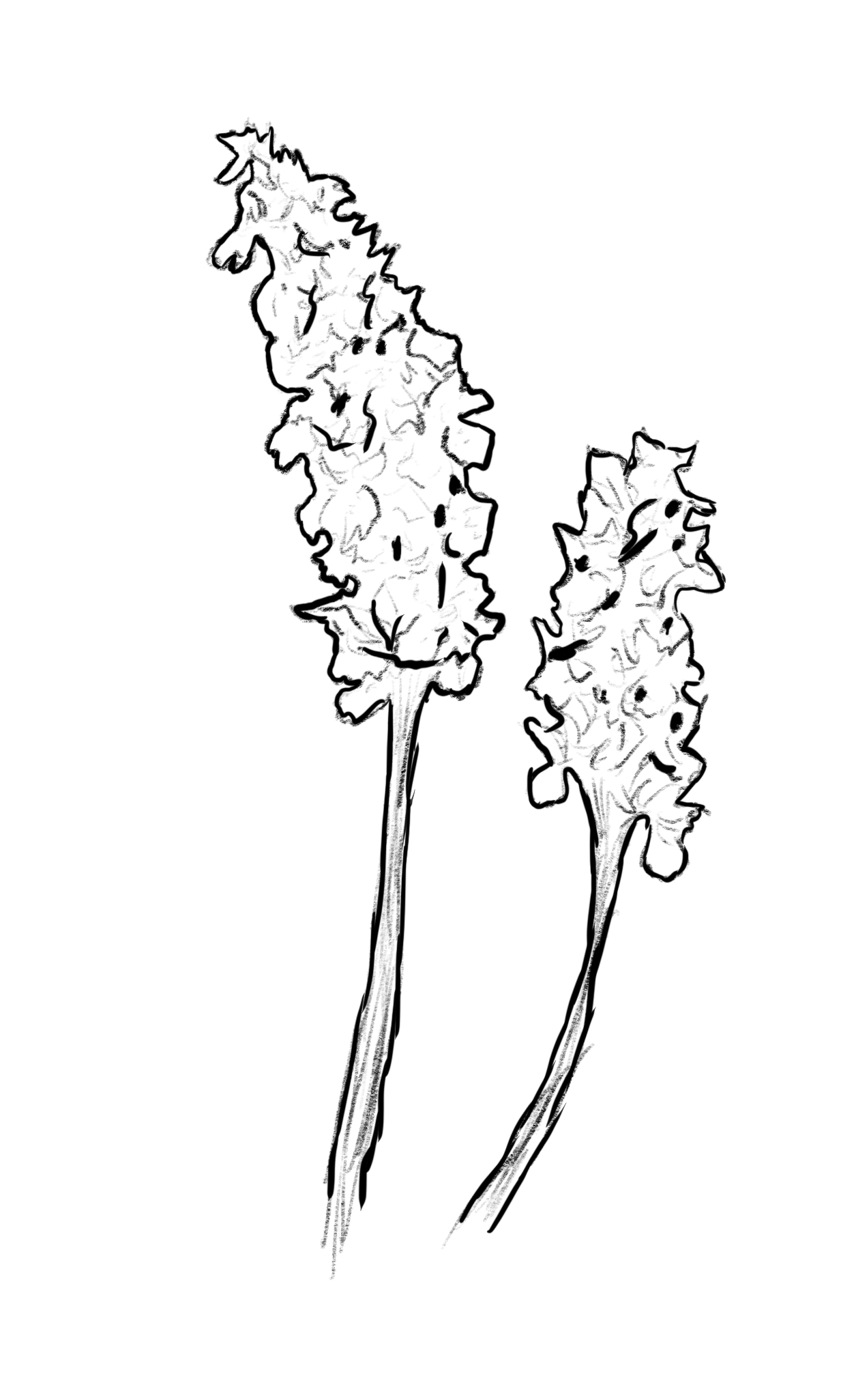
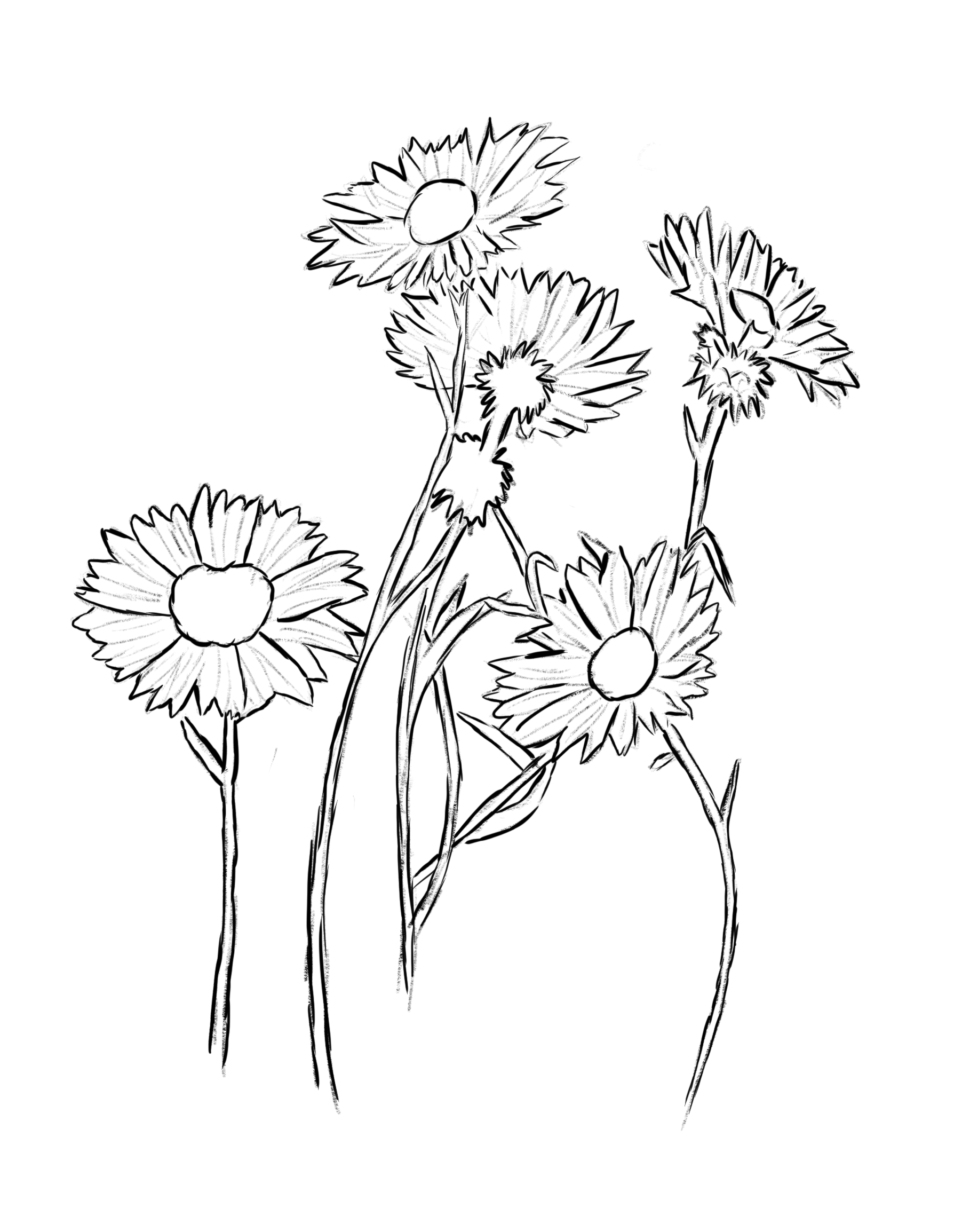
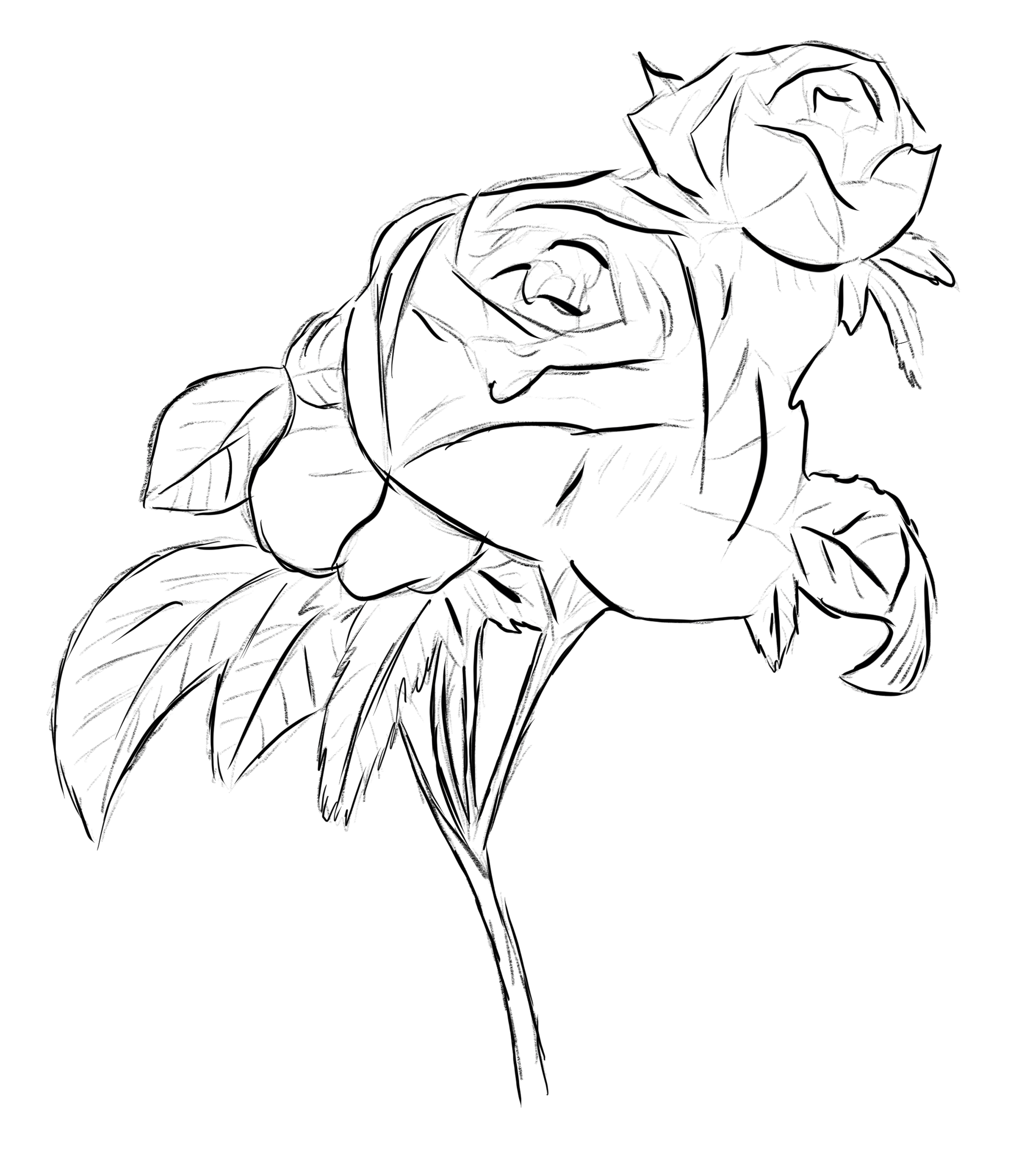
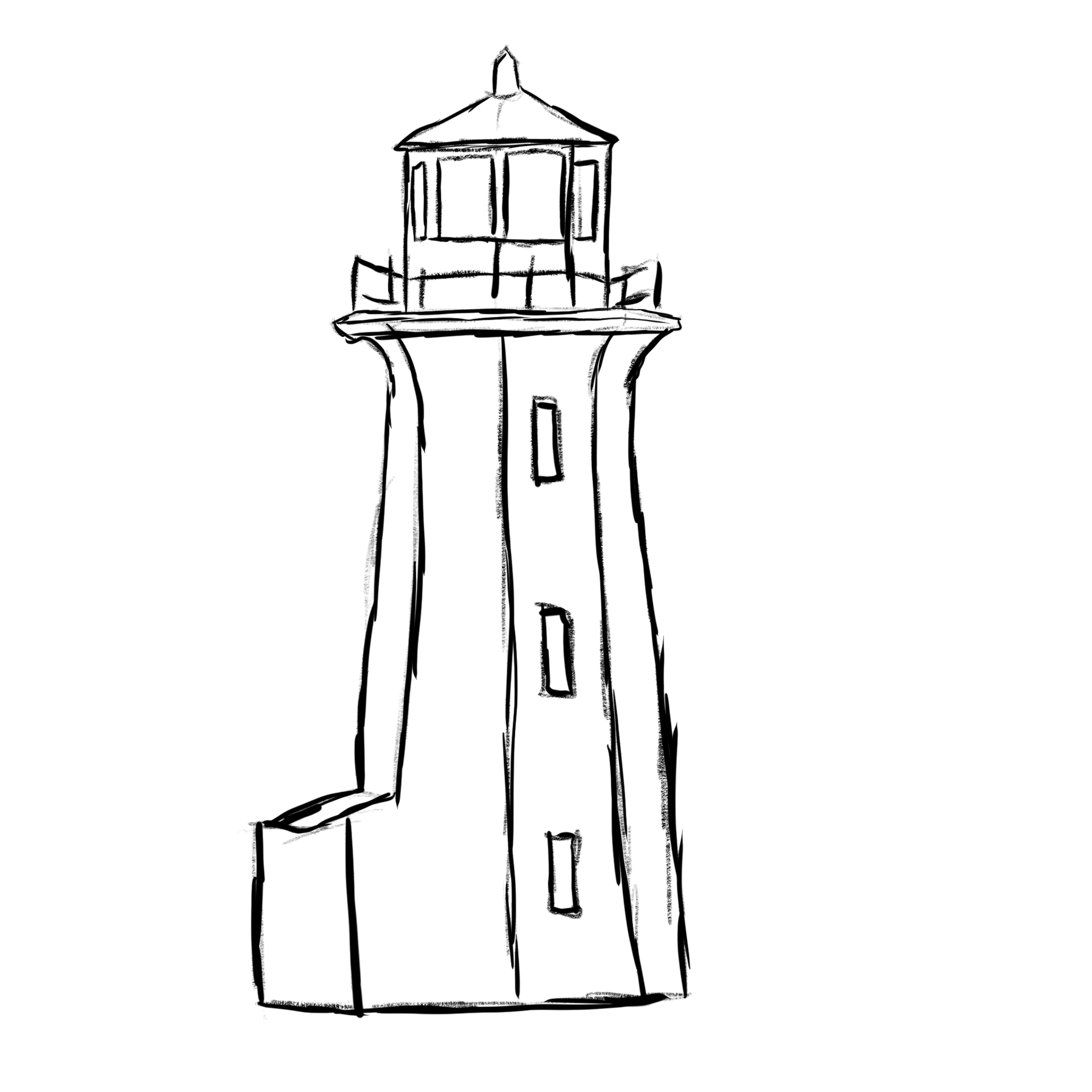
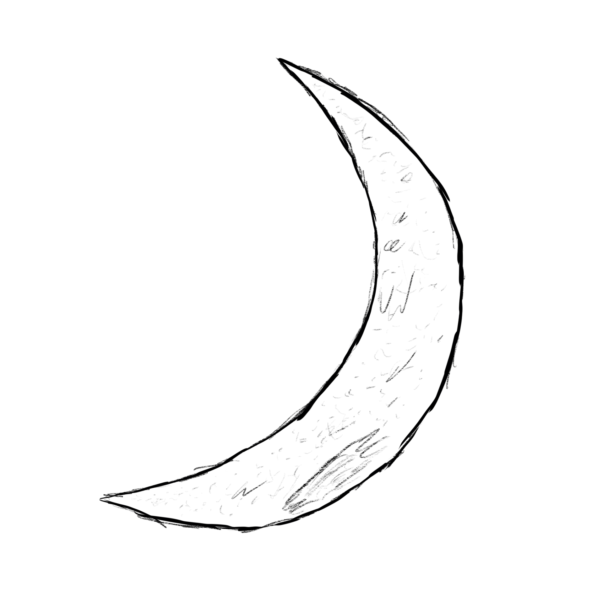
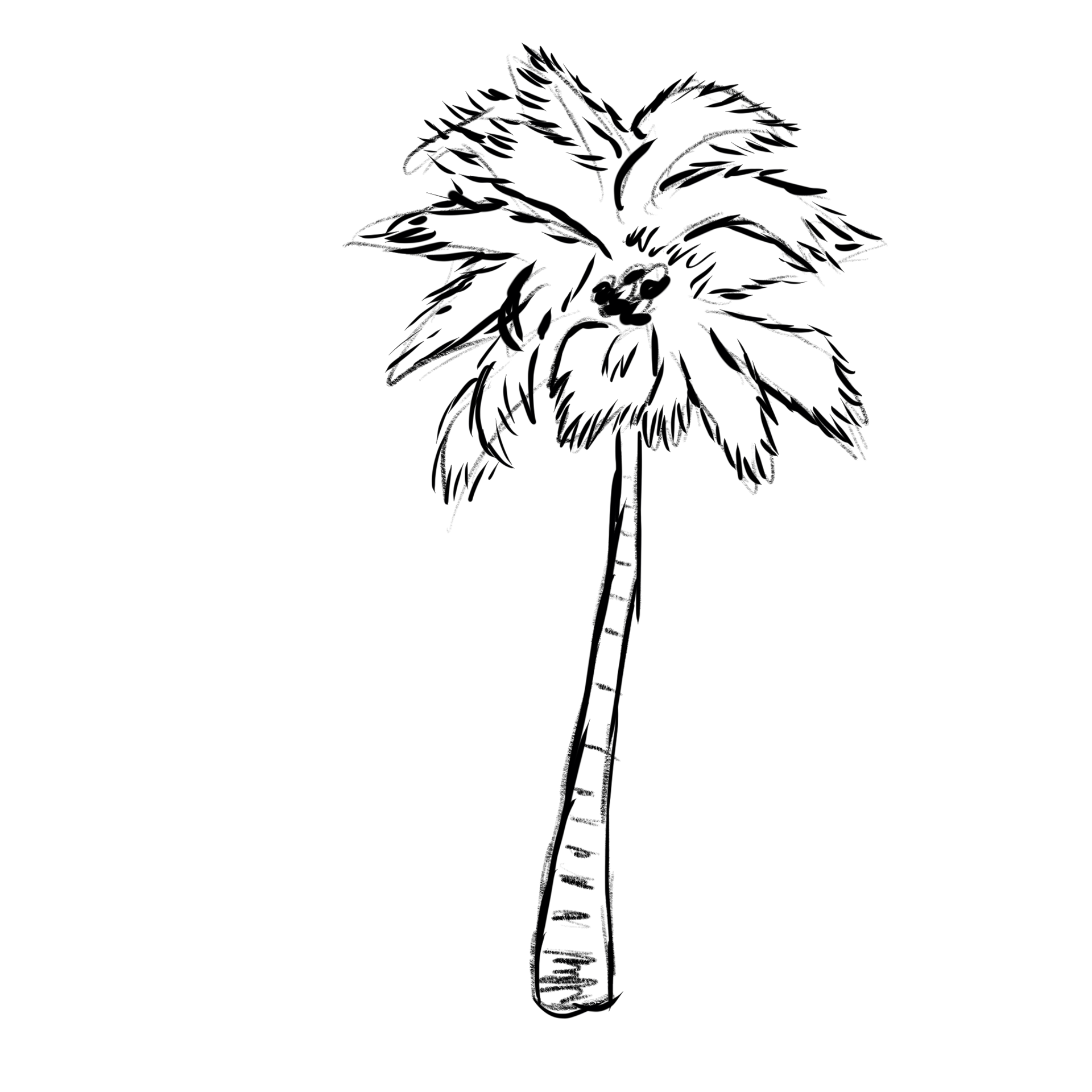
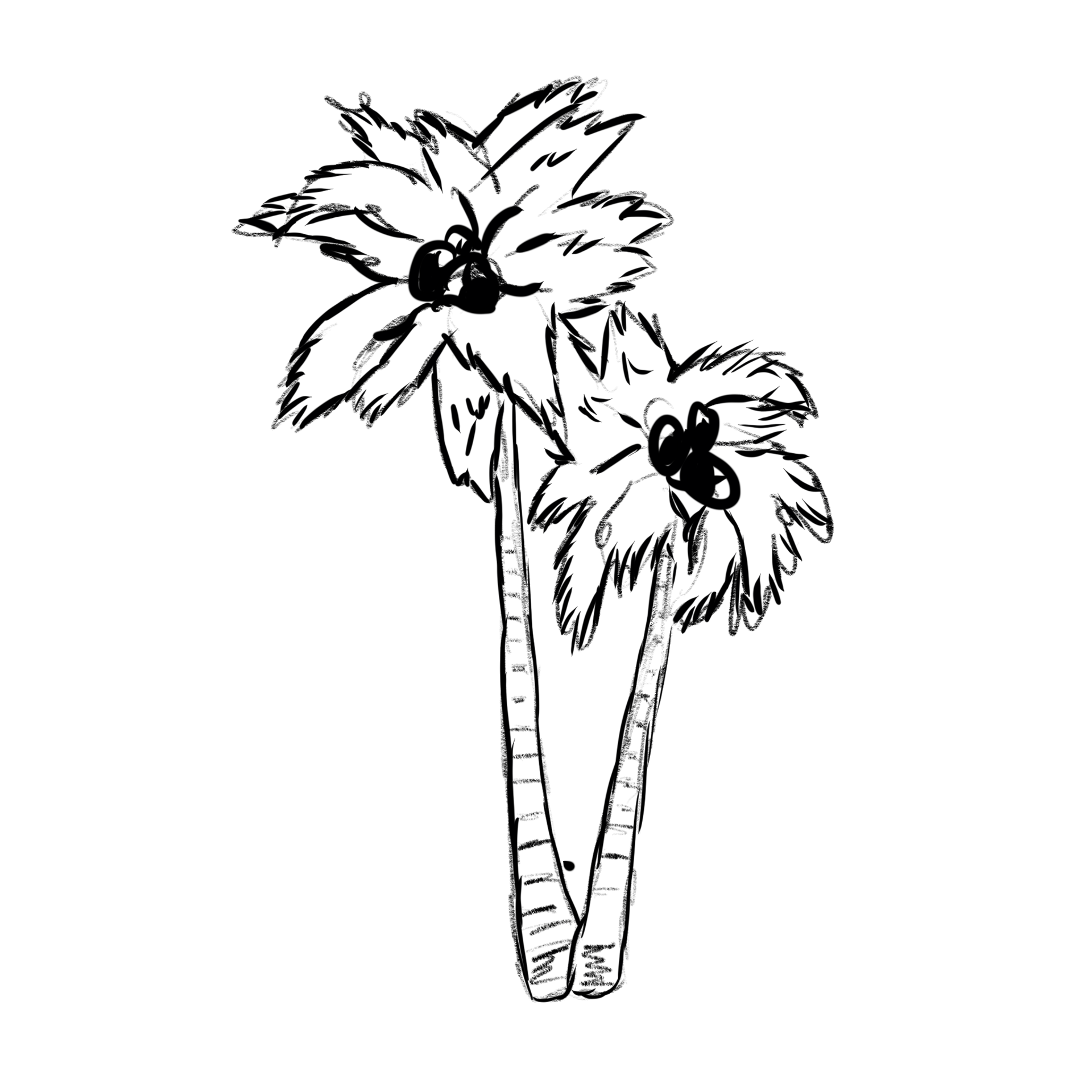
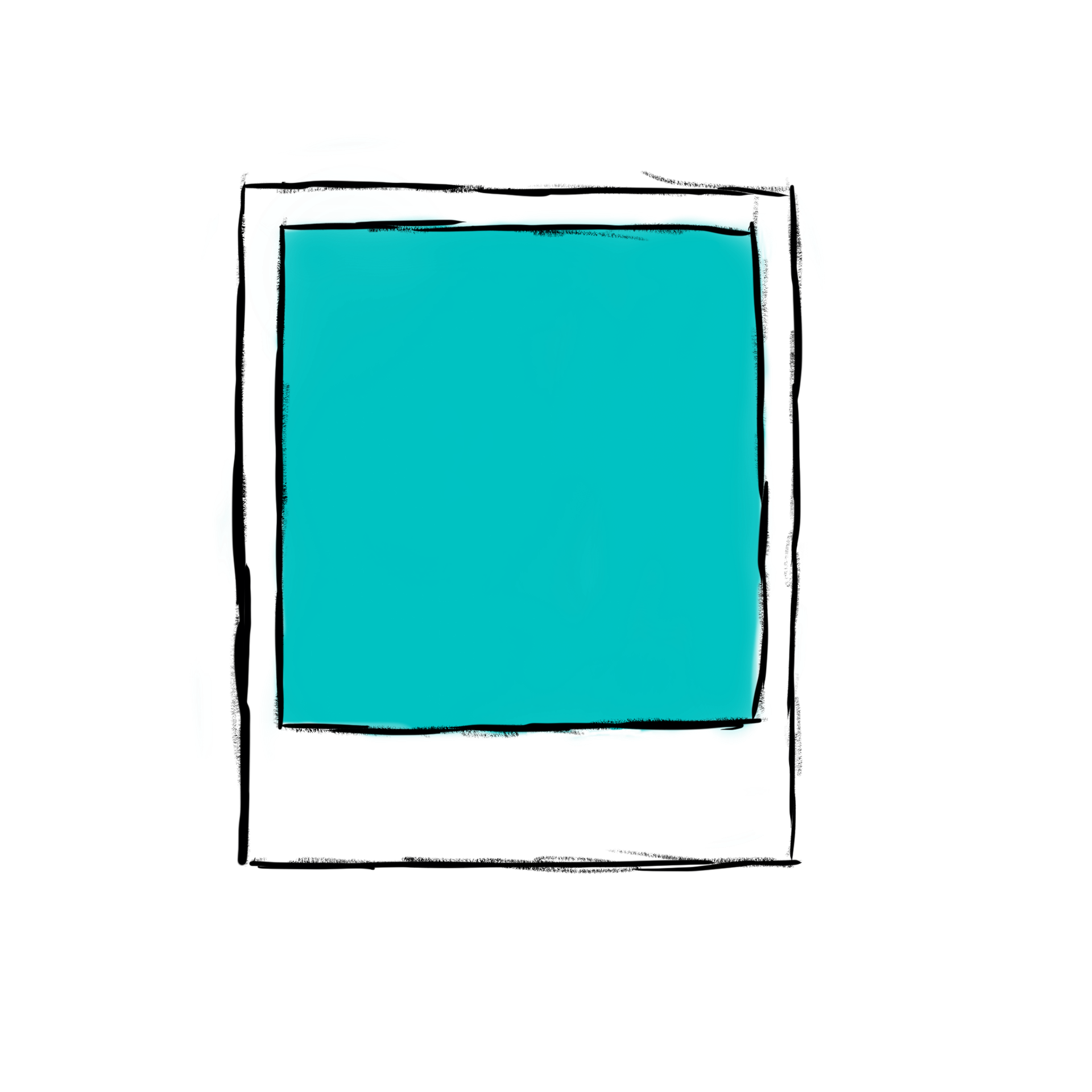
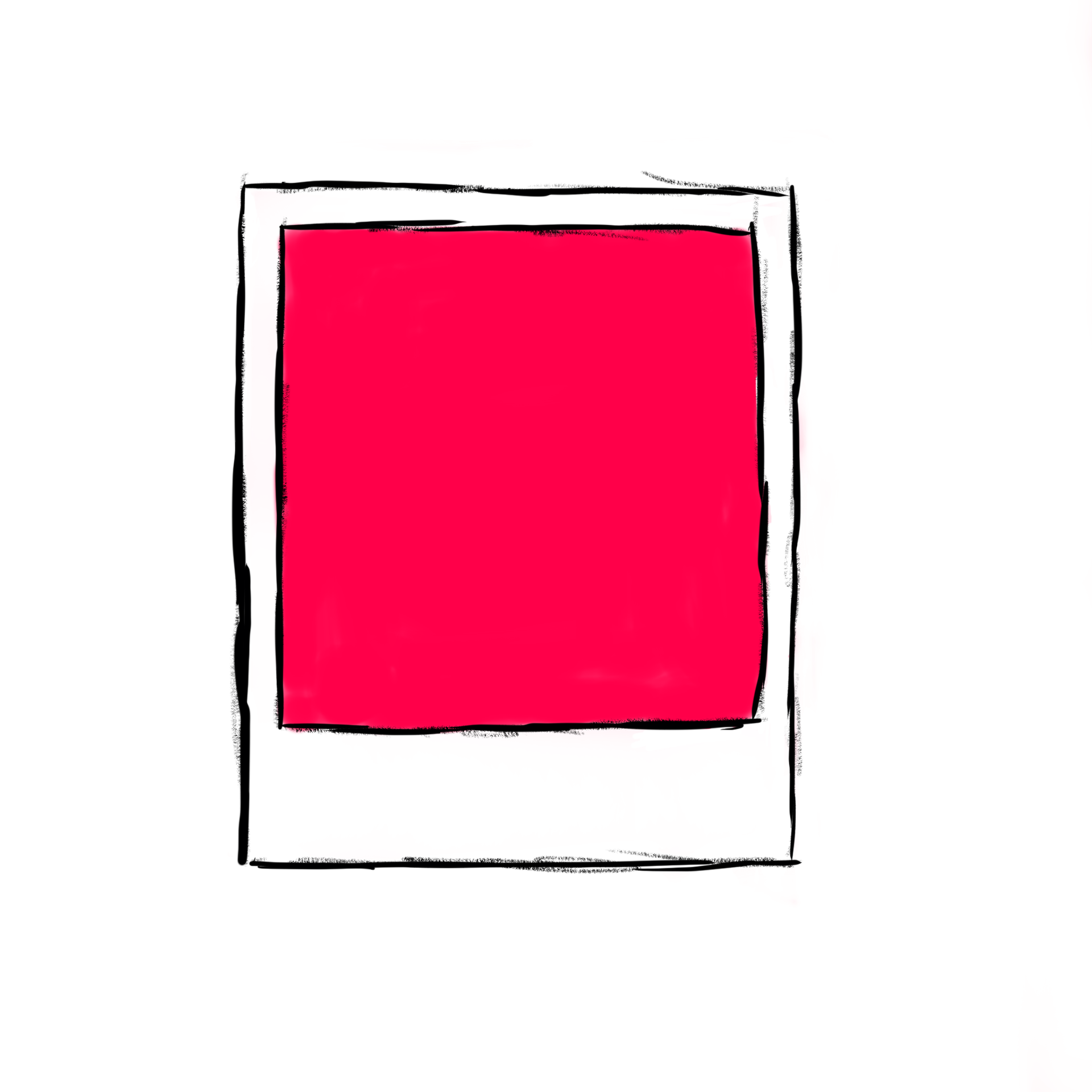
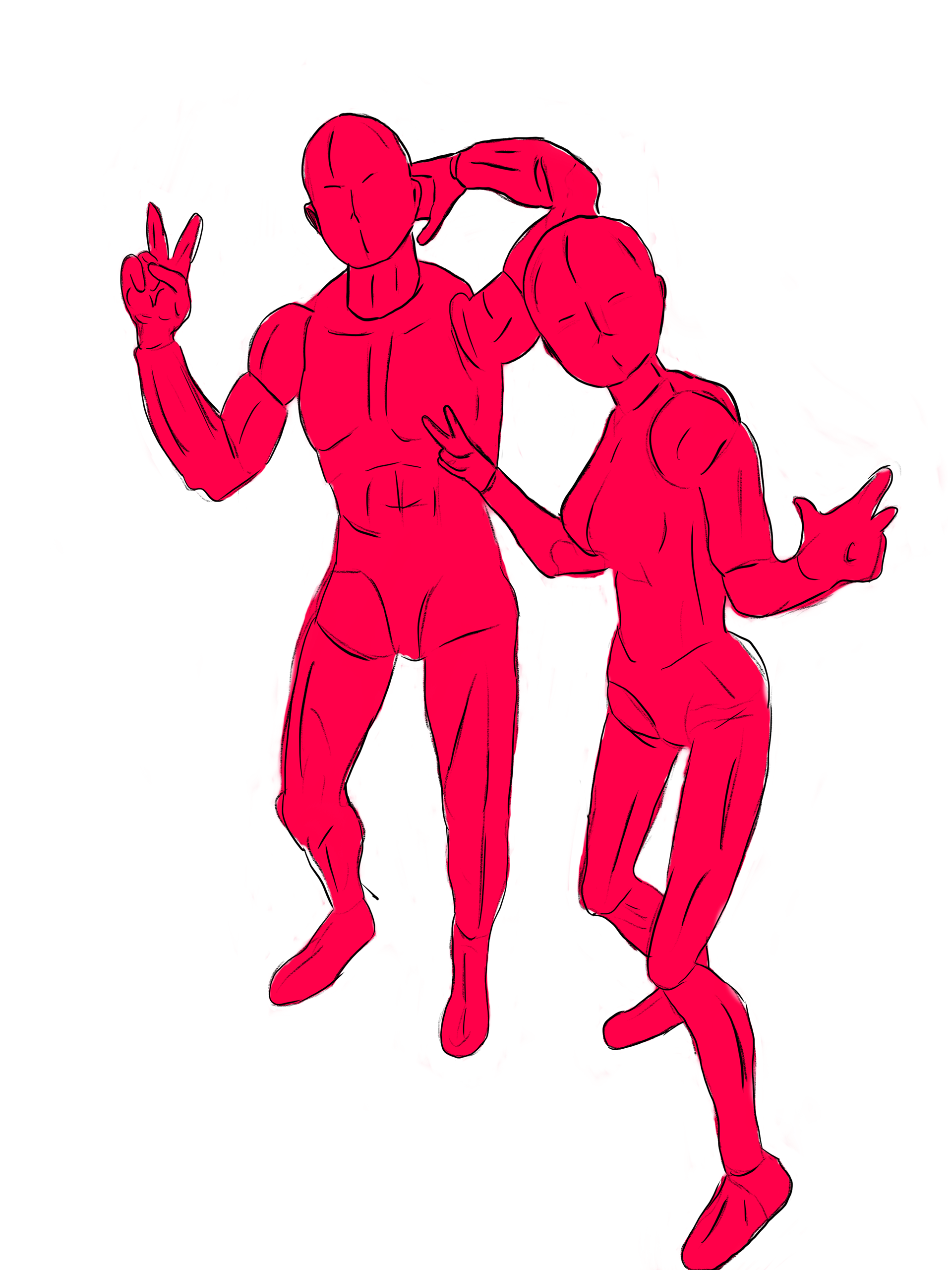
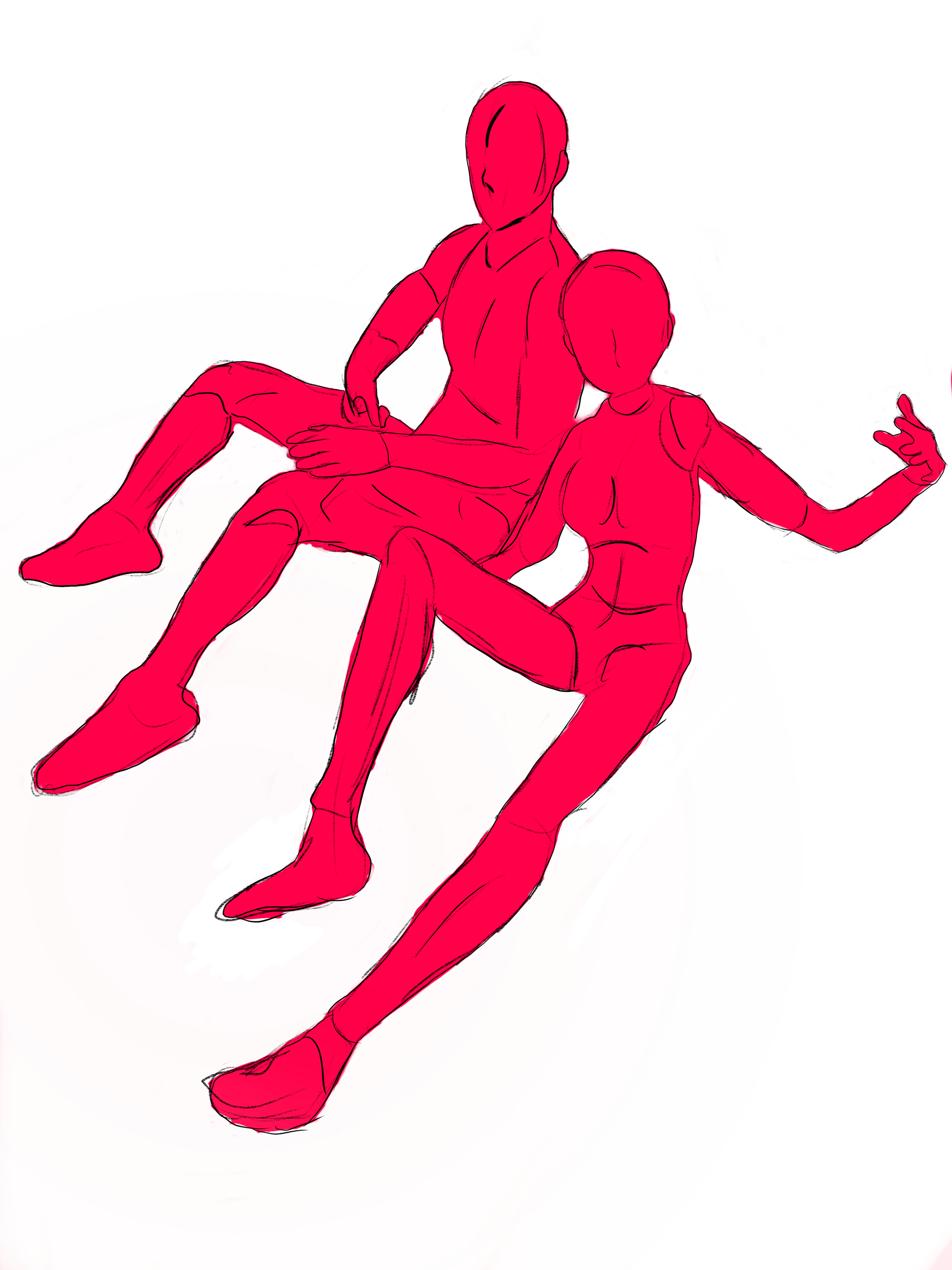
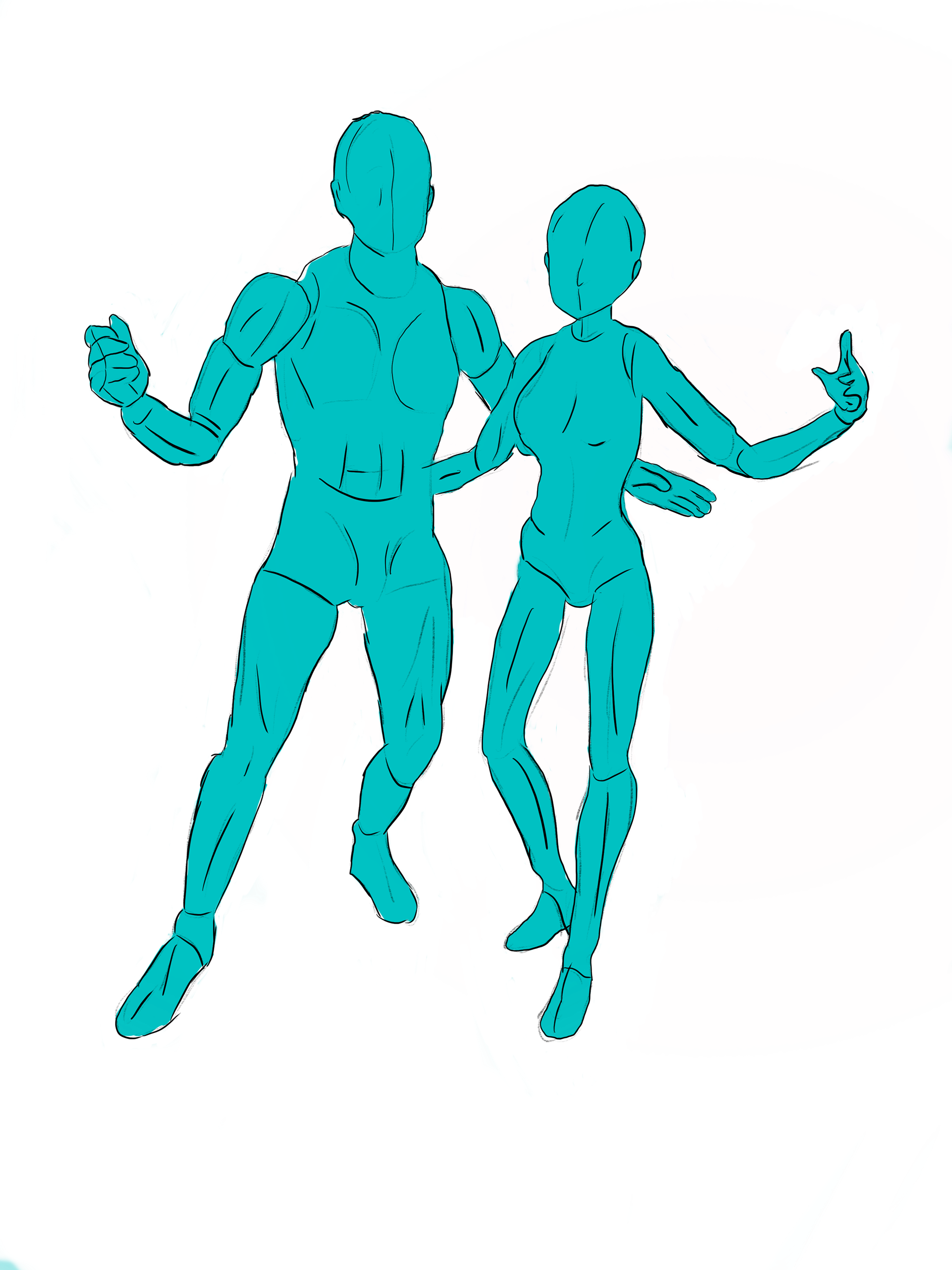
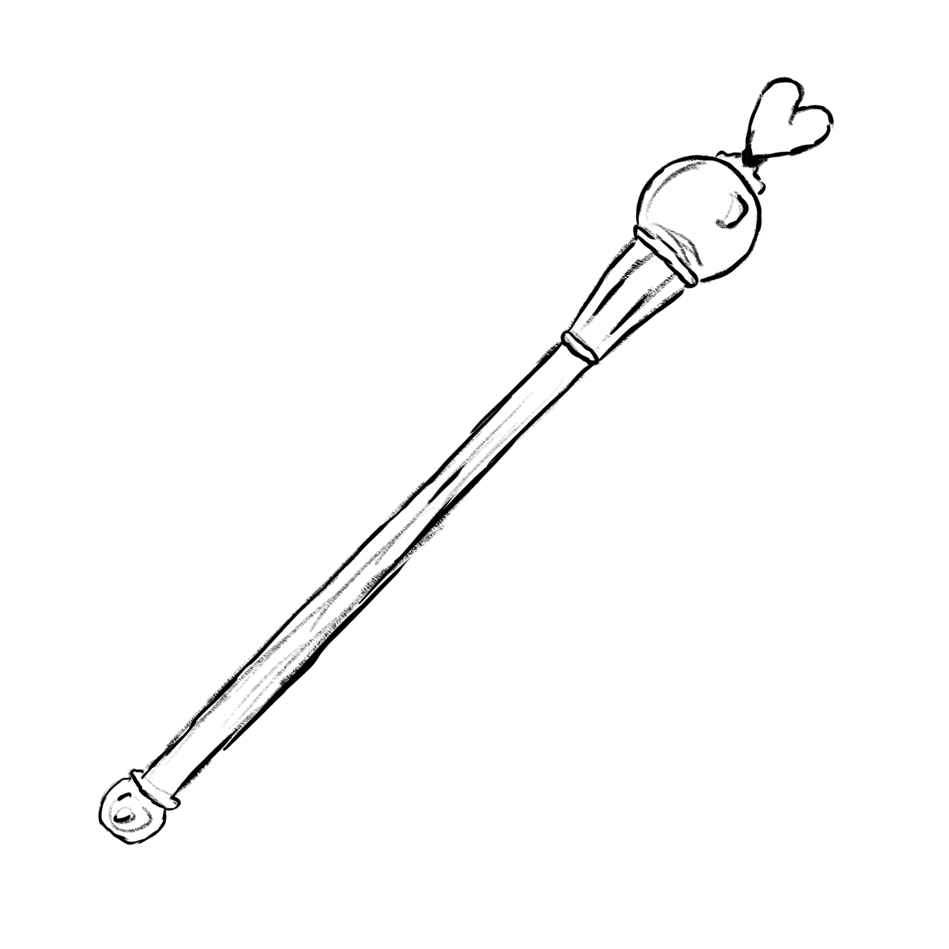
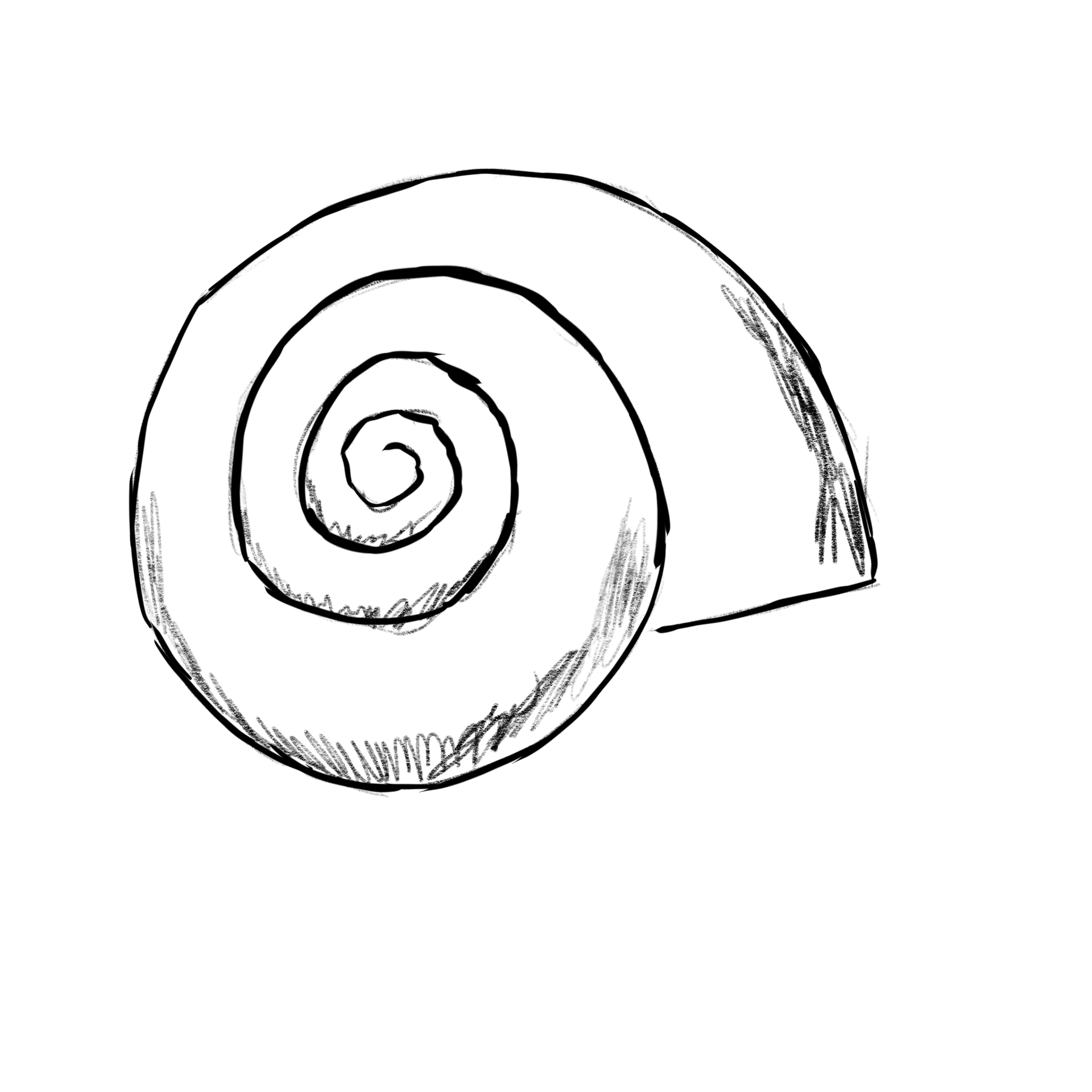
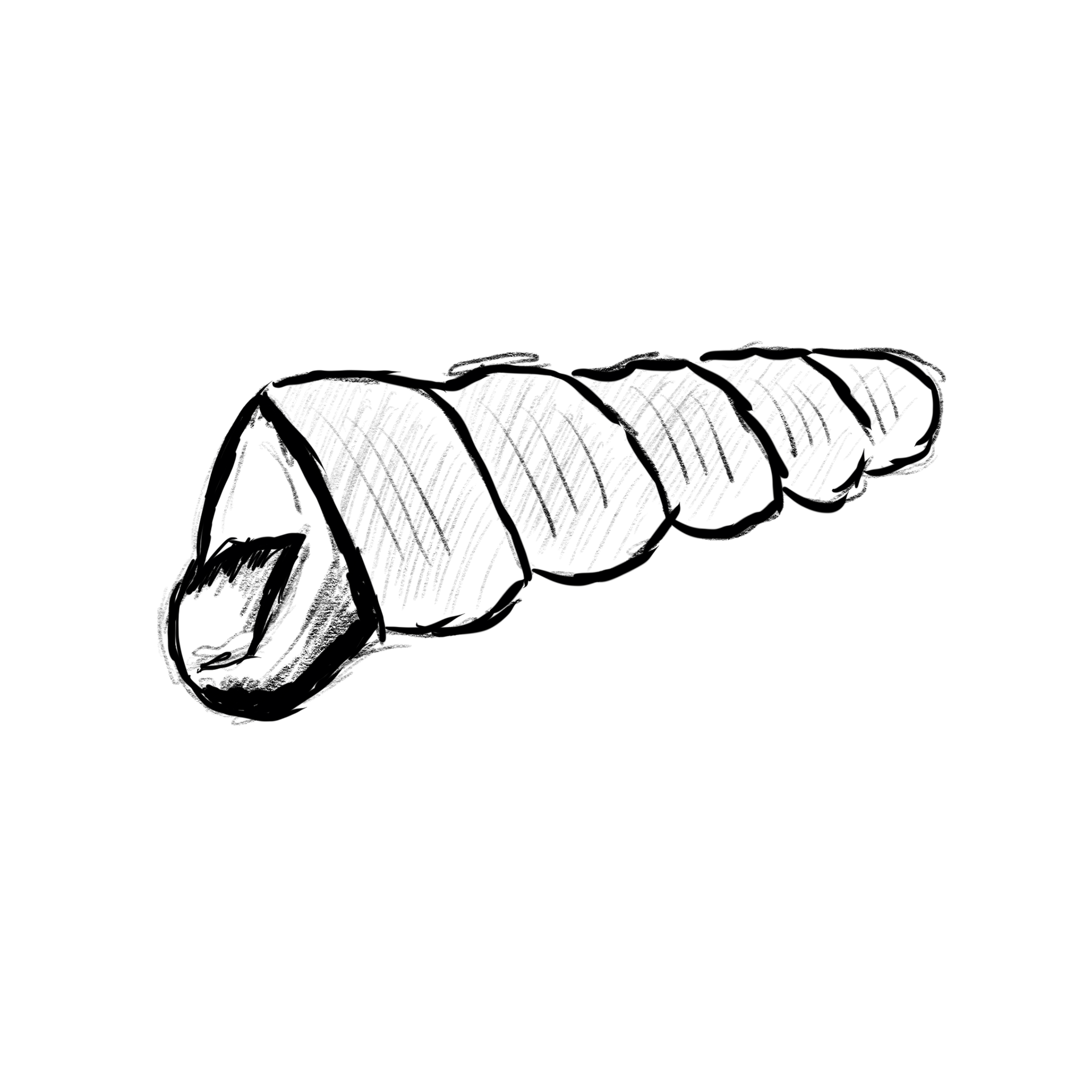
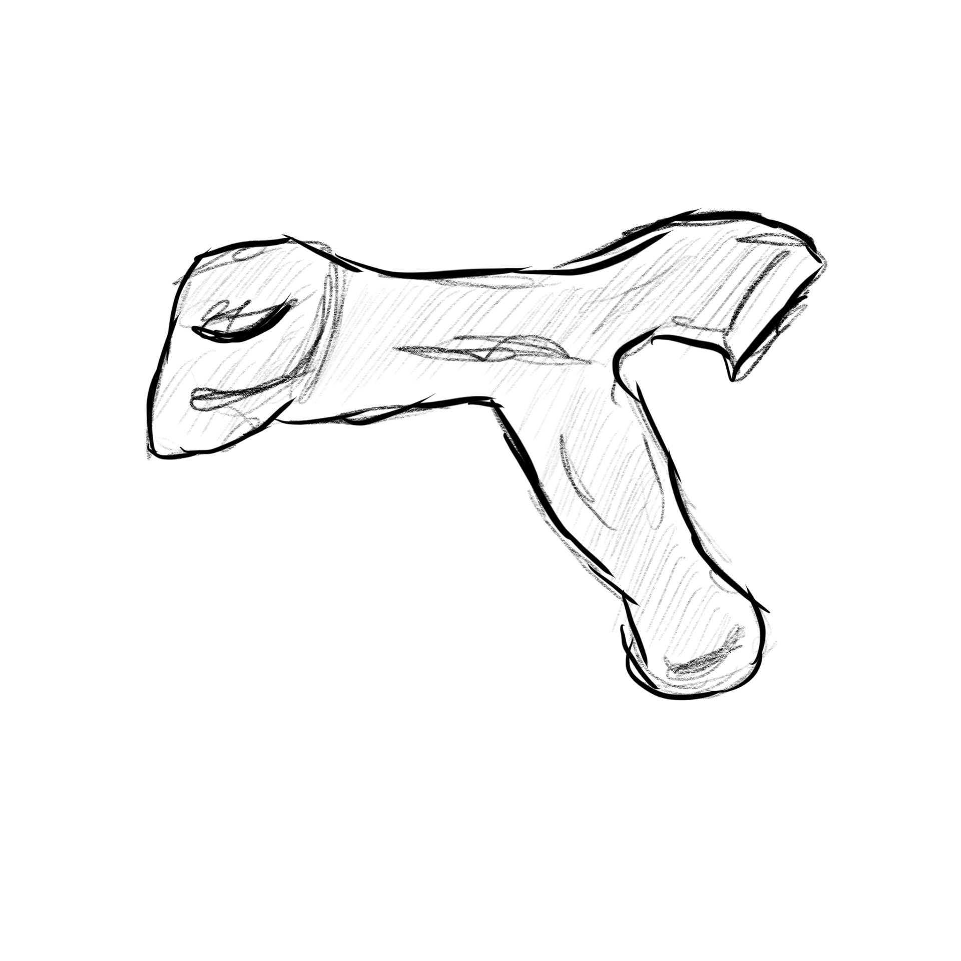
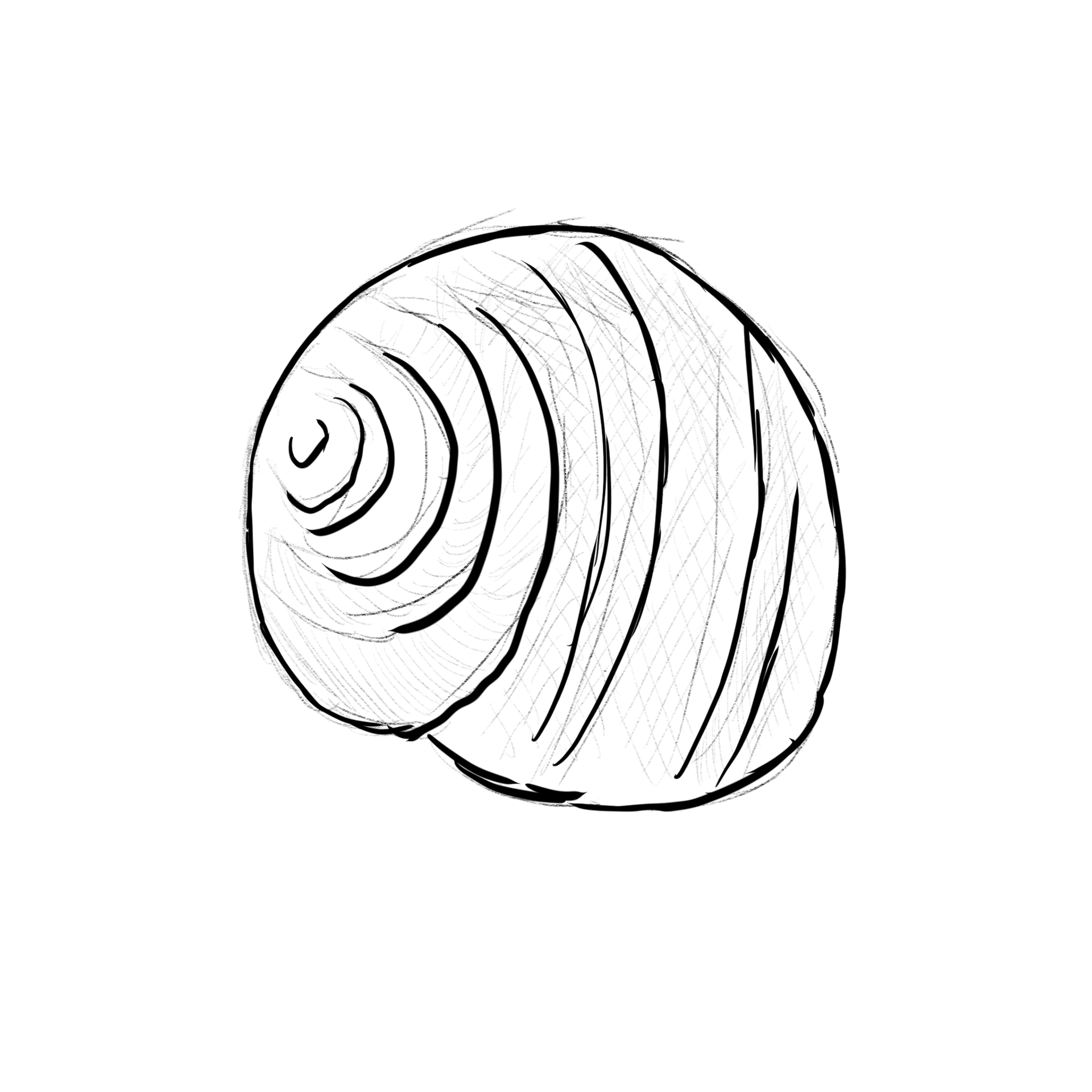
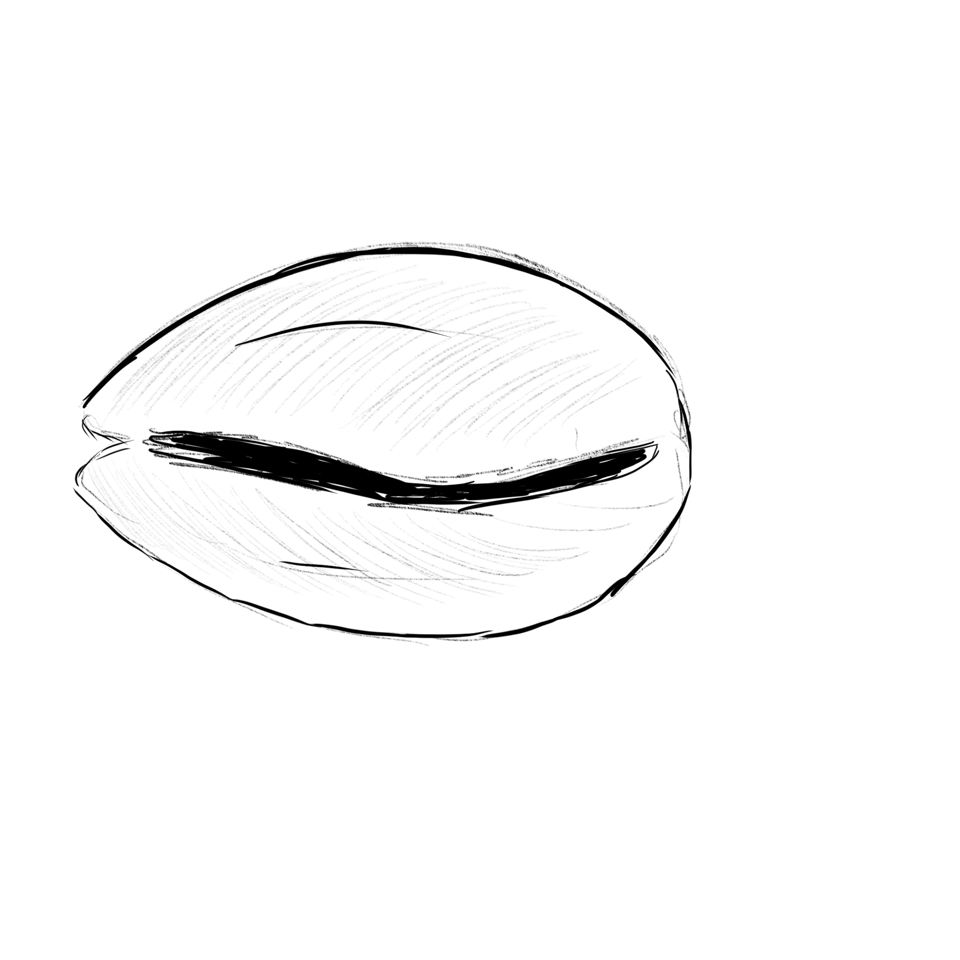
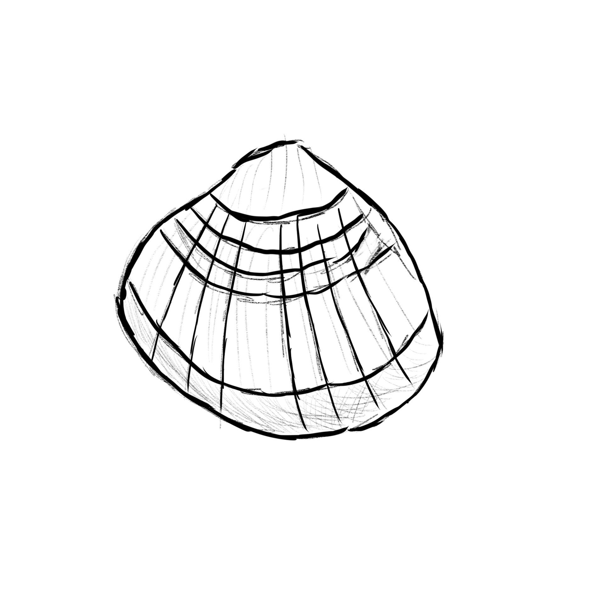
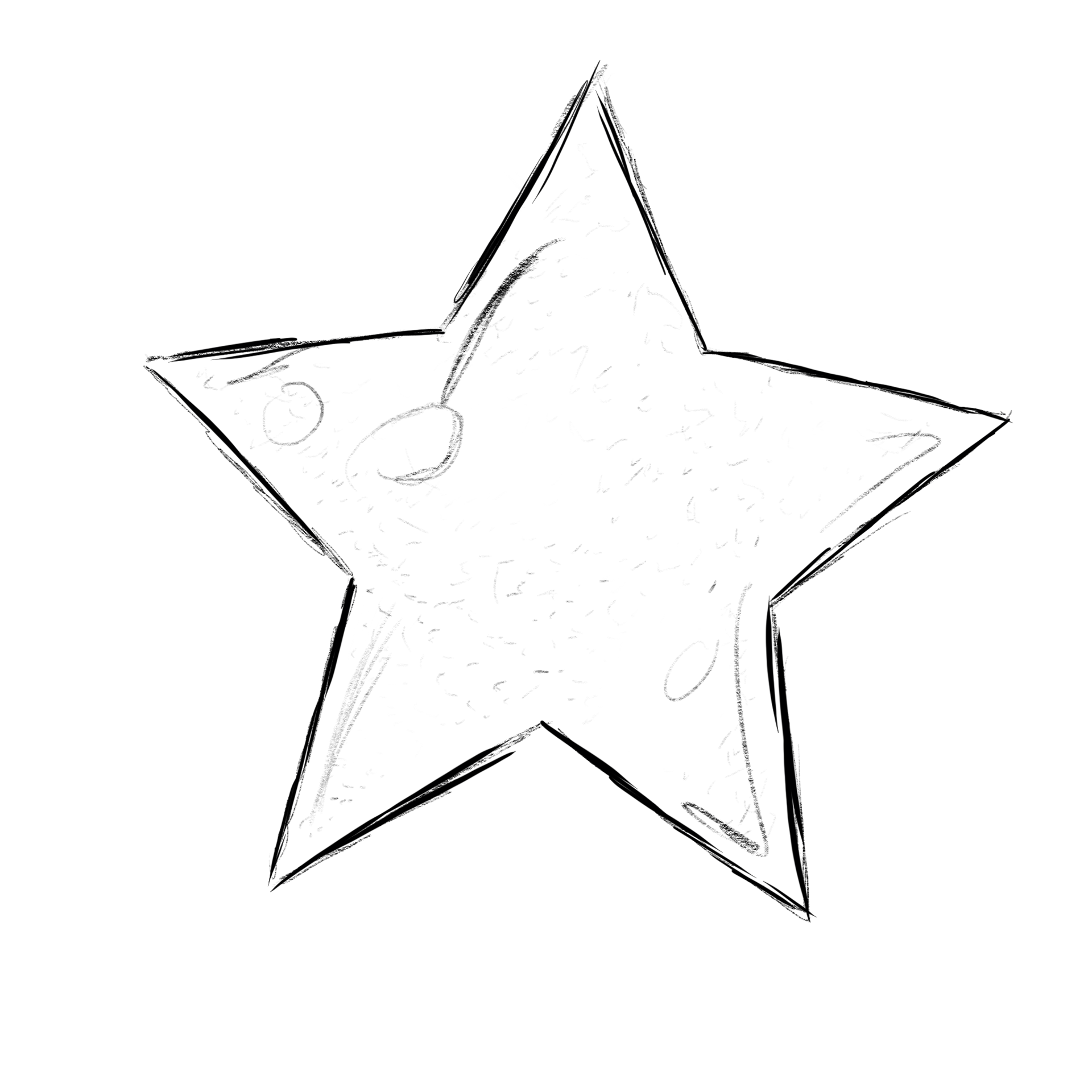


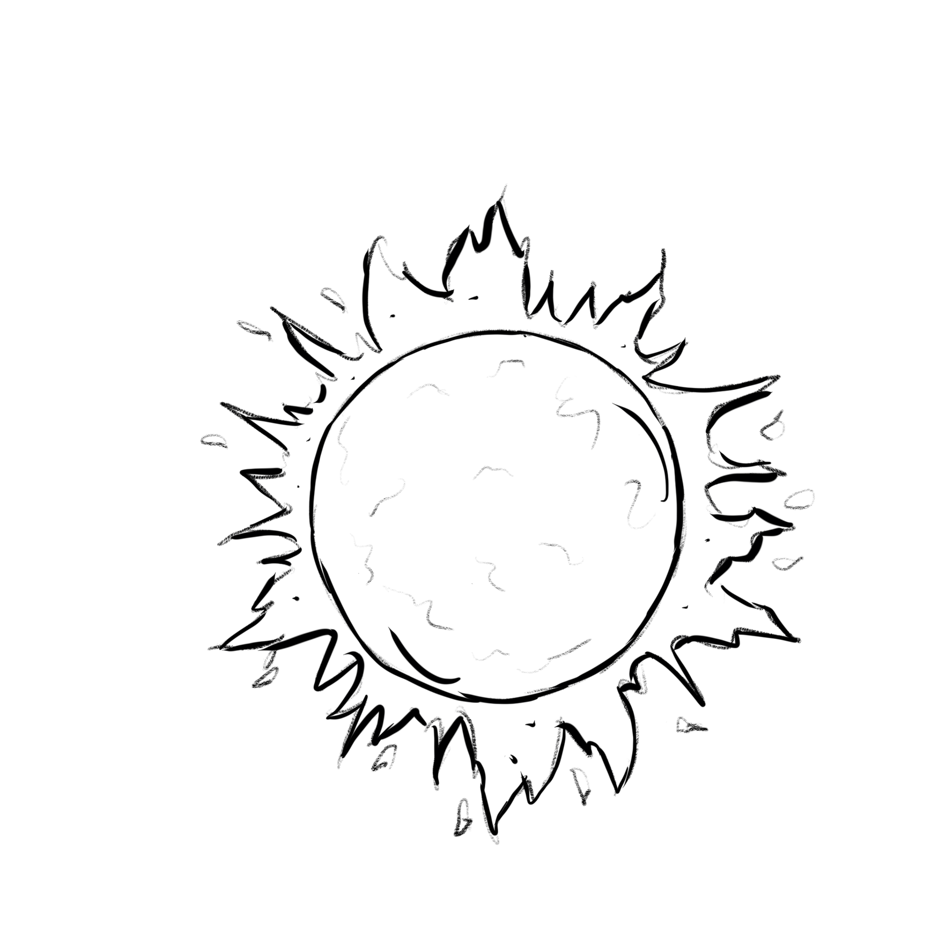
FIGURE CONCEPT
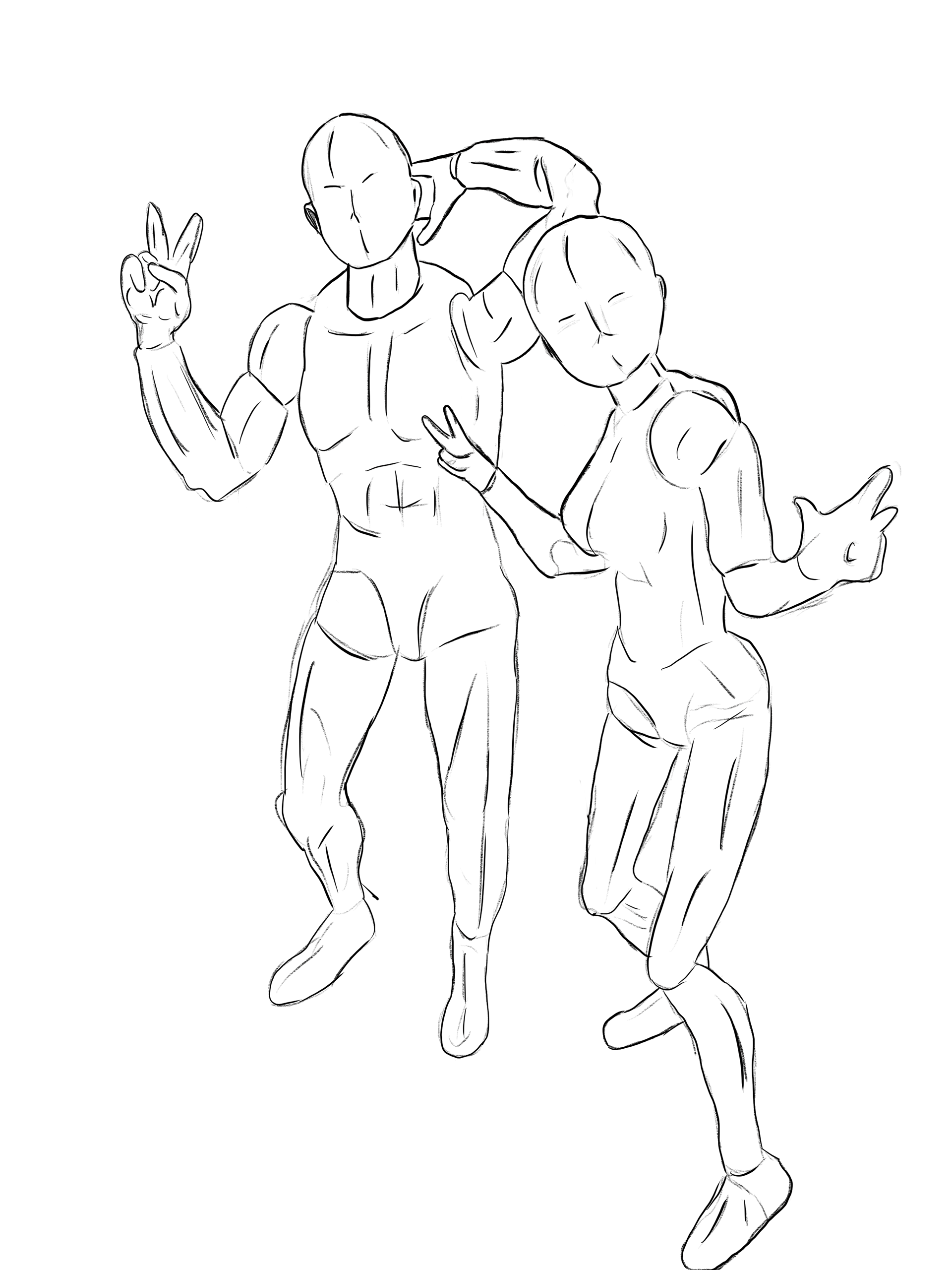
The decision to go with mannequin like figures was to play into the joyful, playful atmosphere that the brand and themes present. Avoiding the often times generic stock photography of people smiling and laughing - and shying away from the more detailed level of artwork, the line work of the silhouettes is meant to showcase people making a pose in front of the camera.
Often times the poses one makes is entirely on the spot.
INITIAL BANNER CONCEPT
With an idea in mind, I went about creating the initial assets (two different poses) and some random items one might find in a theme or prop. Playing with using the name in the beginning, this was later replaced by incorporating the logo, giving more space to use the sketches to form a scene and guide the eye.
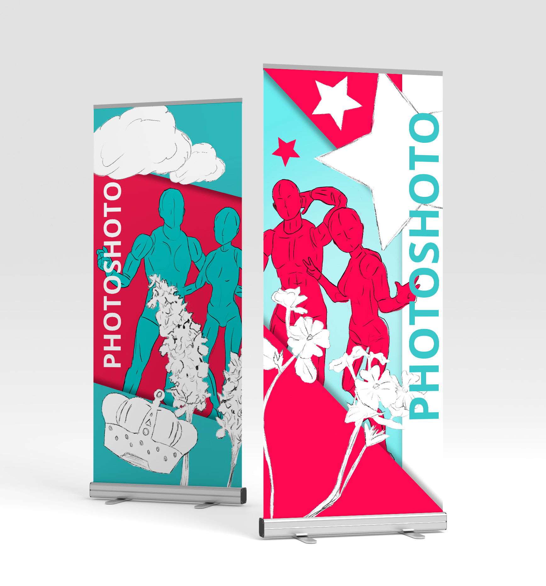
THE MAIN BANNER
Like a series of polaroid photos, the main banner showcases the illustrations in the continued playful style. While not shown, one of the ideas was to have a small quote attached to each photo. In the next iteration of this design, those words might find themselves onto the polaroids.
The colours of the brand are used as the backdrop to each polaroid, allowing the white illustrations (sketch style) to stand out more prominently. It's all about giving a visual treat without being too distracting. After all, these will be at a wedding, and the goal is too have as many silly photos (or serious - everyone is different) taken.
ALL TOGETHER NOW

STATUS OF FINAL DESIGN: TBD