
INTRODUCTION
As a Graphic Designer, I felt it an opportune moment to explore creating cover art for some of my novellas and novels. A lot of my free time is spent writing, forming stories that I see one day being published, be it traditionally or through the more likely of options (indie publishing).
I've spent years learning how to hone my craft in both writing and design. While my profession is that of a designer, a large portion of who I am as a person stems from my love for storytelling. We see a lot of that within good design, and I find it's always good to remember how text and visual elements aren't just there to be pretty, they exist to guide, to form immersion and most importantly, to speak.
This is an ongoing project. Further detail will be shown on the creative process, from how fonts were decided upon, to the colours, layout, and an in depth look into the chapter headings.
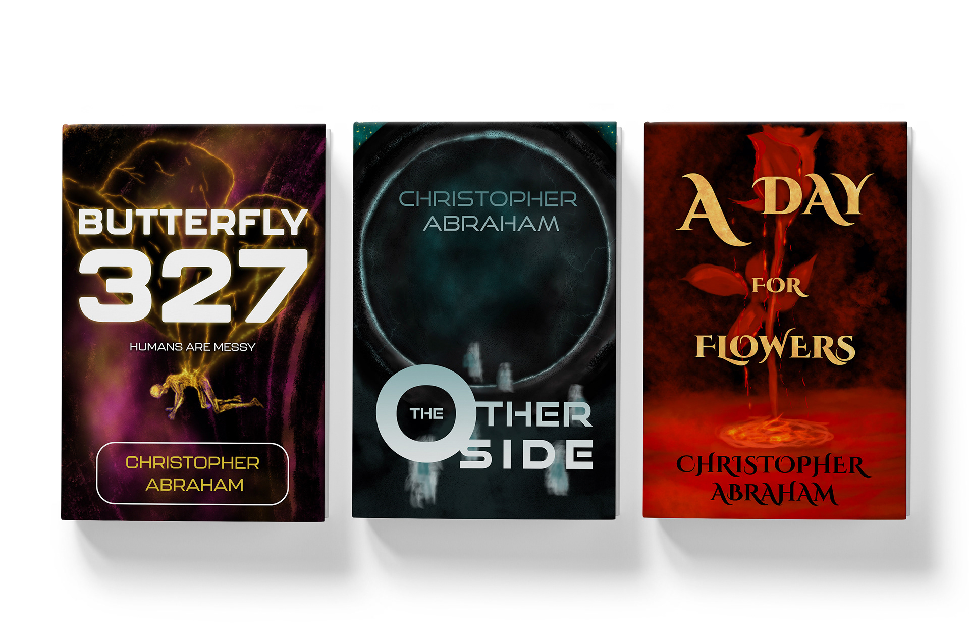
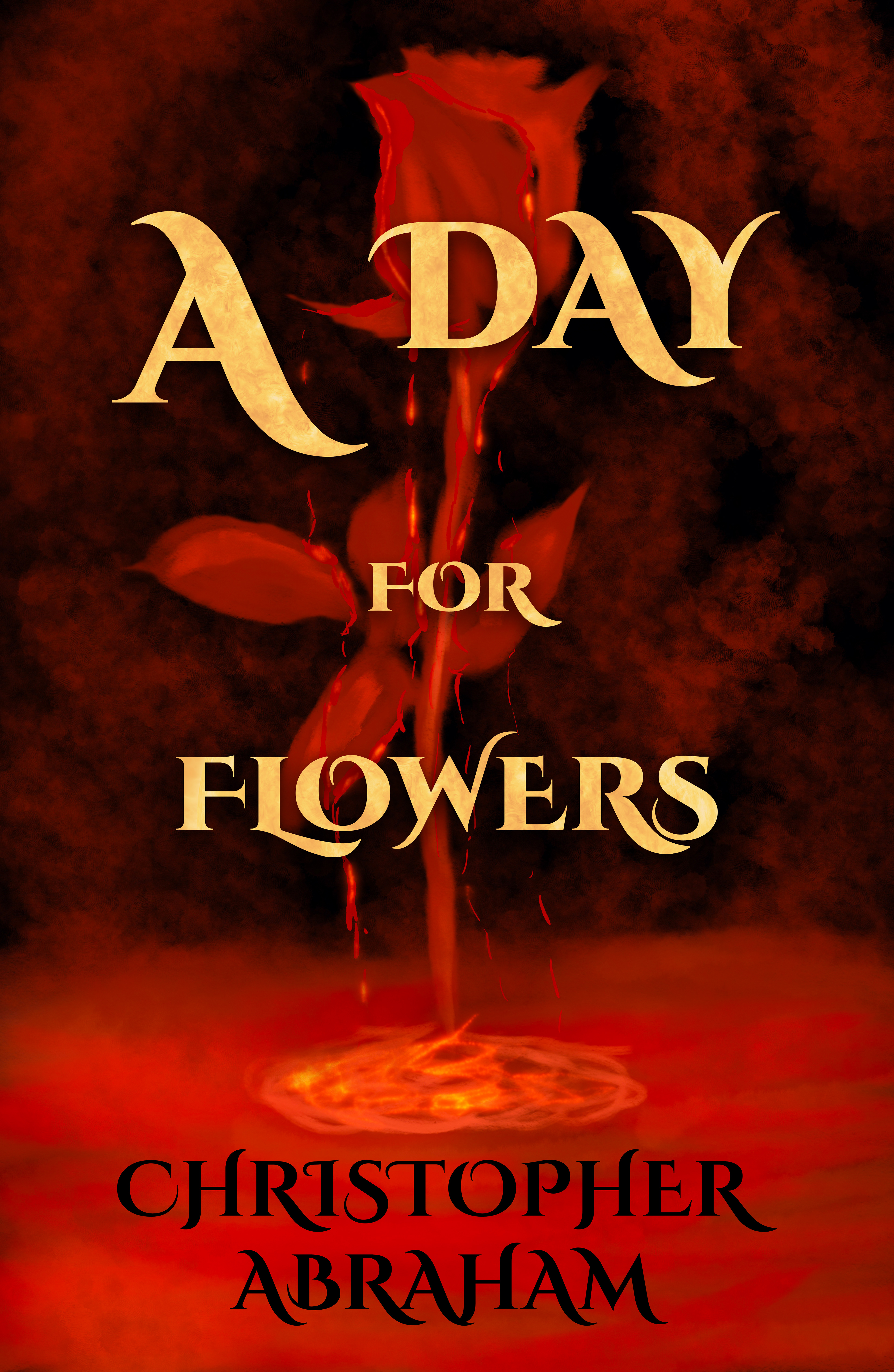
A DAY FOR FLOWERS
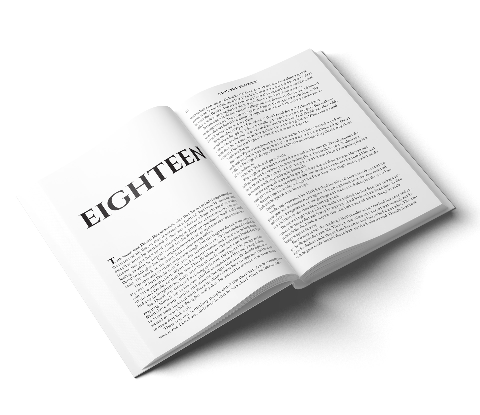
A novella (first draft) that focuses on a satirical take of the zombie genre. When a mutation begins in those who only eat vegetarian or vegan meals, all hell breaks loose and a group of college students band together in hopes of making it out of their town alive.
Origin of Title:
The 'A Day for Flowers' name came from the imagery seen throughout the novella. The initial working title had been 'V Day' to poke fun at Valentine's Day (the events take place on February 14th) however that was replaced when it felt more thematically accurate to focus on the creatures.
Design Concept:
I took the opportunity to create the cover by utilizing Procreate. The meaning behind the illustration is that, while it is a rose, and the title does say 'A Day for Flowers' the red and dark colour scheme speaks the opposite of a cheerful read. It also distinguishes it from a book that focuses on flowers, and sets it up for a fiction read.
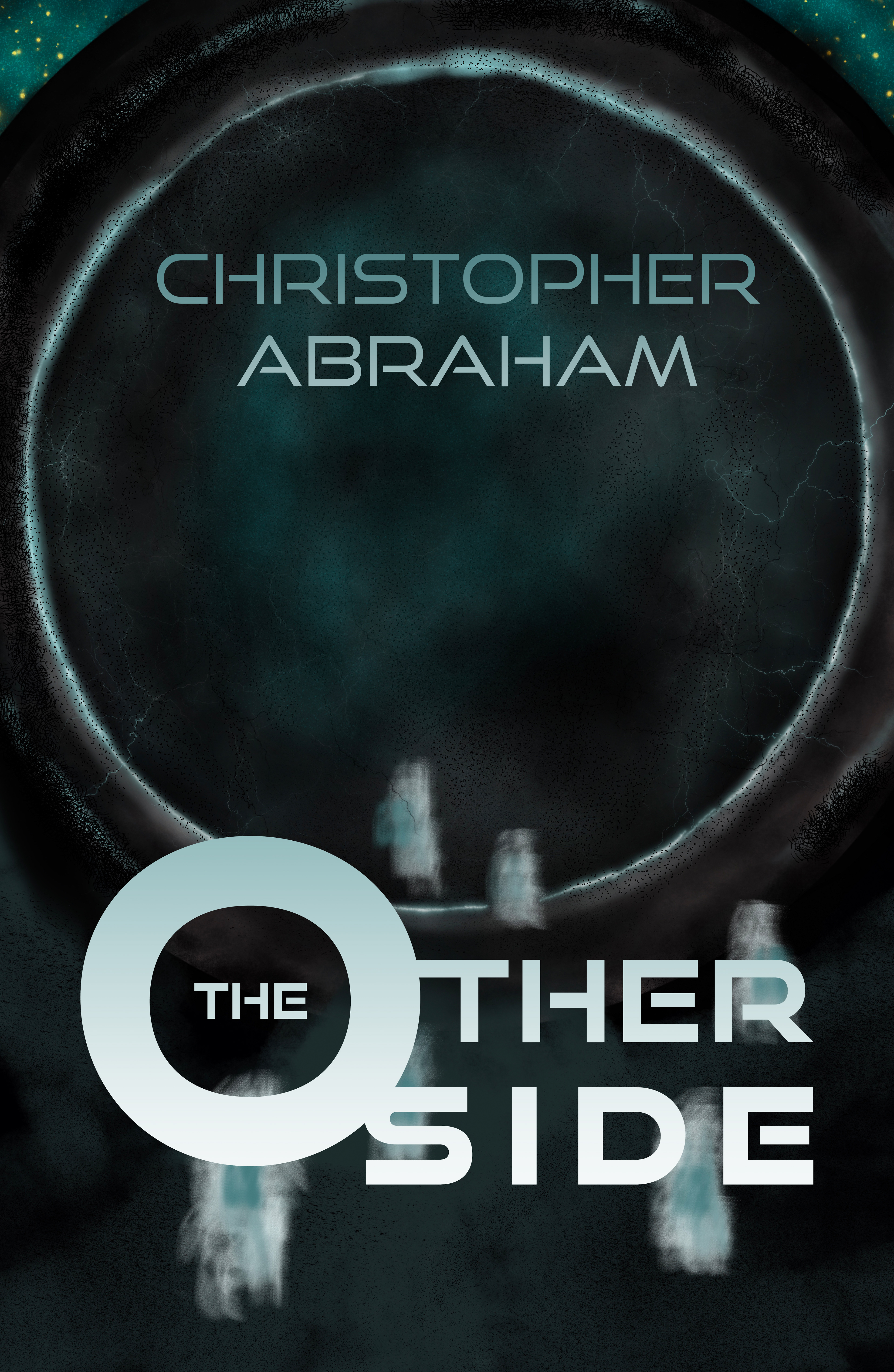
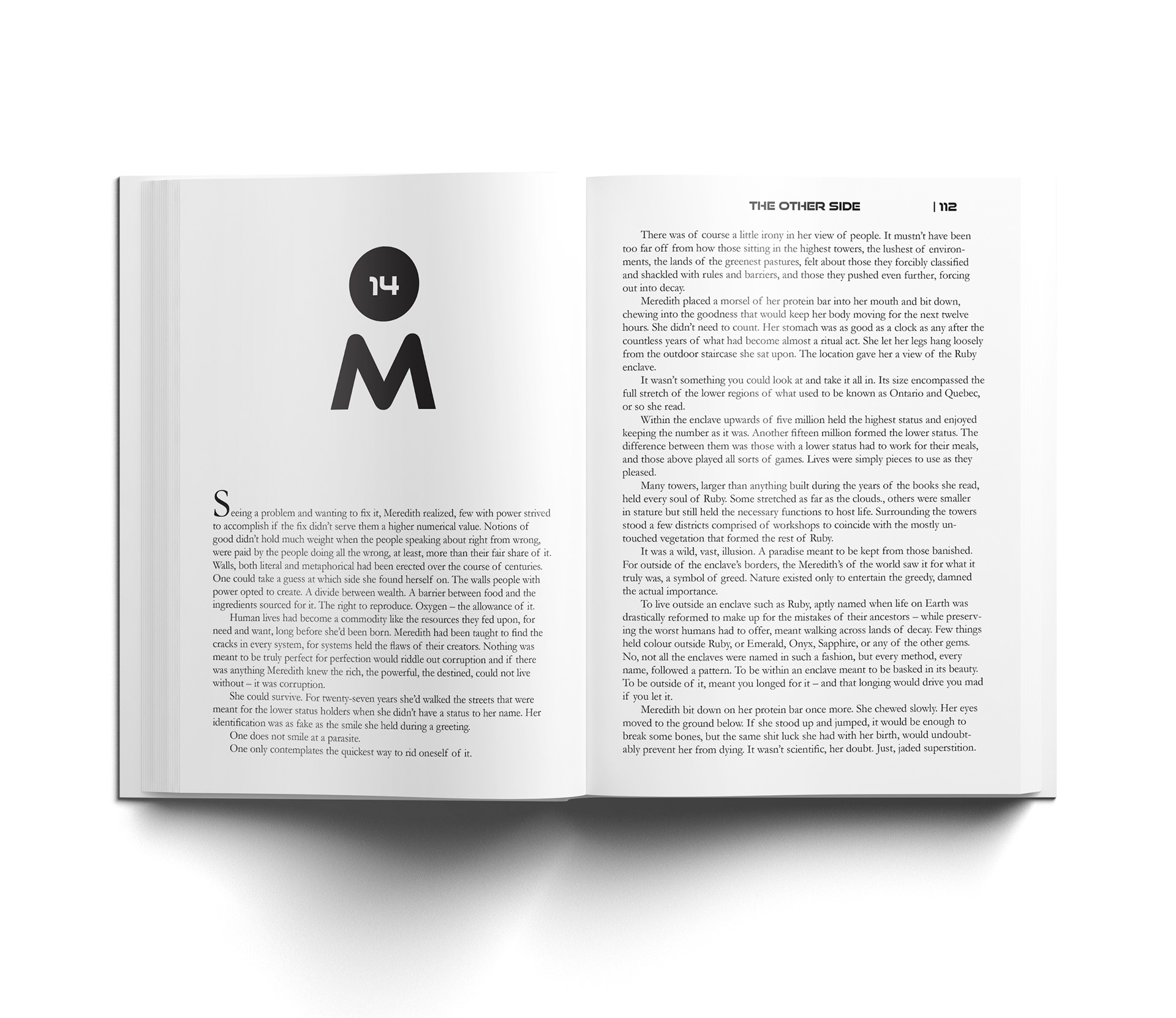
THE OTHER SIDE
A novel I wrote (first draft) that depicts future Earth. The old world is gone, replaced by large enclaves that have plentiful resources, each which is surrounded by a wasteland of land long since stripped of everything. Way of life is kept orderly, by sending convicts through a portal discovered fifty years prior.
Origin of Title:
The original title was 'Mother's Second Face' but that I found proved to be a tad convoluted and would only be understood by those who finished the story. The Other Side, on the other hand, paints a perfect description of the focus of the story. Those, the convicts, who cross the portal to the other version of Earth.
Design Concept:
With a cool and dark colour scheme, the silhouettes showcase people crossing over. While they might be the story, it's the portal and it's depths that take centre stage. The goal was to draw the eye into the emptiness that awaits, and then to look at the title and those who are making the transition over.
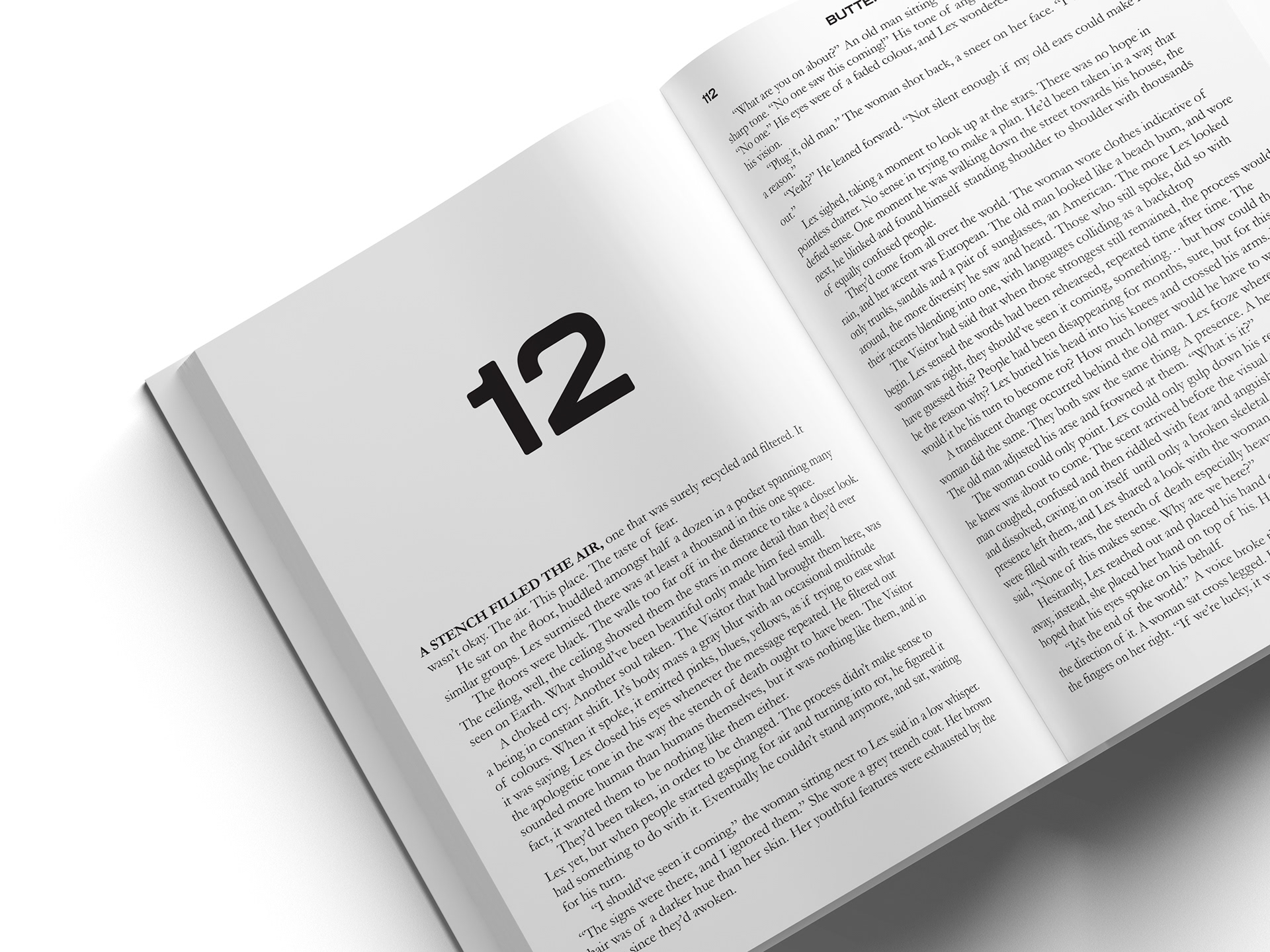
BUTTERFLY 327
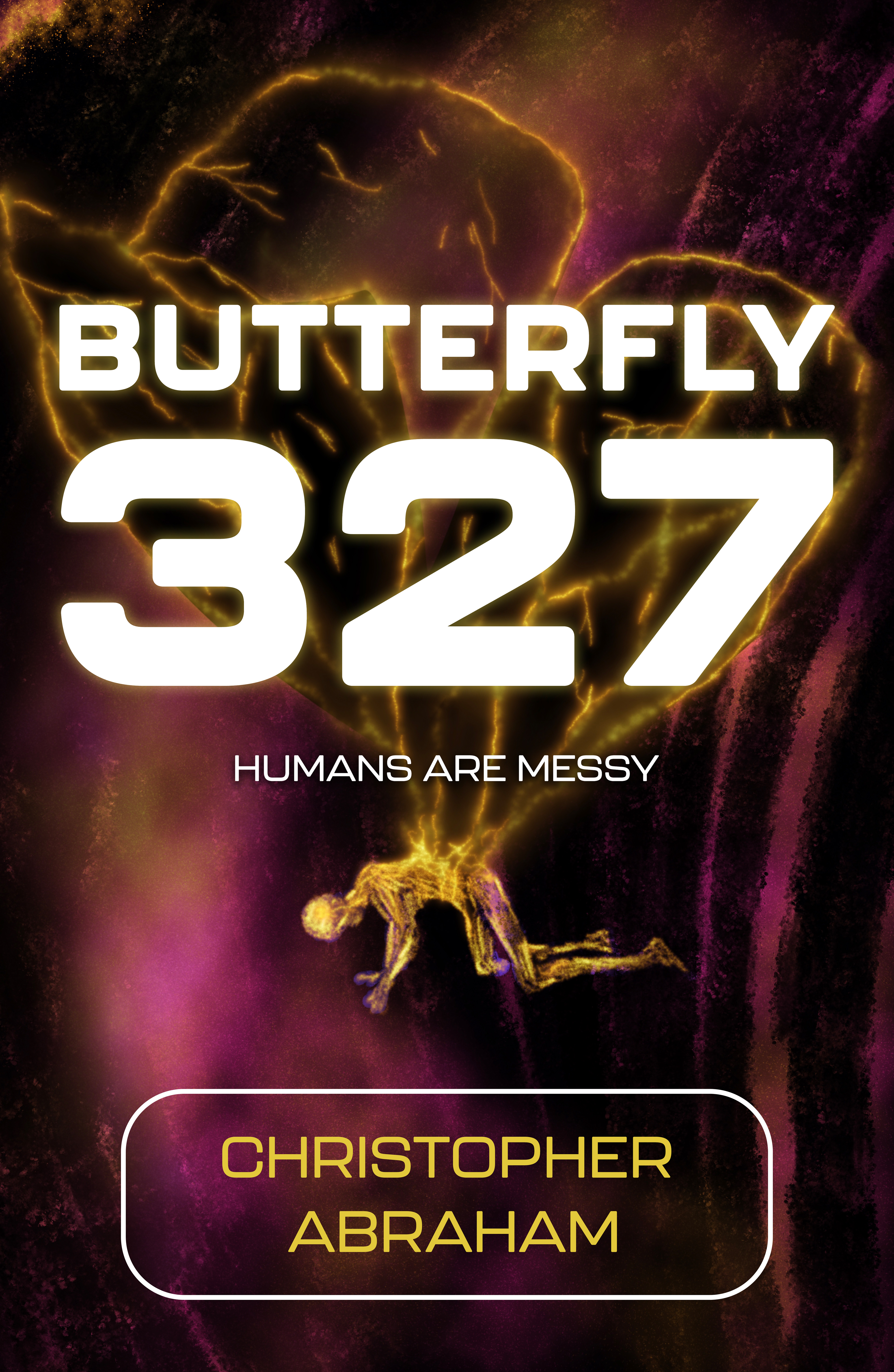
A novella (idea stage) that focuses on an extraterrestrial life form that claims to come in peace. However, its methods are intrusive, dangerous and life altering. It claims that in order for humanity to survive, it must evolve. It is of eerie timing that Earth itself is suffering a collapse of its ecosystem.
Origin of Title:
To become something else, more than human. The title presents the focal point of that evolution (from human, to cocoon, to butterfly), with the number being the focus of the individual.
Design Concept:
The figure is on their knees and hands, pulled into the strange extension of themselves as a process of change takes place. As dangerous as that change is, the visitor believes humans are messy to begin with.
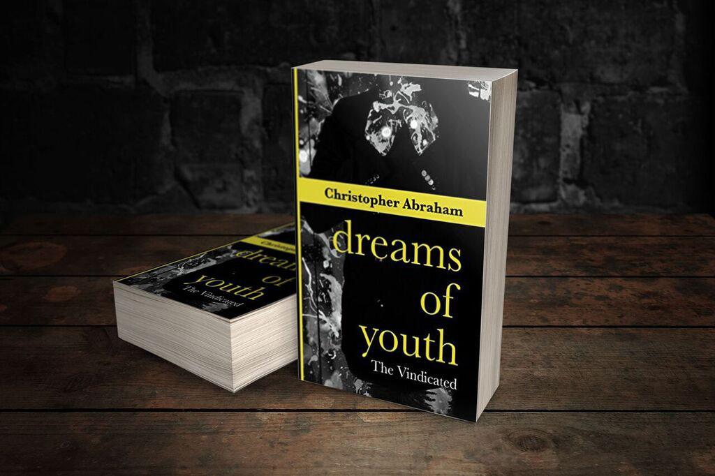
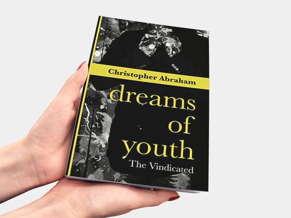
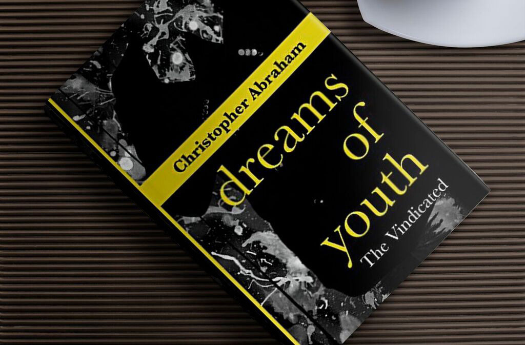
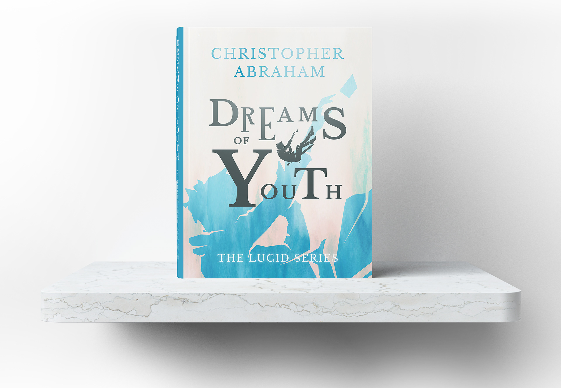
DREAMS OF YOUTH
THE NEW LOOK (2021)
A story that has lived within me since I was fourteen. It's been written, and rewritten, conceptually changed and altered, improved upon and dreamt about. I've returned to this story whenever my writing craft has grown. After learning how to self publish in 2015, I pulled back from trying to sell my stories, and returned to improving upon them. Since that time I have written novellas and novels focused on other stories. However, Dreams of Youth and its seven sequels, will always be my main focus when it comes to my dreams of being a published author, Indie or Traditionally.
Origin of Title:
The title holds two meanings. The first, was that when I created this story, I was fourteen years old. It was, would be, and is, the story that I will carry and tell until my time on this planet is gone. The second ties into the story itself. Dreams play a huge role in the narrative structure, and that story point is presented in the title.
Design Concept:
With this new take of the cover, I used Photoshop and Illustrator. Illustrator to, well, illustrate the font and make adjustments to it. Photoshop to create the layers and filter effect. The silhouette itself was a sourced asset I then changed to my liking. It just so happened to fit what I envisioned perfectly, of a young man falling. I added the small rectangle to depict a photograph, as that is a symbolic representation of the first chapter and what takes place.
The colour scheme is light and blue, an opposite feeling to what I made in 2015. While the story has largely remained the same, how I view it and wish to depict it has changed significantly. There is hope in the despair.
THE OLD LOOK (2015)
Where it began. This, as well as the new look were created by myself. Having the chance to truly combine both passions of writing and design is an awesome experience.