
INTRODUCTION
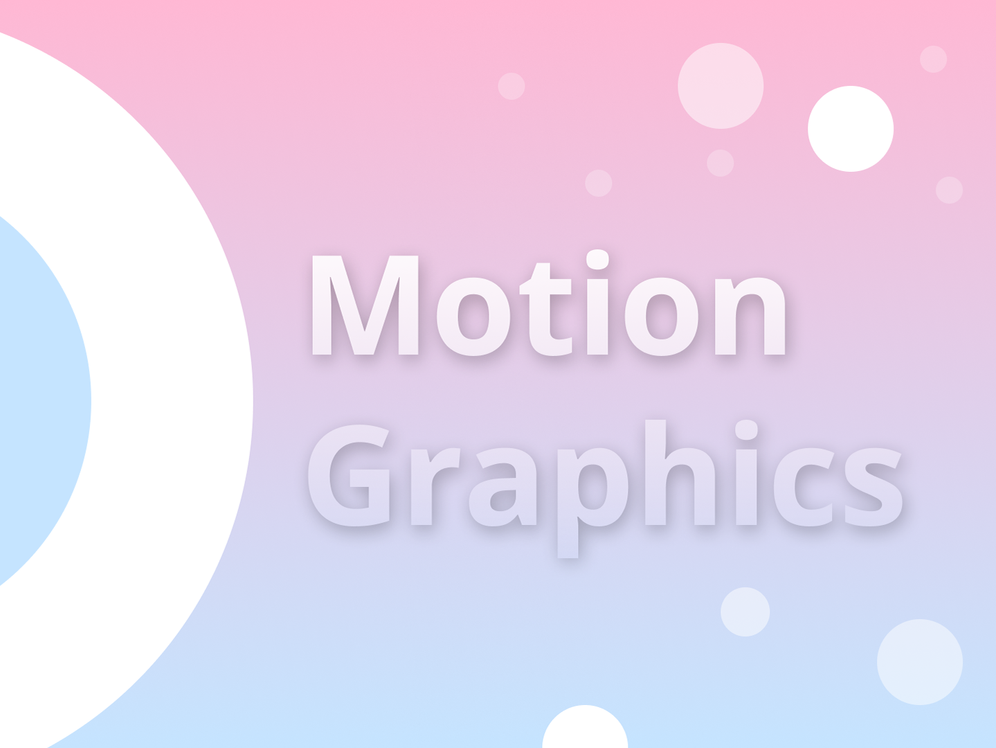
Writing is as much a part of my daily life as design is. A fellow creator of mine who's very much an artist, has been creating various pieces over the past few years. In recent months I've gone about writing art descriptions for his pieces. Below are four instances where I've taken the words used for his art, based the colour scheme from those pieces and went about creating stylistic text focused creations. Each piece is formed only of shape, colour and the most important factor, text.
The idea is for the eye to move where it wishes to go. There is no real important start point (I know, taboo), however there is a hierarchy if the eye wishes to follow it. Just like his art pieces, the various elements cry out for one's attention. Where imagery might've been, now rests the stripped wording.
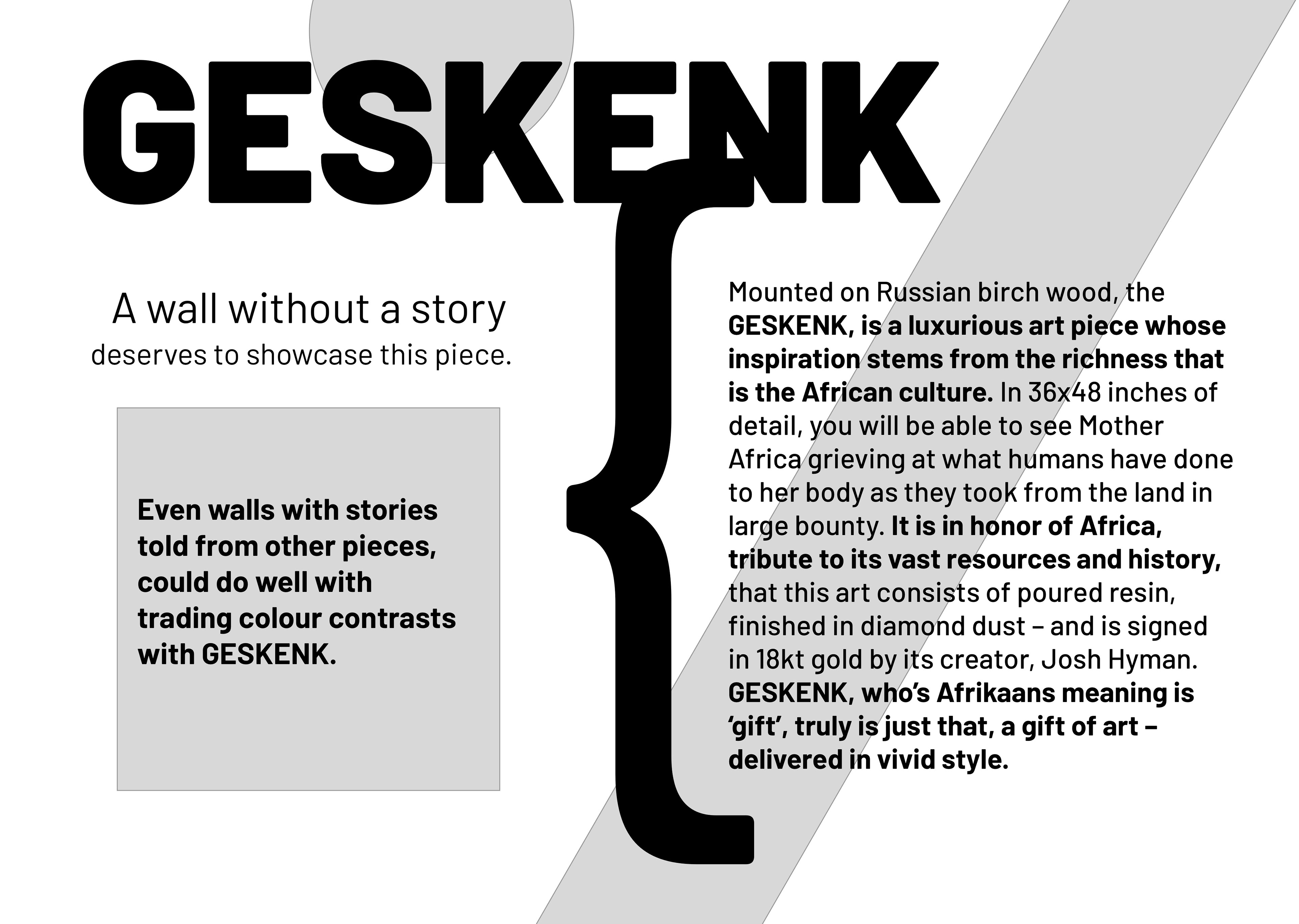
GESKENK
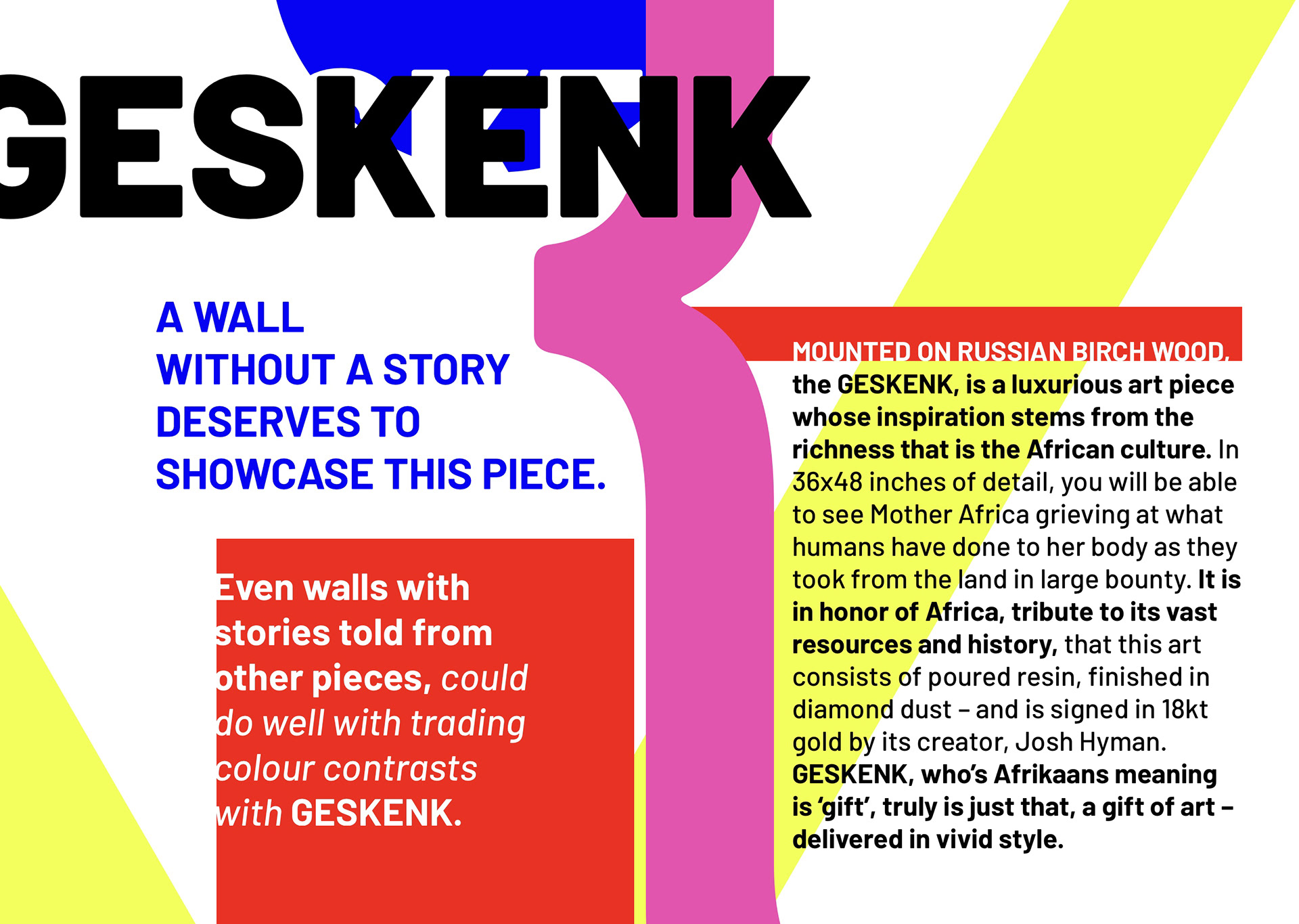
Colour Usage: #E83324 (red), #F2FF5D (yellow), #E255AF (pink), #0603F3 (blue)
Font Usage: Barlow (Black, Bold, Regular)
Written for, Inspired by: https://www.thedezinr.com/store/t20302rvxljp1moeob41dfkc5hq
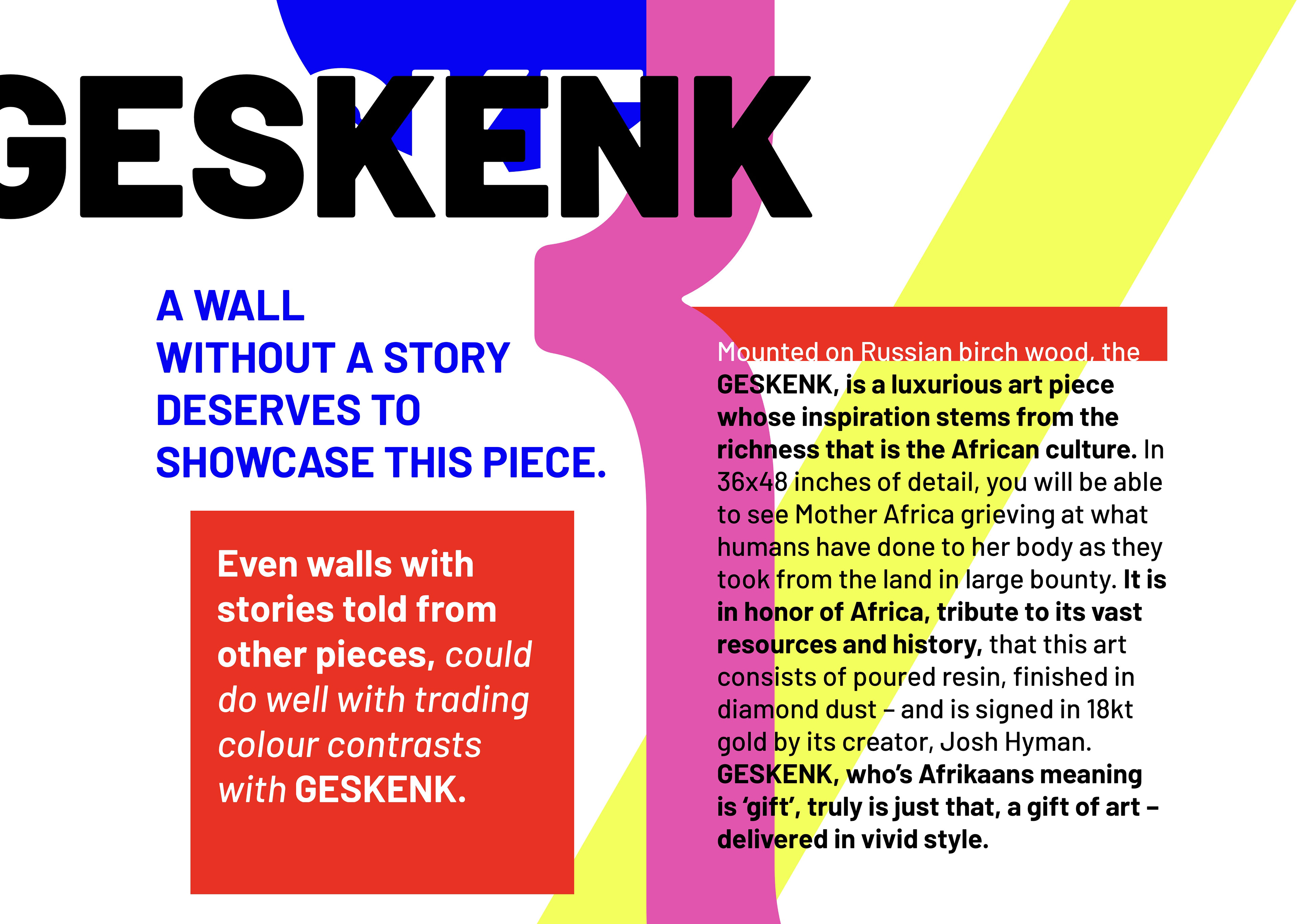
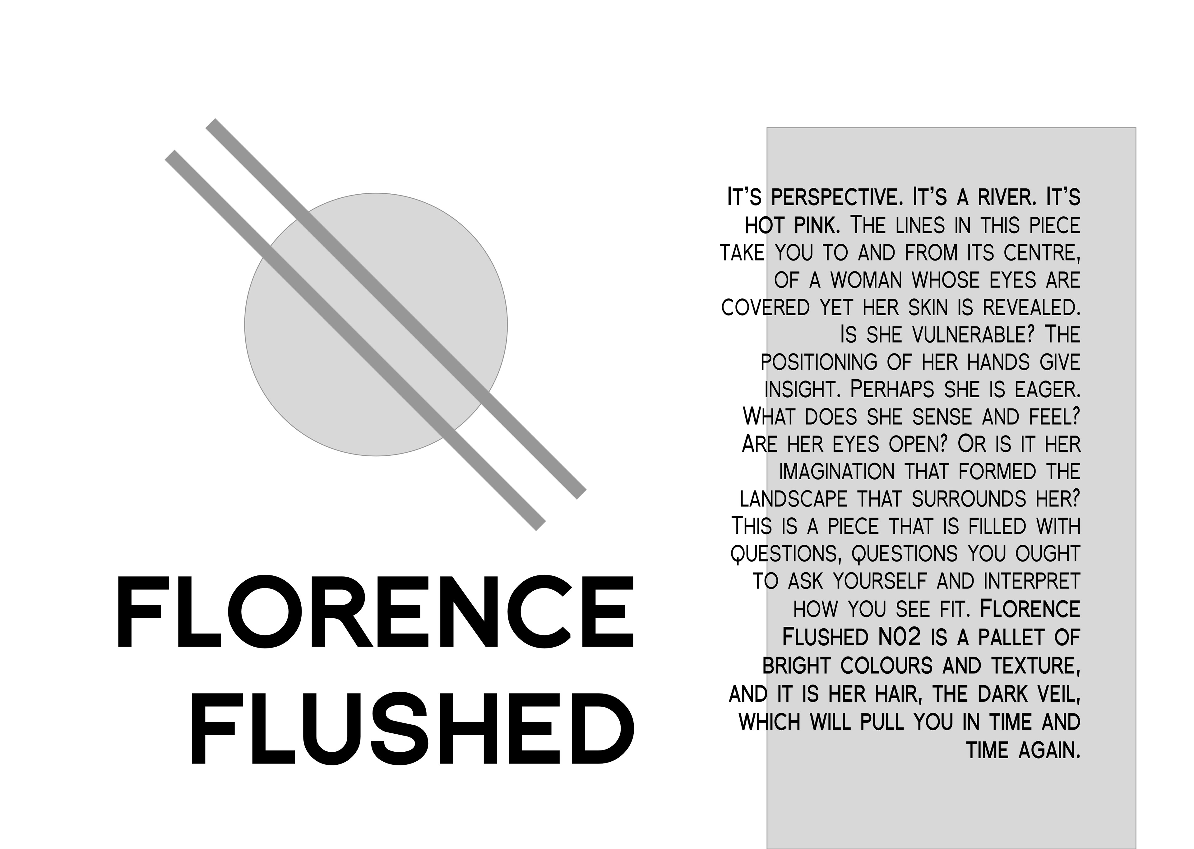
EARLY DESIGN, WIREFRAME
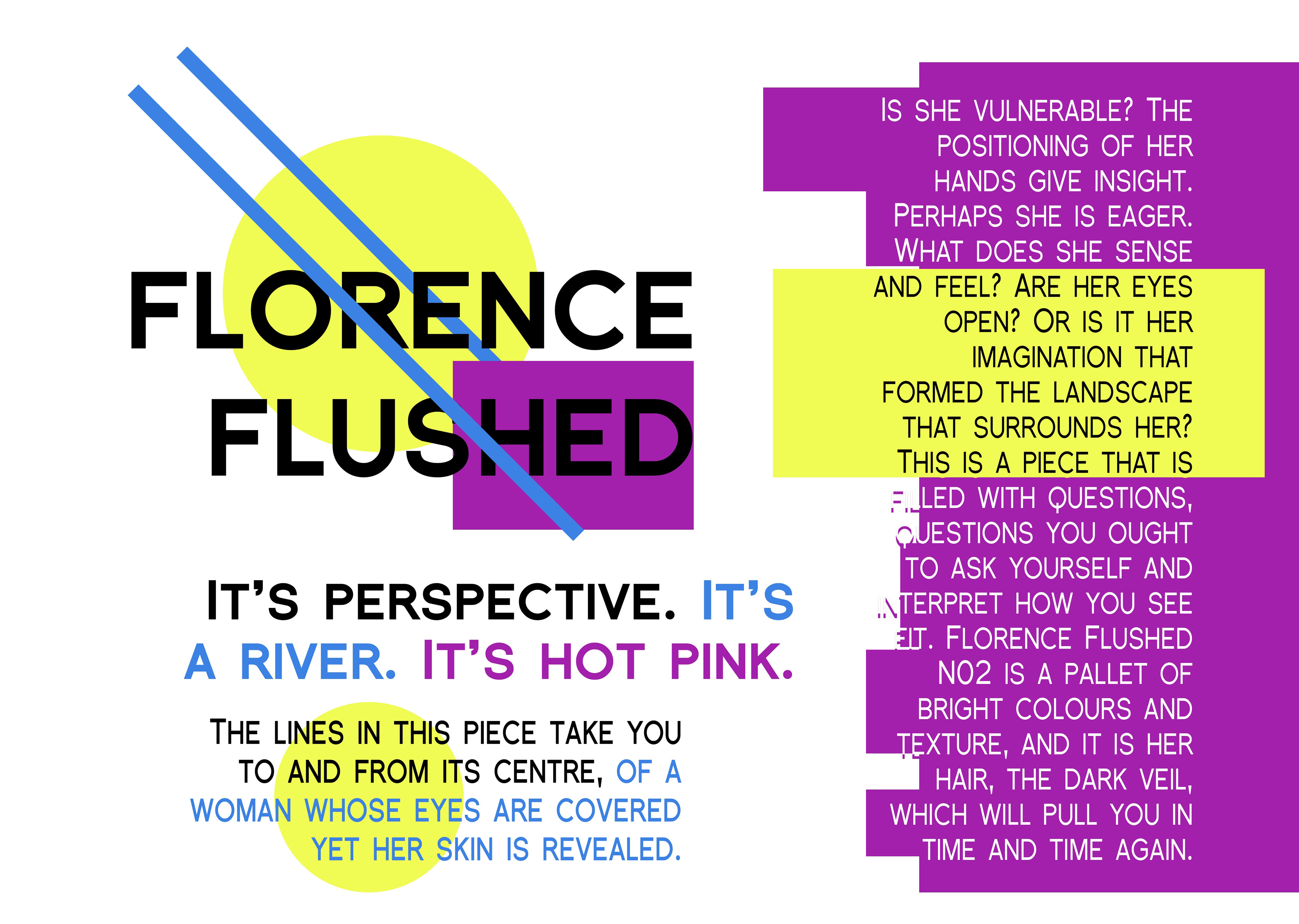
FLORENCE FLUSHED
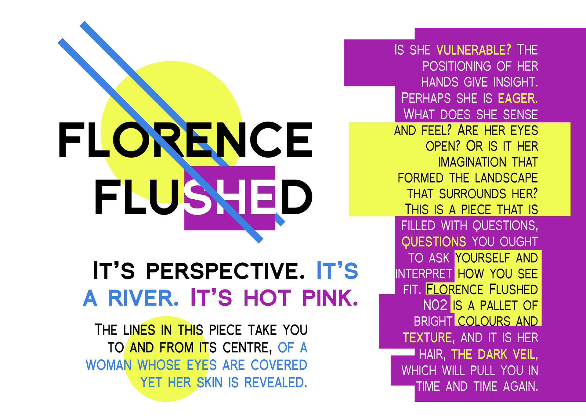
Colour Usage: #3C81E4 (blue), #F0FC54 (yellow), #A220AB (pink)
Font Usage: Florencesans SC, COND (Black, Bold, Regular)
Written for, Inspired by: https://www.thedezinr.com/store/j20313mwr5cl5jjbrnuwz8rvkrq
EARLY DESIGN, WIREFRAME
NEBULIS CENTUARI
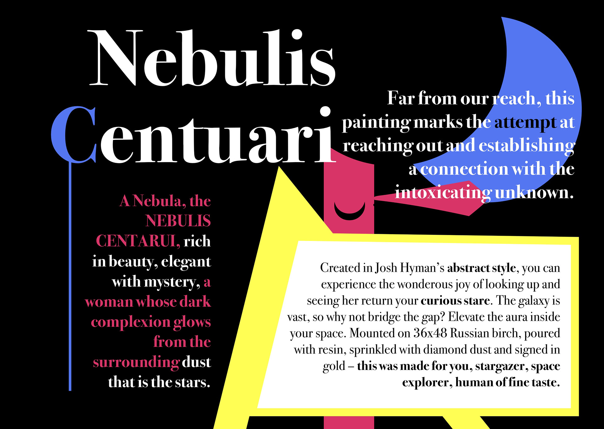
Colour Usage: #5476F0 (blue), #D93467 (pink), #FFFE54 (yellow)
Font Usage: Bodoni 72
Written for, Inspired by: https://www.thedezinr.com/store/k20313ukpkhramsh3fcsmgfrt8d
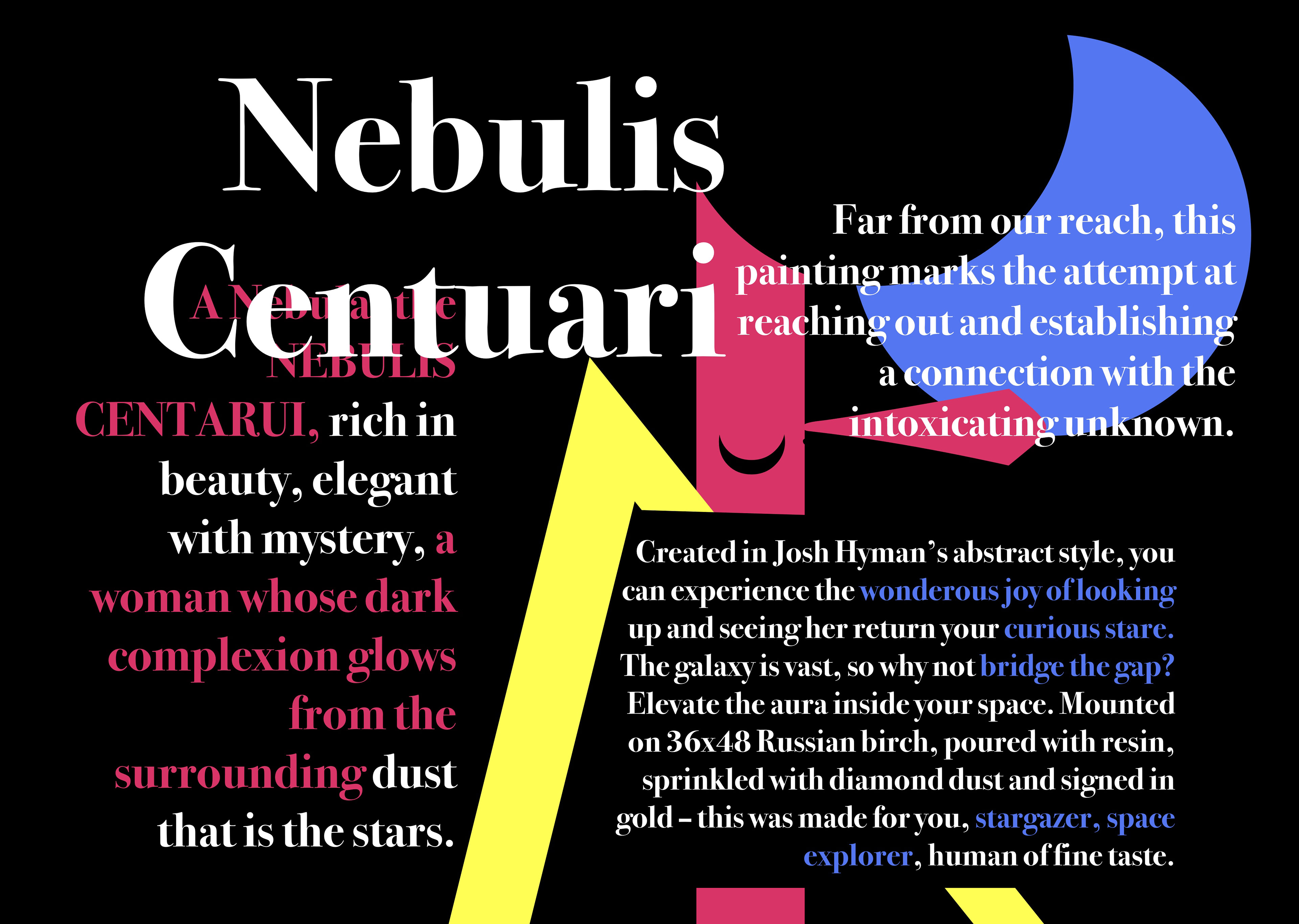
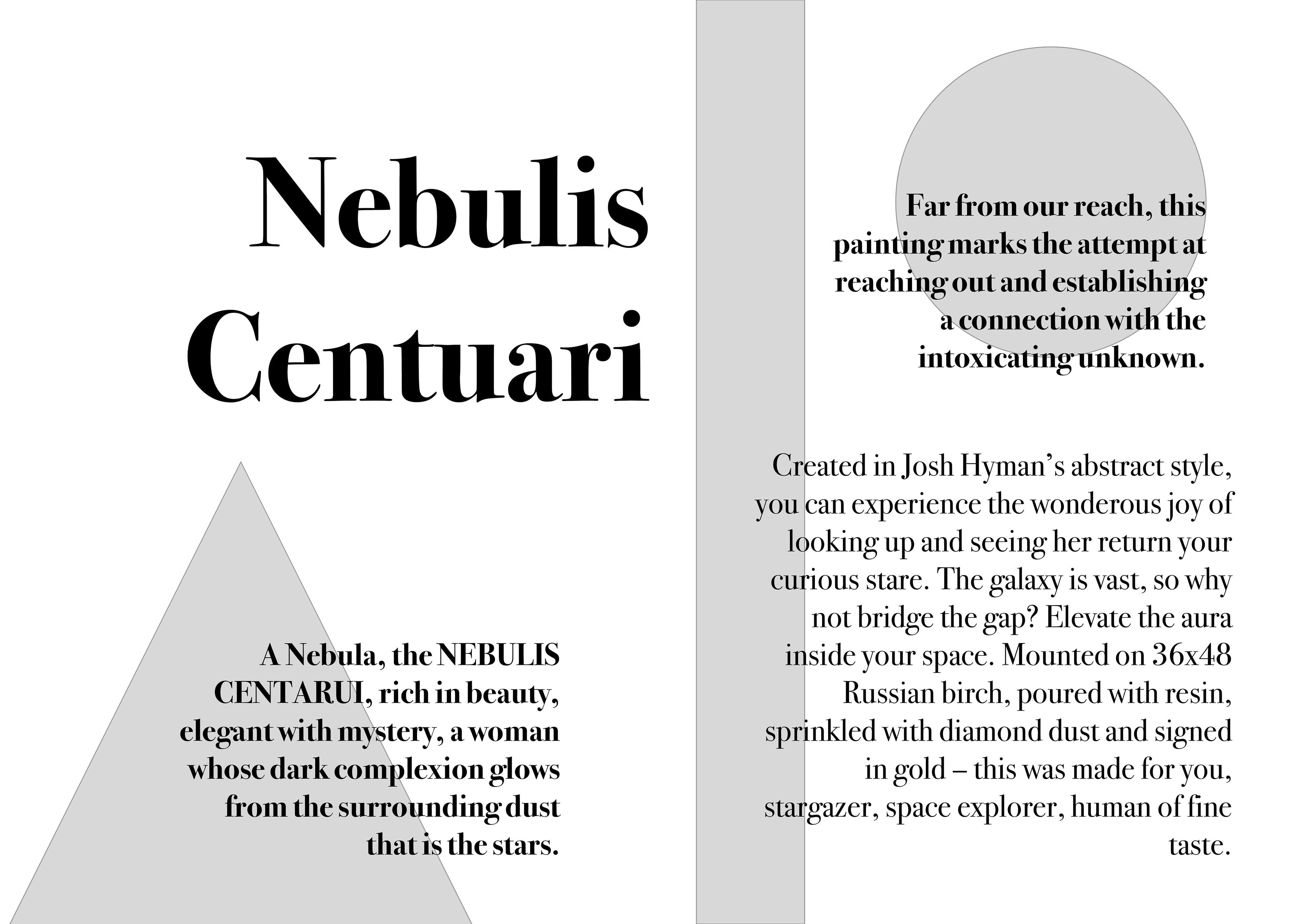
EARLY DESIGN, WIREFRAME
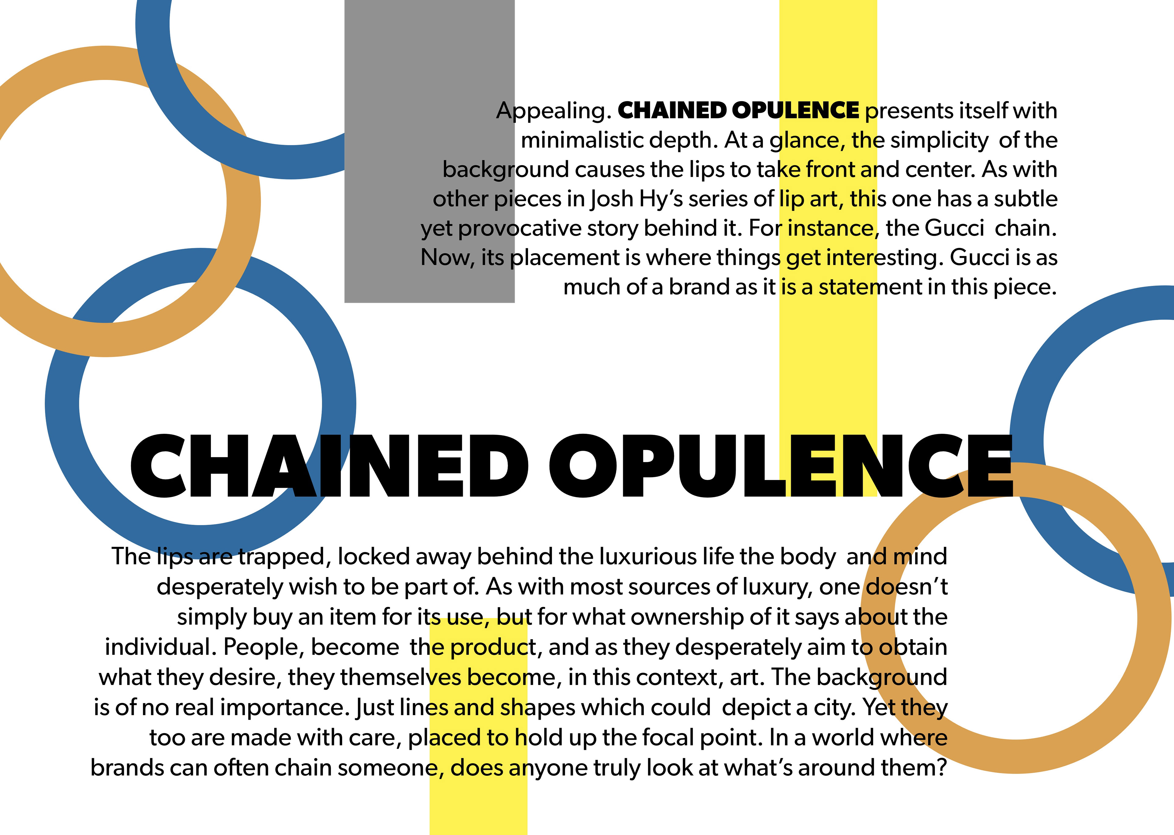
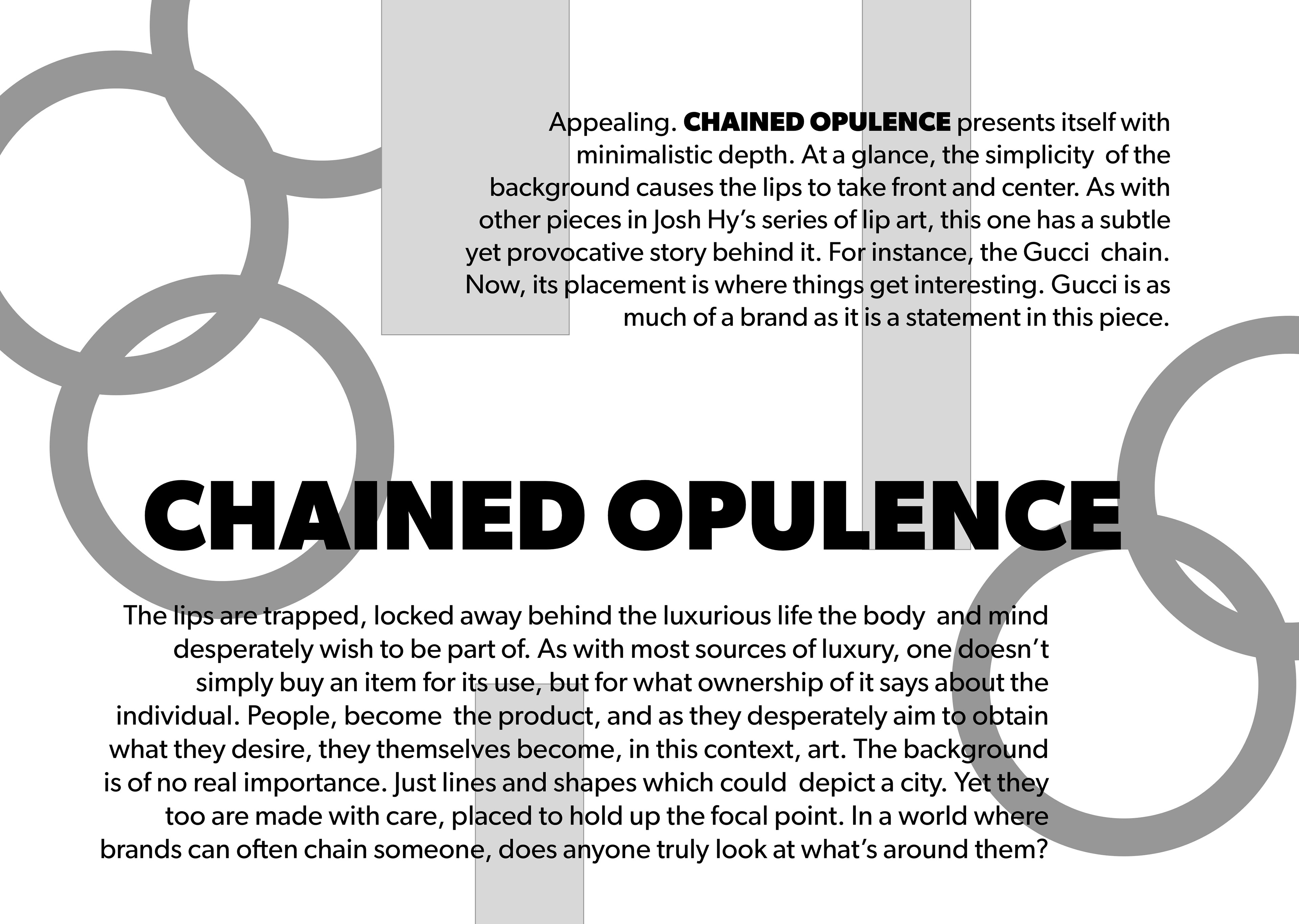
CHAINED OPULENCE
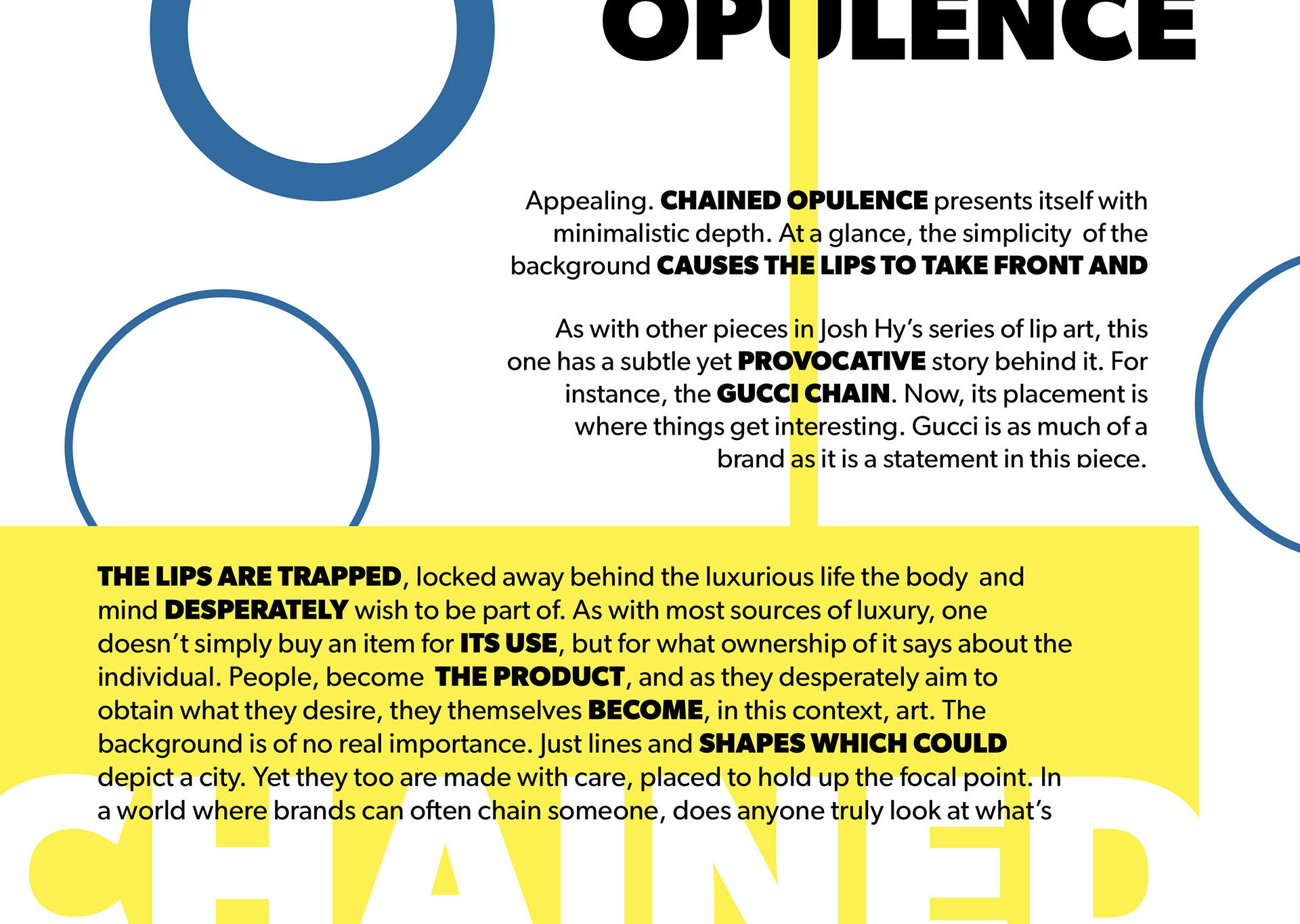
Colour Usage: #316B9F (blue), #FCF150 (yellow)
Font Usage: Gibson
Written for, Inspired by: https://www.thedezinr.com/store/chainedopulence
EARLY DESIGN, WIREFRAME