
INTRODUCTION
Problem:
In previous years the website used for tributes was lacking. Be it the code used getting outdated/lost, or the overall design direction having no clear focus, to remedy this, a new design flow was needed.
Solution:
By focusing in on the MADD colours and comparing what the client does with their personal website, I went about basing the landing page (and its sister pages) with the main focus of being minimalistic and clean.
Programs Used: Sketch
* NOTE: Images used are stock photography. Actual victims are not showcased within this presentation.
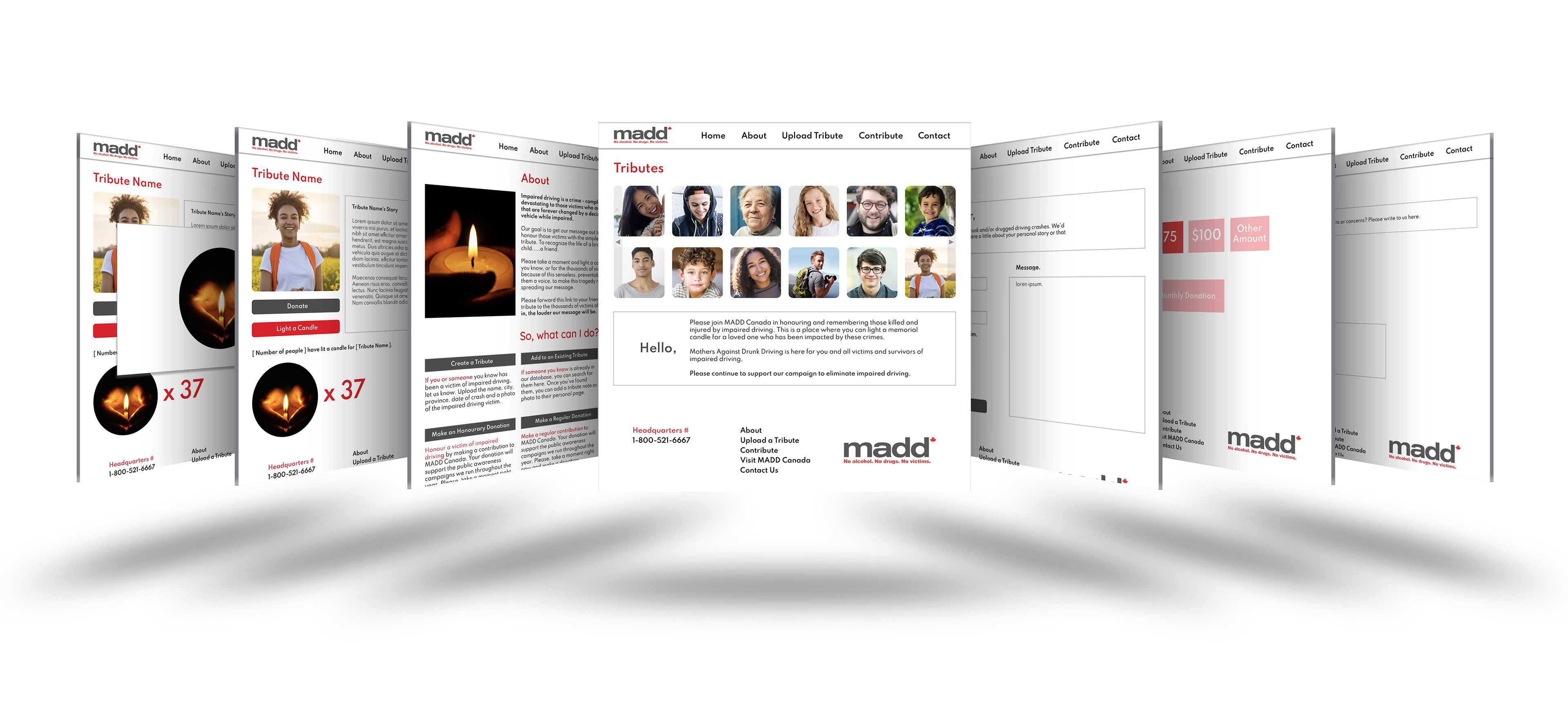
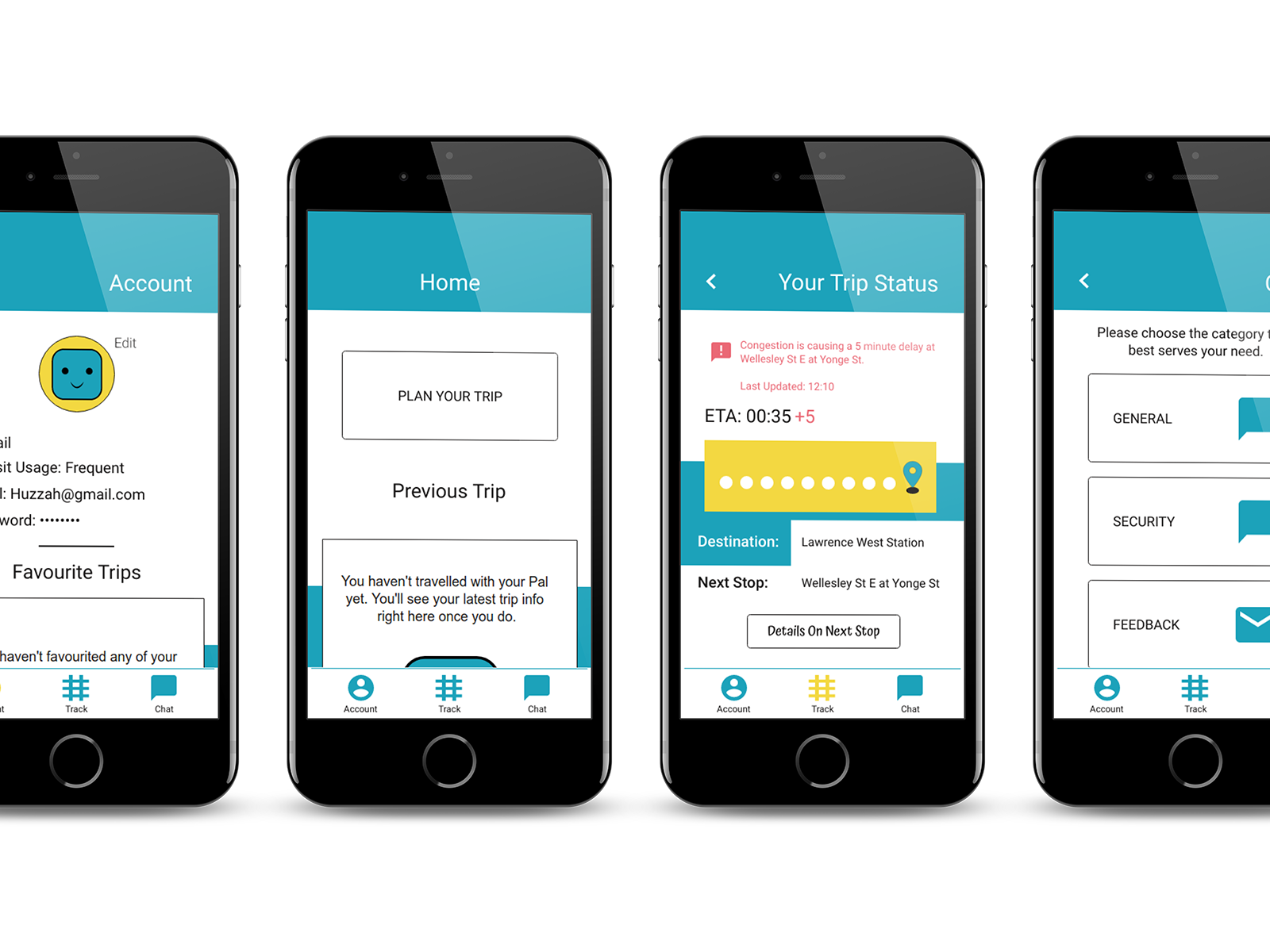
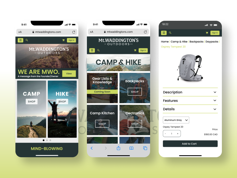
HOME PAGE
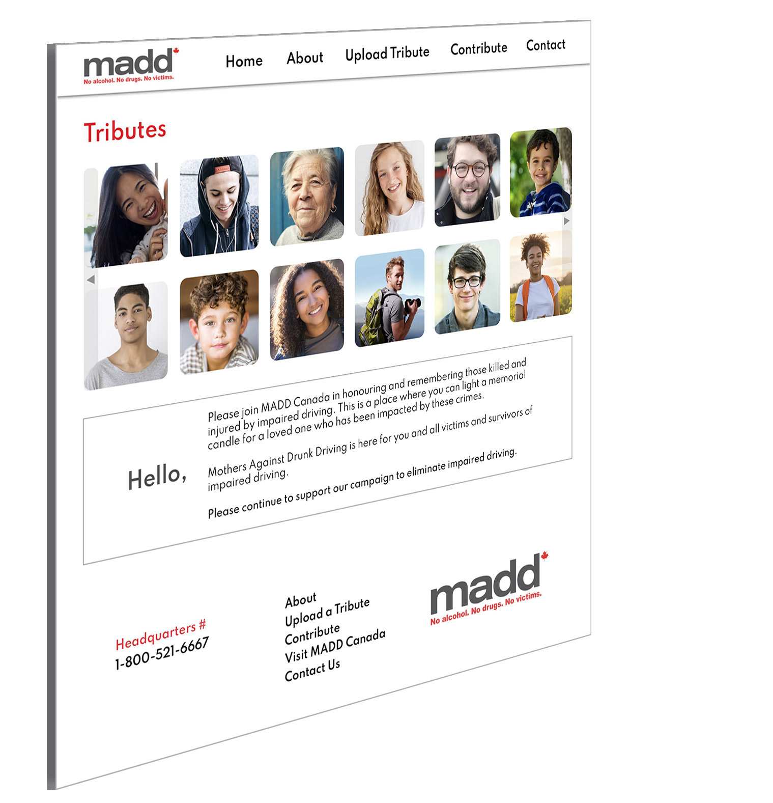
The initial landing page and primary focus of the MADD awareness campaign. A tribute to those who lost their lives during the result of someone driving under the influence (be it drugs or alcohol).
Note: Images shown aren't the victims themselves, however they do portray the age group.
From here the user can click on one of the tabs, or one of the tribute images themselves. From there they will be able to learn more about the individual by a few words from one of their loved ones.
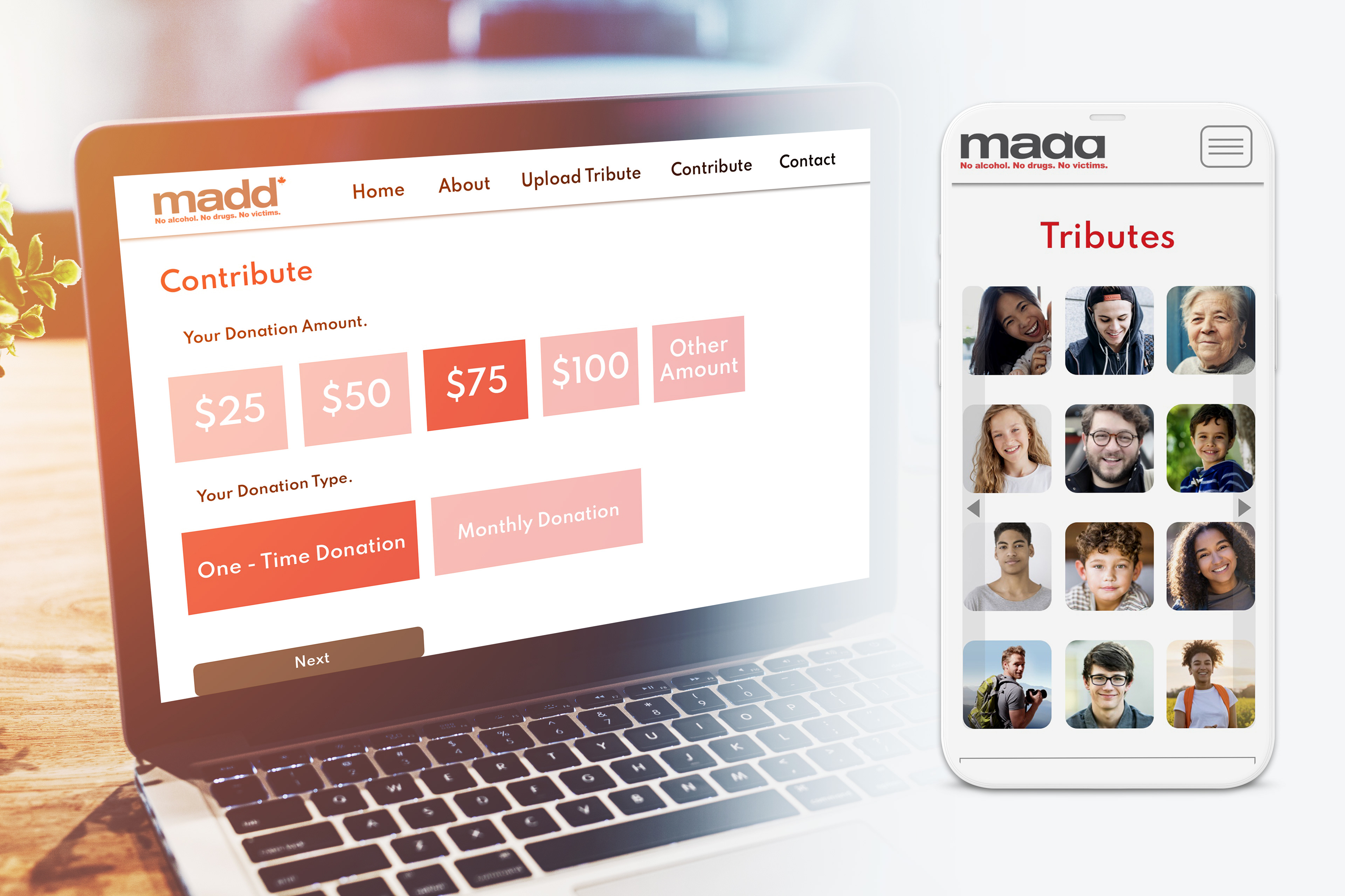
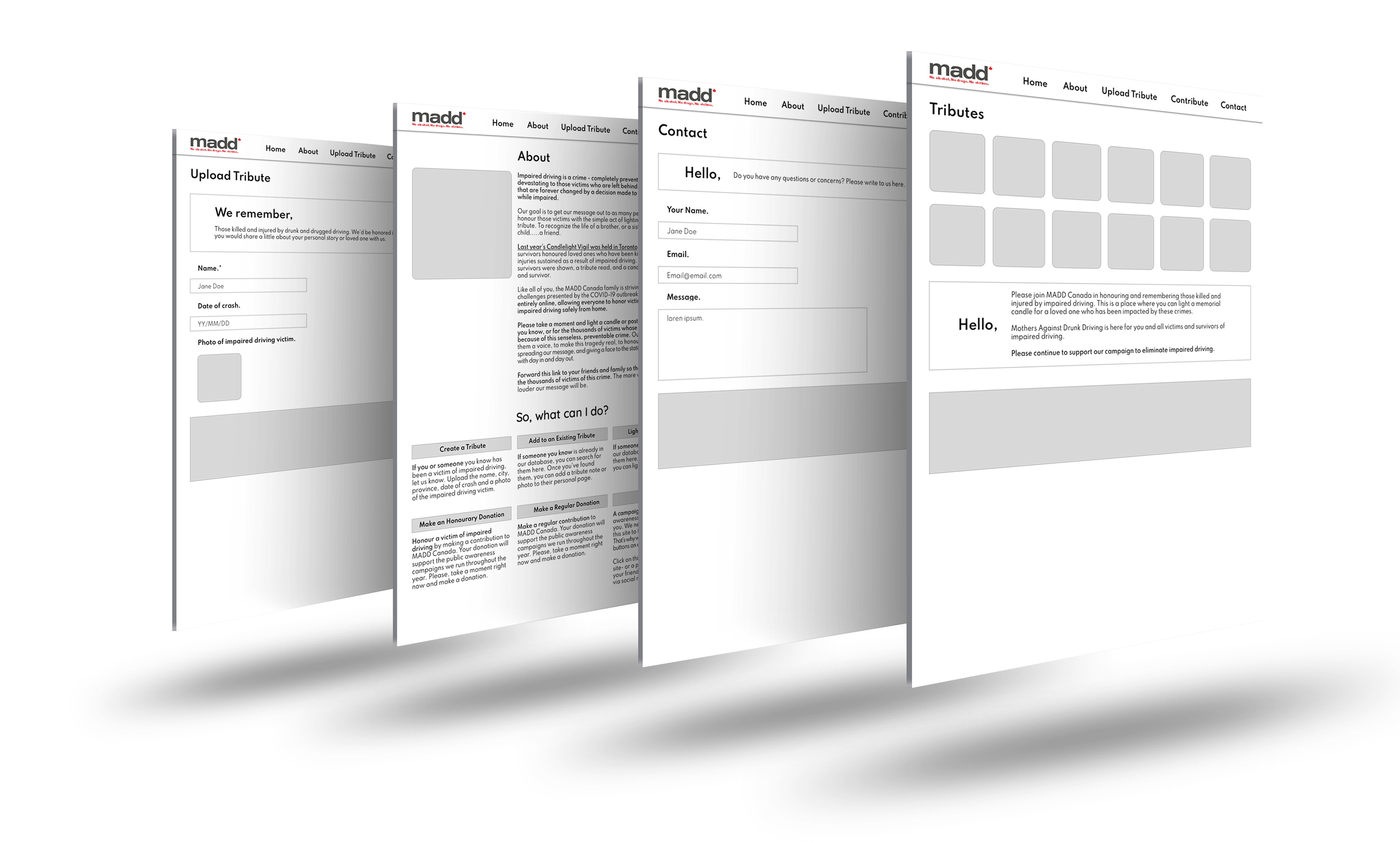
TRIBUTE PAGE
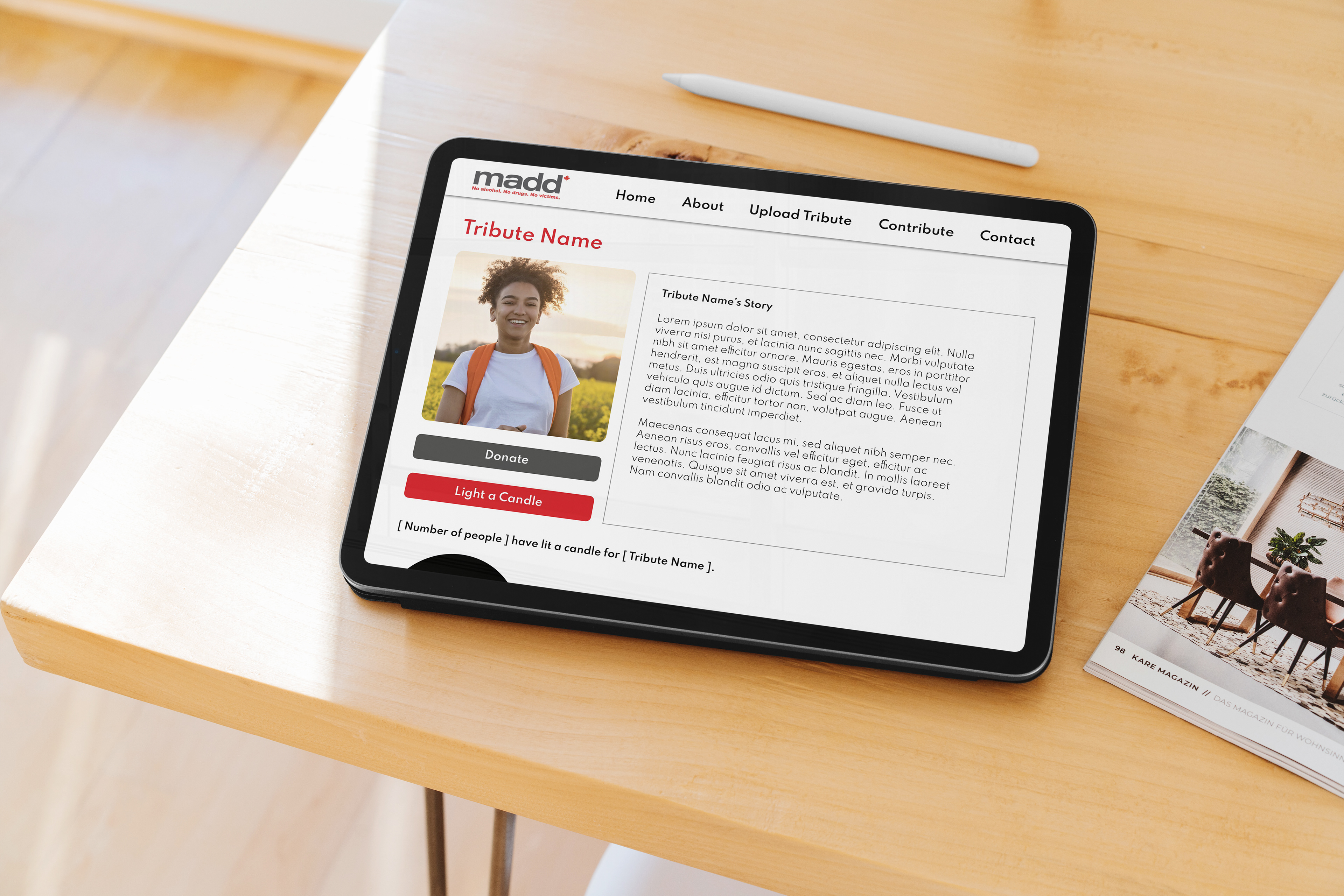
In this instance someone has clicked on one of the tribute photos located on the home page. What pops up is a full scale of the image, alongside text that tells their story. After reading the passage, the user can choose to donate (also accessible via the tab menu) or they can light a candle.
TRIBUTE PAGE & GIFS
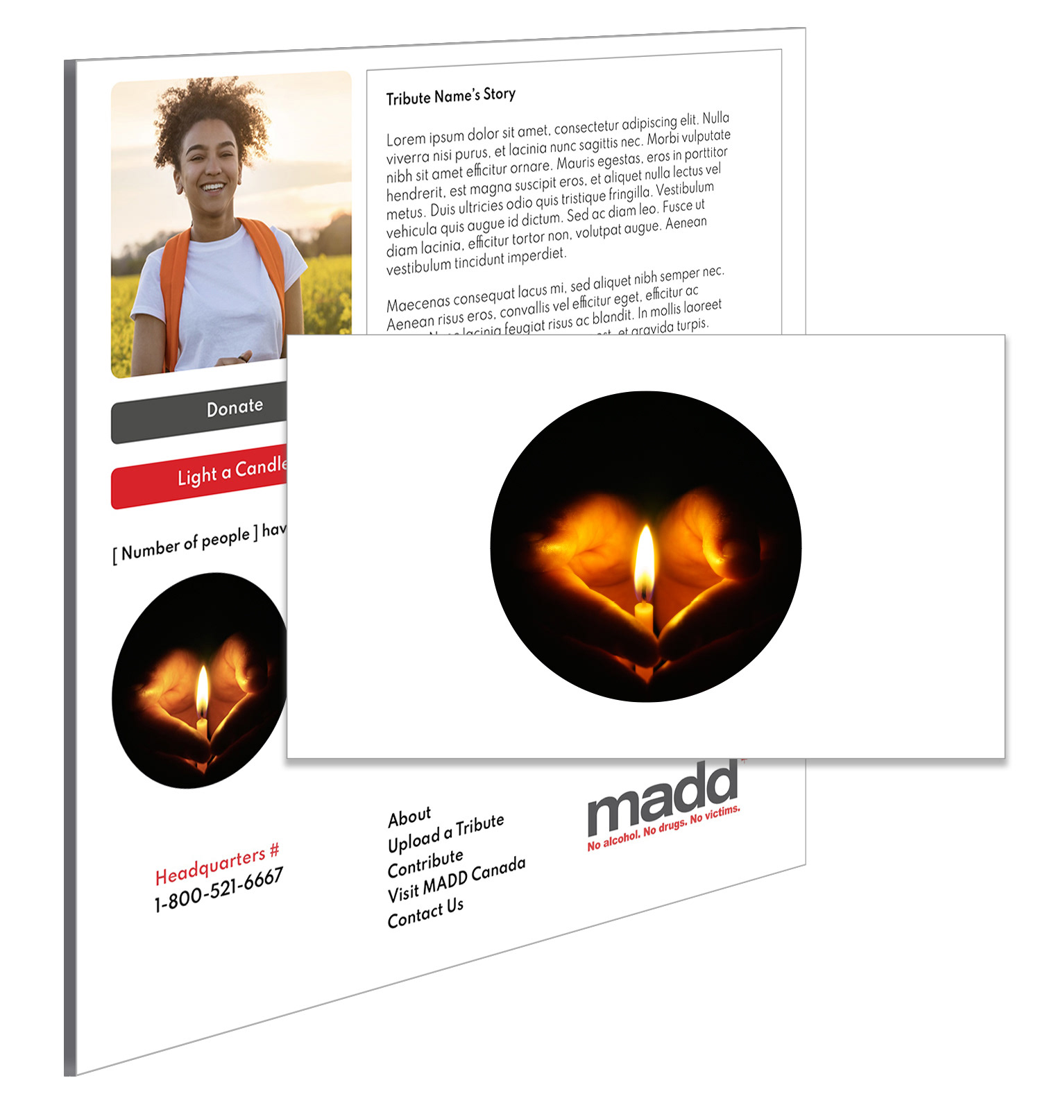
Once choosing to light a candle a gif will appear that shows the candle sprouting a new flame. The number counter beside the home page gif also grows, taking into account your kind gesture to pay tribute.
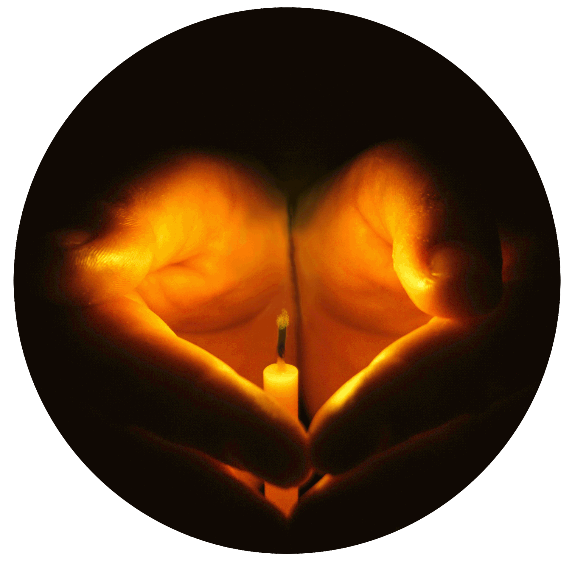
THE GIFS
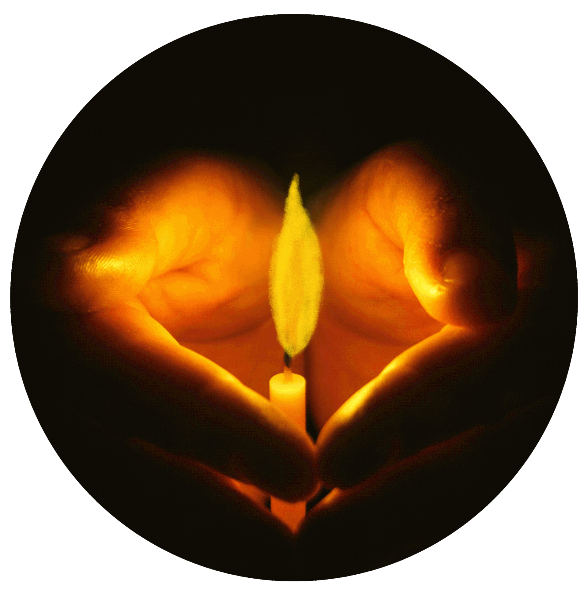
This GIF is always burning. It marks the Vigil and its donation count.
VERSION 01
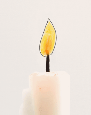
The initial design had a more cartoonish, light feeling. This concept was changed when it started to detract from the heaviness of the circumstances that made these landing pages necessary in the first place. A balance was soon found that after this concept, and the idea of a gif candle was continued.
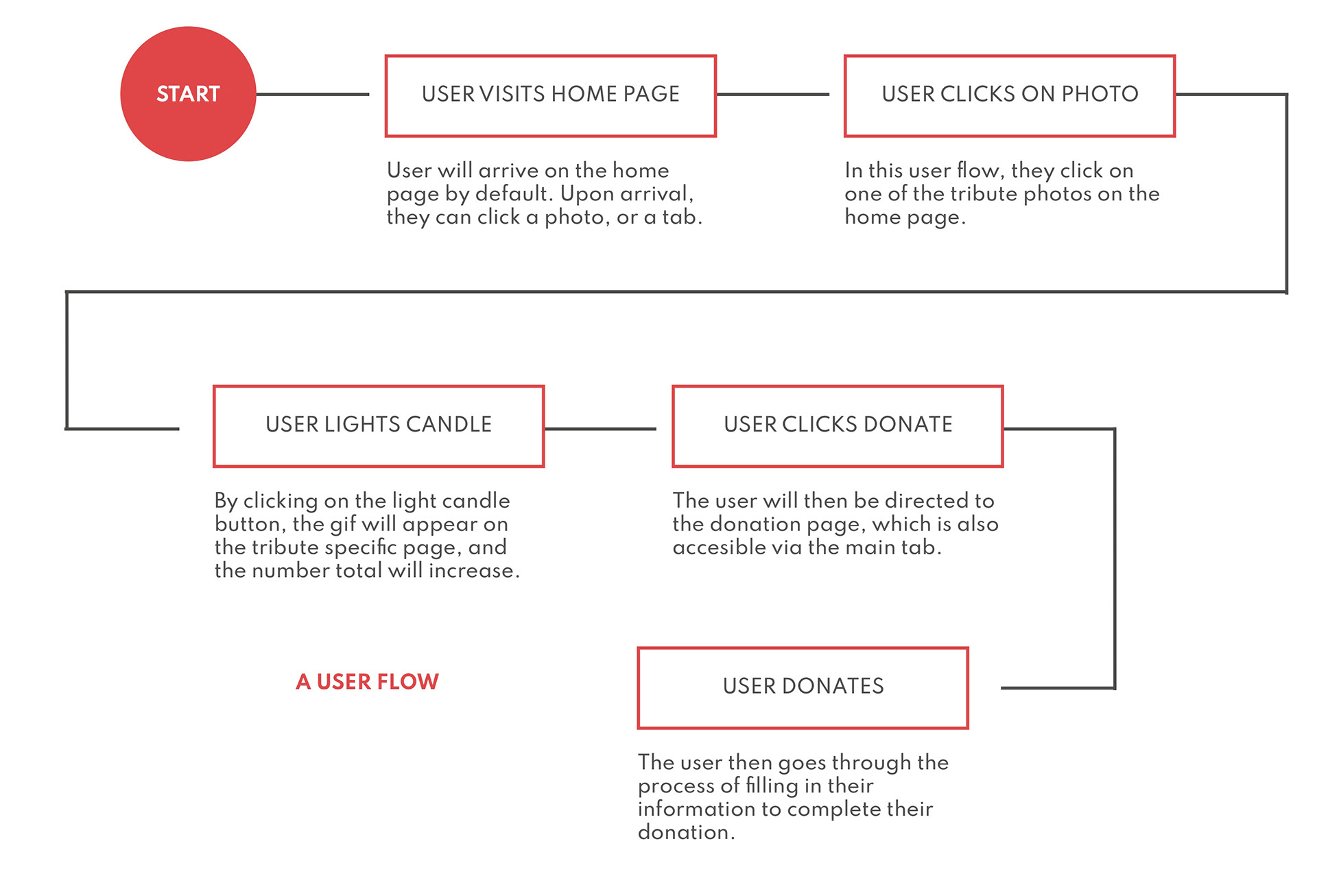
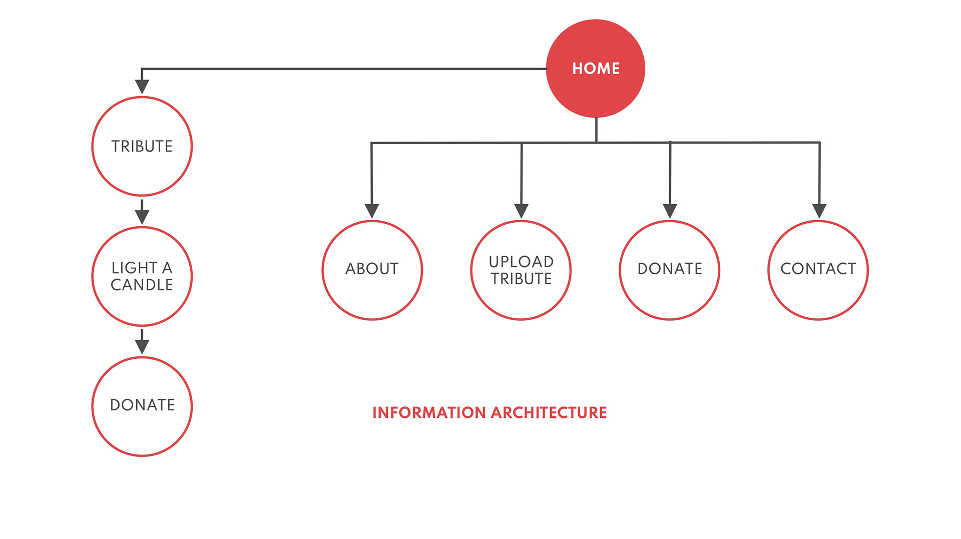
USER FLOW & INFORMATION ARCHITECTURE
WIREFRAMING
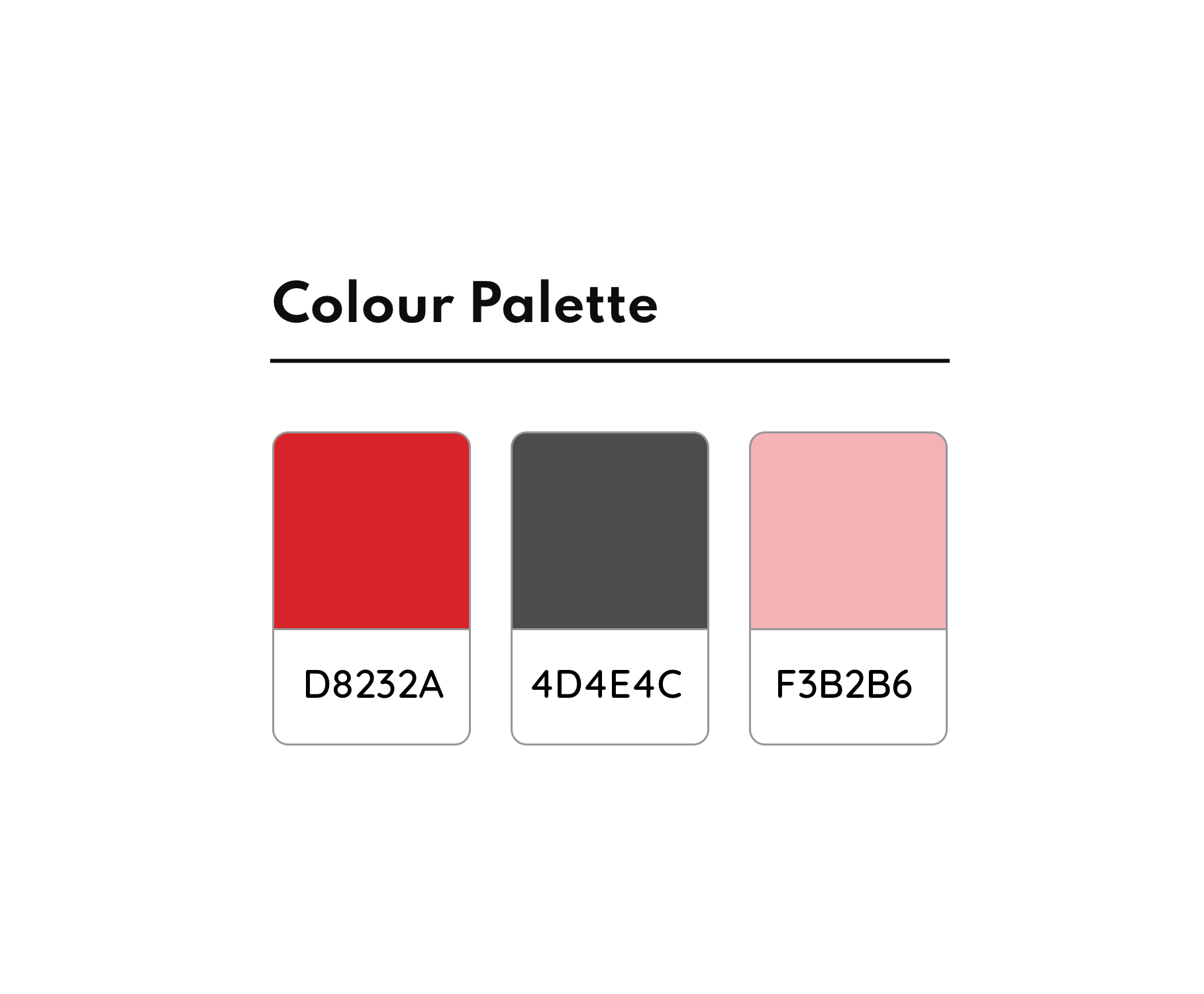
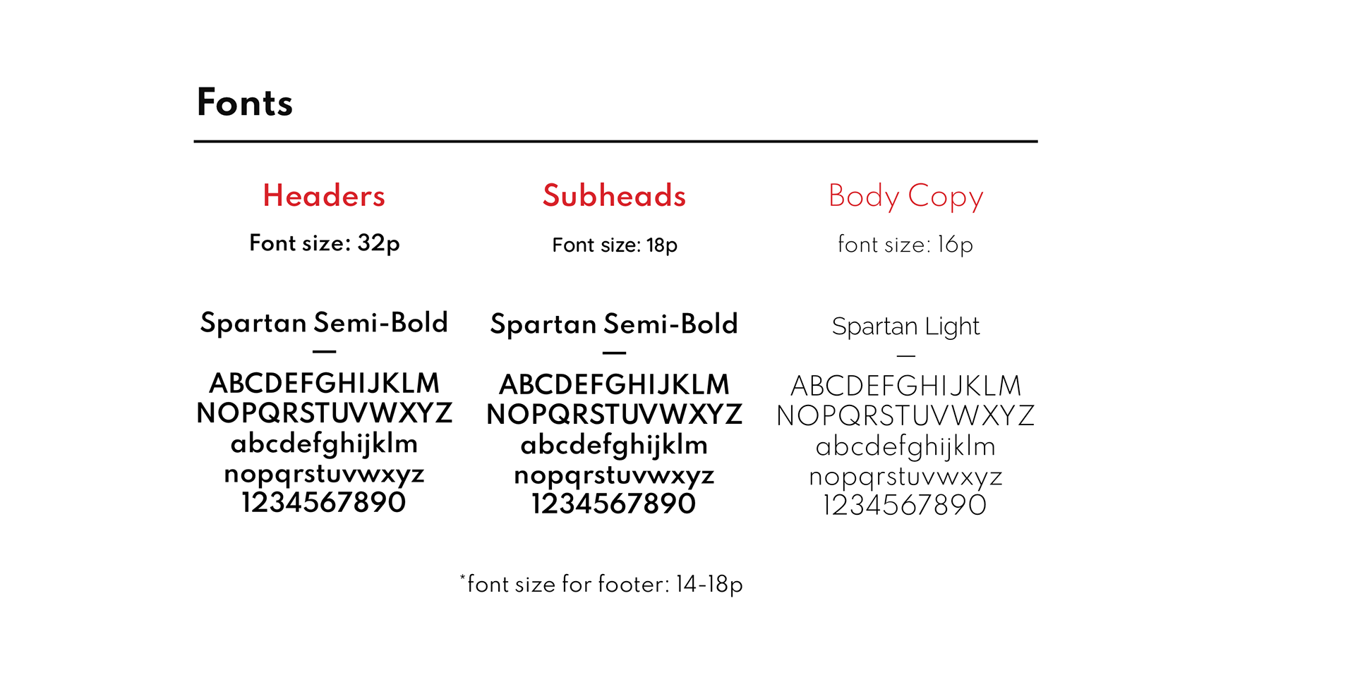
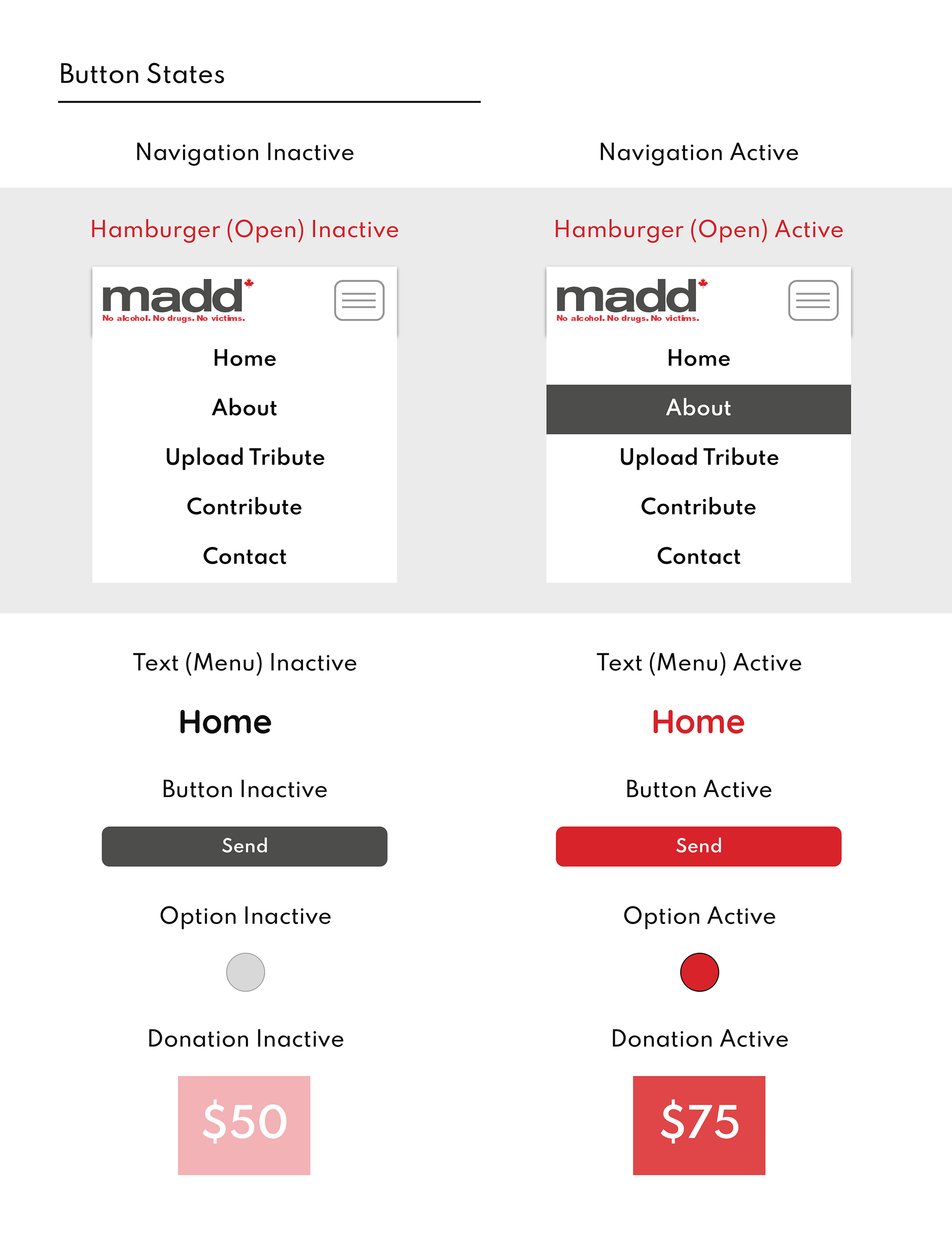
COLOUR, FONT, UI ASSETS