
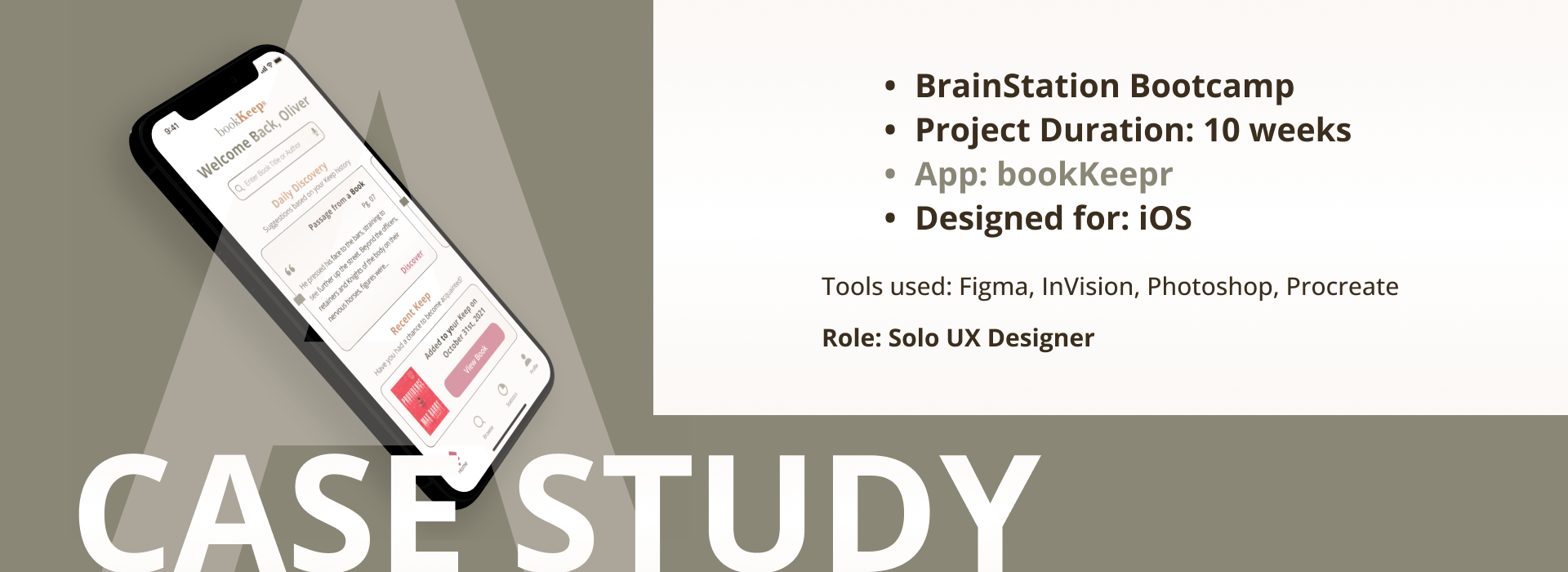
An Introduction
Pages and Time
Reading is a source of escape and adventure, yet finding the right book isn’t a perfect process. As you explore this case study, I will take you through the various steps that occurred throughout this journey. From identifying the problem space and conducting user interviews, to building wireframes and testing them, as well as the steps not yet mentioned but very much explored.
So at this moment you might be asking yourself, what problem space? I’m glad you asked.

The Problem Space
Answering the Question
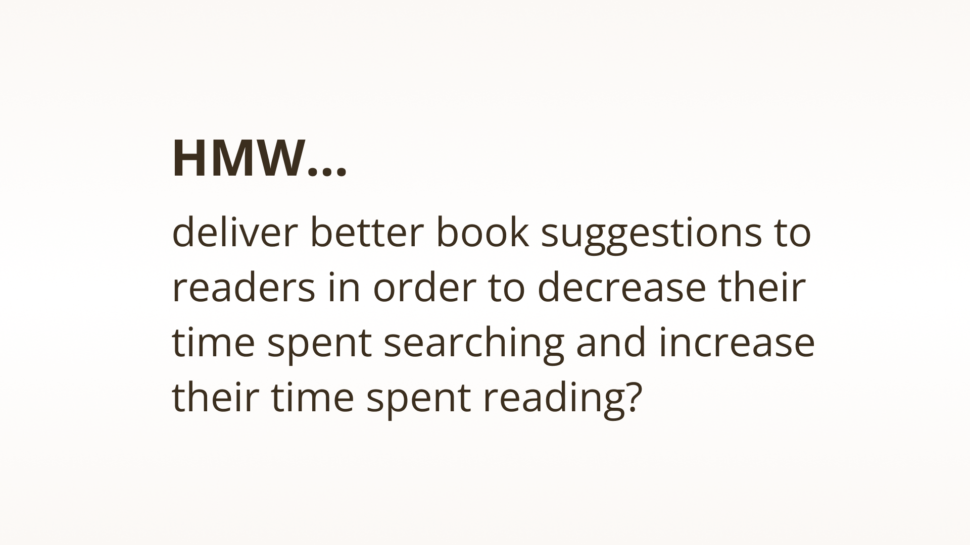
Amongst the websites and apps that currently offer book information to their users, readers struggle to find accurate book recommendations that meet their preferred tastes, with what's new or popular being promoted first. This adds to the time readers spend looking for a book they actually want to read.
So we ask ourselves, how might we....
Secondary Research
Hypothesis
I believe readers need a more refined method that reduces the time it takes in discovering books that fit with their personal preferences. I will know I am right or wrong depending on the feedback received from five interviewees.
I believe by designing an app for millennial’s who like to read, this will aid them in discovering what to read next with a higher level of satisfaction. I will know this is true when the qualitative insight from interviews match this initial idea.
I believe by designing an app for millennial’s who like to read, this will aid them in discovering what to read next with a higher level of satisfaction. I will know this is true when the qualitative insight from interviews match this initial idea.
Validation in Research
It's important to do research before proceeding forward. While I had my assumptions as well as a few hypothesis, in order to validate my HMW statement, seeing what information currently existed on this topic was necessary, and not something that could or should ever be skipped. So without further ado.
Method & Criteria
Methodology
The data gathered that will verify or disprove my hypothesis was conducted with five interviews.
These interviews took place over Zoom, and lasted in the ballpark of 39 to 55 minutes total.
These interviews took place over Zoom, and lasted in the ballpark of 39 to 55 minutes total.
Participant Criteria
In order for the participants to align within the parameters of the problem space, they had to meet this criteria.
A READER
MILLENNIAL (25-40)
In addition, based on the sensitivity of time, they were sourced specifically within the confines of Canada.
A READER
MILLENNIAL (25-40)
In addition, based on the sensitivity of time, they were sourced specifically within the confines of Canada.
Insight Examples
1
Discovering new titles is something interviewee #5 tries to approach in a non biased way. He feels a sixth sense of sorts when browsing for a book, and what calls out to him.
2
Interviewee #2 thinks that focusing more on an author’s writing style, with some visual data, would be easier to process and more fascinating than the current method that exists online. He prefers browsing in person.
3
Having found an author interviewee #3 truly loves (by picking up a pink book), she’s unsure as to how she will discover any other authors that meet the same criteria in terms of its genre and sub genres.
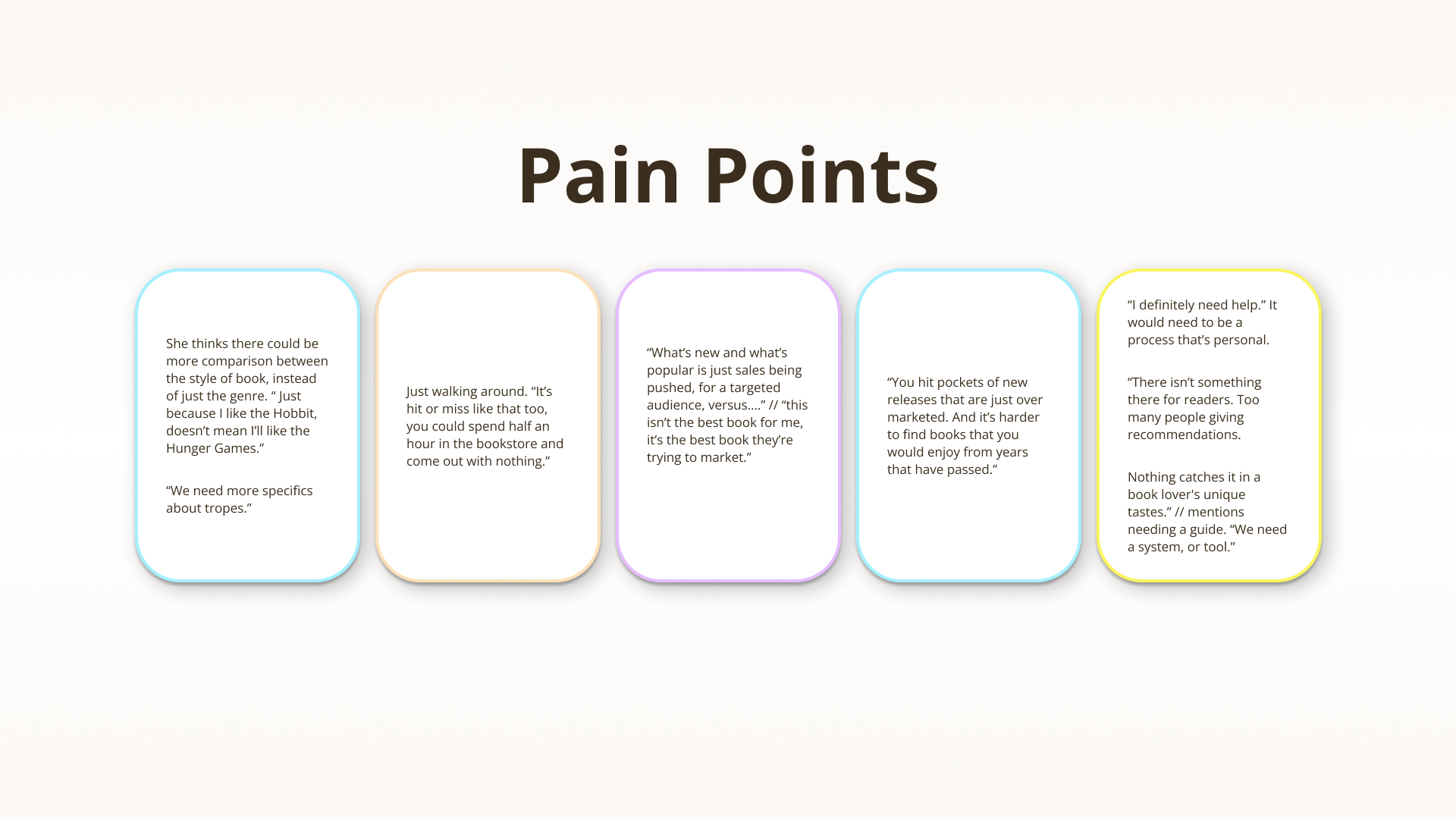
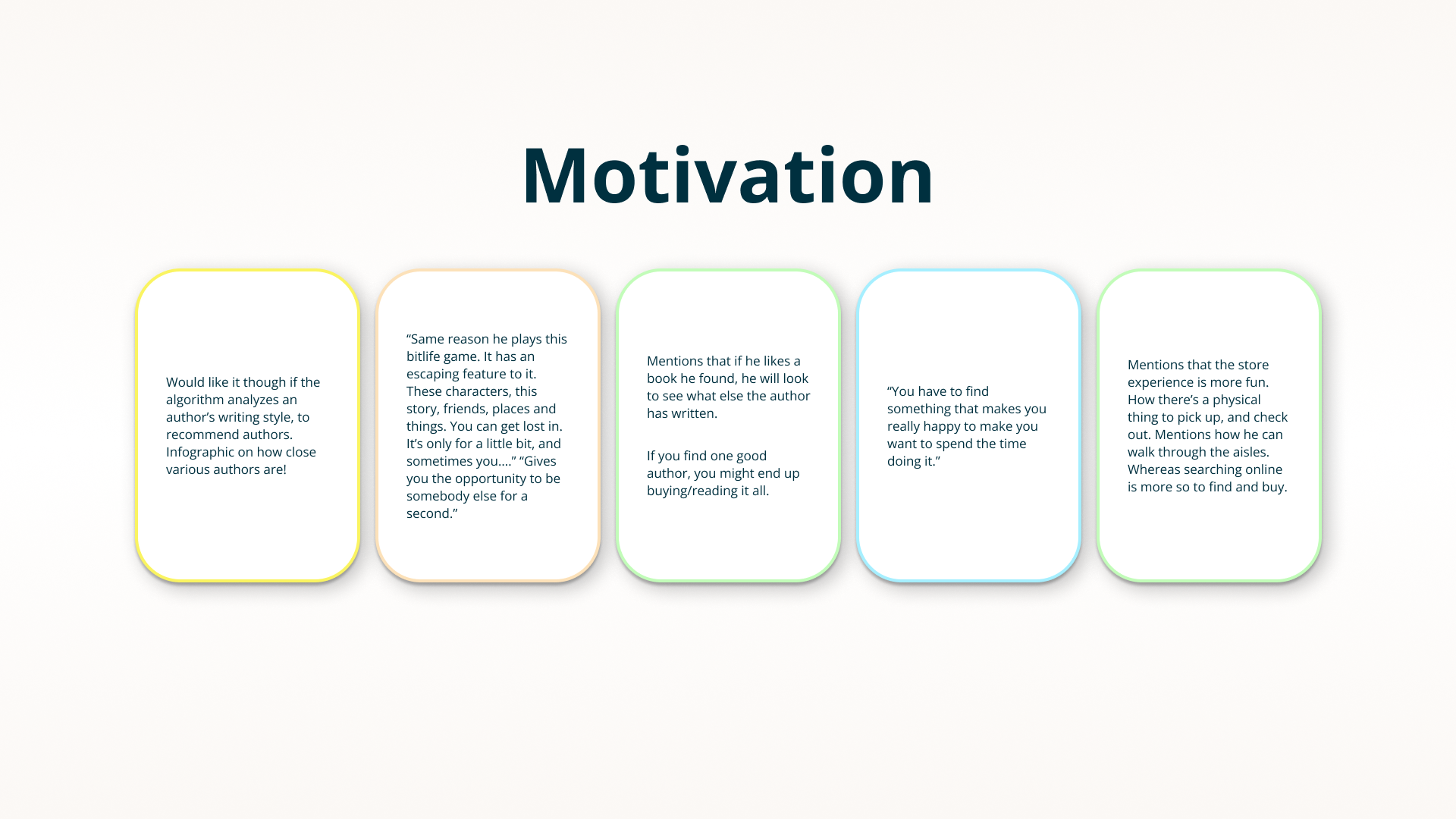
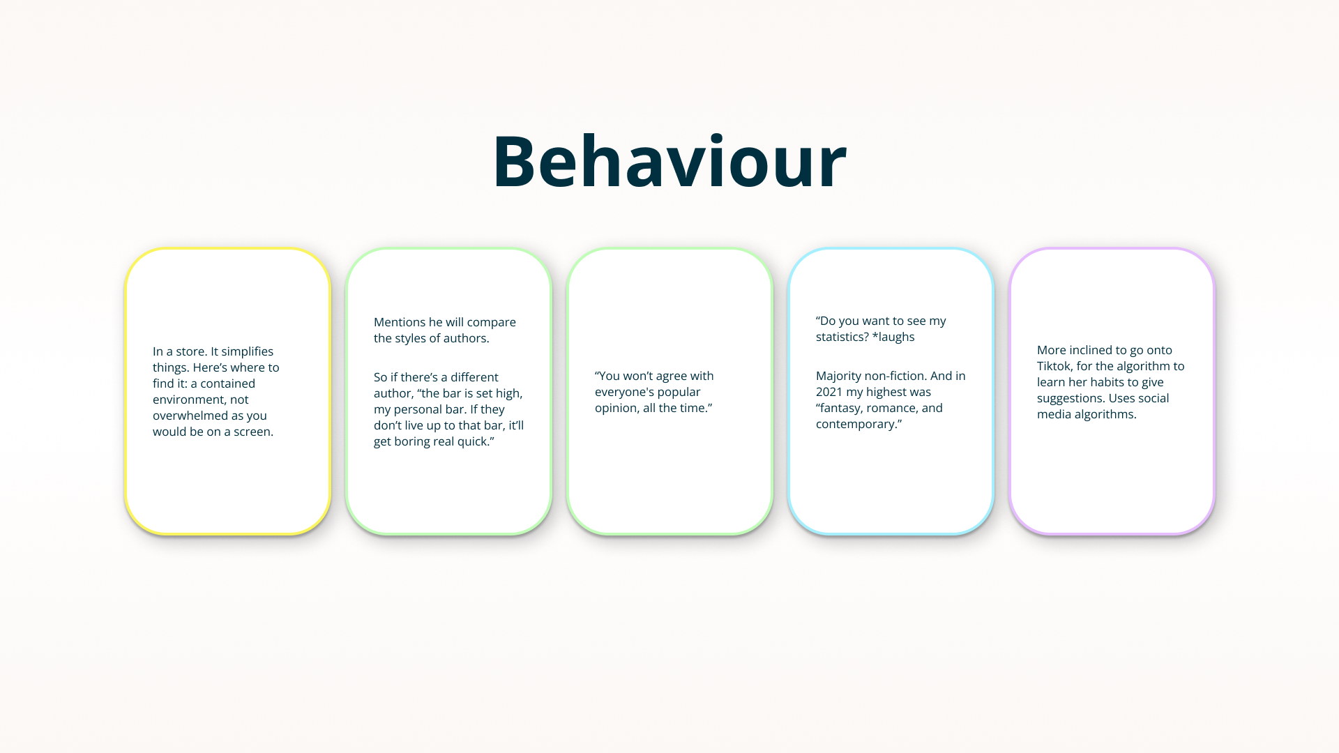
Pain Points | Motivations | Behaviour
It's Important to Ascertain the Similarities
Within five interviews, there were individual insights that were of note. However the real magic comes from looking at all of the data gathered and pointing out the pain points, things that motivate them, and their current behaviour (how they work within the problem space).
Below are some examples pulled from that full list (to see more - click on that wonderful 'see more' button).
Themes & Insights
1
The Value in Popular & New
Be it from random discovery of a book a friend has on their shelf, or the aspect of being intrigued by a person who you follow in another medium, there is importance in being able to share and view the connection between other’s interests and what they’ve read, or recommend.
2
Infographics to Discovery
Data. Visual breakdowns. Readers are aware that algorithms work to show them what they think they’ll like, rather what they’ll buy. If the reader can see information that shows them their actual habits, it will give them further insight into what they like, and allow them greater opportunity to try new things.
3
You’ll find Me at the Bookstore
While purchasing online can be easier, and is used to compare prices, readers seem to prefer the experience given to them while being physically in a store. The books are part of an experience, and it’s easier for them to discover something that isn’t a brand new, or top listed book. That said, they still use their phone to look things up while in the store.
4
Knowledge and Escape
A positive for the most part, readers are drawn to books for the quality of allowing them to relax and escape. For others it’s the knowledge they can gain from a book and its topic. This insight is more so an added benefit that comes from after finding a book that’ll satisfy their preferences.
5
Trust in Others
Be it from random discovery of a book a friend has on their shelf, or the aspect of being intrigued by a person who you follow in another medium, there is importance in being able to share and view the connection between other’s interests and what they’ve read, or recommend.
6
Style of an Author*
Readers are drawn to the way a story is delivered. It’s not simply the genre, but the words that were used. The level of emotion and connection that’s produced. They want to experience that impactful moment again, and if it’s not by the same author, it’ll be from someone who can write in a similar manner.
-- Reasoning --
It addresses the Problem Space by creating an opportunity to explore how an algorithm can use the structure of a passage to find similarities in other works.
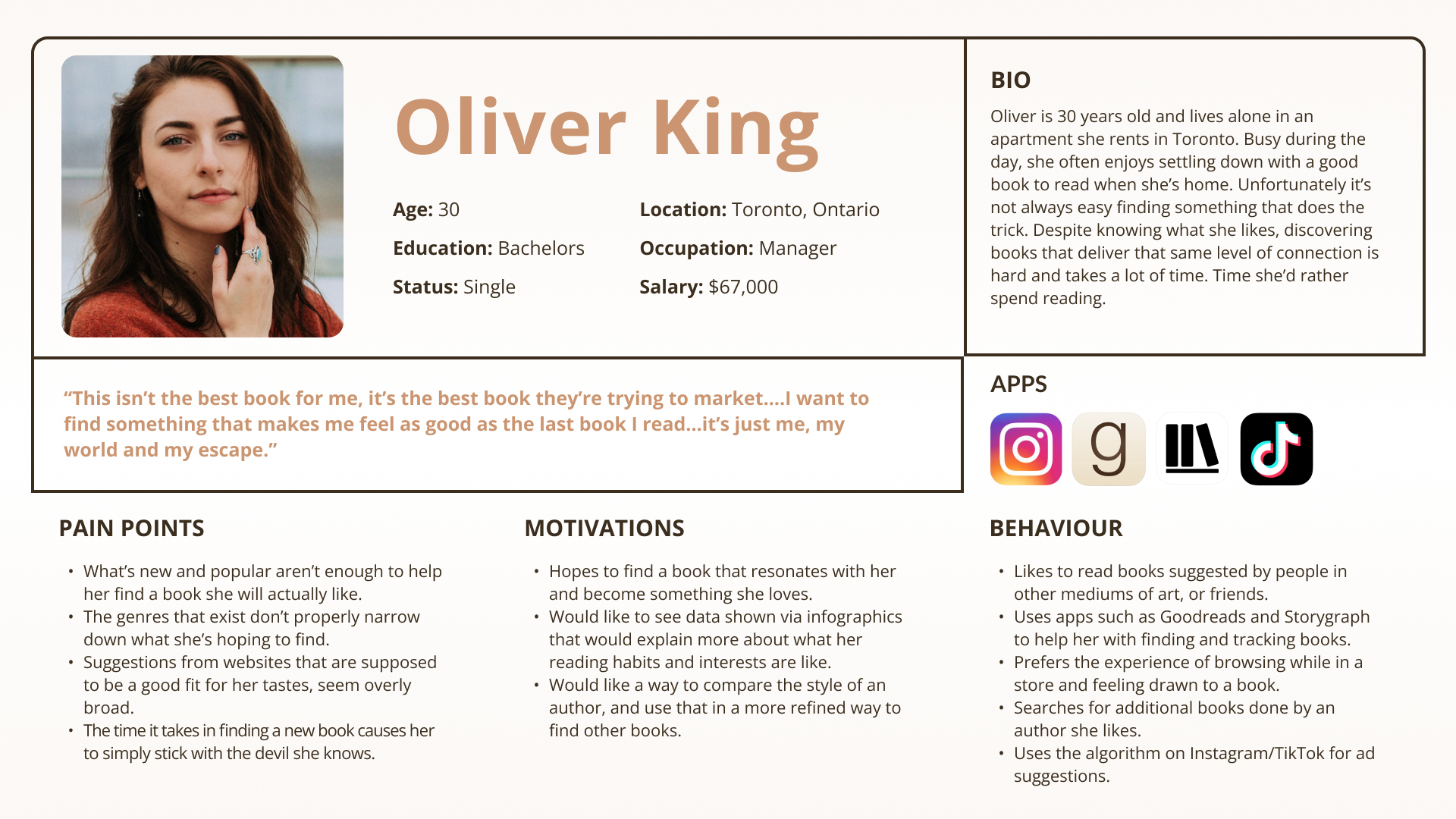
Persona
A Persona?
A persona combines the various information from a variety of different people and forms one identity, e.g., a persona. This persona ensures that the creative decisions keep in mind the pain points, behaviour and motivations.
Let's meet Oliver.
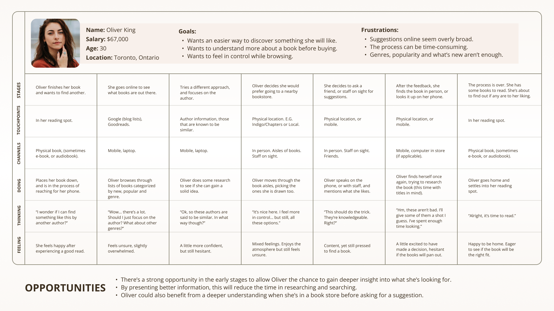
Experience Map
How Goes the Search?
With the persona in mind, and the secondary research conducted as well as the interviews, an experience map helps show where the opportunities exist for Oliver when she is looking for a new book to read.
Conclusion: When Oliver is browsing for books, be it from home or in a book store, an application on her phone that makes this a natural, friendly and intuitive process, forms a great opportunity.
Competitor Analysis
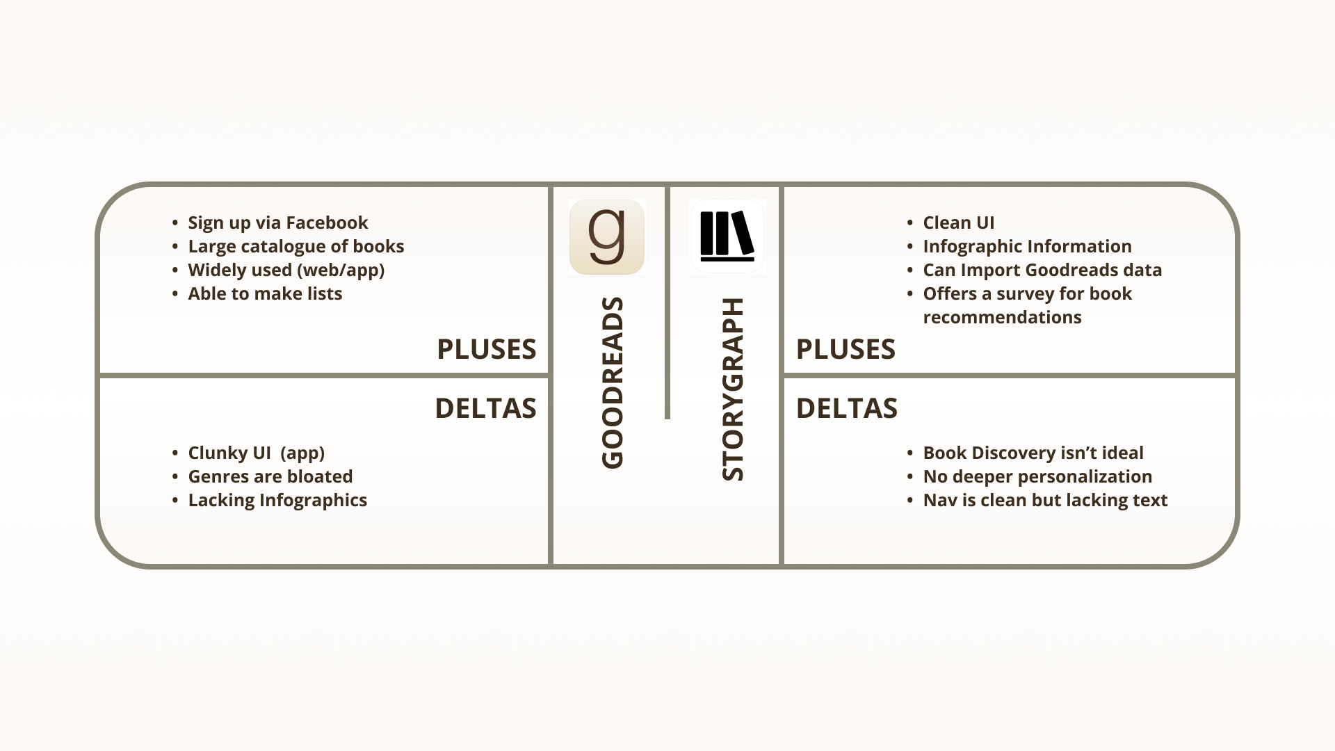
Goodreads huh?
With the problem space in mind, I made sure to see what options currently exist (and are known) to Oliver. With a quick plus and delta (downside) I could gain a sense of how to differentiate from the direct competition.

User Stories & Epics
User stories are defined by the Persona, in this case, Oliver. They allow us to articulate the role, and what the action and benefit is for the user in regards to what they want to happen.
Ah, but it’s also important to know that User Stories can form Epics.
After a series of User Stories are written, Epics will begin to form. They represent a function that the User Stories identify. While each User Story is unique, the task within the function may differ slightly.
So let us see some User Story examples & the identified Epics.
User Stories
As a reader I want to place emphasis on the structure of how something is written so that the recommendations I receive match my desired preferences.
As a reader I want to browse books based on a writing style so that I don’t feel disconnected with the language used in the story.
As a reader I want to feel drawn to the way a story is written so that I read it with a level of intrigue.
As a reader I want to quickly look up a book and gain insight into its writing format so that I can read a portion on the fly.
+ many, many more.
Identified Epics
• Excerpt of Text Analyzed by Algorithm
• Infographic Overview on Reading Habits
• Genre/Topics Filtered by User
• Series Display for Quick Access
• Sharing Book Suggestions
Core Epic
Excerpt of Text Analyzed by Algorithm
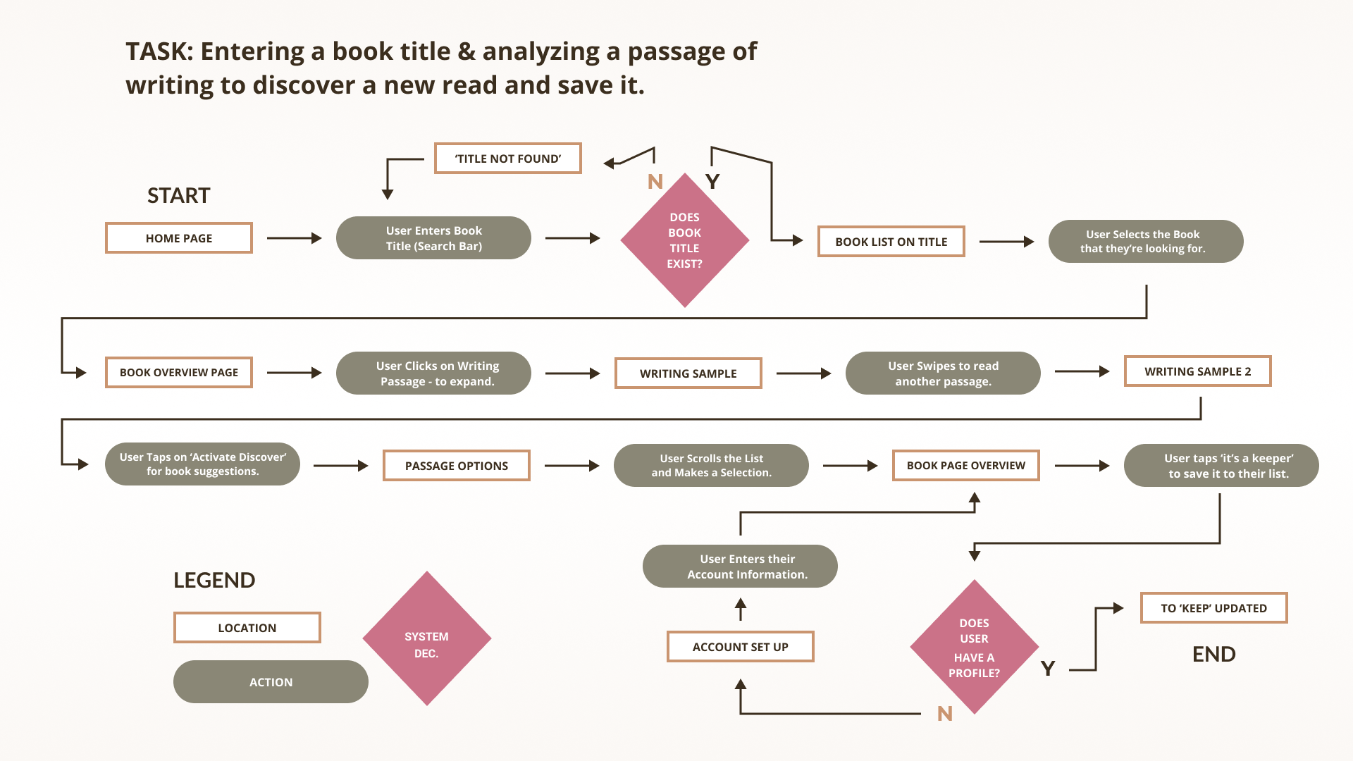
Task Flow
Task Identified from Core Epic as:
Entering a book title & analyzing a passage of writing to discover a new read and save it.
Are you wondering what that task looks like from A to B?

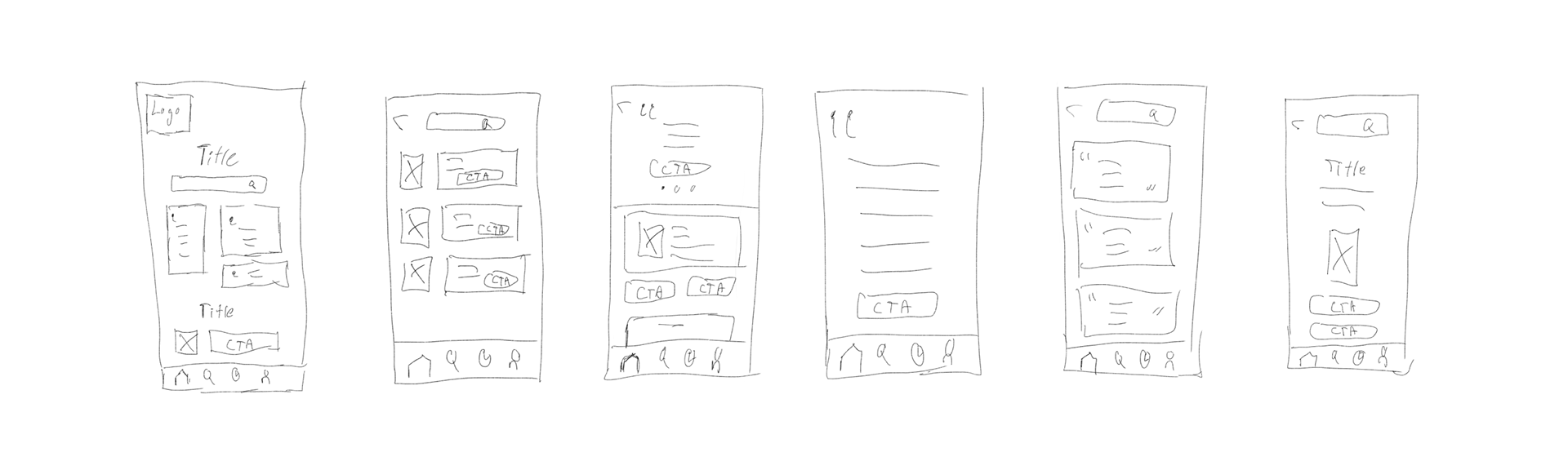
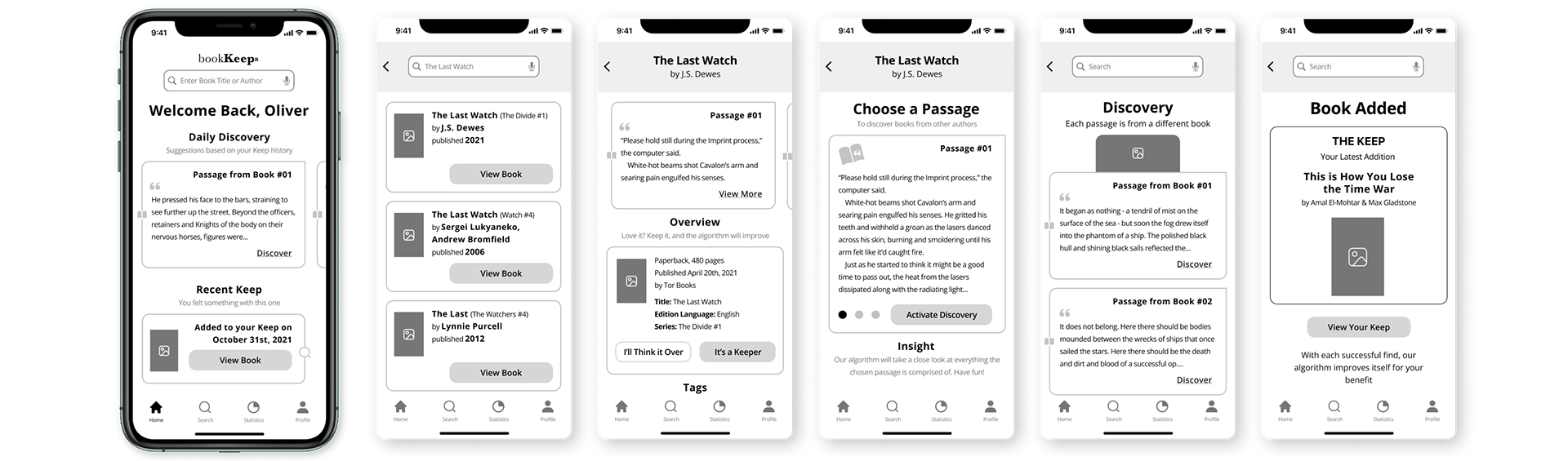
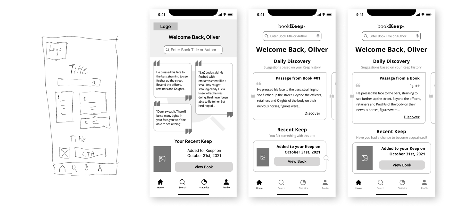
Sketches
Messy Sketching
While the process itself involved annotations, the sketches below are a digitized versions for the sake of presentation cohesiveness. A few minutes in Procreate allowed me to put something together. Did sketching come before the wireframing?
Of course.
*sips coffee*
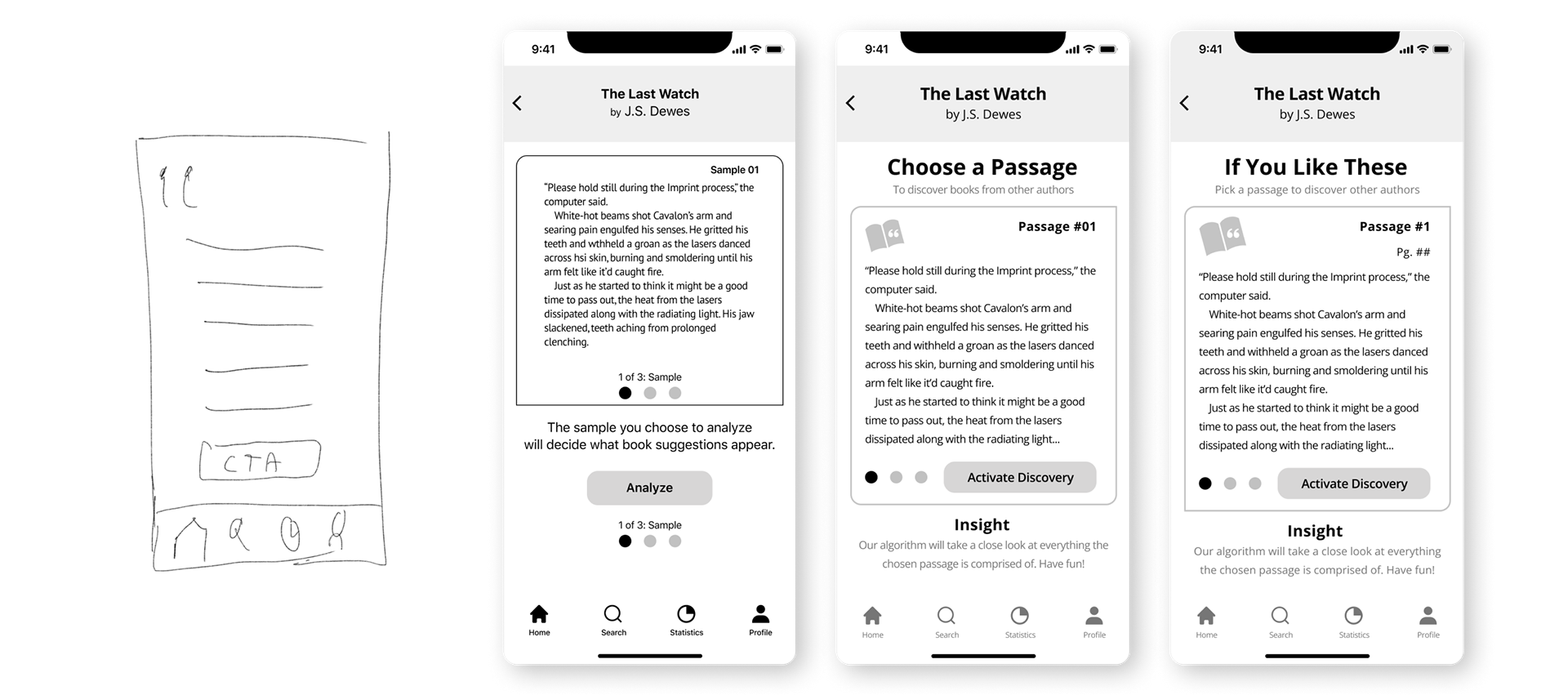
Solution Sketch
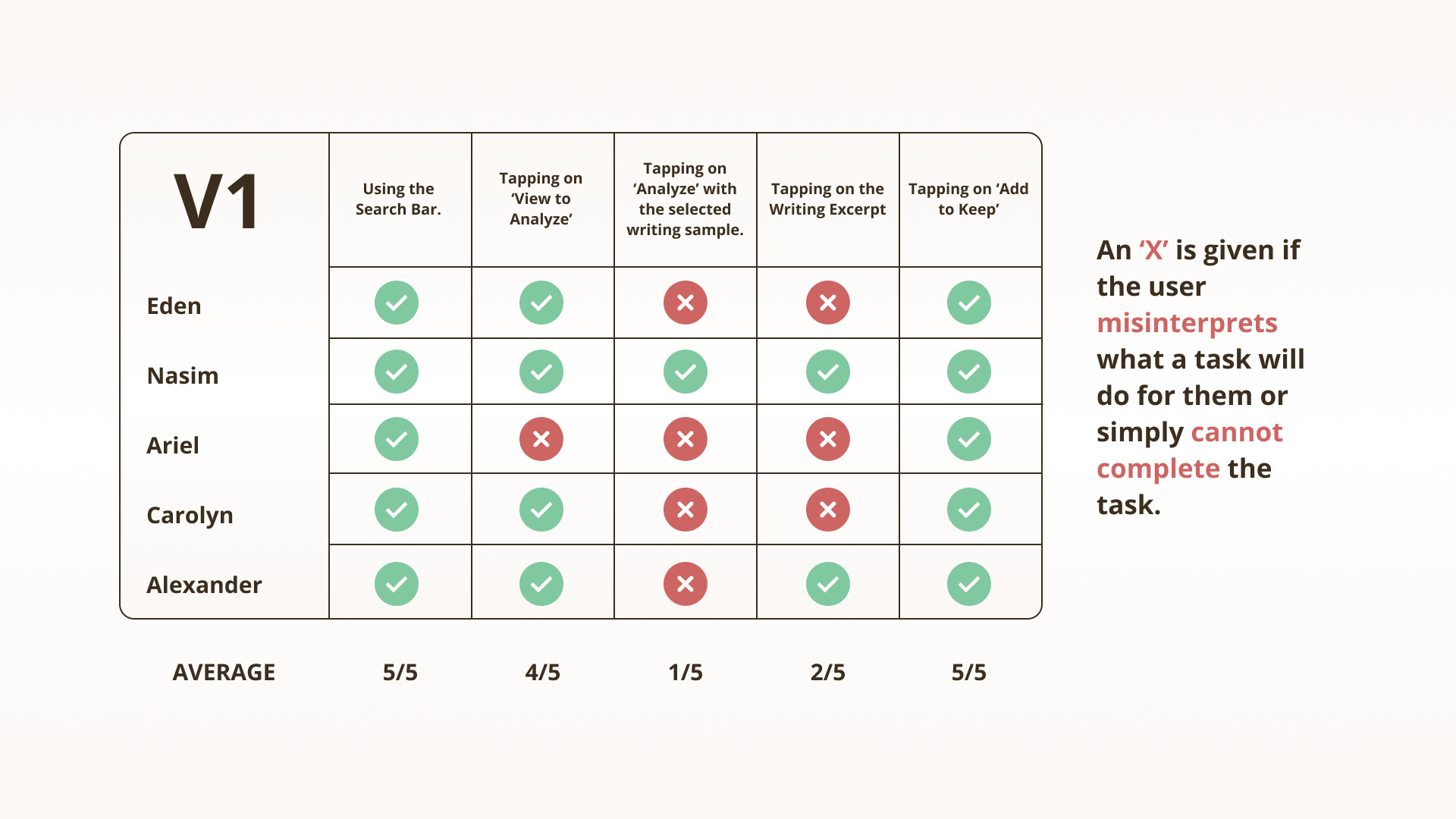
Round 1: Wireframe & Testing Results
Version 01
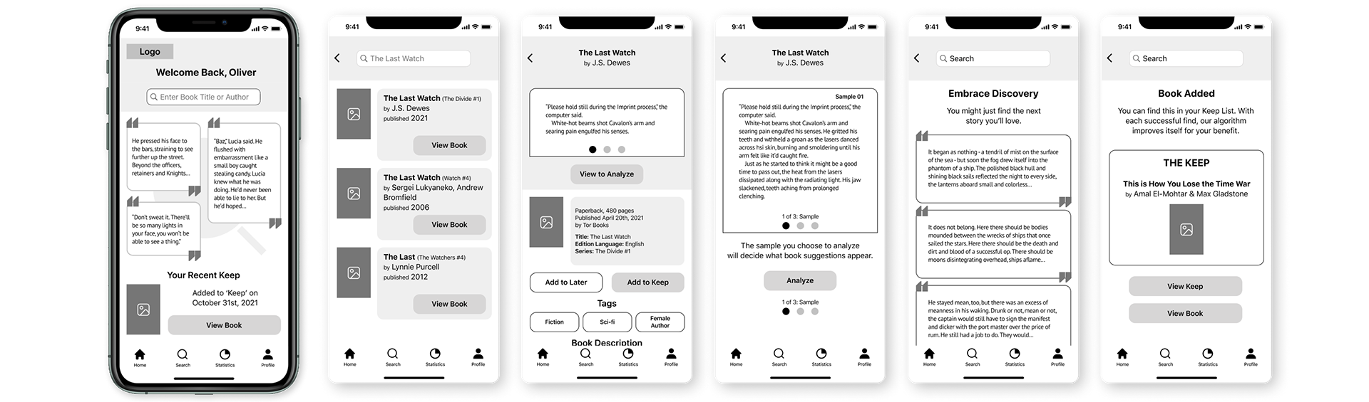
Test Result Summary
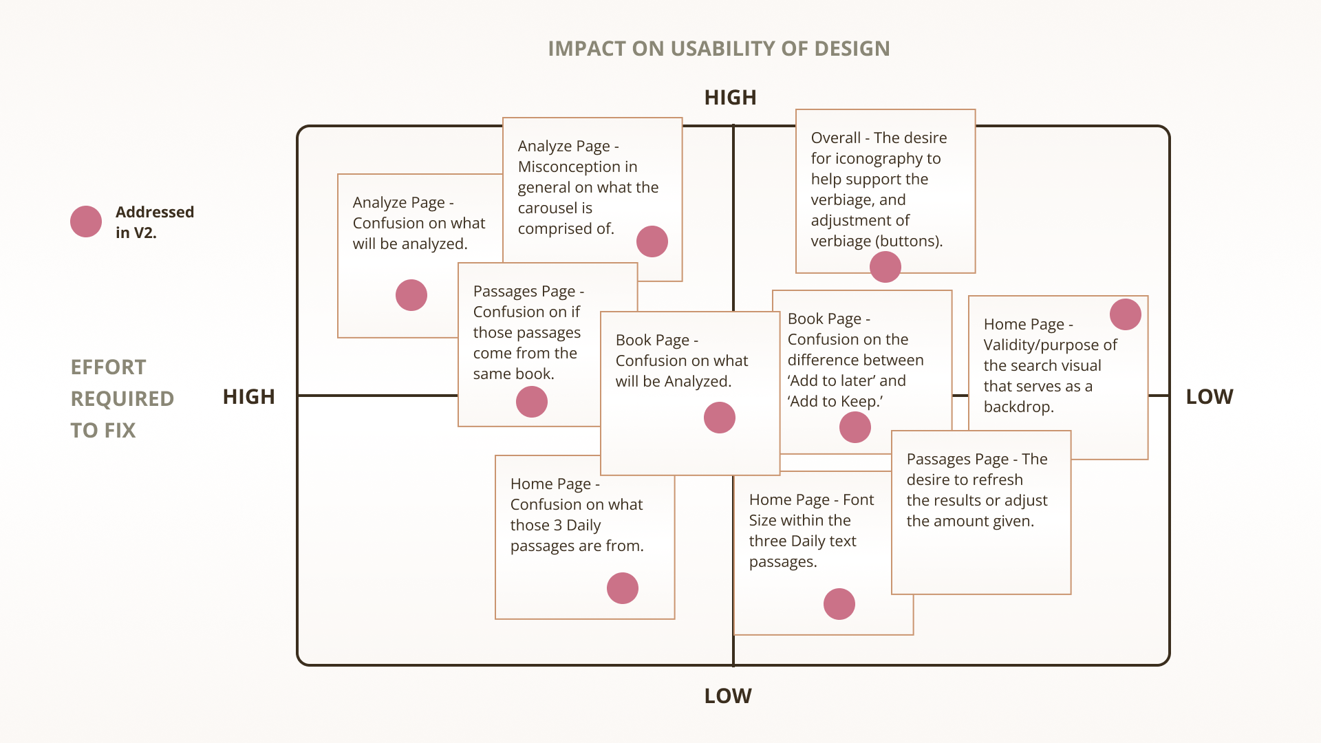
While the tasks were all completed without difficulty (tasks that were performed through a shared Figma link, and observed through Zoom), I felt it was important to truly address the issues surrounding the verbiage. If the user is uncertain what a functionality will do, then that functionality is a mistake in the process, and in my eyes, a task flow error. With small changes, the well received product can become something that is loved and adored. Where questions arose based on ‘what exactly does the analysis process, analyze?’ those would, in theory, be answered in different task flows. Verbiage adjustments can also mitigate that initial confusion, while supporting the level of intrigue that existed throughout the entire task flow.
Prioritization Matrix
With the list of feedback narrowed down to the ten most critical choices, the majority involved improving the verbiage so that the user would have a greater understanding in what to expect, prior to the feedback of an action. Dots represent the areas addressed for v2 and are visible in the UI.
Round 2: Wireframe & Testing Results
Version 2
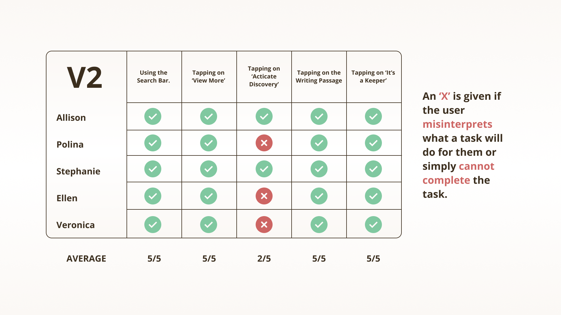
Test Result Summary
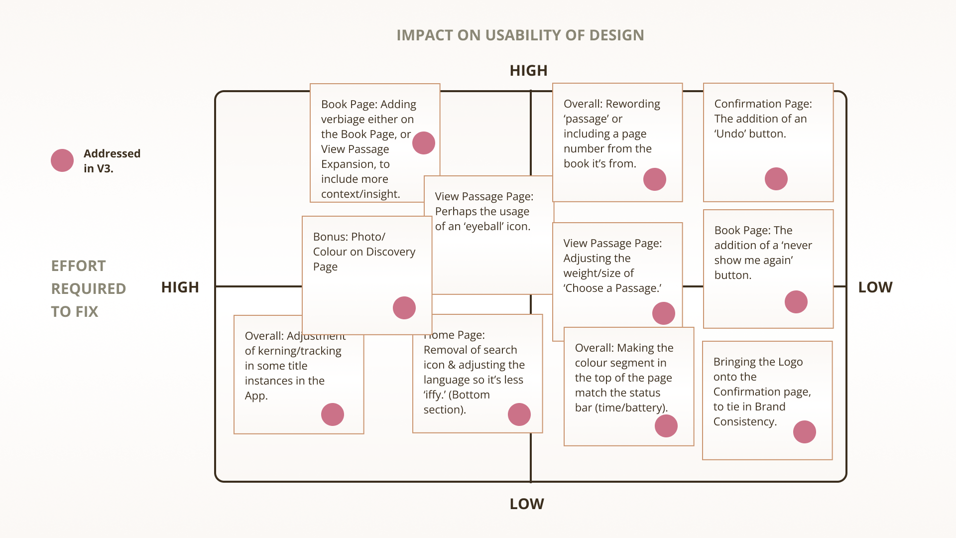
With a lot of time spent in improving both the design (usage of the baseline), as well as choosing a font, and including the early signs of branding, there’s still some work to be done. Users understand the task flow completely as early on as the 3rd task, however users had a tendency of overlooking information which would explain it, and interestingly, only on one page (the most important one). With some additional labelling, and slight adjustments, this should be solved. More can be done, but those would involve work that expands into alternate task flows.
Prioritization Matrix
With an overall improvement in the UI (user interface) of bookKeepr, there was still more to be done in regards to informing the user what an action would do for them. Beyond that, the adjustments were more focused, rather than a being a wide net as was the case in v1. Dots represent the changes that are implemented in v3.
Round 3: Wireframe
Version 3
Side by Side ex. 1
Side by Side ex. 2

Brand Development
Brand Adjectives
It embodies the principle of self discovery. To find answers guided by the intricacy of a letter, a word. Where intrigue and user engagement join together, finding balance in a moment of reflection provided by a solution that understands the user.
Name Exploration
One always wonders, who am I? Now spin that, apply it to the intangible. With this name, everything will be set in stone. For the user, the reader, finding a book can be as important as pulling a sword from a rock. Let’s name it properly shall we?
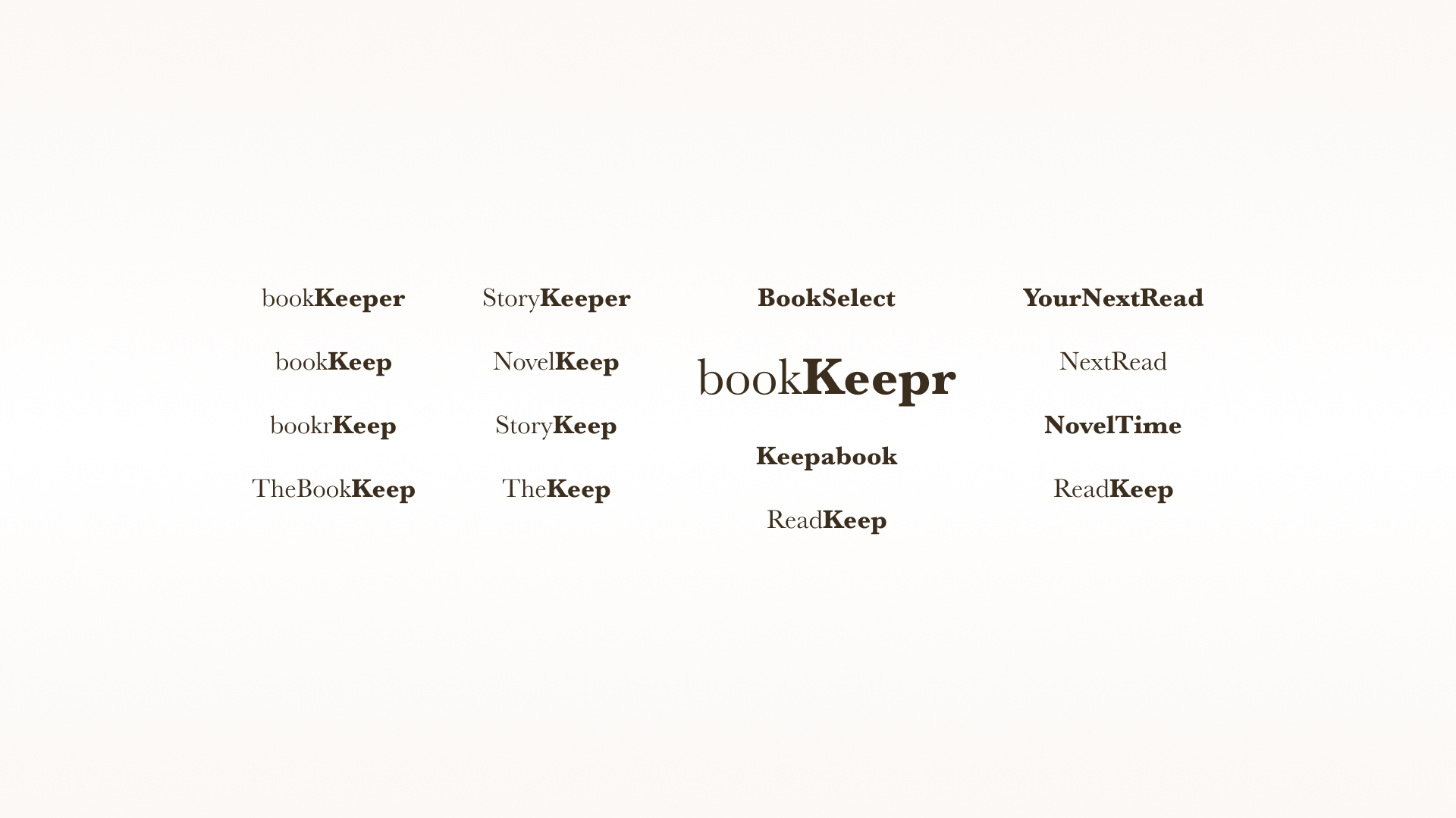
Nothing Comes Easy. Fonts Will Battle.
With bookKeepr as the victor from the name generator (it’s all about reimagining how a name can be used), it’s necessary to discover and choose a font for the brand itself. This will also decide what complimentary fonts will appear later on, ah, yes, this is indeed foreshadowing.
• Baskerville
• Study
• Acuta
• Neuton
• Vendetta OT
• Zilla Slab
Wordmark
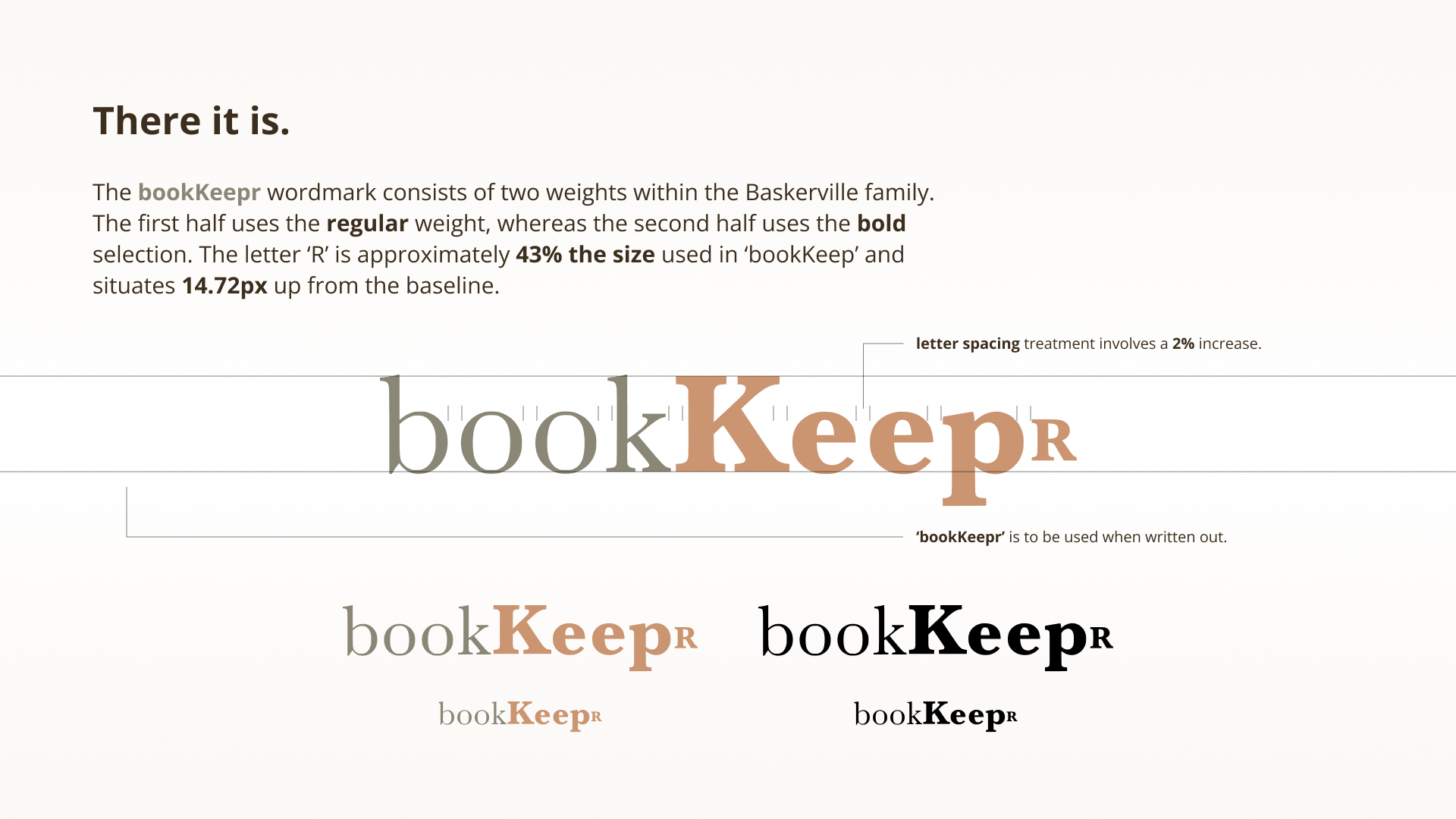
More A than B
To be or not to be? That is the question.
Warm is the answer. The individual is the priority. A unique approach is how one forms a memorable moment. Literature is the focus. Vague defeats bias. Balance accomplishes what turmoil simply envies. Reflection outweighs the essence of what’s popular. A tailored approach outmaneuvers the generalized method. Engaging with the content is required. bookKeepr is the friend who knows the user, giving sound suggestions.
My brand is more warm than cold
My brand is more individual than group
My brand is more unique than typical
My brand is more literature than imagery
My brand is more vague than biased
My brand is more balance than turmoil
My brand is more reflection than popularity
My brand is more tailored than generalized
My brand is more engaging than passive
My brand is more friend than enemy
Moodboard
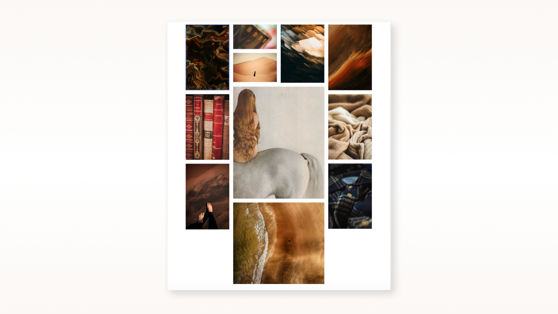
Can You Feel It?
The process of exploration was a true test of my graphic design background. Having to feel without letting bias come into play was important, as the entire concept of bookKeepr is to explore, without bias. As I went through various websites for inspiration, a series of images and textures called out to me, and it was only when they were set into this arrangement that I knew, ‘this is it.’
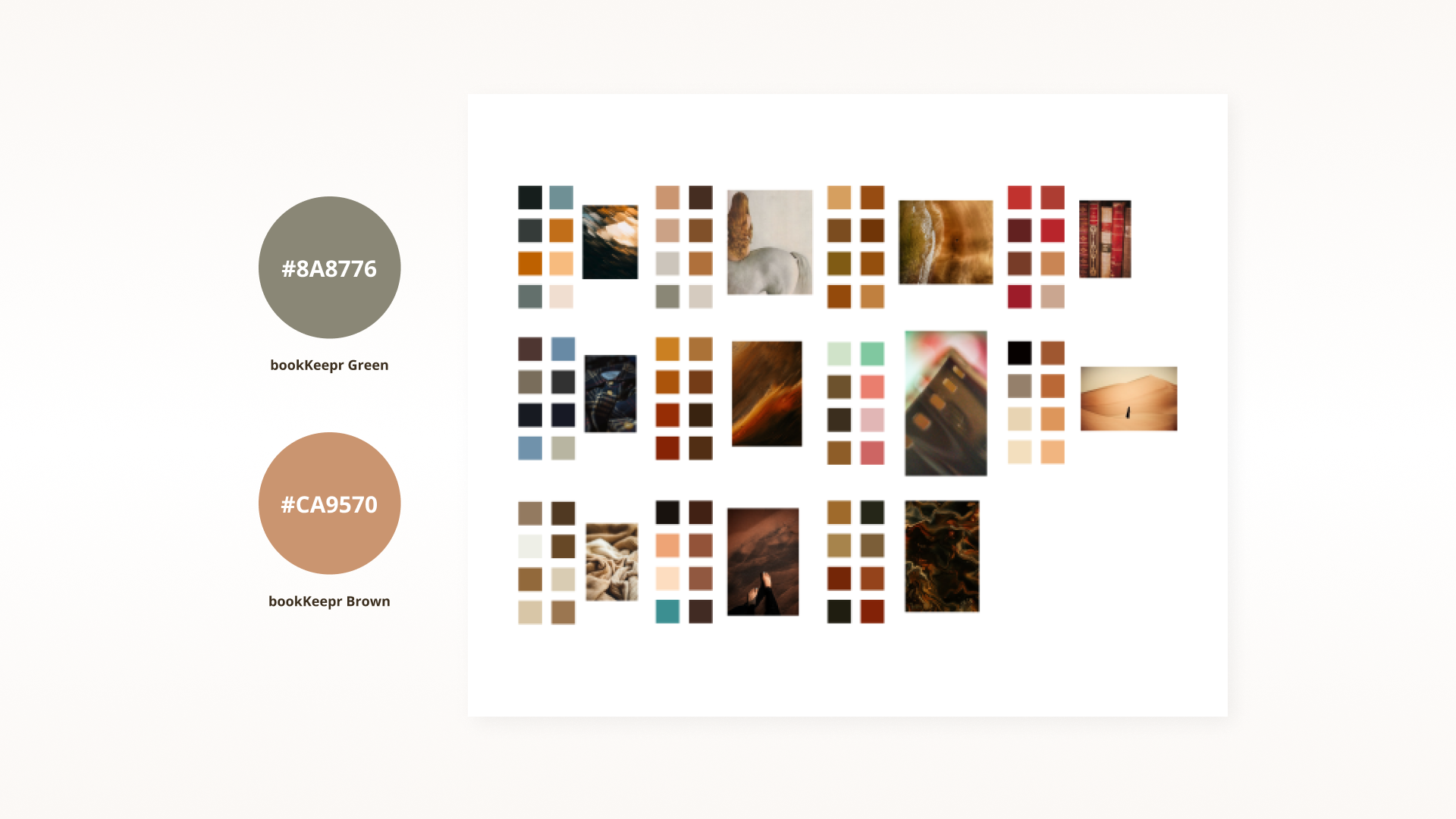
Colour Exploration
The process involved sourcing colour from the moodboard and then adding in necessary colours as required. It was a lengthy exploration, but ultimately allowed me to deliver a strong atmosphere and feeling.
The App Icon
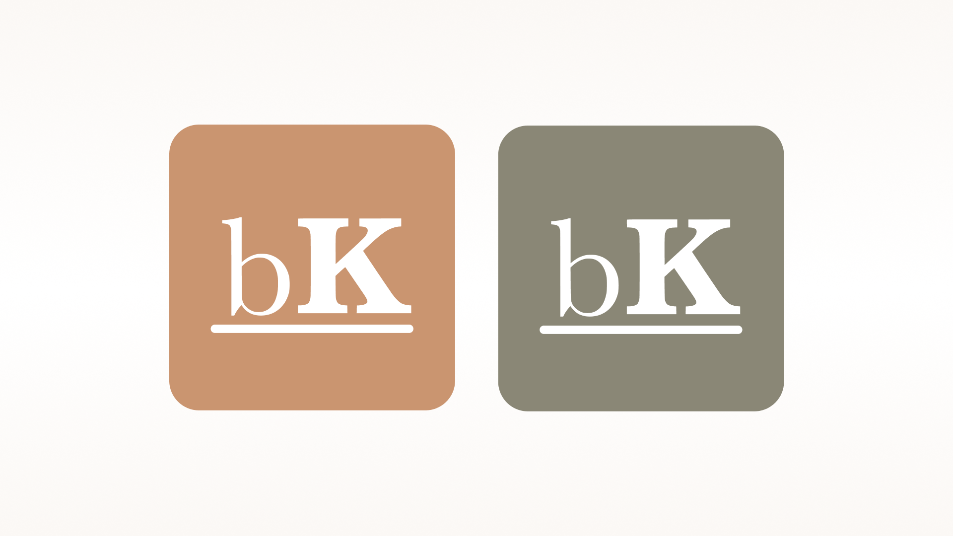
The App Icon...
Can be switched between two versions. By using a simplified form of bookKeepr, the letters themselves read out loud as ‘book.’ The line beneath it represents a bookshelf.
Hi-Fidelity
How UI Embraces the Brand
Ultimately it was thanks to the colour exploration that allowed for a good process when moving from mid to high-fidelity. With the brand colours, the supporting cast helped make for a warm, inviting yet also a unique experience. As was the goal when conjuring up what the bookKeepr brand stood for, the result can be seen below.
Note: There were subtle changes from v3 in the mid-fidelity to the first version if high-fidelity. See if you can spot them.
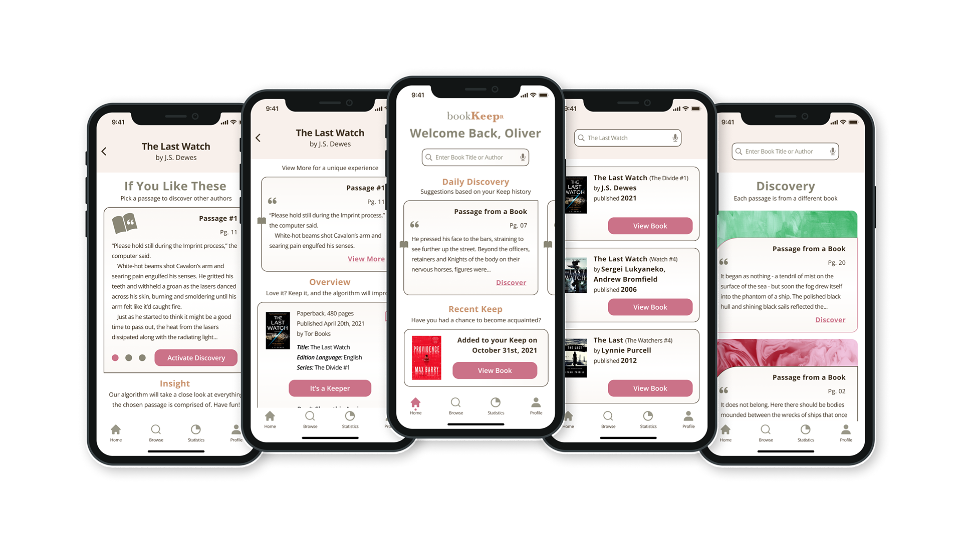
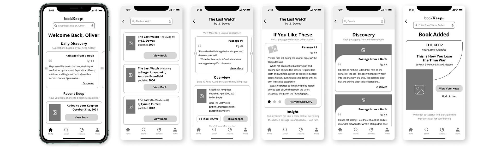
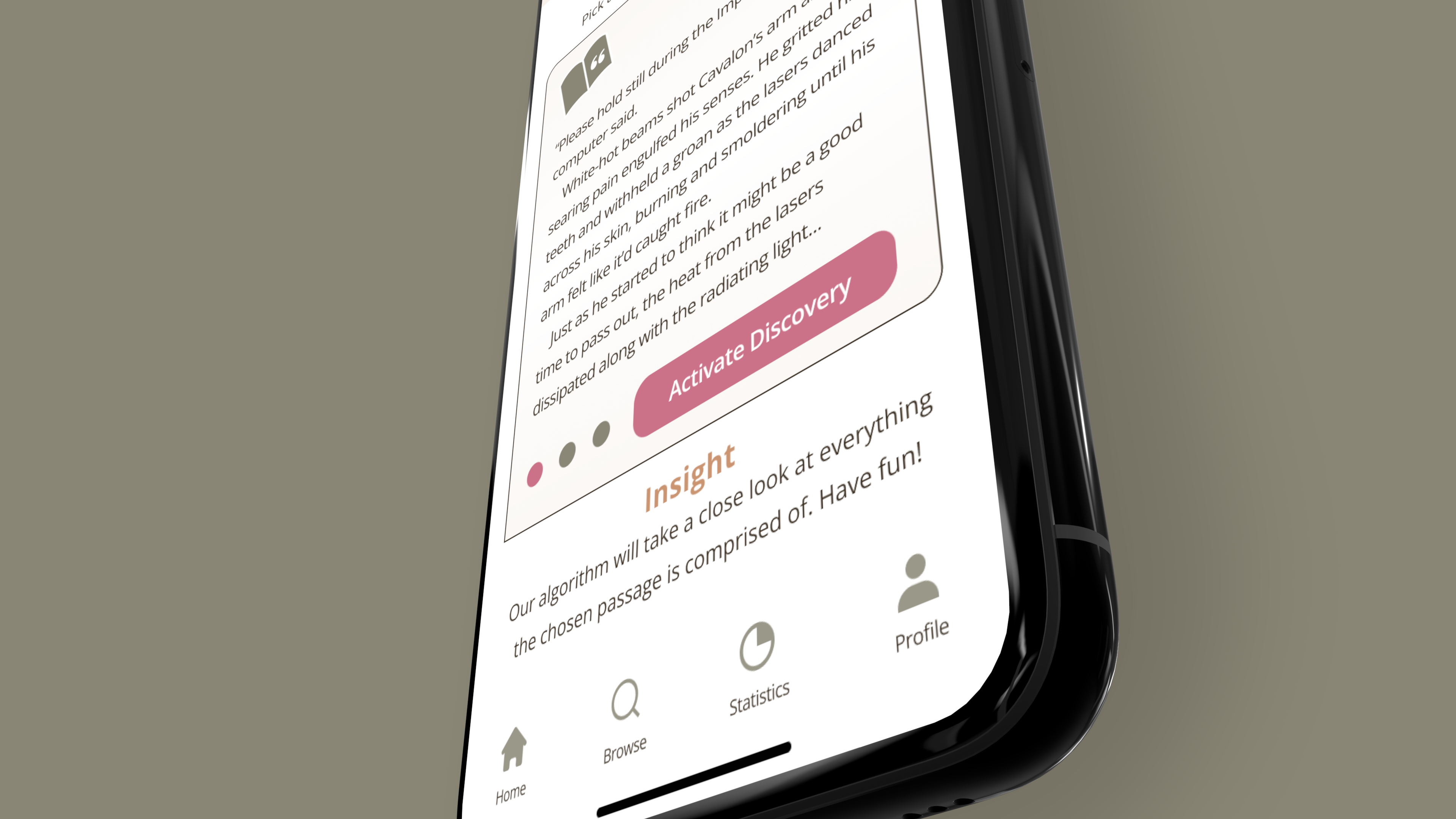
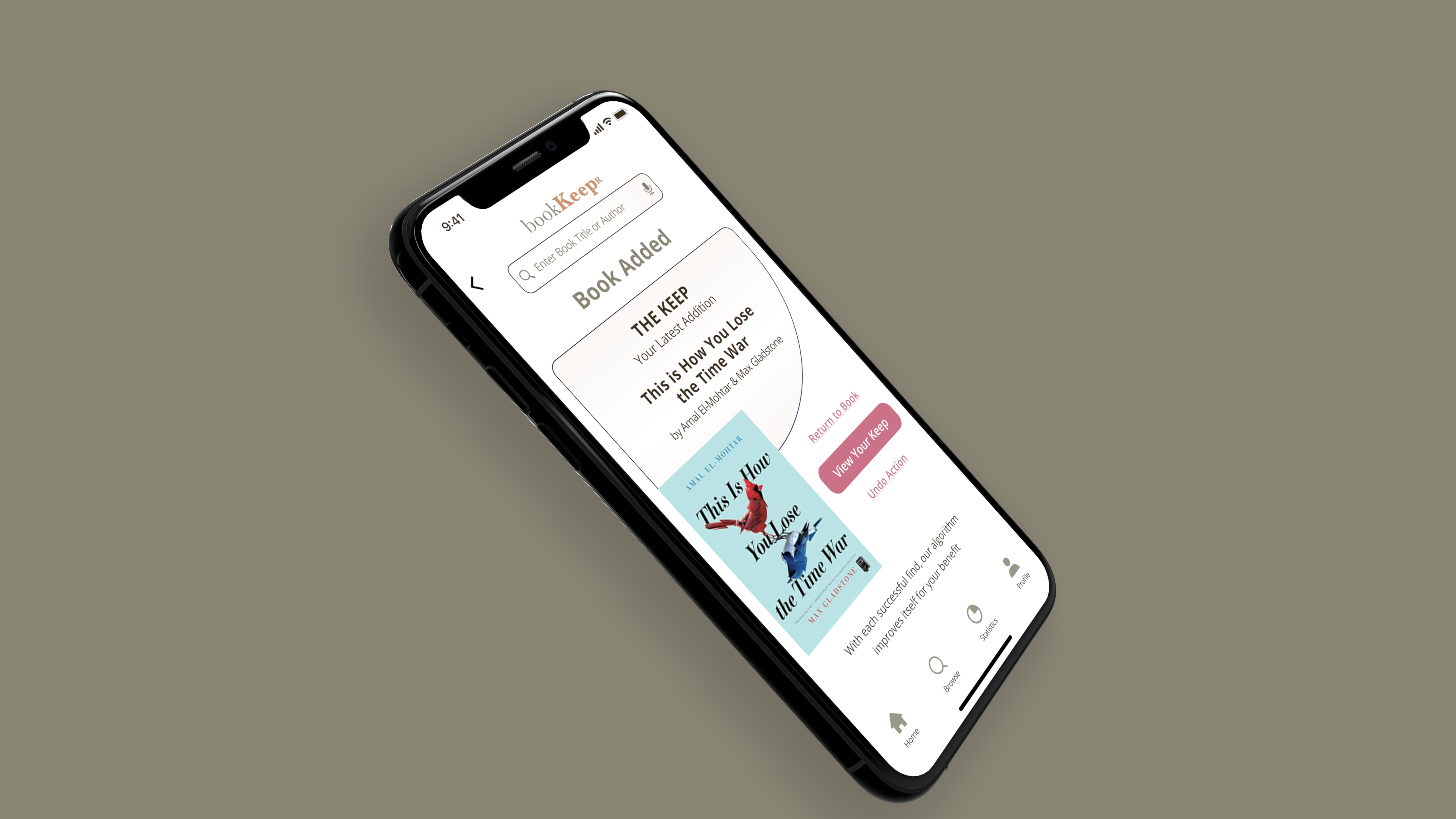
Activate Discovery
A crucial part to the task flow, this screen involved a lot of trial and error. Adjusting verbiage that instructed the user, to also figuring out ways to draw their attention so that they wouldn't overlook what was being given as advice. Colour certainly helps solve a lot of these woes, however for true accessibility, more will be done in future iterations so that every user who comes across this part of the process, knows what to expect once they tap on 'activate discovery.'
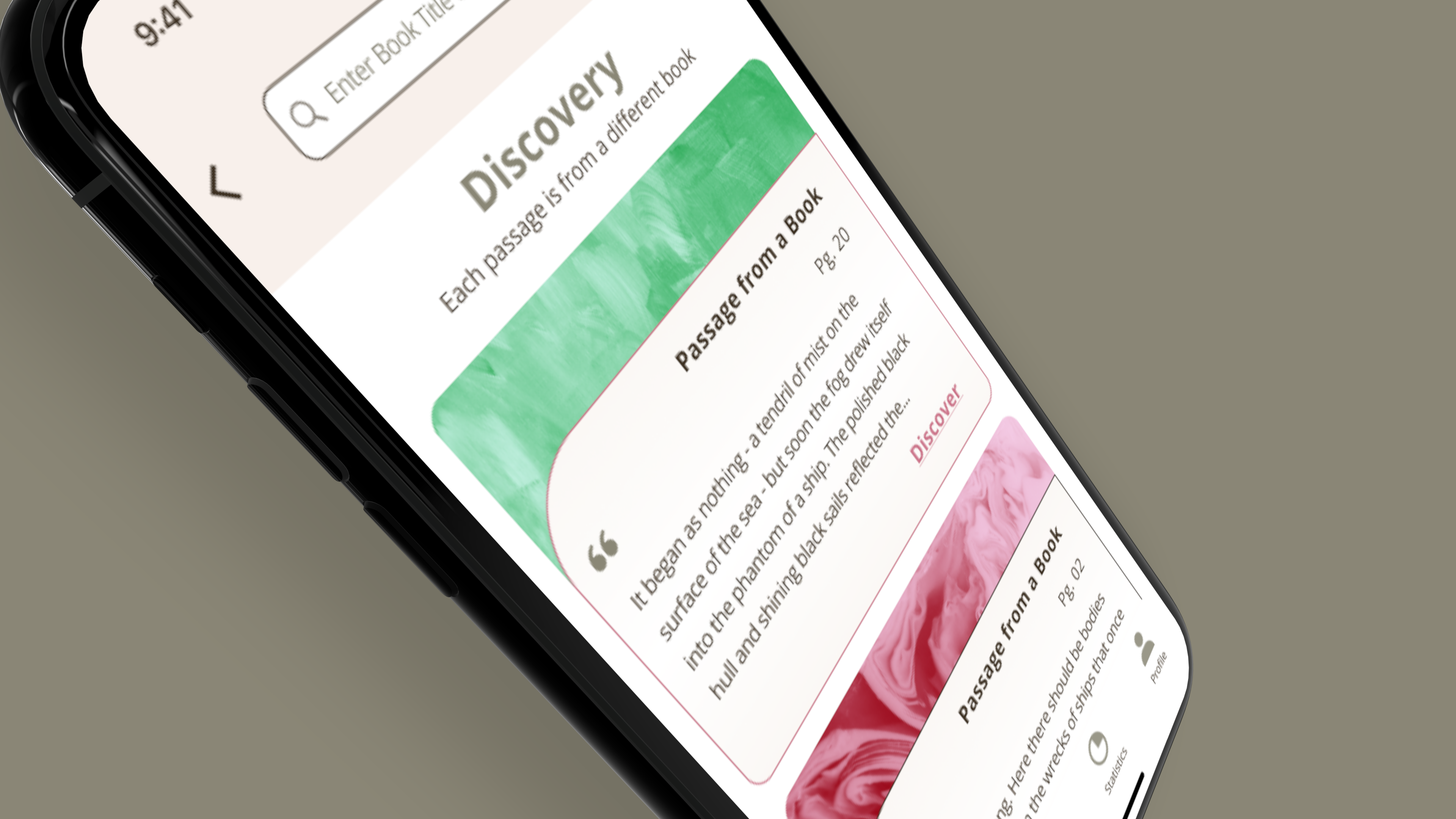
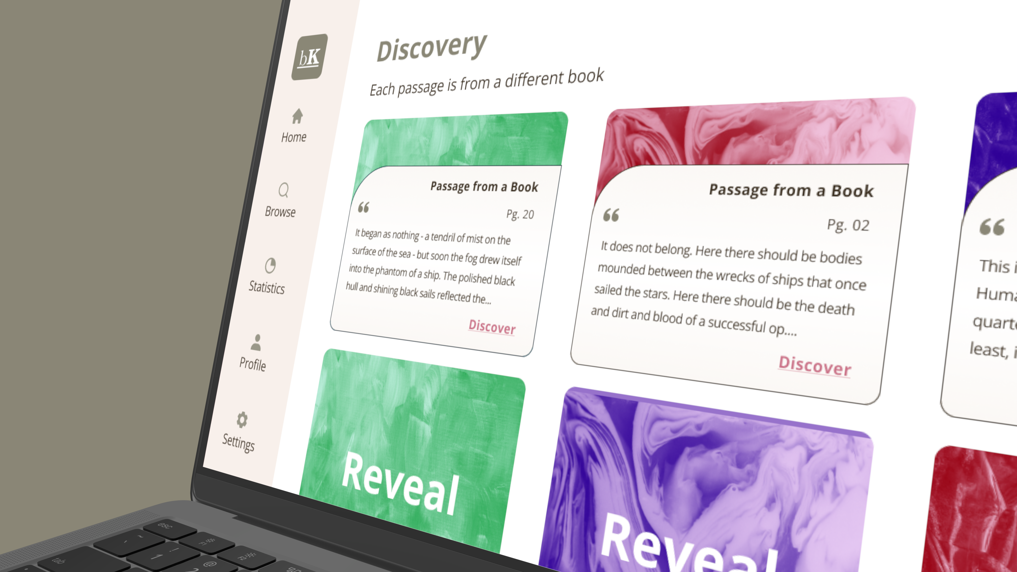
Discovery
A fun tidbit to this page, the idea of using texture came about in v2 of the wireframing. I envisioned some form of image on this page but wasn't sure, so by placing a placeholder, it allowed for me to get feedback on what users thought that image would be, but more importantly, it allowed me to access their level of excitement when they explained what they'd hope for it to become.
With all the results on hand, I found a happy conclusion that involved incorporating texture to help differentiate passage results, and giving it more differentiation from the rest of the app.
UI Library
Throughout the process of realizing the solution to the problem space, the journey involved creating a brand identity which then translated over into the user interface. Important as to how it would form the experience for the user, you can see below what the typography and UI colours were. These are the bits and pieces that work behind the scenes and formed the Hi-Fidelity.
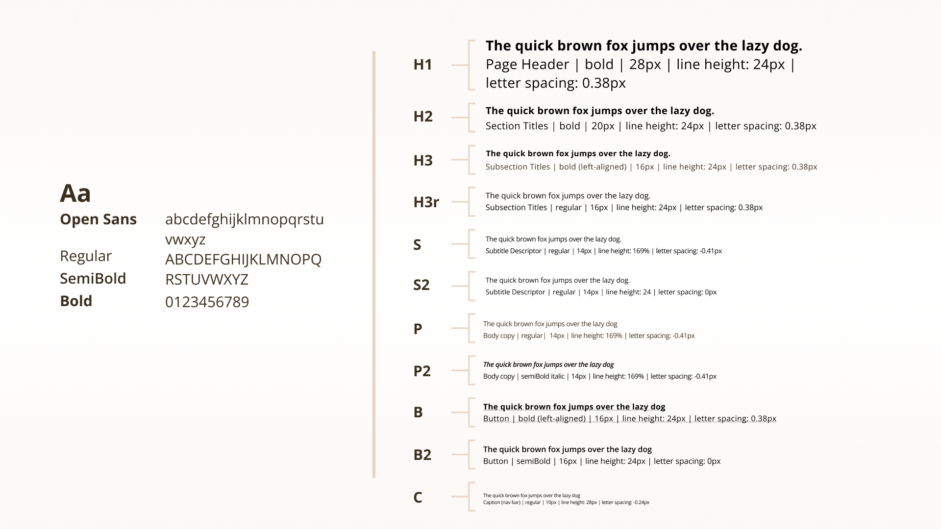
bookKeepr's Typography
bookKeepr uses...
Open sans in three weights, Regular, SemiBold and Bold. In addition it has a slight variation within the letter spacing depending on the use case, e.g. S (subtitle) or S2.
Open Sans was selected for its friendly appearence, as well as its great legibility across multiple platforms.
Open Sans was selected for its friendly appearence, as well as its great legibility across multiple platforms.
bookKeepr's UI Colour
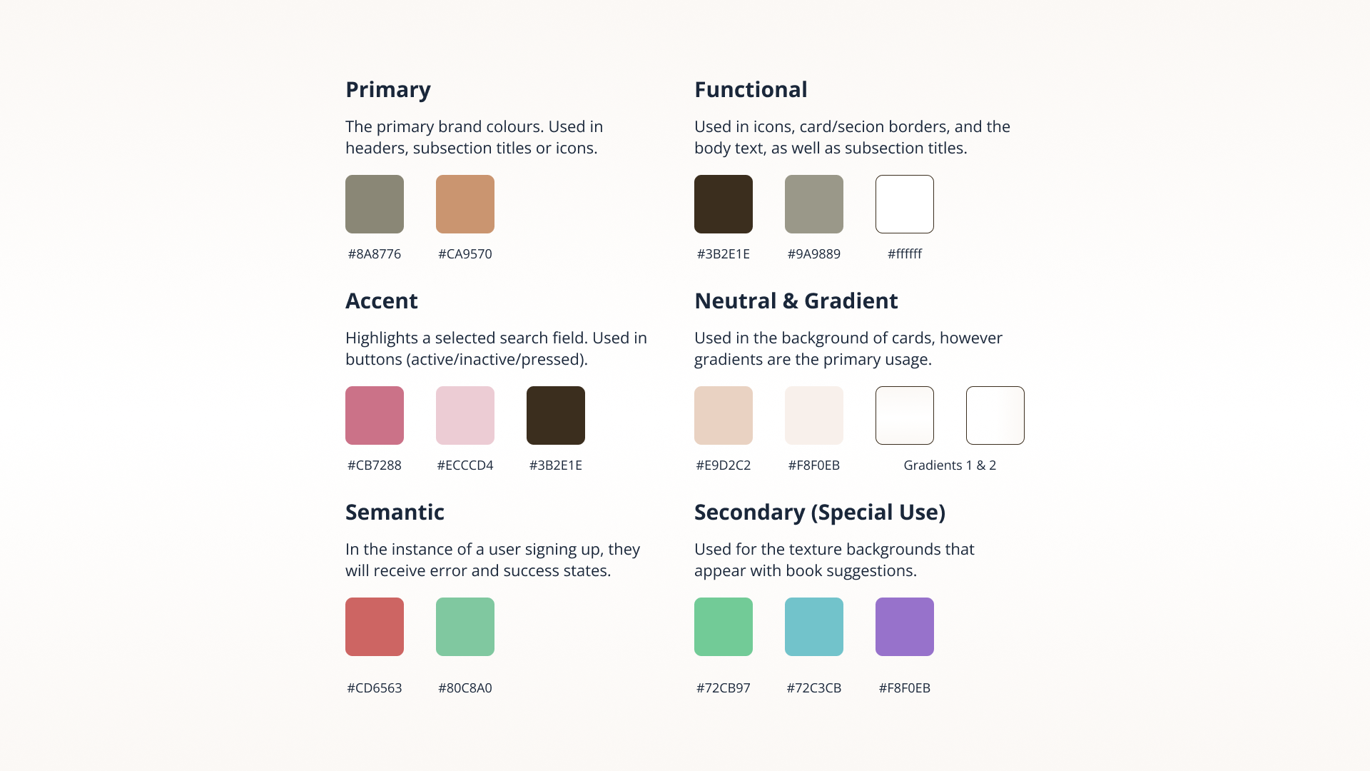
The UI colours are...
A series of primary, accent, semantic/feedback, functional, neutral and gradients. Ultimately these all serve a singular goal, helping the user have a good experience.
The brand colours are used primarily in section headers, whereas a shade is used in the background. Elsewhere colours that are pulled from the moodboard, or are the split complementary/analogous/triadic to the bookKeepr brown, are used for call to actions or as a visual component (imagery-texture) to help differentiate passage examples.
The brand colours are used primarily in section headers, whereas a shade is used in the background. Elsewhere colours that are pulled from the moodboard, or are the split complementary/analogous/triadic to the bookKeepr brown, are used for call to actions or as a visual component (imagery-texture) to help differentiate passage examples.

Marketing Website
Telling a Story
With the solution to the problem space being bookKeepr, it was necessary to create a marketing website that would allow people to learn about the benefits that come from using the app, as well as to help with potential users discovering it. Be it the desktop version, or its mobile counterpart, they'll be taken through a brief journey that explains the benefits that come from using bookKeepr.
Interested? Take a look. It's a click or tap away.
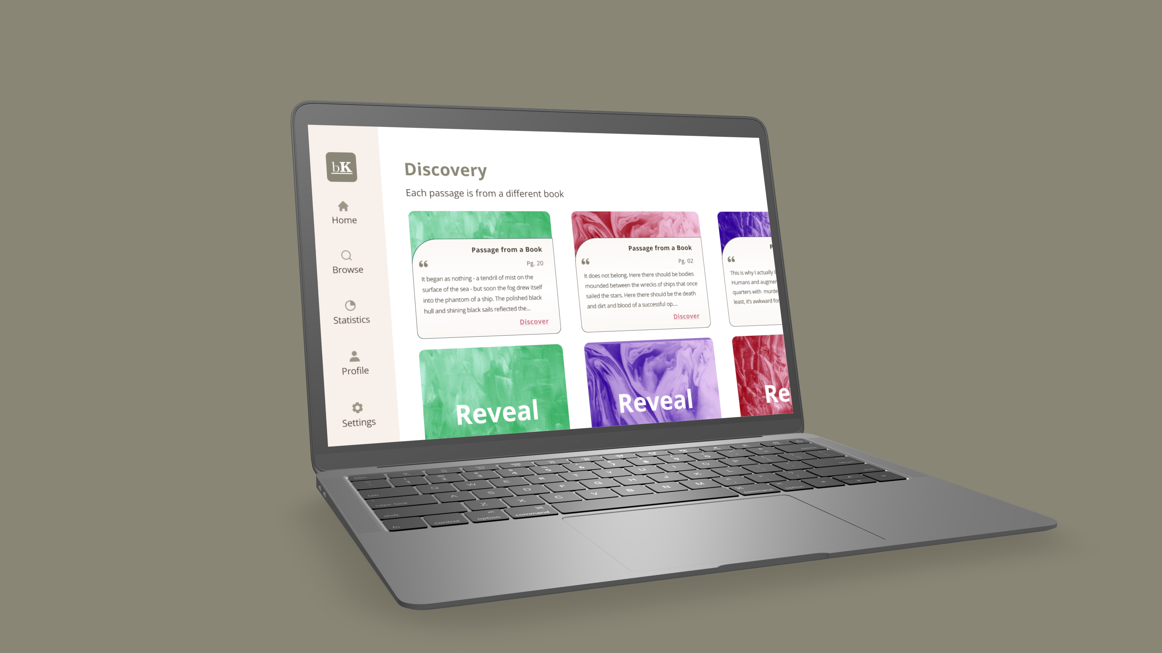
Multi-Platform Design
From the Comfort of Home
What can one do within a span of sixty minutes? Well, the answer lies below. Tasked with showcasing how the bookKeepr app would work on a different platform, I chose to narrow in on the discovery process, that being the crux of the task flow. I asked myself, what would be different if there was more real estate? Could the concept be expanded upon without changing things up too drastically?
The answer was the addition of the reveal function. Letting the user scroll through more options, and letting them interact by revealing the card, and after reading a passage, proceeding forward in the journey.
While rough in its nature, unpolished even, the concept itself was easy to transition over to a desktop, and would also work well on a tv.
Tarot Cards of Tech
http://tarotcardsoftech.artefactgroup.com/
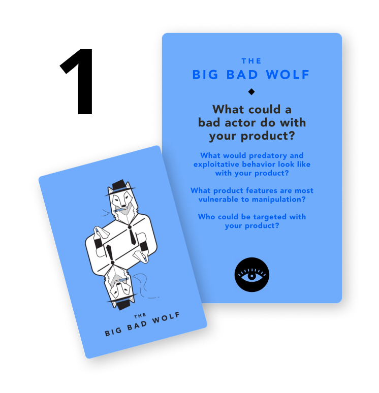
THE BIG BAD WOLF
Answering the question.
Ah, the wolf, such a pain, always up to no good. It's of no shock that a bad actor such as the wolf would go about using this app as a way to perhaps screenshot various works of literature (a screenshot itself isn't the problem per se).
Now is this problem unique to bookKeepr? No. It's a problem that can occur on any platform that offers a preview. Yet if this were a really, really bad wolf, they'd use it as a way to copy the words themselves so they could try and make some profit from it (e.g. stealing a story). bookKeepr wouldn't let them simply copy/paste the passages, but if the passages themselves are known to be well written, as is the goal, it gives the wolf an opportunity to strike. They wouldn't have to read through pages, but merely small bits of well written passages.
Therefore those at greatest risk, are the authors themselves. That being said, there's laws for a reason, and any wolf foolish enough to try and steal for the purpose of obtaining money, will be a wolf soon hunted and placed.... ah, got ahead of myself!
http://tarotcardsoftech.artefactgroup.com/
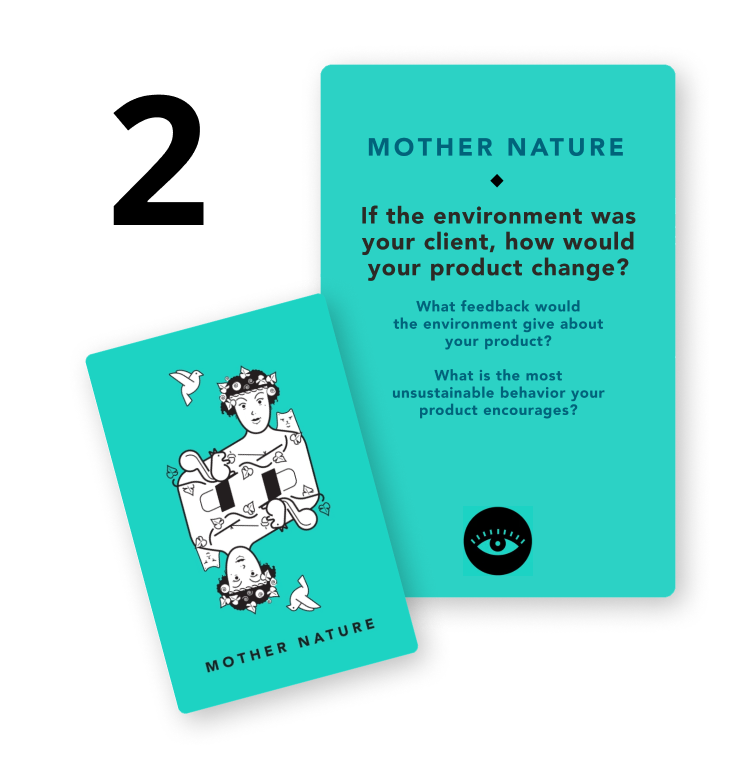
MOTHER NATURE
Answering the question.
Dear mother, I do apologize in advance.
It is with great misfortune that I must inform you that, yet another tree has fallen. Why? To what end? For the purpose of literature I am afraid. There is something magical to the essence of a book in its physical form, no doubt from the properties it takes from you.
I do have an idea, how bookKeepr could promote digital sales over physical, and perhaps that will be the next step in its evolution. A goal to reach, a hypothesis to test, users to study.
Trust, no one smiles at the sight of a fallen tree, but do they crack a smile when they read a splendid passage on a piece of paper? For that, they surely do.
Down goes the tree, with fallen leaves truer than a tear from a humans cheek, tears that mark a world without breathable air, and books left unread.
A Conclusion
Next Steps
The most immediate step would be to further improve and build upon the solutions within bookKeepr, so that the problem space becomes a fully fleshed out solution for all those impacted. So more iterations, more testing, and more task flows as the app grows.
Key Learnings
User Experience design is a messy process, but the results are well worth all of the iterations and testing. As each insight is discovered and solutions are improved upon, the outcome is a better experience that accommodates as many people as possible.