The Focus
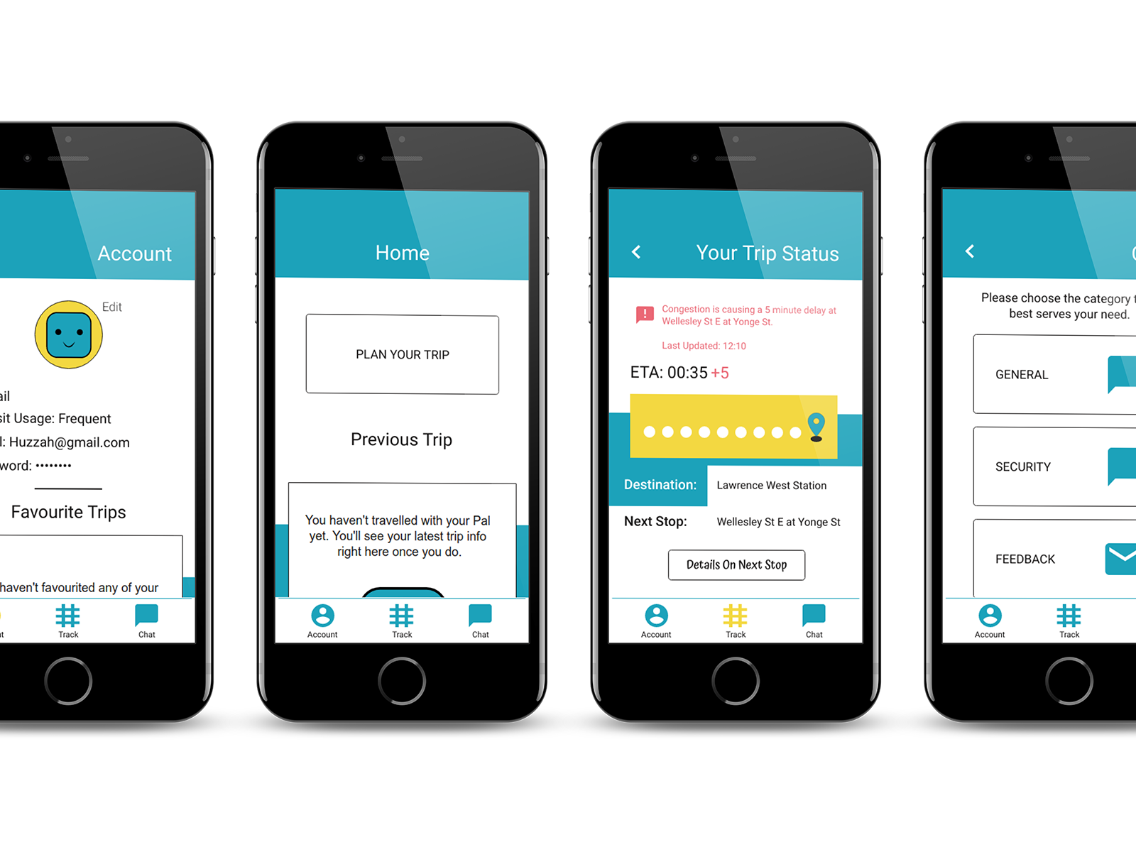
Mobile was the priority as data shows it is the method most users interact with when shopping.
Role Diversity
The Parts We Play
Casey brought the client to our attention based on his previous affiliations with them. Together we worked in tandem, discussing what we were finding until we concluded we'd go about performing the heuristic evaluation. With assets sourced, the three of us worked closely to work on design solutions to address the heuristic violations we identified. In this group dynamic, my role focused on ensuring consistency within the design, and giving aid in polishing up the final versions.
The Chosen Task Flow
An Overview
Simply put, we focused on the experience a shopper might have when browsing the website on mobile. From choosing a category, selecting an item and then adding that item to the cart. This process also included an error page (if something is currently under maintenance) as well as what happens when an item is removed from the cart.
Identified Heuristic Violations
What Was Found
Of the ten heuristics that exist, the ones listed below are what was identified during the task flow analysis. It's important to note that the evaluation itself had different results amongst the three of us, with actions delivering alternative outcomes.
For more information on Heuristics: https://www.nngroup.com/articles/ten-usability-heuristics/
The Severity
Pretty Sever
By focusing on the chosen task flow, it became apparent that the user experience was filled with a series of heuristic violations. Though not to fret, as every problem can be given a solution with the right amount of care and attention. So we did just that.
Comparison of Changes
Left = New | Right = Old
1
&
2
&
3
&
4
&
5
&
Summary
It Goes Beyond Heuristics
One thing that was evident in the heuristic evaluation was that some of the issues stemmed from a flawed information architecture. By focusing on that while also ensuring heuristics are addressed, the overall experience can be greatly improved.


